Preface
Goal: Explore statistic properties with Julia. Providing the data using linear model.
Julia is that one friend,
who not only solves complex math,
but also writes it beautifully in Unicode.
It can express mathematical functions,
in ways that look like they just walked off the page of a textbook.
Seriously, it’s like LaTeX and Python had a mathematically gifted child.
Readable Code
However… just because we can write:
It doesn’t mean we should throw Greek letters everywhere, like we’re decorating a fraternity house.
Readable code beats aesthetic code in production.
Unicode is a flex, but clarity is a lifeline.
We statisticians know that beauty matters, but so does readability, specially when debugging code at 2AM while questioning life choices. So while Unicode looks gorgeous, we’ll proceed with a conservative coding approach, that still gets the job done and keeps future us from rage-quitting.
Statistic Properties
Let’s peek under the hood of how Julia handles statistical properties.
We’ll start with the classic workhorse of regression: least squares.
This is where statisticians get misty-eyed—right,
before they argue about assumptions over coffee.
Manual Calculation
The Spreadsheet Monk Way
Full code available. You can check the detail of the manual calculation in the source code below:
After reading data from CSV,
we extract our favorite bickering pair: x and y.
using CSV, DataFrames, Printf, Statistics

pairCSV = CSV.read("50-samples.csv", DataFrame)
x_observed = pairCSV.x
y_observed = pairCSV.y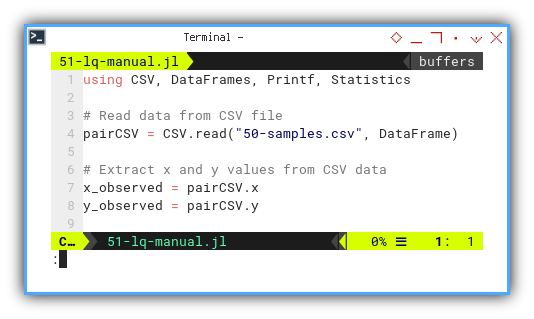
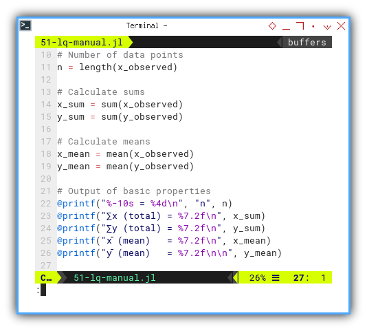
We compute sample size, totals, and means, the boring part of any romantic relationship then printout the basic properties.
n = length(x_observed)

x_sum = sum(x_observed)
y_sum = sum(y_observed)

x_mean = mean(x_observed)
y_mean = mean(y_observed)

@printf("%-10s = %4d\n", "n", n)
@printf("∑x (total) = %7.2f\n", x_sum)
@printf("∑y (total) = %7.2f\n", y_sum)
@printf("x̄ (mean)   = %7.2f\n", x_mean)
@printf("ȳ (mean)   = %7.2f\n\n", y_mean)
These are the building blocks for everything else. Miss a mean, and the whole regression falls like a badly balanced ANOVA.
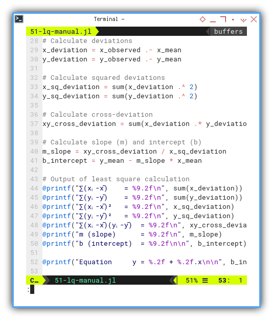
Let’s take those deviations for a walk:
square them, multiply them,
and mash them into slope (m) and intercept (b).
The usual statistics hazing ritual.
Then printout the least square calculation.
x_deviation = x_observed .- x_mean
y_deviation = y_observed .- y_mean

x_sq_deviation = sum(x_deviation .^ 2)
y_sq_deviation = sum(y_deviation .^ 2)
xy_cross_deviation = sum(x_deviation .* y_deviation)

m_slope = xy_cross_deviation / x_sq_deviation
b_intercept = y_mean - m_slope * x_mean

@printf("∑(xᵢ-x̄)    = %9.2f\n", sum(x_deviation))
@printf("∑(yᵢ-ȳ)    = %9.2f\n", sum(y_deviation))
@printf("∑(xᵢ-x̄)²   = %9.2f\n", x_sq_deviation)
@printf("∑(yᵢ-ȳ)²   = %9.2f\n", y_sq_deviation)
@printf("∑(xᵢ-x̄)(yᵢ-ȳ)  = %9.2f\n", xy_cross_deviation)
@printf("m (slope)      = %9.2f\n", m_slope)
@printf("b (intercept)  = %9.2f\n\n", b_intercept)

@printf("Equation     y = %.2f + %.2f.x\n\n", b_intercept, m_slope)
We’re trying to find the line that best hugs our data. Mathematically speaking, least squares is the most socially acceptable line of best fit.
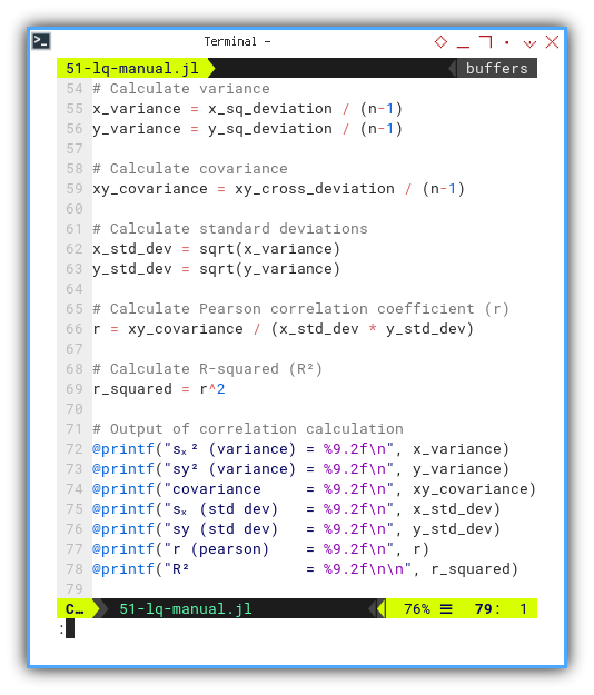
Now we flex our calculator muscles to find: variance, standard deviation, covariance, Pearson correlation coefficient (r), and the beloved R-squared (R²). The crowd cheers. Then again printout the correlation calculations as usual.
x_variance = x_sq_deviation / (n-1)
y_variance = y_sq_deviation / (n-1)
xy_covariance = xy_cross_deviation / (n-1)

x_std_dev = sqrt(x_variance)
y_std_dev = sqrt(y_variance)

r = xy_covariance / (x_std_dev * y_std_dev)
r_squared = r^2

@printf("sₓ² (variance) = %9.2f\n", x_variance)
@printf("sy² (variance) = %9.2f\n", y_variance)
@printf("covariance     = %9.2f\n", xy_covariance)
@printf("sₓ (std dev)   = %9.2f\n", x_std_dev)
@printf("sy (std dev)   = %9.2f\n", y_std_dev)
@printf("r (pearson)    = %9.2f\n", r)
@printf("R²             = %9.2f\n\n", r_squared)
This tells us how tight the data hugs the trend line. In statistics, we call this “relationship goals.”
Residuals time:
subtract predictions from reality, just like grading our expectations after a family reunion. That gap, between expectations and reality, is like a residual in a regression.
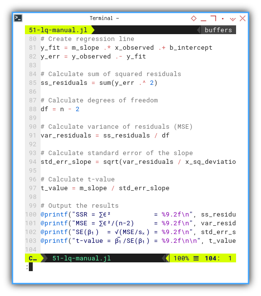
We need to create regression line, along with residual error, using array operations. Then calculate sum of squared residuals, also using array operations.
Based on degrees of freedom, calculate further from variance of residuals (MSE), standard error of the slope, and calculate t-value, then printout the output the results,’ again and again, and again…
y_fit = m_slope .* x_observed .+ b_intercept
y_err = y_observed .- y_fit

ss_residuals = sum(y_err .^ 2)
df = n - 2

var_residuals = ss_residuals / df
std_err_slope = sqrt(var_residuals / x_sq_deviation)
t_value = m_slope / std_err_slope

@printf("SSR = ∑ϵ²           = %9.2f\n", ss_residuals)
@printf("MSE = ∑ϵ²/(n-2)     = %9.2f\n", var_residuals)
@printf("SE(β₁)  = √(MSE/sₓ) = %9.2f\n", std_err_slope)
@printf("t-value = β̅₁/SE(β₁) = %9.2f\n\n", t_value)
This is the beating heart of inference. We’re not just fitting a line. We’re making statistically sound claims.
Execution result:
❯ julia 51-lq-manual.jl
n          =   13
∑x (total) =   78.00
∑y (total) = 2327.00
x̄ (mean)   =    6.00
ȳ (mean)   =  179.00

∑(xᵢ-x̄)    =      0.00
∑(yᵢ-ȳ)    =      0.00
∑(xᵢ-x̄)²   =    182.00
∑(yᵢ-ȳ)²   = 309218.00
∑(xᵢ-x̄)(yᵢ-ȳ)  =   7280.00
m (slope)      =     40.00
b (intercept)  =    -61.00

Equation     y = -61.00 + 40.00.x

sₓ² (variance) =     15.17
sy² (variance) =  25768.17
covariance     =    606.67
sₓ (std dev)   =      3.89
sy (std dev)   =    160.52
r (pearson)    =      0.97
R²             =      0.94

SSR = ∑ϵ²           =  18018.00
MSE = ∑ϵ²/(n-2)     =   1638.00
SE(β₁)  = √(MSE/sₓ) =      3.00
t-value = β̅₁/SE(β₁) =     13.33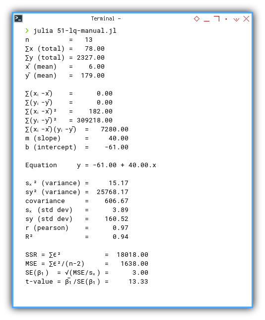
📓 Interactive Jupyter version here:
You can obtain the interactive JupyterLab in this following link:
GLM Library
Using Built-in Method
Now boarding: the GLM train. All manual passengers, please stay seated.
We can simplified aboce calculation with built-in method.
Link to code:
We import GLM.
Julia's own statistics power tool.
using CSV, DataFrames, Printf, Statistics, GLM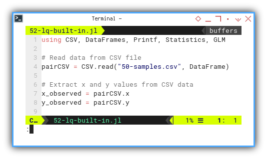
Like in R,
we fit a linear model with lm().
The syntax feels like R,
with a fresh paint job and no memory leaks.
model = lm(@formula(y ~ x), pairCSV)
coefs = coef(model)
m_slope = coefs[2]
b_intercept = coefs[1]

@printf("m (slope)      = %9.2f\n", m_slope)
@printf("b (intercept)  = %9.2f\n\n", b_intercept)
@printf("Equation     y = %.2f + %.2f.x\n\n", b_intercept, m_slope)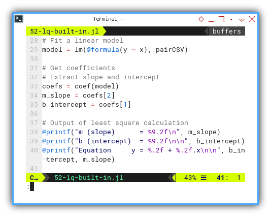
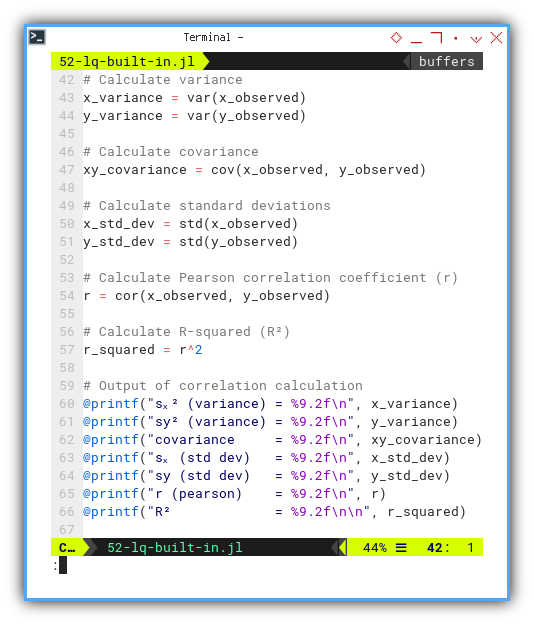
We still do our ritual variance-covariance dance. This time, using built-in methods that actually want to be used: variance, covariance, standard deviations, and even the pearson correlation coefficient (r). From this we can manually calculate R-squared (R²).
x_variance = var(x_observed)
y_variance = var(y_observed)
xy_covariance = cov(x_observed, y_observed)

x_std_dev = std(x_observed)
y_std_dev = std(y_observed)

r = cor(x_observed, y_observed)
r_squared = r^2

@printf("sₓ² (variance) = %9.2f\n", x_variance)
@printf("sy² (variance) = %9.2f\n", y_variance)
@printf("covariance     = %9.2f\n", xy_covariance)
@printf("sₓ (std dev)   = %9.2f\n", x_std_dev)
@printf("sy (std dev)   = %9.2f\n", y_std_dev)
@printf("r (pearson)    = %9.2f\n", r)
@printf("R²             = %9.2f\n\n", r_squared)
These are sanity checks. Even if the model does the heavy lifting, we still want to peek inside , nd make sure it’s not drunk on assumptions.
From previous this linear model,
we can generate predicted values along with residuals.
Then we can continue doing our manual calculation.
Just ask politely and GLM serves it on a silver platter.
y_fit = predict(model)
y_err = residuals(model)

df = n - 2
ss_residuals = sum(y_err .^ 2)
var_residuals = ss_residuals / df

x_deviation = x_observed .- x_mean
x_sq_deviation = sum(x_deviation .^ 2)
std_err_slope = sqrt(var_residuals / x_sq_deviation)
t_value = m_slope / std_err_slope

@printf("SSR = ∑ϵ²           = %9.2f\n", ss_residuals)
@printf("MSE = ∑ϵ²/(n-2)     = %9.2f\n", var_residuals)
@printf("∑(xᵢ-x̄)²            = %9.2f\n", x_sq_deviation)
@printf("SE(β₁)  = √(MSE/sₓ) = %9.2f\n", std_err_slope)
@printf("t-value = β̅₁/SE(β₁) = %9.2f\n\n", t_value)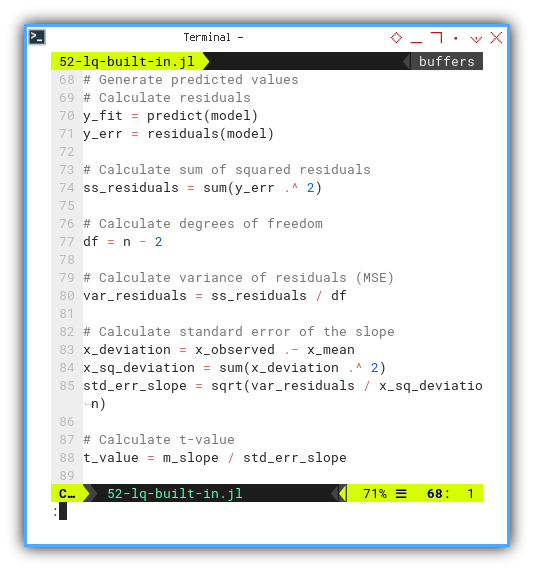
Execution result:
❯ julia 52-lq-built-in.jl
n          =   13
∑x (total) =   78.00
∑y (total) = 2327.00
x̄ (mean)   =    6.00
ȳ (mean)   =  179.00

m (slope)      =     40.00
b (intercept)  =    -61.00

Equation     y = -61.00 + 40.00.x

sₓ² (variance) =     15.17
sy² (variance) =  25768.17
covariance     =    606.67
sₓ (std dev)   =      3.89
sy (std dev)   =    160.52
r (pearson)    =      0.97
R²             =      0.94

SSR = ∑ϵ²           =  18018.00
MSE = ∑ϵ²/(n-2)     =   1638.00
∑(xᵢ-x̄)²            =    182.00
SE(β₁)  = √(MSE/sₓ) =      3.00
t-value = β̅₁/SE(β₁) =     13.33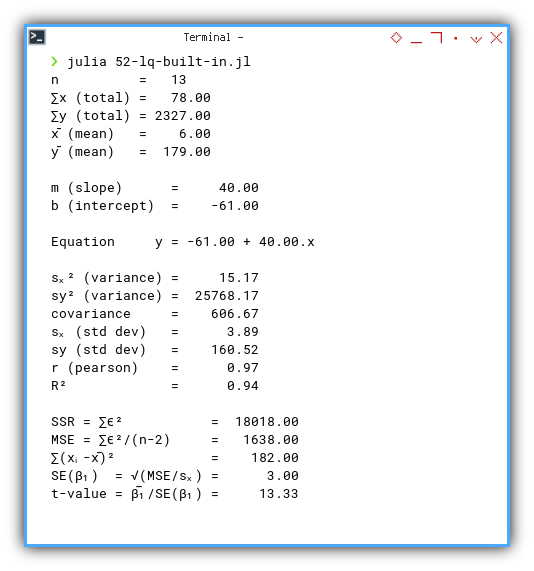
📓 Interactive Jupyter version here:
You can obtain the interactive JupyterLab in this following link:
Final Thoughts
Whether we go monk-mode and write everything by hand,
or let GLM do the heavy lifting,
Julia gives us tools that are not just elegant, but trustworthy.
As long as we understand what’s going on under the hood, we can keep our statistical integrity—, nd maybe even crack a smile while doing it.
Unicode Symbols as Variables
Making Greek Great Again
Let’s take a detour from dry regressions, and dive into something a bit more fun. Unicode madness.
Julia, unlike our old high-school calculators, is happy to speak Greek. This section explores just how readable, and elegant code can be, when our variables wear togas and quote Pythagoras.
In short: our math professor’s chalkboard now runs Julia.
Why should our variables be limited to boring x and y,
when we could use the entire Greek fraternity?
Let’s treat our dataset like a philosophy class,
with xᵢ, ȳ, and ∑ϵ² all mingling like Socratic thinkers.
Defining UTF-8 Variables
Yes, Julia lets us use UTF-8 characters for variable names, no arcane flags, no weird syntax. Just copy-paste the Greek. Let’s have this experiment below:
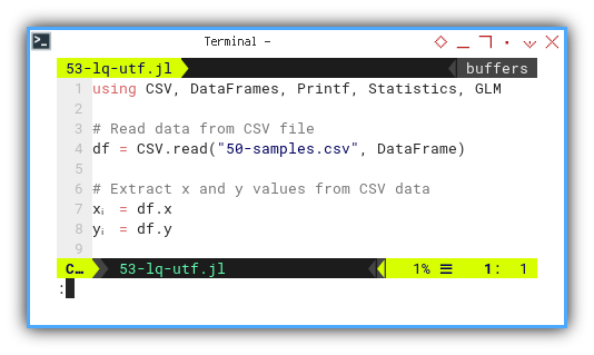
Let’s start by loading data and switching to Greek mode.
First we are going to use xᵢ and yᵢ.
using CSV, DataFrames, Printf, Statistics, GLM

df = CSV.read("50-samples.csv", DataFrame)
xᵢ = df.x
yᵢ = df.y
Code readability skyrockets when math notation in our code matches the textbook. It’s like translating math into executable form. No decoder ring required.
Why write sum_x when we can just… write ∑x?
Now let’s go full-statistician and summon the ancient symbols:
∑ for summation and x̄ for the mean.
n = length(xᵢ)

∑x = sum(xᵢ)
∑y = sum(yᵢ)

x̄ = mean(xᵢ)
ȳ = mean(yᵢ)

@printf("%-10s = %4d\n", "n", n)
@printf("∑x (total) = %7.2f\n", ∑x)
@printf("∑y (total) = %7.2f\n", ∑y)
@printf("x̄ (mean)   = %7.2f\n", x̄)
@printf("ȳ (mean)   = %7.2f\n\n", ȳ)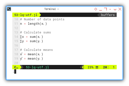
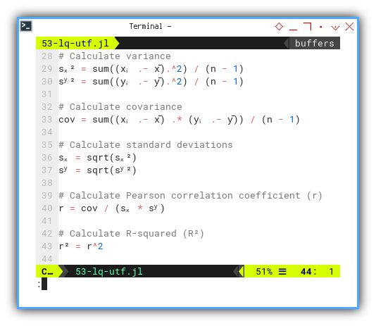
Embracing Variance, Standard Deviation, and Friends
In true academic fashion, we calculate the essentials: variance, standard deviation, covariance, and Pearson’s r. All wrapped in tidy UTF-8.
sₓ² = sum((xᵢ .- x̄).^2) / (n - 1)
sʸ² = sum((yᵢ .- ȳ).^2) / (n - 1)
cov = sum((xᵢ .- x̄) .* (yᵢ .- ȳ)) / (n - 1)

sₓ = sqrt(sₓ²)
sʸ = sqrt(sʸ²)

r = cov / (sₓ * sʸ)
r² = r^2

@printf("sₓ² (variance) = %9.2f\n", sₓ²)
@printf("sʸ² (variance) = %9.2f\n", sʸ²)
@printf("covariance     = %9.2f\n", cov)
@printf("sₓ (std dev)   = %9.2f\n", sₓ)
@printf("sʸ (std dev)   = %9.2f\n", sʸ)
@printf("r (pearson)    = %9.2f\n", r)
@printf("R²             = %9.2f\n\n", r²)
Understanding these statistical values is the core of linear regression. Using intuitive symbols means we see the math as we compute it. No translation overhead.
Let’s now compute our regression line, in proper Greek attire:
mᵣ = sum((xᵢ .- x̄) .* (yᵢ .- ȳ)) / sum((xᵢ .- x̄).^2)
bᵣ = ȳ - mᵣ * x̄

@printf("m (slope)      = %9.2f\n", mᵣ)
@printf("b (intercept)  = %9.2f\n\n", bᵣ)
@printf("Equation     y = %.2f + %.2f.x\n\n", bᵣ, mᵣ)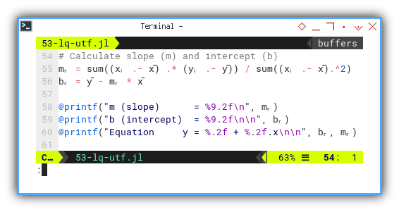
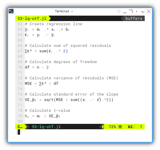
Residuals and T-Value: Greek Theater Finale
Now for the grand finale, the residuals (ϵᵢ) and the t-value. This is the statistical equivalent of checking, if our theory survived peer review.
ŷᵢ = mᵣ .* xᵢ .+ bᵣ
ϵᵢ = yᵢ .- ŷᵢ

df = n - 2
∑ϵ² = sum(ϵᵢ .^ 2)

MSE = ∑ϵ² / df
SE_β₁ = sqrt(MSE / sum((xᵢ .- x̄).^2))
tᵥ = mᵣ / SE_β₁

@printf("SSR = ∑ϵ²           = %9.2f\n", ∑ϵ²)
@printf("MSE = ∑ϵ²/(n-2)     = %9.2f\n", MSE)
@printf("SE(β₁)  = √(MSE/sₓ) = %9.2f\n", SE_β₁)
@printf("t-value = β̅₁/SE(β₁) = %9.2f\n\n", tᵥ)
The t-value helps us decide whether the slope matters, or whether it’s just a line we imagined after too much coffee.
Here’s the real output, complete with statistical drama:
❯ julia 53-lq-utf.jl
n          =   13
∑x (total) =   78.00
∑y (total) = 2327.00
x̄ (mean)   =    6.00
ȳ (mean)   =  179.00

sₓ² (variance) =     15.17
sʸ² (variance) =  25768.17
covariance     =    606.67
sₓ (std dev)   =      3.89
sʸ (std dev)   =    160.52
r (pearson)    =      0.97
R²             =      0.94

m (slope)      =     40.00
b (intercept)  =    -61.00

Equation     y = -61.00 + 40.00.x

SSR = ∑ϵ²           =  18018.00
MSE = ∑ϵ²/(n-2)     =   1638.00
SE(β₁)  = √(MSE/sₓ) =      3.00
t-value = β̅₁/SE(β₁) =     13.33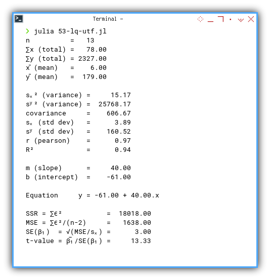
You can also explore this visually using the JupyterLab version:
It looks like that it works.
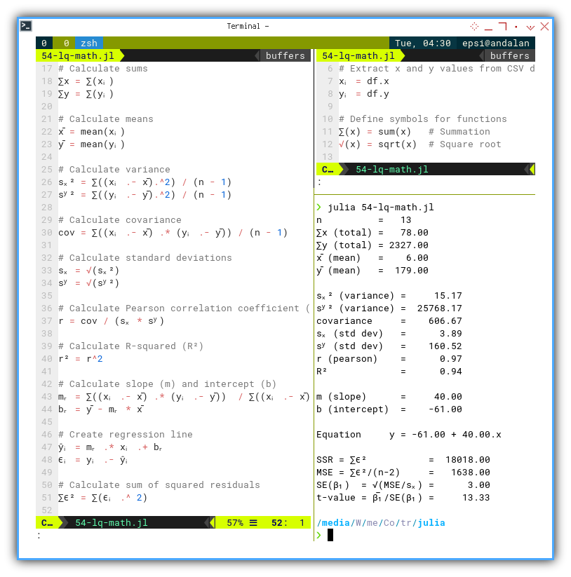
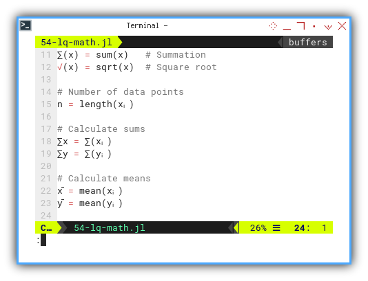
Defining Functions in Greek
Math Equation
Why stop at variables? Let’s name our functions in Greek too. It’s like writing a math paper that runs itself.
Let’s experiment with ∑(x) and √(x).
∑(x) = sum(x)   # Summation
√(x) = sqrt(x)  # Square root

n = length(xᵢ)
∑x = ∑(xᵢ)
∑y = ∑(yᵢ)

x̄ = mean(xᵢ)
ȳ = mean(yᵢ)
It’s just that simple. No plugins. No special mode. No sacrificing goats..
With this, we can recreate textbook equations nearly line-for-line.
sₓ² = ∑((xᵢ .- x̄).^2) / (n - 1)
sʸ² = ∑((yᵢ .- ȳ).^2) / (n - 1)
cov = ∑((xᵢ .- x̄) .* (yᵢ .- ȳ)) / (n - 1)

sₓ = √(sₓ²)
sʸ = √(sʸ²)

r = cov / (sₓ * sʸ)
r² = r^2
Compare that to the original equation: It looks like we can put the math equation, right into the code.
We can see how close the code looks with the original equation.
We’re not just coding math. We’re living it.
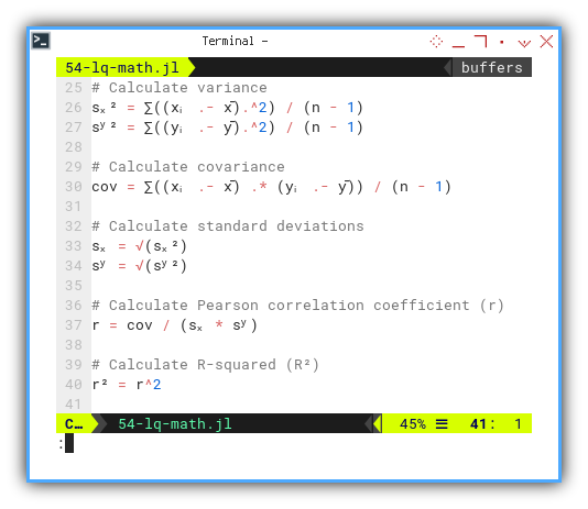
This way, we can see how the code works better.
mᵣ = ∑((xᵢ .- x̄) .* (yᵢ .- ȳ)) / ∑((xᵢ .- x̄).^2)
bᵣ = ȳ - mᵣ * x̄

ŷᵢ = mᵣ .* xᵢ .+ bᵣ
ϵᵢ = yᵢ .- ŷᵢ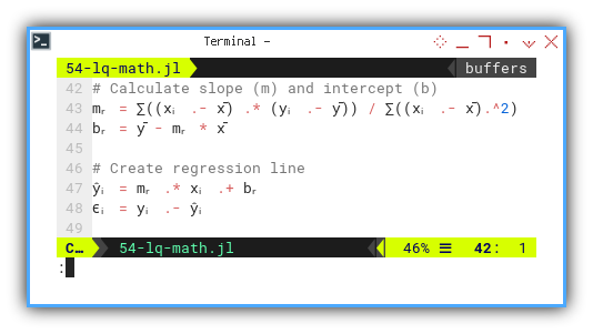
And of course, we go all the way to the t-test:
df = n - 2
∑ϵ² = ∑(ϵᵢ .^ 2)

MSE = ∑ϵ² / df
SE_β₁ = √(MSE / ∑((xᵢ .- x̄).^2))
tᵥ = mᵣ / SE_β₁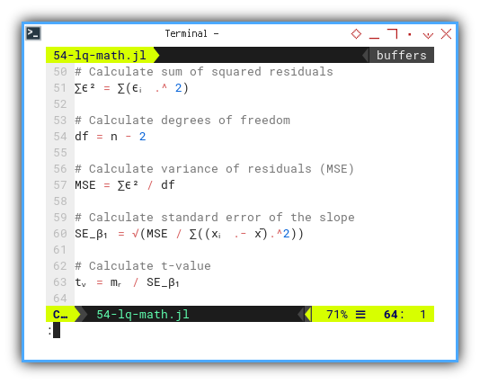
And finally printout all the statistic properties, from basic properties, correlation calculation, regression coefficient until we get the t-value.
@printf("%-10s = %4d\n", "n", n)
@printf("∑x (total) = %7.2f\n", ∑x)
@printf("∑y (total) = %7.2f\n", ∑y)
@printf("x̄ (mean)   = %7.2f\n", x̄)
@printf("ȳ (mean)   = %7.2f\n\n", ȳ)

@printf("sₓ² (variance) = %9.2f\n", sₓ²)
@printf("sʸ² (variance) = %9.2f\n", sʸ²)
@printf("covariance     = %9.2f\n", cov)
@printf("sₓ (std dev)   = %9.2f\n", sₓ)
@printf("sʸ (std dev)   = %9.2f\n", sʸ)
@printf("r (pearson)    = %9.2f\n", r)
@printf("R²             = %9.2f\n\n", r²)

@printf("m (slope)      = %9.2f\n", mᵣ)
@printf("b (intercept)  = %9.2f\n\n", bᵣ)
@printf("Equation     y = %.2f + %.2f.x\n\n", bᵣ, mᵣ)

@printf("SSR = ∑ϵ²           = %9.2f\n", ∑ϵ²)
@printf("MSE = ∑ϵ²/(n-2)     = %9.2f\n", MSE)
@printf("SE(β₁)  = √(MSE/sₓ) = %9.2f\n", SE_β₁)
@printf("t-value = β̅₁/SE(β₁) = %9.2f\n\n", tᵥ)
Again, let’s test the result.
❯ julia 54-lq-math.jl
n          =   13
∑x (total) =   78.00
∑y (total) = 2327.00
x̄ (mean)   =    6.00
ȳ (mean)   =  179.00

sₓ² (variance) =     15.17
sʸ² (variance) =  25768.17
covariance     =    606.67
sₓ (std dev)   =      3.89
sʸ (std dev)   =    160.52
r (pearson)    =      0.97
R²             =      0.94

m (slope)      =     40.00
b (intercept)  =    -61.00

Equation     y = -61.00 + 40.00.x

SSR = ∑ϵ²           =  18018.00
MSE = ∑ϵ²/(n-2)     =   1638.00
SE(β₁)  = √(MSE/sₓ) =      3.00
t-value = β̅₁/SE(β₁) =     13.33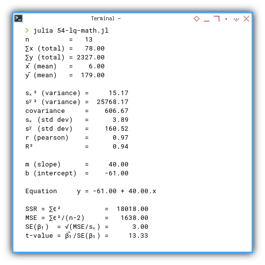
You can obtain the interactive JupyterLab in this following link:
Embedding math symbols in actual code, helps students, researchers, and code reviewers alike, follow logic with less friction.
A Final Word of Caution
Yes, we can name our variables ∑, √, and ϵᵢ.
These are just utf-8.
Although this works, don’t be a fool of the symbol.
You may use apples, fruit, vegetables,
or any smiley faces, instead of greek letter.
Just because we can use Greek doesn’t mean we should go full emoji.
Julia doesn’t judge if we name our slope 🍕, but our future selves might.
So, be elegant. Be readable. And maybe, just maybe, leave the smiley faces for Slack.
Visualization
A Statistician’s Canvas
Time to stop theorizing and start visualizing. We’re entering the show-don’t-tell phase of statistics, where numbers finally admit they have feelings, and express them in scatter plots.
We begin by importing data from a CSV file.
Think of it as a sociable little matrix,
that prefers to travel in rows and columns.
Then, we extract our x and y values,
the dynamic duo of regression analysis.
using CSV, DataFrames, Plots, GLM

pairCSV = CSV.read("50-samples.csv", DataFrame)
x_observed = pairCSV.x
y_observed = pairCSV.y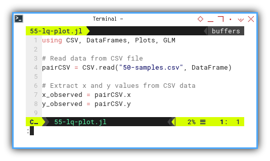
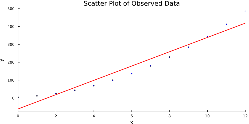
Next up: we scatter.
This basic scatter plot displays our observed data. No lines, no assumptions, just the raw awkwardness of reality. Every dot is a witness to randomness, and maybe some underlying structure. If we’re lucky.
scatter_plot = scatter(
  x_observed, y_observed,
  xlabel = "x", ylabel = "y",
  title = "Scatter Plot of Observed Data",
  markersize = 2,
  legend = false,
  color = :blue,
  grid = false,
  size = (800, 400))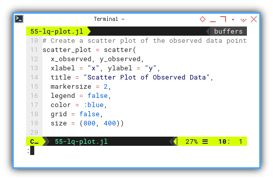
But we’re statisticians, we see lines where others see dots. It’s time to fit a linear model.
Here’s where regression enters with a cape.
Using the Generalized Linear Model (GLM) package,
we fit a straight line to our data.
That line is our best guess of the trend,
minimizing the squared distance from each point.
In plain English, it’s the least embarrassed line our dataset could draw.
model = lm(@formula(y ~ x), pairCSV)

coefs = coef(model)
m_slope = coefs[2]
b_intercept = coefs[1]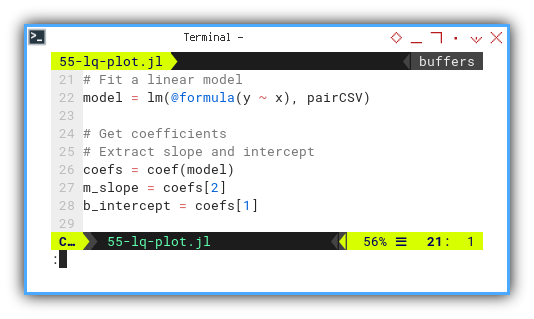
With slope and intercept in hand, two numbers that explain an entire relationship, we overlay the regression line.
regression_line = plot!(
  x -> m_slope * x + b_intercept,
  xlims = extrema(x_observed),
  color = :red, linewidth = 2)
Before we forget—save the plot. It didn’t struggle through all that math just to be discarded.
# Save plot as PNG
savefig("55-lq-plot.png")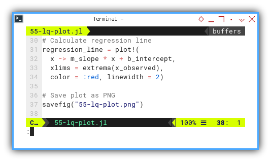
And voilà. The result is a clean visual: raw data, elegant line, statistical beauty. Simple, honest, and useful. Just like our favorite p-values.
For the hands-on folks,
an interactive JupyterLab notebook version is ready for exploration:
This line turns scattered noise into insight. It helps us predict, summarize, and sound wise in meetings.
Additional Properties
When Stats Go Beyond the Basics
Once we finish celebrating the mean and standard deviation, we realize the party’s far from over. There are more statistical snacks on the table, like median, mode, range, and their mysterious cousins: skewness and kurtosis.
Let’s dig in.
As always, we begin with our trusted x and y values,
summoned from the depths of a CSV file.
A good dataset never ghosted anyone.
using CSV, DataFrames, Statistics, Printf, Distributions

pairCSV = CSV.read("50-samples.csv", DataFrame)
x_observed = pairCSV.x
y_observed = pairCSV.y
These values give us a quick scan of the data landscape. Are we dealing with tight clusters or wild outliers? Are the y-values scaling mountains while x gently naps?
Max, Min, Range
Let’s start with the basics of the basics. We count how many data points we have (just in case someone snuck in an extra row), then we grab the max, min, and calculate the range, the statistical equivalent of measuring the tallest, and shortest party guests and the gap between them.
n = length(x_observed)

x_max = maximum(x_observed)
x_min = minimum(x_observed)
x_range = x_max - x_min

y_max = maximum(y_observed)
y_min = minimum(y_observed)
y_range = y_max - y_min

@printf("x (max, min, range) = (%7.2f, %7.2f, %7.2f)\n",
  x_min, x_max, x_range)
@printf("y (max, min, range) = (%7.2f, %7.2f, %7.2f)\n\n",
  y_min, y_max, y_range)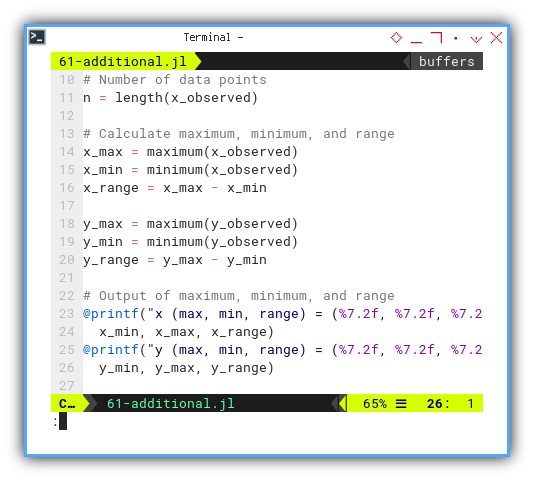
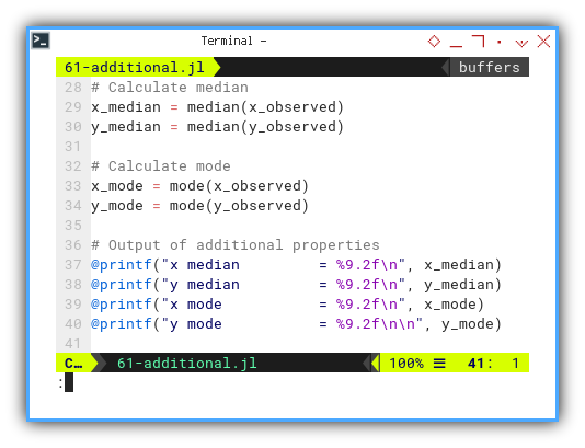
Median and Mode
Let’s move deeper. The median tells us the middle child of the dataset: quiet, centered, reliable. The mode, meanwhile, is the most popular kid on the block. Together, they help us understand symmetry or the lack thereof.
# Calculate median
x_median = median(x_observed)
y_median = median(y_observed)

# Calculate mode
x_mode = mode(x_observed)
y_mode = mode(y_observed)

# Output of additional properties
@printf("x median         = %9.2f\n", x_median)
@printf("y median         = %9.2f\n", y_median)
@printf("x mode           = %9.2f\n", x_mode)
@printf("y mode           = %9.2f\n\n", y_mode)
Mean gets all the fame, but median and mode are often better at handling weird data distributions. They are less swayed by drama, aka outliers.
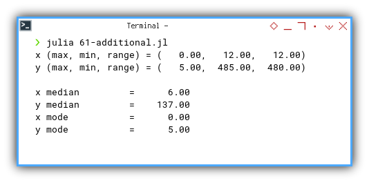
Execute
Let’s peek at the result, our data speaks.
❯ julia 61-additional.jl
x (min, max, range) = (   0.00,   12.00,   12.00)
y (min, max, range) = (   5.00,  485.00,  480.00)

x median         =      6.00
y median         =    137.00
x mode           =      0.00
y mode           =      5.00
Turns out our y-values are living large, possibly influenced by a few overachievers.
Curious minds can interact with the dataset directly here:
Now, a confession.
We could also compute kurtosis and skewness. And I did. But the numbers refused to match their PSPP counterparts. At this point, I decided to avoid philosophical debates with statistical libraries.
It is not that I gave up, It is just that I’m postponing our enlightenment, until I find the right reference book, or a kind statistician who explains it with coffee.
What’s the Next Chapter 🤔?
Our Julia journey so far has taken us from the humble CSV, to a flurry of scatter plots, regression lines, and statistical side quests. We measured, we modeled, we even met the mode. Not bad for a bunch of symbols, syntax, and slightly suspicious outliers.
But we’re not done yet. The story continues.
Next up, we’ll roll up our sleeves,
and dive into defining custom types.
A bit like teaching Julia how to think like a statistician.
We’ll also explore more plotting,
this time featuring our stylish friend: Gadfly.
It’s the one with the bowtie that insists on doing things the declarative way.
Defining structures helps us organize data like pros, and visualizing trends helps us explain it to the rest of the world. Especially those who don’t get excited about variance on a Saturday night.
So if our current chapter felt like snack time at the stats buffet, the next one is the main course.
Join us for the sequel: 👉 [ Trend - Language - Julia - Part Three ].
Bring curiosity, coffee, and possibly a fresh pair of parentheses.