Preface
Goal: Exploring additional statistic properties not related to trend.
There are also common properties for statistics not related with trend. In trend context let’s call them additional properties. This properties is important for other statistics analysis.
Before you integrate the statistic properties, into your super duper application. You’d better make a good modelling to make sure your code get the right output result. You can make mathematical model using spreadsheet, but first you should understand the math behind the formula.
Equation
We begin with equation symbol, as our base of calculation.
Min, Max, Range
It is obvious.
Where the max function can be express in set notation:
Pretty explanatory
Median
The median can be described as below:
Mode
We need two steps to find the modus. First we have to find frequencies, then find the maximum frequencies, and finally get the value of that frequencies.
To find the frequencies of each unique value in a dataset, where I() is the indicator function, which equals 1 if the condition is true and 0 otherwise.
Then we find the maximum frequency.
Or in the set notation as:
Mathematically, you would find the mode value using this equation:
Or in oneliner fashioned all three above, can be rewritten as one set as follows:
SEM (Standard Error of the Mean)
The equation for SEM is:
Kurtosis and Skewness
The equation for Kurtosis and Skewness can found by using this equation:
Standard Error of Kurtosis and Skewness
The Standard Error equation for both Kurtosis and Skewness can be tricky, and can be differ from one reference to another.
The simplified approximation of Standard Error can be expressed as below:
While the complex Standard Error equation can be described as follows:
From stackoverflow I found out that, on different software the equation of Standard Error of gaussian kurtosis, can be expressed as follows.
I’m simply copying and pasting the code published by Howard Seltman in here:
Note that above equation only applied for data that follow gaussian distribution.
Worksheet Formula
I have already prepare the built in formula for these statistics properties.
Worksheet Source
Playsheet Artefact
The Excel file is available, so you can have fun, modify as you want.
Min, Max, Range
It is also obvious.
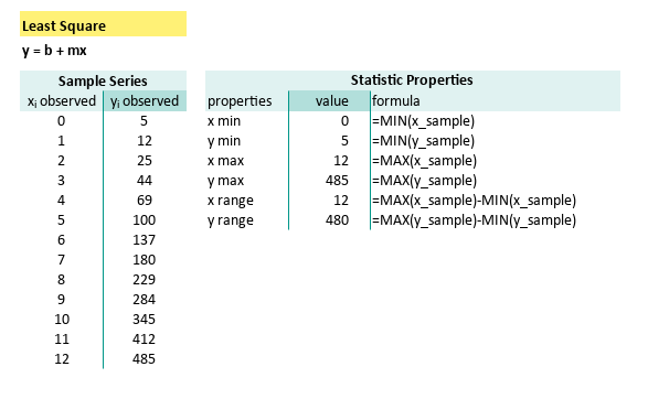
These simple formulas can be summarized as follows:
| properties | formula |
|---|---|
| x min | =MIN(x_sample) |
| y min | =MIN(y_sample) |
| x max | =MAX(x_sample) |
| y max | =MAX(y_sample) |
| x range | =MAX(x_sample)-MIN(x_sample) |
| y range | =MAX(y_sample)-MIN(y_sample) |
Median and Mode
We can use built-in median() formula.
But we should be careful while i uderstanding the mode() formula.
For example for a completely unique data series,
the result should be no mode, because all data frequency is 1.
Then our beloved spreadsheet is right to give error as `#VALUE1’.
The solution is make a new helper column to calculate frequency.
Let’s name the range as x_freq and y_freq,
and we can use our excel/calc expertise to craft this formula:
=INDEX(y_sample, MATCH(MAX(y_freq), y_freq, 0))The summary can be descirbed as follows:
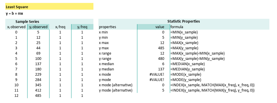
| properties | formula |
|---|---|
| x median | =MEDIAN(x_sample) |
| y median | =MEDIAN(y_sample) |
| x mode | =MODE(x_sample) |
| y mode | =MODE(y_sample) |
| x mode (alternative) | =INDEX(x_sample, MATCH(MAX(x_freq), x_freq, 0)) |
| y mode (alternative) | =INDEX(y_sample, MATCH(MAX(y_freq), y_freq, 0)) |
| x SE Mean | =STDEV.S(x_sample) / SQRT(COUNT(x_sample)) |
| y SE Mean | =STDEV.S(y_sample) / SQRT(COUNT(y_sample)) |
Kurtosis and Skewness
Excel/Calc has built in formula KURT() and SKEW().
But unfortunately no built-in formula for standard error.
With equation above, we can craft our SE formula as follows:
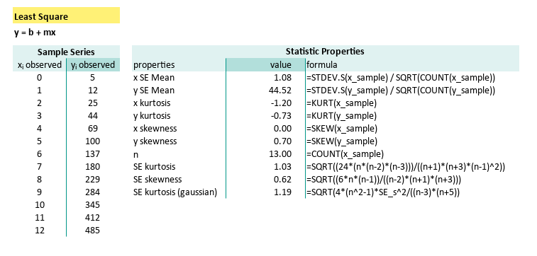
| properties | formula |
|---|---|
| x kurtosis | =KURT(x_sample) |
| y kurtosis | =KURT(y_sample) |
| x skewness | =SKEW(x_sample) |
| y skewness | =SKEW(y_sample) |
| n | =COUNT(x_sample) |
| SE kurtosis | =SQRT((24*(n*(n-2)*(n-3)))/((n+1)*(n+3)*(n-1)^2)) |
| SE skewness | =SQRT((6n(n-1))/((n-2)(n+1)(n+3))) |
| SE kurtosis (gaussian) | =SQRT(4*(n^2-1)*SE_s^2/((n-3)*(n+5)) |
It is fun to play with these two properties, if you understand the concept. We will also give you the visualization in this article.
Outliers
Actually, this one is interesting. But we are going to postpone.
Maybe in another article someday.
Python Tools
We can calculate additional statistic properties with python.
Python Source
The source can be obtained here:
Data Source
Instead of hardcoded data, we can setup the source data in CSV.
Min, Max, Range
Using the examples above:
import numpy as np

# Getting Matrix Values
pairCSV = np.genfromtxt("50-samples.csv",
  skip_header=1, delimiter=",", dtype=int)

# Extract x and y values from CSV data
x_observed = pairCSV[:, 0]
y_observed = pairCSV[:, 1]

# Number of data points
n = len(x_observed)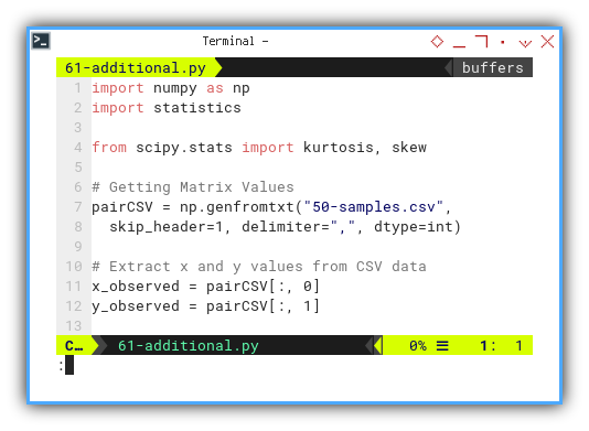
We can calculate
# Calculate maximum, minimum, and range
x_max = np.max(x_observed)
x_min = np.min(x_observed)
x_range = x_max - x_min

y_max = np.max(y_observed)
y_min = np.min(y_observed)
y_range = y_max - y_min

# Output of maximum, minimum, and range
print('x (max, min, range) = '
 + f'({x_min:7.2f}, {x_max:7.2f}, {x_range:7.2f} )')
print('y (max, min, range) = '
 + f'({y_min:7.2f}, {y_max:7.2f}, {y_range:7.2f} )')
print()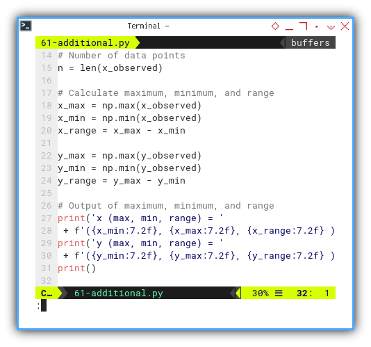
Median and Mode
We can find mode using statistics library.
import statistics

x_mode = statistics.mode(x_observed)
y_mode = statistics.mode(y_observed)
We can implement above equation to find median:
def calc_median(data: np.array) -> float:
  # Sort the data
  sorted_data = np.sort(data)

  # Calculate the median
  n = len(sorted_data)
  if n % 2 == 1:
    # If odd number of data points
    median = sorted_data[n // 2]
  else:
    # If even number of data points
    median = (sorted_data[n // 2 - 1] \
           +  sorted_data[n // 2]) / 2

  return median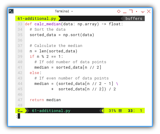
And display.
# Calculate additional propeties
x_median = calc_median(x_observed)
y_median = calc_median(y_observed)

x_mode = statistics.mode(x_observed)
y_mode = statistics.mode(y_observed)

# Output of additional propeties
print(f'x median       = {x_median:9.2f}')
print(f'y median       = {y_median:9.2f}')
print(f'x mode         = {x_mode:9.2f}')
print(f'y mode         = {y_mode:9.2f}')
print()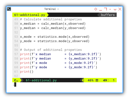
You can also utilize
y_mode = np.argmax(np.bincount(y_observed))Kurtosis and Skewness
We can use scipy.stat to calculate kurtosis and skewness.
from scipy.stats import kurtosis, skew

# Calculate kurtosis and skewness
x_kurtosis = kurtosis(x_observed, bias=False)
y_kurtosis = kurtosis(y_observed, bias=False)

x_skewness = skew(x_observed, bias=False)
y_skewness = skew(y_observed, bias=False)

print(f'x kurtosis     = {x_kurtosis:9.2f}')
print(f'y kurtosis     = {y_kurtosis:9.2f}')
print(f'x skewness     = {x_skewness:9.2f}')
print(f'y skewness     = {y_skewness:9.2f}')
print()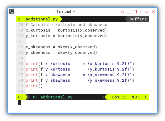
Standard Error of Kurtosis and Skewness
We should craft our own method to get the standard errors.
def calc_se_kurtosis(n):
  return np.sqrt( \
    (24 * n * (n - 2) * (n - 3)) \
    / ((n + 1) * (n + 3) * (n - 1) ** 2))

def calc_se_skewness(n):
  return np.sqrt( \
    (6 * n * (n - 1)) \
    / ((n - 2) * (n + 1) * (n + 3)))

def calc_se_kurtosis_gaussian(n):
  return np.sqrt( \
    (4 * n**2 * calc_se_skewness(n)**2) \
    / ((n - 3) * (n + 5)))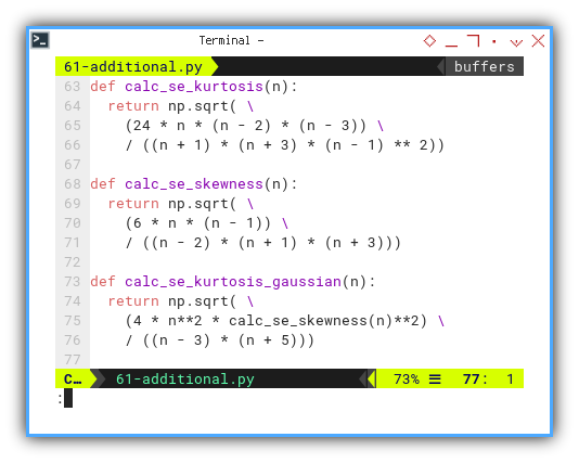
Then we can display as usual:
# number of data points
x_n = len(x_observed)
y_n = len(y_observed)

# Calculate SE kurtosis and SE skewness
x_se_kurtosis = calc_se_kurtosis_gaussian(x_n)
y_se_kurtosis = calc_se_kurtosis_gaussian(y_n)
x_se_skewness = calc_se_skewness(x_n)
y_se_skewness = calc_se_skewness(y_n)

print(f'x SE kurtosis  = {x_se_kurtosis:9.2f}')
print(f'y SE kurtosis  = {y_se_kurtosis:9.2f}')
print(f'x SE skewness  = {x_se_skewness:9.2f}')
print(f'y SE skewness  = {y_se_skewness:9.2f}')
print()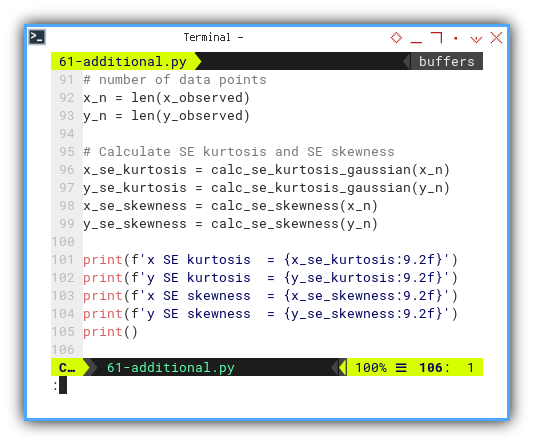
Output Result
x (max, min, range) = (   0.00,   12.00,   12.00 )
y (max, min, range) = (   5.00,  485.00,  480.00 )

x median       =      6.00
y median       =    137.00
x mode         =      0.00
y mode         =      5.00

x kurtosis     =     -1.20
y kurtosis     =     -0.73
x skewness     =      0.00
y skewness     =      0.70

x SE kurtosis  =      1.19
y SE kurtosis  =      1.19
x SE skewness  =      0.62
y SE skewness  =      0.62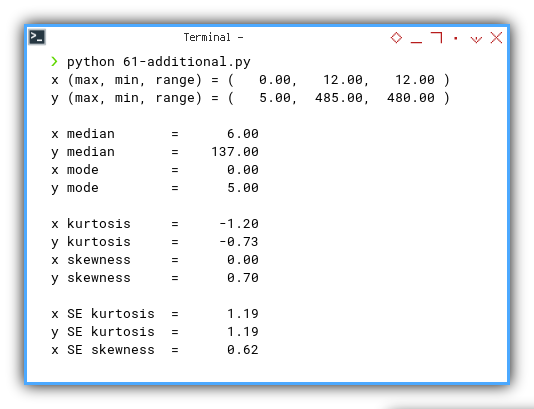
Interactive JupyterLab
You can obtain the interactive JupyterLab in this following link:
Properties Visualization
Now it is a good time to get the interpretation, of above additional statistic properties, in visualization using python matplotlib.
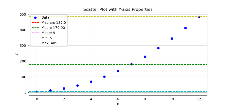
Min, Max, Range, Median and Mode
Using scatter plot we can put the statistic properties in horizontal line.
# Add horizontal lines for properties
plt.axhline(y_median, c='r', ls='--',
  label=f'Median: {y_median}')
plt.axhline(y_mean,   c='g', ls='--',
  label=f'Mean: {y_mean:.2f}')
plt.axhline(y_mode,   c='m', ls='--',
  label=f'Mode: {y_mode}')
plt.axhline(y_min,    c='c', ls='--',
  label=f'Min: {y_min}')
plt.axhline(y_max,    c='y', ls='--',
  label=f'Max: {y_max}')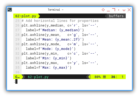
The result of the plot can be visualized as below:
You can obtain the interactive JupyterLab in this following link:
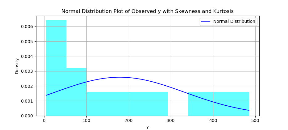
Histogram and Distribution Curve
You can create a histogram, and overlay a normal distribution curve on top of it.
# Calculate skewness and kurtosis of y
y_skewness = np.mean(
  ((y_observed - y_mean) / y_std) ** 3)
y_kurtosis = np.mean(
  ((y_observed - y_mean) / y_std) ** 4)

# Create histogram
plt.hist(y_observed, bins=10,
  density=True, alpha=0.6, color='cyan')

# Create range for x values
x_range = np.linspace(
  min(y_observed), max(y_observed), 100)

y_dist = norm.pdf(x_range, y_mean, y_std)

# Plot normal distribution curve
plt.plot(x_range, y_dist, color='blue',
  label='Normal Distribution')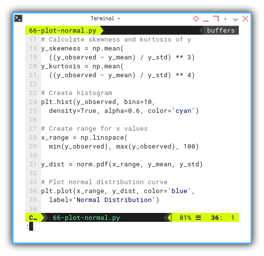
The result of the plot can be visualized as below:
You can obtain the interactive JupyterLab in this following link:
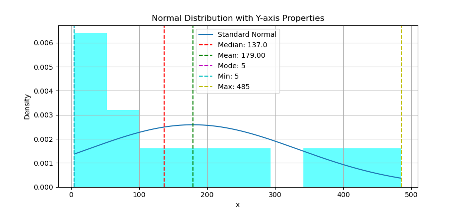
Revisited: Min, Max, Range, Median and Mode
Using scatter plot we can put the statistic properties, but this time in vertical line.
# Add vertical lines for properties
plt.axvline(y_median, c='r', ls='--',
  label=f'Median: {y_median}')
plt.axvline(y_mean,   c='g', ls='--',
  label=f'Mean: {y_mean:.2f}')
plt.axvline(y_mode,   c='m', ls='--',
  label=f'Mode: {y_mode}')
plt.axvline(y_min,    c='c', ls='--',
  label=f'Min: {y_min}')
plt.axvline(y_max,    c='y', ls='--',
  label=f'Max: {y_max}')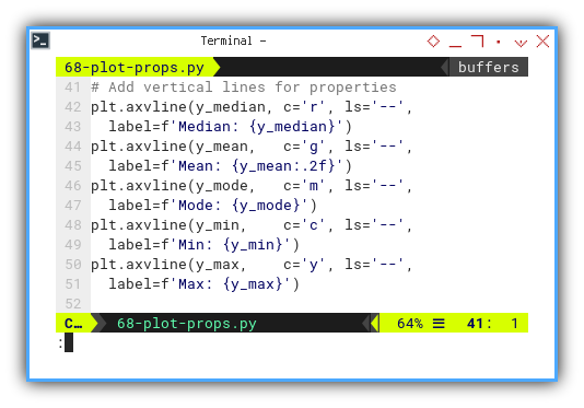
The result of the plot can be visualized as below:
You can obtain the interactive JupyterLab in this following link:
Kurtosis and Skewness
With histogram, you can also overlay a distribution curve, with applied kurtosis and skewness.
First we need to calculate the corresponding y-values for the standard normal distribution. Then we need to adjust the shape parameter manually to achieve the desired kurtosis You may need to experiment with different values to get closer to the desired kurtosis. Then calculate the corresponding y-values for skewnorm distribution with given skewness and adjusted shape parameter. Finally plot both normal distribution curve, and skewnorm distribution.
y_standard = norm.pdf(x_range, y_mean, y_std)

shape_param = 2

y_ks = skewnorm.pdf(x_range, a=y_skewness,
  loc=y_mean, scale=y_std / shape_param)

plt.plot(x_range, y_standard,
  label='Standard Normal')

plt.plot(x_range, y_ks, ls='-.',
  label='With Kurtosis and Skewness')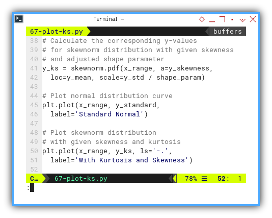
The result of the plot can be visualized as below:
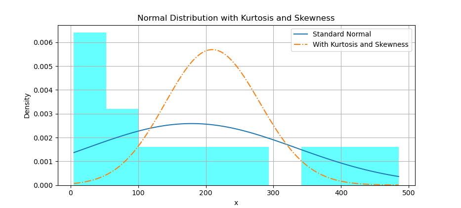
Actually, I’m not sure if I get the visual right. I still don;t know how this shape parameter works. Please consult your nearest statiscian to get the right interpretation.
You can obtain the interactive JupyterLab in this following link:
Density with Seaborne
Seaborne can make a really pretty chart.
# Plot distribution of y with annotations
sns.set(style="whitegrid")
sns.displot(y_observed,
  bins=10, kde=True, rug=True)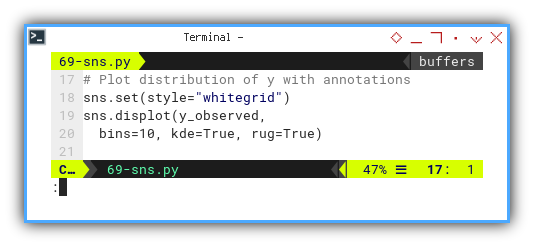
The result of the plot can be visualized as below:
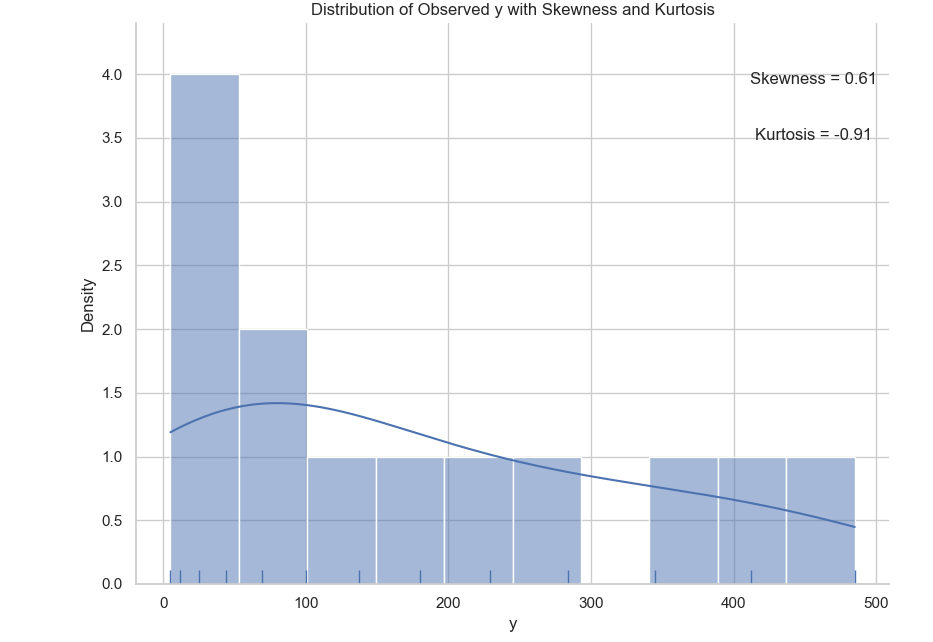
You can obtain the interactive JupyterLab in this following link:
What’s the Next Chapter 🤔?
Even with this cool matplotlib feature, we still need tool to make easy for us to visualize statistic properties. Fortunately, there is this seaborn library with ready to use plot chart, specifically made for statistics.
We are going to explore visualization again, further pretty plot with seaborn.
Consider progressing further by exploring the next topic: [ Trend - Properties - Additional ].