Preface
Goal: Explore Julia statistic plot visualization. Providing the data using linear model.
In the ever-evolving garden of Julia plotting libraries,
we find ourselves surrounded by exotic species:
StatPlots, Gadfly, VegaLite,
and a few more lurking in the corners.
Think of them as eccentric artists at a statistical gallery,
each with their own brushstroke style,
and very strong opinions on color palettes.
To be honest, I haven’t explored them all deeply yet. Some of them still feel like that unopened drawer in the lab. Full of potential, mildly intimidating. But that’s alright. We’ll begin with a simple mission: visualizing data from a linear model.
A solid visual is worth a thousand summary statistics. Whether we’re explaining regression to students, or convincing ourselves the model isn’t plotting revenge. A good plot makes patterns pop and errors harder to ignore.
So let’s dip our toes into the world of Julia plotting. No lab coat required, but we do recommend goggles, if our data has sharp outliers.
Distribution
When it comes to statistics, distributions are like spices in cooking. The normal distribution? That’s our salt. It’s everywhere, everybody expects it, and things taste weird without it.
Let’s start with the classic.
This pdf (probabilty density function) can be used to
calculate the corresponding y-values
for the standard normal distribution
Normal Distribution
Before we dive into tails and peaks, we need to make one data series. Let’s generate our star performer: the standard normal distribution. This is the one where mean is zero, standard deviation is one, and statisticians feel strangely comforted.
Using Julia’s Distributions package, we can conjure our x-values, and from those, calculate the corresponding y-values, using the probability density function.
using StatsPlots, Distributions

x = range(-5, 5, length=1000)
y = pdf(Normal(), x)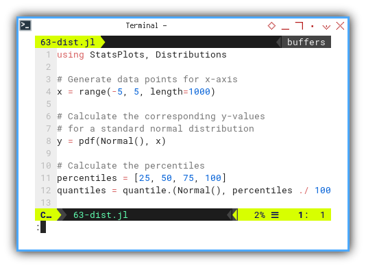
Now that we have our x and y series,
let’s wrap them in a warm visualization blanket,
with titles and labels,
so we don’t forget what we were plotting after two cups of coffee.
plot(
  x, y, fillrange = zero(x), fillalpha = 0.35,
  color=:black,
  label="Standard Normal Distribution", lw=1)

xlabel!("x")
ylabel!("Density")
title!("Standard Normal Distribution with Quantiles")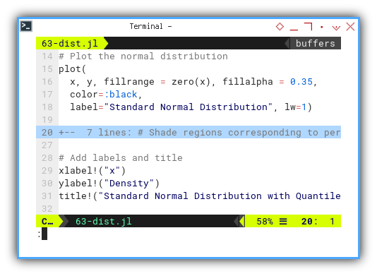
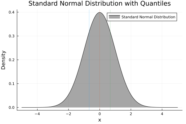
The final masterpiece:
Interactive JupyterLab version is here for the click-happy:
The normal distribution is the reference point, for a huge range of statistical methods. Seeing it helps us build visual intuition, especially when comparing other, less obedient distributions.
Normal Distribution with Quantiles
No luck 🙃
I’ve got no luck of visualizing quantiles with Julia.
Despite my best efforts (and one existential tea break), visualizing quantiles within this distribution didn’t pan out. Some day. Some plugin. Some patch. Until then, it’s just a beautiful bell curve.
Kurtosis
With the pdf method,
we can simulate kurtosis and skewness.
If the normal distribution is the middle child of stats, then kurtosis is that weird cousin, who’s always “too extra” or “too chill.” Kurtosis describes how pointy or flat a distribution is, basically, how much drama your data brings.
Let’s simulate a few personalities. We start with making series by generating data points for x-axis, and calculating the corresponding y-values for the standard normal distribution.
using StatsPlots, Distributions

x = range(-5, 5, length=1000)
y_standard = pdf.(Normal(), x)
We’ll now tweak the variance to simulate different levels of kurtosis:
- Standard normal distribution (Kurtosis = 0)
- Lower kurtosis
- Higher kurtosis
y_kurtosis_1 = pdf.(Normal(1, 1), x)
y_kurtosis_2 = pdf.(Normal(1, 0.5),
y_kurtosis_3 = pdf.(Normal(1, 2), x)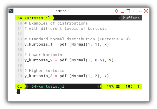
Start with the vanilla plot, using normal distribution.
# Plot the normal distribution and
plot(
  x, y_standard, color=:black,
  label="Standard Normal",
  title = "Normal Distribution "
    * "with Different Kurtosis",
  xlabel = "x", ylabel = "Density",
)
Then stir in the flavors, by adding each different levels of kurtosis to the plot grammar.
# distributions with different levels of kurtosis
plot!(
  x, y_kurtosis_1, color=:red,
  label="Standard Kurtosis = 0",
  linestyle=:dash,
)

plot!(
  x, y_kurtosis_2, color=:green,
  label="Lower Kurtosis",
  linestyle=:dash,
)

plot!(
  x, y_kurtosis_3, color=:blue,
  label="Higher Kurtosis",
  linestyle=:dash,
)
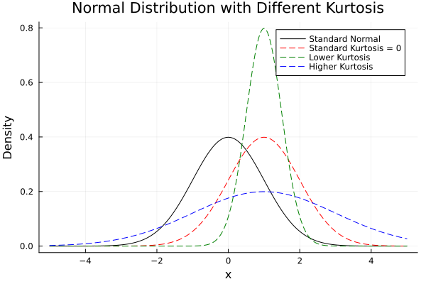
Final chart:
Interactive JupyterLab version:
Understanding kurtosis helps us detect heavy tails, or overly flat distributions. Critical for risk analysis, quality control, and figuring out if our model is secretly partying in the tails.
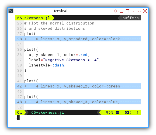
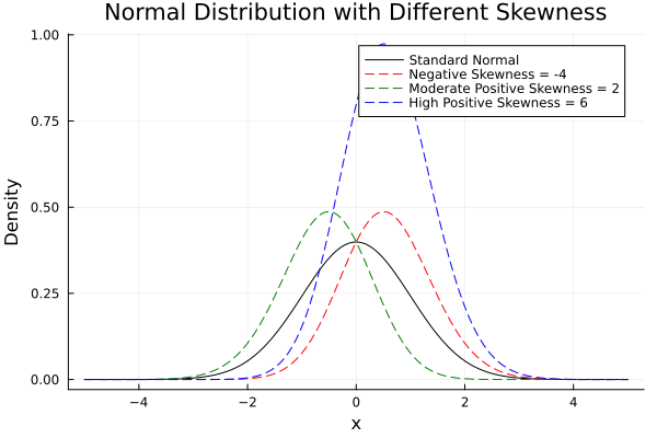
Skewness
Now we move on to skewness, the measure of symmetry, or how lopsided a distribution is. If our data curve leans like it’s trying to eavesdrop, skewness is the gossip it’s chasing.
using StatsPlots, Distributions

x = range(-5, 5, length=1000)
y_standard = pdf.(Normal(), x)
Here come the characters. Let’s make examples of distributions with different skewness parameters.
- Negative skewness
- Moderate positive skewness
- High positive skewness
y_skewed_1 = (2 * pdf.(Normal(), x)
  .* cdf.(Normal(), x))
y_skewed_2 = (2 * pdf.(Normal(), -x)
  .* cdf.(Normal(), -x))
y_skewed_3 = (2 * pdf.(Normal(), x)
  .* cdf.(Normal(), x) * 2)
Plot the symmetrical base, using normal distribution.
plot(
  x, y_standard, color=:black,
label="Standard Normal",
  title = "Normal Distribution "
    * "with Different Skewness",
  xlabel = "x", ylabel = "Density",
)
Add the drama. Each distributions with different skewness parameters to the plot grammar.
plot!(
  x, y_skewed_1, color=:red,
  label="Negative Skewness = -4",
  linestyle=:dash,
)

plot!(
  x, y_skewed_2, color=:green,
  label="Moderate Positive Skewness = 2",
  linestyle=:dash,
)

plot!(
  x, y_skewed_3, color=:blue,
  label="High Positive Skewness = 6",
  linestyle=:dash,
)
Final visual:
Play with the code here:
Skewness affects mean and standard deviation. If we assume symmetry when it’s not there, we might make decisions that only work for perfectly balanced data worlds. Which, let’s be honest, almost never happen.
Multiple Series
When life gives us multiple data series, we do not complain. We visualize. This section is all about juggling multiple trends on the same stage, whether it’s in one glorious unified plot or gracefully separated using grid layouts. Think of it as conducting an orchestra of noisy datasets.
Regression Steps
This part is not about passing our thesis defense. We are just plotting three series, running regressions, estimating their standard errors, and wrapping them all in a warm, fuzzy ribbon of confidence.
This can be done by these four steps.
- Scatter plot for each series.
- Line plot for each series.
- Calculate each standard errors.
- Add shaded region for standard error for each series.
With total plot drawing as 6 plots.
We begin, as statisticians often do, by reading a CSV.
This populates our dataframe and separates x from the three y's.
They’re not siblings, but close enough.
df = CSV.read("series.csv", DataFrame, types=Dict())
rename!(df, Symbol.(strip.(string.(names(df)))))

xs = df.xs
ys1 = df.ys1
ys2 = df.ys2
ys3 = df.ys3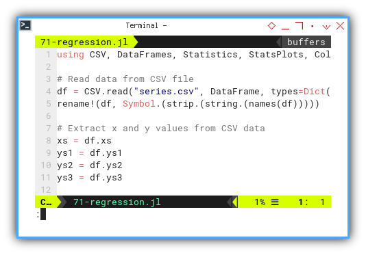
Scatter
Scatter plots first, without with regression lines. This is our baseline before the serious statistical dress-up begins.
scatter(
  xs, ys1, label="ys1",
  seriestype=:scatter, color=:red,
  legend=:topright)
scatter!(
  xs, ys2, label="ys2",
  seriestype=:scatter, color=:green)
scatter!(
  xs, ys3, label="ys3",
  seriestype=:scatter, color=:blue)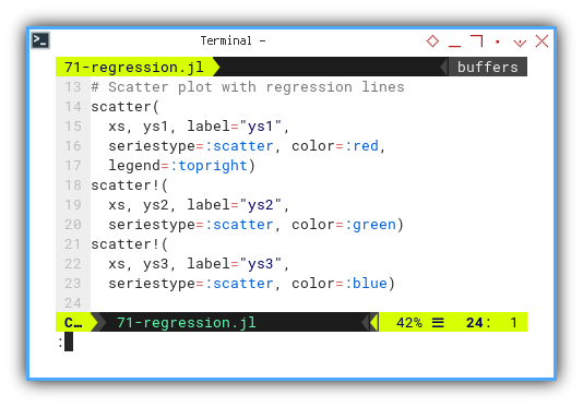
Standard Error
Now let’s add some statistical seasoning: the standard error. It tells us how much the data wobbles around the mean. A lower SE means our trend is a well-behaved intern. A higher SE means it drinks coffee at midnight.
se1 = std(ys1) / sqrt(length(ys1))
se2 = std(ys2) / sqrt(length(ys2))
se3 = std(ys3) / sqrt(length(ys3))
Let’s bring in colors, because grayscale regression is a mood killer.
colors = ColorSchemes.magma.colors
Plot
Plotting time again, line plot for each series, along with shaded region using ribbon, representing standard error for each series. This time with smooth trend lines and shaded error ribbons. Like giving each line a warm blanket to keep their variability cozy.
plot!(
  xs, ys1, label="", color=colors[1],
  ribbon=(se1, se1), fillalpha=0.3)
plot!(
  xs, ys2, label="", color=colors[2],
  ribbon=(se2, se2), fillalpha=0.3)
plot!(
  xs, ys3, label="", color=colors[3],
  ribbon=(se3, se3), fillalpha=0.3)
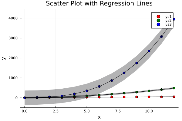
Behold the final result. Three trends. Three ribbons. One plot to rule them all.
If you’re feeling adventurous (or just hate static images),
the interactive JupyterLab notebook is here:
Visualizing regression and its uncertainty helps us understand, both the central trend and how twitchy our estimates are. Data might lie, but standard error whispers the truth.
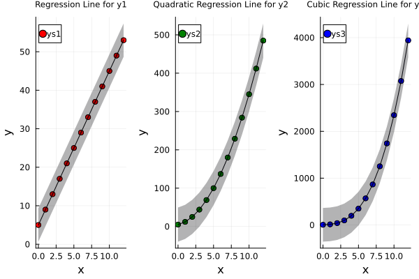
Combined
Sometimes, throwing everything into one plot is like, forcing three cats into a bathtub. Better to give each one its own little space, especially if their y-axis scales are vastly different.
We follow our trusted ritual: read the CSV, extract the values, calculate standard errors, and assign color roles like casting a telenovela.
df = CSV.read("series.csv", DataFrame, types=Dict())
rename!(df, Symbol.(strip.(string.(names(df)))))

xs = df.xs
ys1 = df.ys1
ys2 = df.ys2
ys3 = df.ys3

se1 = std(ys1) / sqrt(length(ys1))
se2 = std(ys2) / sqrt(length(ys2))
se3 = std(ys3) / sqrt(length(ys3))

colors = ColorSchemes.magma.colors
Next, we create one plot per series
[``ys₁, ys₂, and ys₃`.].
Like opening three tabs instead of,
squashing everything into one spreadsheet cell.
plot1 = scatter(
  xs, ys1, label="ys1",
  seriestype=:scatter, color=:red)
...

plot2 = scatter(
  xs, ys2, label="ys2",
  seriestype=:scatter, color=:green)
...

plot3 = scatter(
  xs, ys3, label="ys3",
  seriestype=:scatter, color=:blue)
...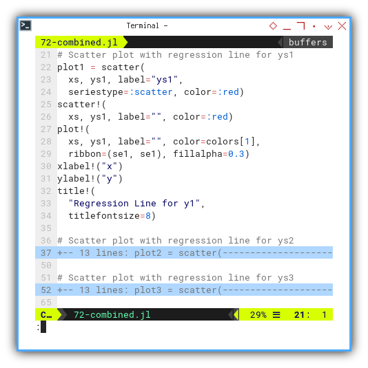
Now it’s time to align them neatly, like well-behaved academic panels at a conference.
plot_combined = plot(
  plot1, plot2, plot3, layout=(1, 3))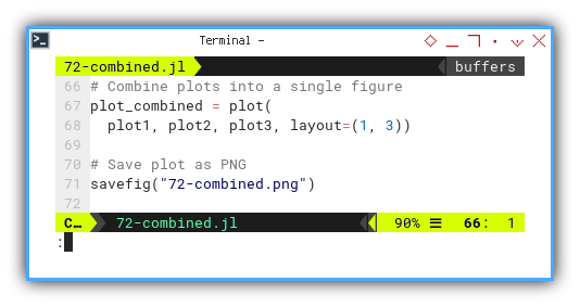
TAnd there we have it. Three subplots, side by side, not yelling over each other.
The interactive version is just a click away. Because real statisticians always double-check their plots.
Separate plots offer clarity when each series tells a very different story. Think of it as letting each dataset speak without being talked over.
Statistic Properties: StatsPlot
Three series. One axis. No mercy.
Previously, we focused on regression and trendlines, but now we turn our gaze toward the fundamental descriptors of our data It’s time to put those y-series on the therapist’s couch and ask: “How are you feeling? Centered? Spread out? Any outliers bothering you?”
As you can see from previous statistical properties.
We can analyze the data for each series.
For example we can just consider just the y-series,
and obtain the mean, median, mode,
and also the minimum, maximum, range, and quantiles.
We can use StatsPlot for simple Boxplot and Violinplot.
But we require Gadfly to draw Swarm Plot.
Understanding statistical properties helps us move, from “pretty plots” to “actually meaningful insights.” Boxplots and violin plots summarize shape, spread, and centrality all in one tidy graphic.
StatsPlot: Box Plot
When our inner statistician wants to play minimalist,
the boxplot method from StatsPlot steps in.
It shows the median, interquartile range, whiskers, and outliers.
All without saying a word.
It’s basically the silent film of data visualization.
We start with the same ritual: read the CSV,
and politely ask for [ys₁, ys₂, and ys₃].
These will be the stars of our plot.
using CSV, DataFrames, StatsPlots

df = CSV.read("series.csv", DataFrame)
rename!(df, Symbol.(strip.(string.(names(df)))))

data = [df.ys1, df.ys2, df.ys3]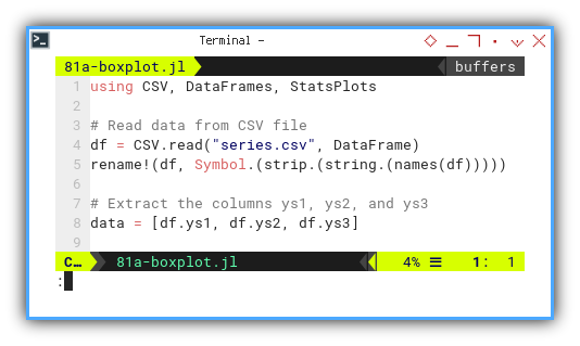
Now, we summon the mighty boxplot function from StatsPlots.
It does exactly what it says. No drama, just five-number summaries.
boxplot(data,
  labels = ["ys1", "ys2", "ys3"],
  linecolor = :black,
  legend = false,
  xlabel = "Variable",
  ylabel = "Value",
  title = "Box Plot for ys1, ys2, and ys3",
  grid = false)
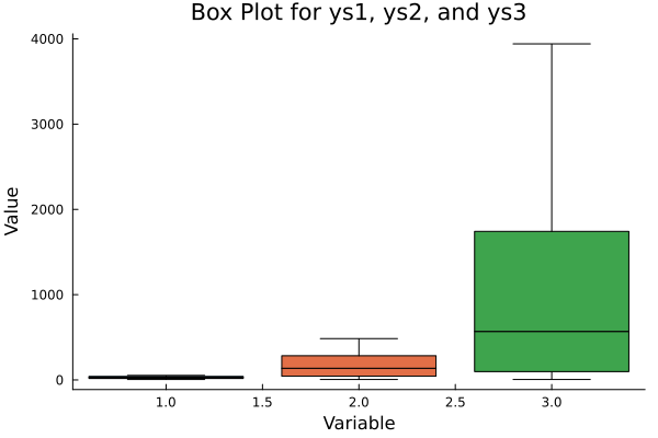
Here’s the final plot. otice how each box whispers secrets about skewness and variability. And those dots? Outliers. Every dataset has its rebels.
Need to poke around the data interactively? We’ve got a Jupyter notebook for that:
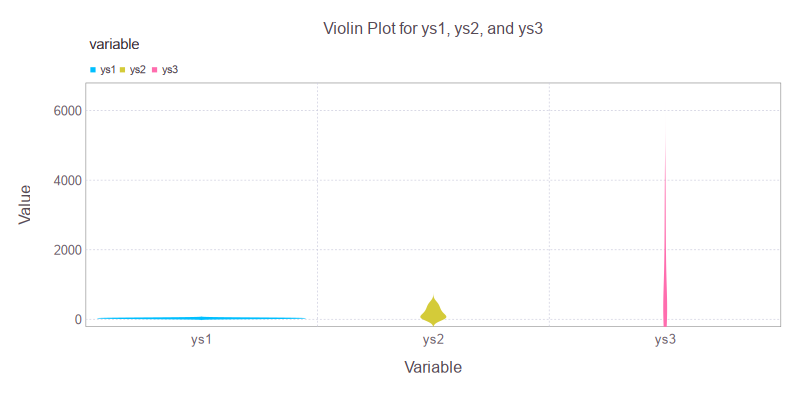
StatsPlot: Violin Plot
If boxplots are a bit too uptight for our taste,
we can go with violins method from StatsPlot.
These plots combine boxplots with kernel density estimates.
Think of it as a plot that went to art school,
and now speaks softly about distribution curves.
We use the same data, but with a more expressive tool. This time, the violin tells the whole story, and plays a solo too.
violin(data,
  labels = ["ys1", "ys2", "ys3"],
  linecolor = :black,
  legend = false,
  xlabel = "Variable",
  ylabel = "Value",
  title = "Violin Plot for ys1, ys2, and ys3",
  grid = false)
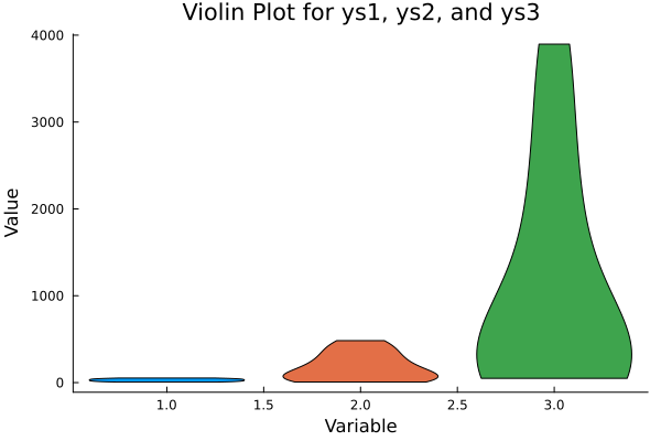
And here’s the result: elegant, symmetric violins, representing how thick or thin the data is across the value range.
If boxplots were terse academic abstracts, violins are dramatic spoken-word poetry.
Curious to fiddle with the violins yourself? The JupyterLab version awaits:
Violin plots reveal where data clusters within the distribution, not just the edges. It’s like going from watching shadows on the wall, to actually seeing the data dance.
Sadly, despite my enthusiasm,
StatsPlot is not yet equipped to do swarm plots or strip plots
So I shall go gadget hunting.
erhaps in the land of Gadfly, a new hope awaits.
Statistic Properties: Gadfly
Three series. One axis. All beautifully chaotic.
Now that we have dissected our data with StatsPlot,
it’s time to put on our artsy glasses and give Gadfly a spin.
amed after the philosophical pest Socrates was proud to be,
this library pokes our data just enough to make it confess.
Gadfly brings elegant grammar-of-graphics plotting to Julia, and it’s a great choice when we want flexible yet readable visual output. Plus, it sounds cool.
Gadfly: Box Plot
To let Gadfly do this box plot thing,
we must summon its visual spellbook with Cairo and Fontconfig.
using CSV, DataFrames, Gadfly
import Cairo, Fontconfig
As always, raw data must be reshaped to long format. Think of it as giving the dataset a good yoga stretch, before the plotting begins.
df = CSV.read("series.csv", DataFrame)
rename!(df, Symbol.(strip.(string.(names(df)))))

df_long = stack(df, Not(:xs))
Now comes the visual reveal.
We ask Gadfly to plot boxes for each series,
which allows us to judge central tendency, spread, and outlier drama.
Basically the entire personality profile of our variables.
box_plot = Gadfly.plot(
  df_long,
  x=:variable,
  y=:value,
  color=:variable,
  Geom.boxplot(),
  Guide.xlabel("Variable"),
  Guide.ylabel("Value"),
  Guide.title("Box Plot for ys1, ys2, and ys3"),
  Theme(
    key_position = :top,
    boxplot_spacing = 100px,
    background_color = "white",
  )
)
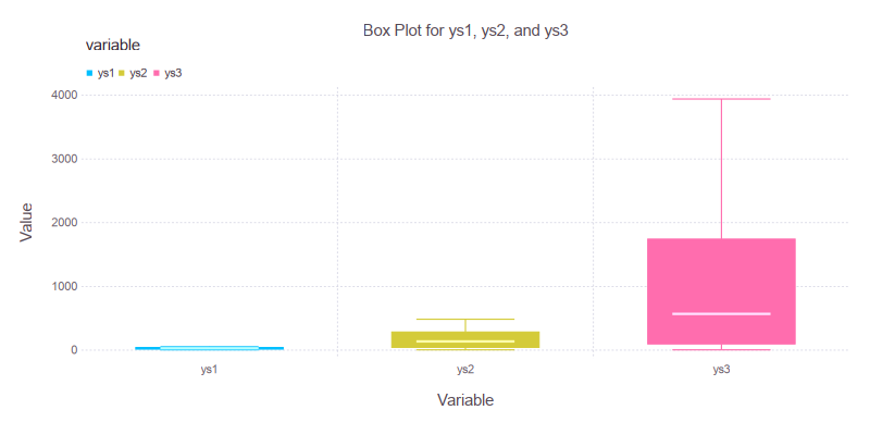
Here’s our output: clean lines, expressive boxes, and a whisper of statistical elegance. The outliers are still there, silently pleading not to be judged.
Interactive version for plot tinkerers:
Gadfly: Violin Plot
A violin plot is like a boxplot that listened to too much jazz.
It adds density estimation, giving us not just the notes but the melody of our data.
we also need to import Cairo and Fontconfig.
Same data, but now the rhythm changes.
violin_plot = Gadfly.plot(
  df_long,
  x=:variable,
  y=:value,
  color=:variable,
  Geom.violin,
  Guide.xlabel("Variable"),
  Guide.ylabel("Value"),
  Guide.title("Violin Plot for ys1, ys2, and ys3"),

  Coord.cartesian(ymin=0),

  Scale.y_continuous(minvalue=0),
  Theme(
    key_position=:top,
    default_color="purple",
    background_color="white",
    panel_stroke=colorant"gray",
    minor_label_font_size=10pt,
    major_label_font_size=12pt,
  )
)
Behold: violins of data. Some are chunky, some are skinny, but all are telling us where the values live, breathe, and occasionally spike unexpectedly.
Our JupyterLab ensemble is available here:
Where boxplots are terse and strict, violin plots show distribution nuances. We get to see whether the data is heavy in the middle, skewed to the side, or trying to impersonate a bimodal bell curve.
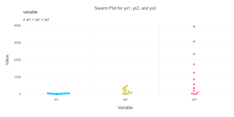
Gadfly: Swarm Plot
And now, for the grand finale, bees on a box. The swarm plot, also known as beeswarm, shows every single data point while gently nudging them to avoid overlap. It is as if our data formed a polite crowd at a buffet.
To get buzzing, we add Geom.beeswarm() to the mix:
box_plot = Gadfly.plot(
  df_long,
  x=:variable,
  y=:value,
  color=:variable,
  Geom.beeswarm(),
  Guide.xlabel("Variable"),
  Guide.ylabel("Value"),
  Guide.title("Swarm Plot for ys1, ys2, and ys3"),
  Theme(
    key_position = :top,
    background_color = "white",
  )
)
Let each dot speak. We no longer summarize. We observe the crowd. Here it is in all its buzzing glory.:
Interactive swarm fun awaits at:
Swarm plots highlight distribution and density without aggregation. If each data point were a vote, this would be the fairest election plot in statistics.
Statistic Properties: Distribution
From frequencies to densities.
Sometimes the spread tells the whole story.
After giving our data the spa treatment with box plots and violin strokes, it is time to ask a deeper question: “How is our data distributed?” In this section, we look at the y-axis not just as numbers but as frequencies and densities. A true bonding moment between data and probability.
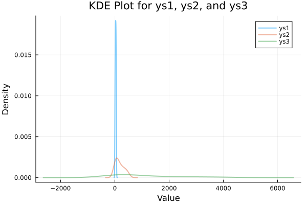
KDE Plot
Kernel Density Estimation
How to smooth out chaos politely.
A KDE plot gives us a continuous estimate of the distribution. It answers that ancient question: “What would our histogram look like if it were raised by mathematicians?”
KDE shown well the distribution of the frequency.
This complex task can be done easily
with kde_plot from StatsPlots.
First, we must prep our data. Yes, again. The data must be melted. We need to melt the DataFrame to long format. Think fondue, but for DataFrames.
using CSV, DataFrames, StatsPlots

df = CSV.read("series.csv", DataFrame)
rename!(df, Symbol.(strip.(string.(names(df)))))

df_long = stack(df, Not(:xs))
Now we can create KDE plot using StatsPlots with custom colors
kde_plot = density(
  df_long.value,
  group = df_long.variable,
  fillalpha = 0.7,
  legend = :topright,
  xlabel = "Value",
  ylabel = "Density",
  title = "KDE Plot for ys1, ys2, and ys3",
  lw = 2, # Line width
  α = 0.5 # Opacity
)
And voilà: a trio of smoothed density curves, gliding through the value space like they just completed a statistics PhD.
Explore interactively:
Histograms are nice, but KDE plots let us peek behind the bins, and reveal the underlying probability whisper.
Smooth, elegant, and informative.
Rug Plot
No Luck
Despite our best statistical intentions, the rug plot continues to elude us in Julia. A perfect example of how even in data science, some rugs are pulled from under our feet.
You know, I still have no luck, drawing this plot in Julia. I’d better come back later on.
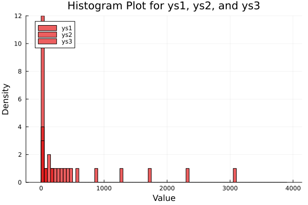
Histogram
Where it all began—bin by bin.
The humble histogram. A classic. The visual equivalent of sorting socks by color, and counting how many of each. Simple. Satisfying. Slightly obsessive.
This looks like the most common chart for beginner.
This simple task can be done easily
with hist_plot from StatsPlots.
Yes, we melt again. Our DataFrame, that is. Not our .
using CSV, DataFrames, StatsPlots

df = CSV.read("series.csv", DataFrame)
rename!(df, Symbol.(strip.(string.(names(df)))))

df_long = stack(df, Not(:xs))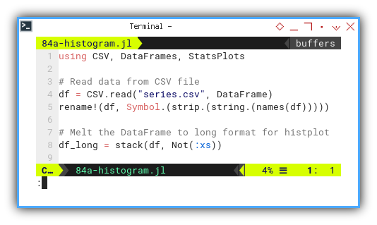
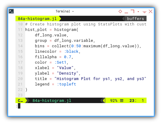
Now we can create Histogram using StatsPlots with custom colors
hist_plot = histogram(
    df_long.value,
    group = df_long.variable,
    bins = collect(0:50:maximum(df_long.value)),
    linecolor = :black,
    fillalpha = 0.7,
    color = :Set1,
    xlabel = "Value",
    ylabel = "Density",
    title = "Histogram Plot for ys1, ys2, and ys3",
    legend = :topleft
)
A familiar sight: colorful bars rising, from the axis like a baritone choir, representing grouped frequencies.
Play with the histogram interactively:
Histograms give a discrete view of data frequency. Great for quick intuition, beginner-friendly, and surprisingly deep once bin size joins the party.
A small confession: custom color tweaking is still not working as intended. We will circle back when the Julia gods grant us enlightenment. For now, we lean on default palettes and optimism. I’ll do it later. When I’ve got the time.
Marginal
No Luck (Again)
I have to explore more. Unfortunately.
The marginal plot, an elusive unicorn in our Julia zoo. It waits in the shadows with rug plots, probably sipping espresso and judging our color palettes.
I apologize.
This one goes on the someday list.
What’s the Next Chapter 🤔?
We have seen how Julia helps us visualize statistical properties. Not just with style, but with substance. Whether we box it, violin it, swarm it, or smooth it with KDE, each plot is a conversation between us and the data.
Statistical visualization is not just for pretty graphs in reports. It helps us think, to detect patterns, identify outliers, and avoid the dreaded “everything looks normal” fallacy.
Naturally, we’ve focused on Python, R, and Julia.
Each a different flavor of statistical sorcery.
But we can go further: with TypeScript and Go on the horizon,
our next frontier might include full-stack statistical integration (just kidding).
Imagine serving insights with both confidence intervals and a REST API. Bliss.
But for now?
Well, life’s confidence interval is currently skewed right. Work is calling. To be honest life is pretty demanding. So we’ll hit pause here and return when our time series permits it.
Conclusion
Was this fun? Statistically speaking… highly significant.
What do we think?
- Did we melt enough data?
- Plot with enough color?
- Make enough jokes about KDE to summon a Linux mascot?
Farewell for now, fellow data wranglers. Until the next round of rows, columns, and probability distributions. Stay curious, stay caffeinated, and never trust a histogram without labels.
We shall meet again.