Preface
Goal: Explore R Programming language visualization with ggplot2. Provide a bunch of example of plot cases in your fingertip.
We’re back at it with our beloved ggplot2.
It is easy if we can embrace the grammar.
Like any well-behaved grammar, once we know the rules, the plots practically write themselves. Only here the commas are aesthetics, the clauses are geoms, nd the punchlines are distributions.
Let’s keep building our visual intuition. The more we speak in plots, the more persuasive we become, during those impromptu midnight data debates. And let’s be honest, some of us argue better with graphs than with words.
Let’s continue building our visual intuition. The more we speak in plots, the more persuasive we sound in late-night data debates. And let’s be honest, some of us argue better with graphs than with words.
When you have a pet, you can make a poet about it.
When you have a data pet, visualization is the poet.
👉 Remember: ggplot2 is not just a plotting library.
It’s a grammar for visual storytelling.
Let’s make our data sing, or at least hum with statistical elegance.
Distribution
Let’s start with the classic, the normal distribution. Statisticians love it. Students fear it. Algorithms assume it. We may not always get normally distributed data in real life, but that does not stop us from dreaming in bell curves.
The dnorm method gives us the y-values (probability densities)
for each x on the standard normal distribution curve.
y <- dnorm(x)Normal Distribution
geom_line
We start by loading the essential gear (required libraries),
generating x values across the curve,
and calculating y using dnorm method.
Then we wrap it all in a tidy data.frame,
so ggplot2 can do what it does best: turn numbers into art.
library(ggplot2)

x <- seq(-5, 5, length.out = 1000)
y <- dnorm(x)

df <- data.frame(x = x, y = y)
Once we have our data frame, we build the plot.
geom_line() does the drawing,
and theme_minimal() keeps things as clean as our assumptions.
We can add labels and save the output.
This is how we go from raw probability to polished PNG.
plot <- ggplot(df, aes(x = x, y = y)) +
  geom_line(color = "black")

plot <- plot +
  theme_minimal() +
  theme(
    text = element_text(size = 4),
    panel.grid = element_blank()) +

  labs(
    x = "x", y = "Density",
    title = "Standard Normal ",
      "Distribution with Quantiles")

ggsave("63-normal.png", plot,
  width = 800, height = 400, units = "px")
Normal Distribution with Quantiles
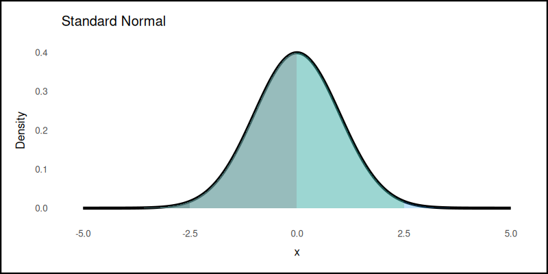
geom_area
We enhance the normal plot by showing quantiles. Why? Because sometimes we need to explain to others, where “most of the data lives”, without quoting the full standard deviation manifesto.
We define the percentiles,
then let quantile() do the slicing.
percentiles <- c(25, 50, 75, 100)
quantiles <- quantile(x, probs = percentiles / 100)
And add this shade regions corresponding to percentiles,
to the plot grammar. This can be done by using geom_area.
for (i in seq_along(quantiles)) {
  plot <- plot + geom_area(
    data = subset(df,x <= quantiles[i]),
    aes(x = x, y = y),
    fill = i, alpha = 0.3)
}
The plot result can be shown as follows:
👉 Want to play with it interactively?
Adding quantiles makes the plot speak. Visually hinting where the data clusters. This is useful for storytelling, teaching, and winning arguments about, whether someone’s test score is “really above average.”
Kurtosis
The pointiness of our curve
With the dnorm method,
we can simulate kurtosis and skewness.
We explore different levels of kurtosis. Technically it is about tails and peaks, but informally, it tells us how extreme our data feels. like comparing drama queens to stoics in distribution form.
Let’s make examples of distributions with different levels of kurtosis. We generate standard, flat, and pointy curves.
- Standard normal distribution (Kurtosis = 0)
- Lower kurtosis
- Higher kurtosis
y_standard <- dnorm(x)
df_standard <- data.frame(x = x, y = y_standard)

y_kurtosis_1 <- dnorm(x, mean = 1, sd = 1)
y_kurtosis_2 <- dnorm(x, mean = 1, sd = 0.5)
y_kurtosis_3 <- dnorm(x, mean = 1, sd = 2)

df_kurtosis_1 <- data.frame(x = x, y = y_kurtosis_1)
df_kurtosis_2 <- data.frame(x = x, y = y_kurtosis_2)
df_kurtosis_3 <- data.frame(x = x, y = y_kurtosis_3)
Now we draw them using geom_line.
for each different levels of kurtosis to the plot grammar.
Each line shows how the same mean can hide wildly different stories.
plot <- ggplot() +
  geom_line(data = df_standard, color = "black"
    aes(x = x, y = y), linewidth = 0.2) +
  geom_line(data = df_kurtosis_1,
    aes(x = x, y = y), color = "red",
    linetype = "dashed", linewidth = 0.2) +
  geom_line(data = df_kurtosis_2,
    aes(x = x, y = y), color = "green",
    linetype = "dashed", linewidth = 0.2) +
  geom_line(data = df_kurtosis_3,
    aes(x = x, y = y), color = "blue",
    linetype = "dashed", linewidth = 0.2) +
  labs(x = "x", y = "Density",
    title = "Normal Distribution ",
      "with Different Kurtosis") +
  scale_linetype_manual(
    values = c("solid", "dashed", "dashed", "dashed"),
    labels = c(
      "Standard Normal", "Standard Kurtosis = 0",
      "Lower Kurtosis", "Higher Kurtosis")) +
  theme_minimal() +
  theme(
    text = element_text(size = 4))
The plot result can be shown as follows:
👉 Want to run the numbers live?
Why care about kurtosis? Because reality is messy. Sometimes data behaves like a chill Gaussian. Sometimes it spikes like a stressed-out grad student on deadline week.
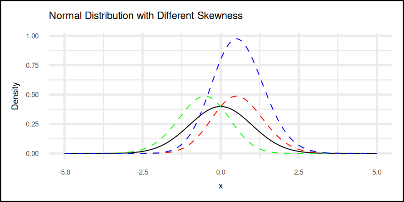
Skewness
When data leans—left, right, or dramatically off-center
Now let’s shift our focus to skewness. It tells us whether our data leans like a suspicious p-hacking attempt.
Let’s make examples of distributions with different skewness parameters. We simulate several skewness levels: negative, moderate, and highly positive.
- Negative skewness
- Moderate positive skewness
- High positive skewness
y_standard <- dnorm(x)
df_standard <- data.frame(x = x, y = y_standard)

y_skewed_1 <- dnorm(x) * 2 * pnorm(x)
y_skewed_2 <- dnorm(x) * 2 * pnorm(-x)
y_skewed_3 <- dnorm(x) * 2 * pnorm(x) * 2

df_skewed_1 <- data.frame(x = x, y = y_skewed_1)
df_skewed_2 <- data.frame(x = x, y = y_skewed_2)
df_skewed_3 <- data.frame(x = x, y = y_skewed_3)
Then we draw them in context by adding geom_line again,
When done right, the plot reveals which side the data whispers its secrets to.
for each different skewed distributions to the plot grammar.
plot <- ggplot() +
  geom_line(data = df_standard, color = "black",
    aes(x = x, y = y), linewidth = 0.2) +
  geom_line(data = df_skewed_1,
    aes(x = x, y = y), color = "red",
    linetype = "dashed", linewidth = 0.2) +
  geom_line(data = df_skewed_2,
    aes(x = x, y = y), color = "green",
    linetype = "dashed", linewidth = 0.2) +
  geom_line(data = df_skewed_3,
    aes(x = x, y = y), color = "blue",
    linetype = "dashed", linewidth = 0.2) +
  labs(x = "x", y = "Density",
    title = "Normal Distribution with Different Skewness") +
  scale_linetype_manual(
    values = c("solid", "dashed", "dashed", "dashed"),
    labels = c(
      "Standard Normal",
      "Negative Skewness = -4",
      "Moderate Positive Skewness = 2",
      "High Positive Skewness = 6")) +
  theme_minimal() +
  theme(
    text = element_text(size = 4))
The plot result can be shown as follows:
👉 Try bending the curve yourself:
Understanding skewness helps us avoid misleading averages. Sometimes the “average” income includes Jeff Bezos, and that shifts everything right.
Trend: Multiple
When in doubt, regress everything. Then doubt the regression.
Sometimes, we need to show multiple trends at once.
Maybe to compare patterns, maybe to confuse our boss.
Either way, ggplot2 lets us put several series in one plot,
or spread them neatly across a grid.
It’s like choosing between a dinner buffet or a tasting menu.
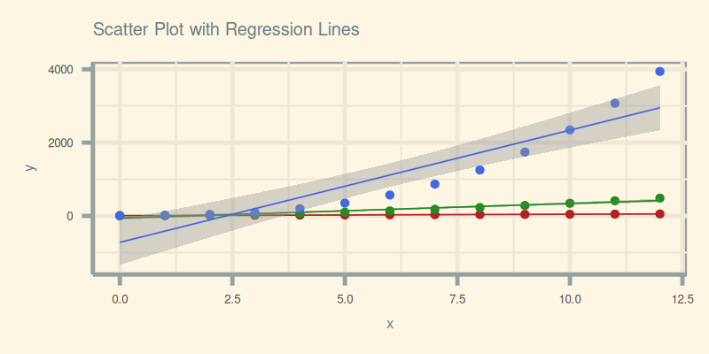
Geom Smooth
Linear model with standard errors: the tuxedo of trendlines.
Why manually calculate regression when geom_smooth() can,
do the heavy lifting and wear a standard error cloak while at it?
Think of it as our personal assistant for drawing statistically proper lines.
Let’s begin with a scatter plot using geom_point(),
then let geom_smooth() do its thing,
plotting linear fits for [ys₁, ys₂, and ys₃].
plot <- ggplot(data, aes(x = xs)) +
  geom_point(
    aes(x = xs, y = ys1),
    size = 0.5, color = "firebrick") +
  geom_smooth(
    aes(x = xs, y = ys1), method = "lm",
    se = TRUE, color = "firebrick",
    linewidth = 0.2) +
    text = element_text(size = 4))
  ...
To make it visually elegant (and slightly hipster),
we can apply the solarized theme from the ggthemes library.
Plots deserve style too.
  labs(x = "x", y = "y",
    title = "Scatter Plot with Regression Lines") +
  theme_solarized() +
  scale_color_solarized() +
  theme(
    text = element_text(size = 4))
Here’s the final output, where our data points are loud and the regression lines are proud:
Get interactive and tinker in JupyterLab:
These plots help us compare multiple trend patterns on a single canvas Regression isn’t just prediction, it’s persuasion in visual form.
Grid Extra
Not all trends get along on the same y-axis.
Sometimes plotting everything together makes,
the trends look like they’re in a statistical street fight.
When axes clash or y-axis scales diverge,
it’s time to separate the series using gridExtra.
Here, we arrange the individual trend plots,
using gridExtra side-by-side horizontally with:
grid_plot <- grid.arrange(
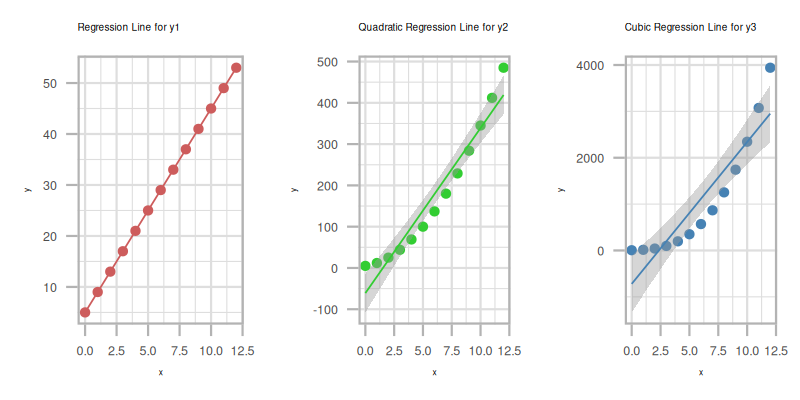
plot_y1, plot_y2, plot_y3, ncol = 3)The result is a civilized separation of trends, each plot gets its own y-axis, no need to share or compromise:
The plot result can be shown as follows:
Explore it yourself in JupyterLab:
Multiple trends in one frame are useful,
until the y-axis scale distorts the story.
Grid arrangements help us show the data fairly,
without statistical squabbling.
Statistic Properties: One Axis Plot
Three series in one axis plot
Three series walk into a plot… and immediately argue about the median.
Before we start visualizing, let’s remember: statistics are like cats (cat the pet, not the linux command). They don’t always behave the way we expect, but with the right box (or violin), we can get them to show their shape.
In this section, we wrangle multiple y-series, and explore ways to compare their distributions using one axis. This is our statistical group therapy session, here each series gets a chance to express itself.
As you can see from previous statistical properties.
We can analyze the data for each series.
For example we can just consider just the y-series,
and obtain the mean, median, mode,
and also the minimum, maximum, range, and quantiles.
Long Format
Melt
We melt the data, not the analyst.
When plotting multiple y-series in one go,
we need to reshape the data from wide to long.
Why? Because ggplot2 prefers tidy data,
each row is one observation, each column one variable.
Wide format is for spreadsheets,
long format is for plots and parties.
We use gather() from the tidyr package.
Think of it as inviting all your series to one common table.
series_longer <- series %>%
  gather(key = "y", value = "value", -xs)
You can check the result by cat or print the merged series.
Melting lets us treat all y-series equally. Ideal for side-by-side comparison in single-axis plots.
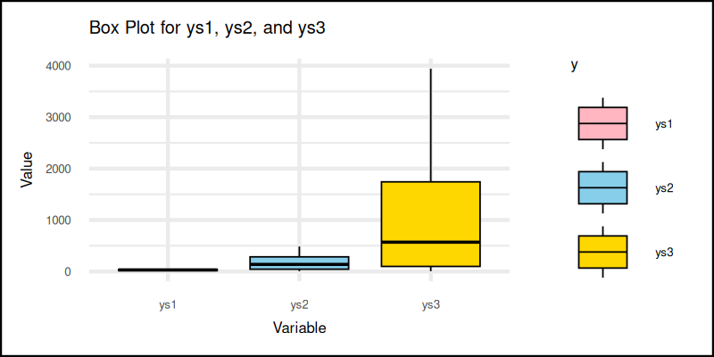
Box Plot
The box plot: where medians get the spotlight, and outliers are gently shamed.
The classic box plot summarizes data with quartiles and outliers. It’s like a résumé for our series: here’s the median, here’s the range, and oh, those dots? We don’t talk about those.
The most common way to visualize this is the box plot.
We can utilize geom_boxplot to get the plot.
plot <- ggplot(
    series_longer,
    aes(x = y, y = value, fill = y)) +
  geom_boxplot(color = "black", linewidth= 0.2) +
  ...
Let’s use custom colors for this example.
scale_fill_manual(values = soft_colors) +The plot result can be shown as follows:
You can obtain the interactive JupyterLab in this following link:
Box plots are the go-to for comparing distributions. Quick, informative, and a favorite of statisticians, who want to look serious.
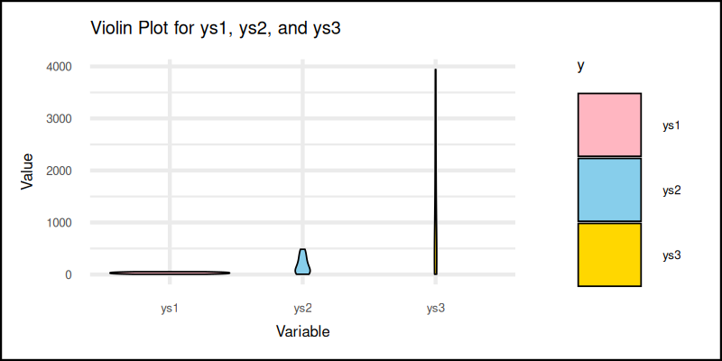
Violin Plot
When a box plot learns to dance.
Box plots are informative, but sometimes we want more flair. Enter the violin plot: a combination of box plot and kernel density. Now we get to see the shape of the data, not just its summary.
The better to visualize is by using violin plot.
We can utilize geom_violin to get the plot.
plot <- ggplot(
    series_longer,
    aes(x = y, y = value, fill = y)) +
  geom_violin(color = "black", linewidth= 0.2) +
 ...
The plot result can be shown as follows:
You can obtain the interactive JupyterLab in this following link:
Violin plots show the full distribution. Great for spotting multimodal patterns or hidden spikes. Like a box plot with emotional range.
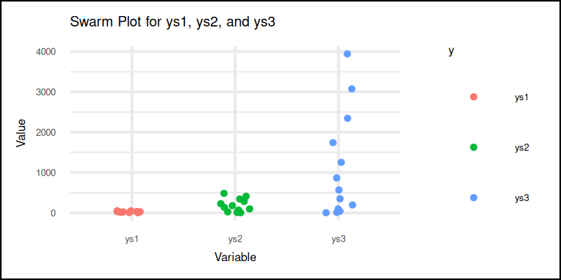
Swarm Plot
Dot by dot, truth emerges.
Sometimes we just want to see all the raw values,
without summarizing them away.
The swarm plot (via jitter in geom_point),
lets each data point speak for itself.
No data left behind.
This leave us with other option such as swarm plot and strip plot.
We can get swarm plot using jitter inside geom_point.
plot <- ggplot(
    series_longer,
    aes(x = y, y = value, color = y)) +
  geom_point(
    position = position_jitterdodge(
      jitter.width = 0.3, jitter.height = 0),
    size = 0.5) +
  ...
And here it is. The plot result can be shown as follows:
You can obtain the interactive JupyterLab in this following link:
Swarm plots are perfect when sample sizes are small, or distributions are non-traditional. Plus, it just looks cool.
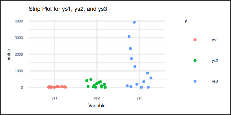
Strip Plot
Minimalism, but make it jitter.
Strip plots are similar to swarm plots but even simpler.
Here, we use geom_jitter() to spread out points horizontally,
so they don’t overlap like penguins in a pile.
We can get strip plot using geom_jitter.
plot <- ggplot(
    series_longer,
    aes(x = y, y = value, color = y)) +
  geom_jitter(
    width = 0.3, height = 0, size = 0.5) +
  ...
The plot result can be shown as follows:
You can obtain the interactive JupyterLab in this following link:
Strip plots keep it simple. Good for exploratory views and, when we want to embrace a bit of chaos, but still understand the story.
Statistic Properties: Distribution
Let there be frequencies, and let them plot themselves.
We’ve met our y-series in various boxy, violiny, and jittery forms. Now it’s time to ask: how do these values, distribute themselves along the number line? Are they huddled near the mean? Wandering wildly like unsupervised p-values?
We’ll explore that with some of, our favorite tools for visualizing distributions. Just like previous four, we can analyse the y-axis, but this time by frequency of each series.
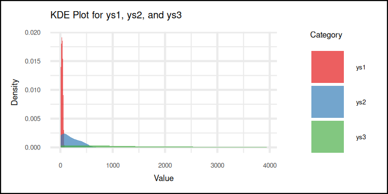
KDE Plot
Kernel Density Estimation
The KDE plot gives us a smoothed-out version of the histogram. It estimates the probability density function of the variable. Which sounds fancy, but really just means: “Here’s where the data likes to hang out.”
And thanks to geom_density,
we don’t even need to bring calculus to the party.
KDE shown well the distribution of the frequency.
This complex task can be done easily with geom_density.
plot <- ggplot(
    series_longer,
    aes(x = value, fill = Category)) +
  geom_density(alpha = 0.7, color = NA) +
  ...
And here’s the resulting plot:
You can obtain the interactive JupyterLab in this following link:
KDE plots help us compare shapes of distributions, without worrying about bin size. They give a smooth overview that highlights trends, like a box plot with a PhD in smoothness.
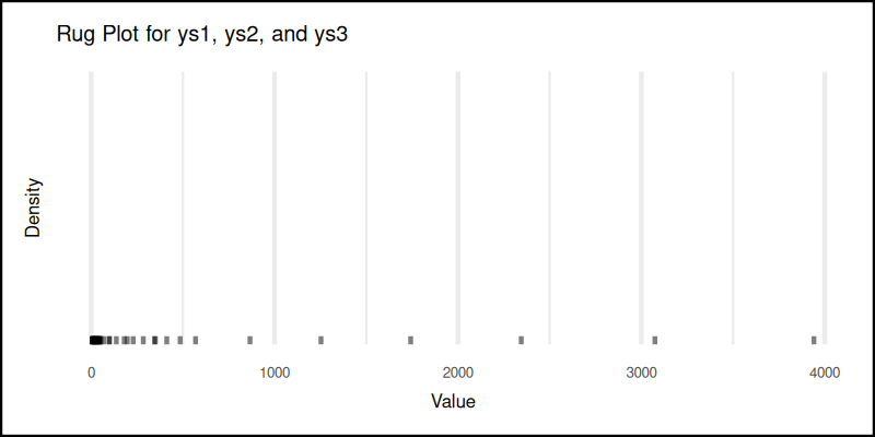
Rug Plot
The rug plot is about minimalism. It doesn’t summarize, smooth, or bin. It simply places a tiny tick mark for each observation. Elegant. Humble. Underrated.
We can also simply show the rug plot using geom_rug.
plot <- ggplot(
    series_longer,
    aes(x = value, fill = Category)) +
  geom_rug(alpha = 0.5, sides = "b") +
  ...
And here’s the tick parade:
You can obtain the interactive JupyterLab in this following link:
Rug plots show the raw locations of all data points. Great for spotting clustering, gaps, or if our data has secretly turned binary when we weren’t looking.
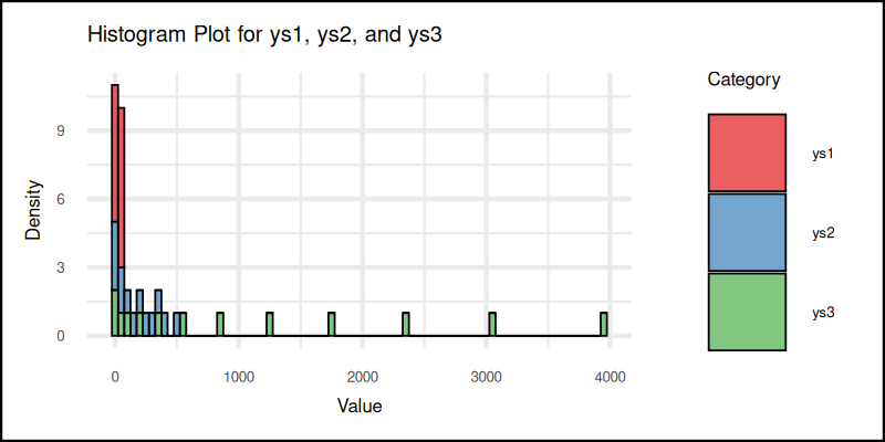
Histogram
The classic.
Histograms are still one of the clearest ways,
to show frequency distributions.
But geom_histogram is more than the basic histogram for beginner.
In R, geom_histogram lets us tweak bins, colors, and aesthetics
to make our plots look good and tell the truth.
A rare combo.
plot <- ggplot(
    series_longer,
    aes(x = value, fill = Category)) +
  geom_histogram(
    binwidth = 50, linewidth = 0.2,
    alpha = 0.7, color = "black") +
  ...
And here’s the result:
You can obtain the interactive JupyterLab in this following link:
Histograms offer a quick glance, at the frequency of values in intervals. Perfect for spotting skewness, symmetry, and when the data is just plain weird.
Statistic Properties: Marginal
At this point, we have sliced and diced our data in every direction,
except the literal margins. Time to fix that.
Marginal plots allow us to peek at each axis on its own turf.
Think of it as giving the x and y axes their solo performance,
with ggMarginal from the ggExtra library as our stage manager.
We can step to analyse each of single axis analysis,
right on its own axis using ggMarginal from ggExtra library.
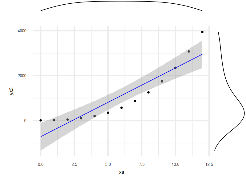
Density Example
We start with a classic 2D plot. So far so good.
For example we can add marginal density plot. Let’s start with usual plot.
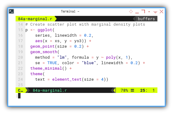
Now we let each axis whisper its own secrets, by adding marginal density plots. This gives a quick glimpse of distribution on both axes, without adding clutter to the main scene.
p_with_margins <- ggMarginal(
  p, type = "density", linewidth = 0.2,)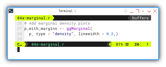
The final result is a polished plot that combines the big picture with fine details:
Explore the interactive version here:
Marginal plots help us connect the dots, between joint and marginal distributions. In other words, we see not just where the points are, but how they behave on each axis. For statisticians, that’s like switching from grayscale to technicolor.
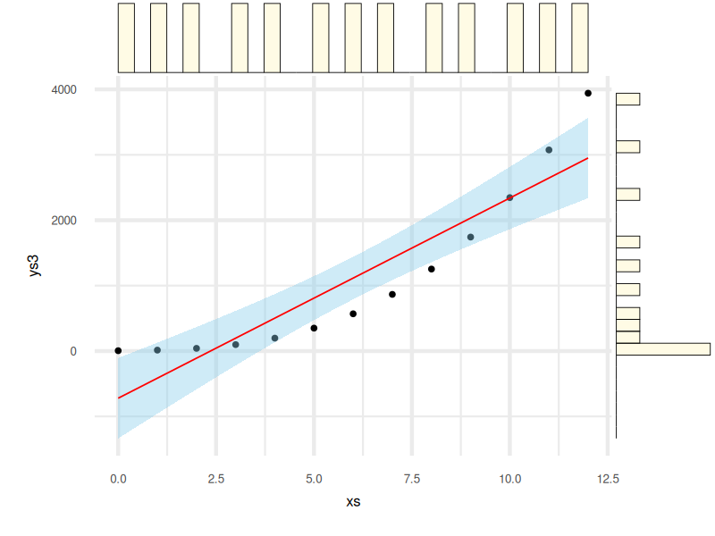
Histogram Example
We’re not married to density. Let’s switch it up and try histograms instead.
We can use marginal histograms to get a more “binned” perspective. This is the histogram’s time to shine—on the sidelines.
p_with_margins <- ggMarginal(
  p, type = "histogram",
  color = "black", fill = alpha("#FFD700", 0.1),
  linewidth = 0.1)
Here’s how the final result looks:
And the interactive version is ready for your curiosity:
Sometimes we want to see the raw frequency count. Histograms add structure to the axis-wise distribution, making it easier to spot skew, outliers, or whether the data suffers from “the dreaded left shoulder syndrome.”
What’s the Next Chapter 🤔?
So far, we’ve explored statistical properties with R,
sliced data from every angle,
and smoothed it like a well-behaved normal curve.
All in all, not bad for a plotting party hosted by statisticians.
Numbers deserve more than being left alone in a spreadsheet. We’ve shown how to visualize data distributions in practical, meaningful ways. From box plots to violin plots to marginal density overlays, we now have tools that not only inform, but also impress during awkward coffee break conversations.
But where do we go from here?
While Python and R are the old reliable friends of the statistical world,
the programming party doesn’t end there.
There’s Julia, fast, modern, and already practicing its keynote speech for the future.
Then there’s Typescript and Go, bridging the world of analysis,
with scalable applications that refuse to crash under pressure.
Learning statistical visualization across multiple languages means, we are not just tool users. We are toolmakers. We future-proof our workflows and avoid the classic trap: “I have this great insight, but it only runs on my laptop.”
So if you’re curious what comes next, consider peeking into: 👉 [ Trend - Language - Julia - Part One ].
In data science, like in life, flexibility is the best regression line. It’s time to see how the stats game changes, when we switch gears.