Preface
Goal: Pretty statistics visualization with Seaborn, equipped with example script for each plots.
We need tool to make easy for us to visualize statistic properties. Fortunately, there is this seaborn library with ready to use plot chart, specifically made for statistics.
Example chart plot in this article provided with source code. There will be no explanation step by step tutorial, as there is already a bunch of tutorial in the internet anyway. Our focus is what you can do with Seaborn, related with statistics properties.
Note that in real life we would face complex data analysis, so the script would also be more complex than just these simple examples.
Let’s have a tour, enjoy the view of each chart plot.
Visualizing Linear Regression
Yes we are still talking about trend.
Data Series
Instead of just one series,
we would like to use three series: ys1, ys2, or ys3:
xs, ys1, ys2, ys3
0,  5,   5,   5
1,  9,   12,  14
2,  13,  25,  41
3,  17,  44,  98
4,  21,  69,  197
5,  25,  100, 350
6,  29,  137, 569
7,  33,  180, 866
8,  37,  229, 1253
9,  41,  284, 1742
10, 45,  345, 2345
11, 49,  412, 3074
12, 53,  485, 3941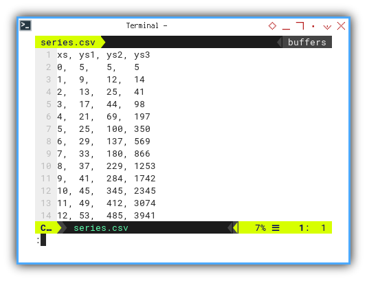
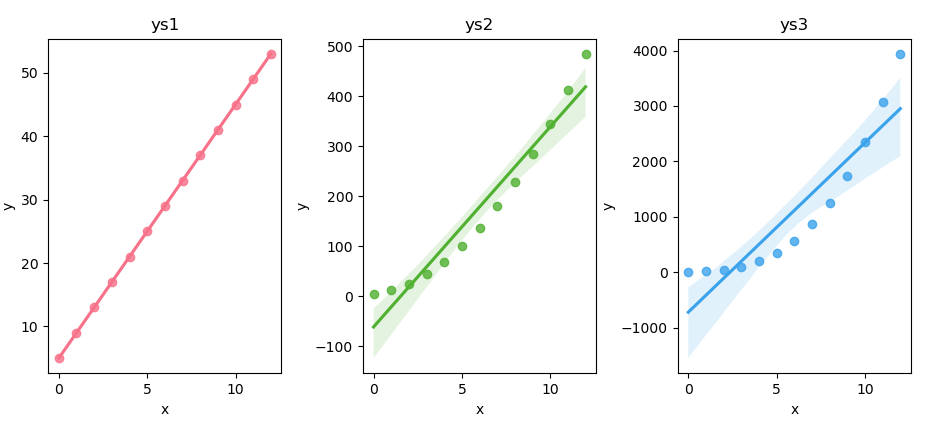
Regression Plot
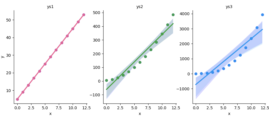
Plotting linear regression plot is straightforward. You can plot all these three series at once in one plot figure.
# Getting Matrix Values
pairCSV = np.genfromtxt("series.csv",
  skip_header=1, delimiter=",", dtype=float)

# Extract x and y values from CSV data
xs, ys1, ys2, ys3 = pairCSV.T

# Scatter plot with regression line
plt.figure(figsize=(8, 6))
sns.regplot(x=xs, y=ys1)
sns.regplot(x=xs, y=ys2)
sns.regplot(x=xs, y=ys3)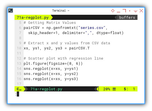
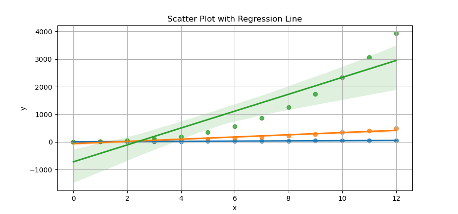
The result of the plot can be visualized as below:
You can obtain the interactive JupyterLab in this following link:
Or if you wish you can have three subplots in one figure with the help of tight layout,
Prepare our data first. Getting Matrix Values, and extract x and y values from CSV data.
pairCSV = np.genfromtxt("series.csv",
  skip_header=1, delimiter=",", dtype=float)

xs, ys1, ys2, ys3 = pairCSV.T
Create the subplots. And also defining seaborn color palette. You can specify the number of colors here.
# Creating subplots
fig, axs = plt.subplots(1, 3, figsize=(12, 4))

palette = sns.color_palette("husl", 3)
Then plotting each scatter plot with regression line.
pairs = zip([ys1, ys2, ys3], ['ys1', 'ys2', 'ys3'])

for i, (ys, title) in enumerate(pairs):
  sns.regplot(x=xs, y=ys,
    ax=axs[i], color=palette[i])

  axs[i].set_title(title)
  axs[i].set_xlabel('x')
  axs[i].set_ylabel('y')

plt.tight_layout()
plt.show()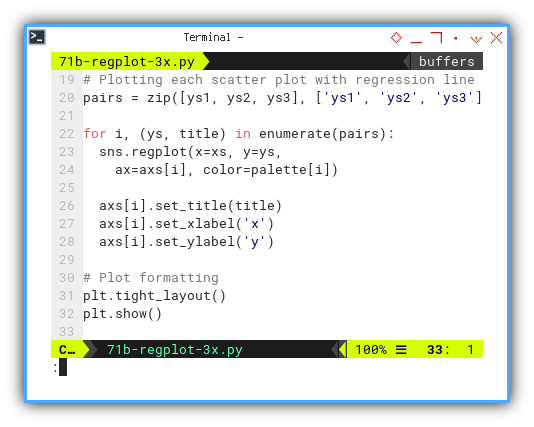
The result of the plot can be visualized as follows. All with pretty color. You can see the color is better than matplotlib.
You can obtain the interactive JupyterLab in this following link:
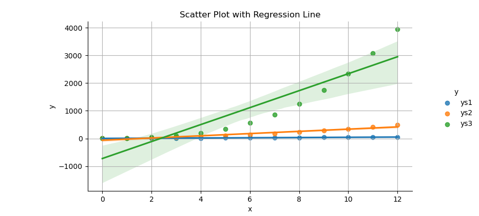
Linear Model Plot
LM: Linear Model
We can make the code above simpler with lmplot.
With panda dataframe, we can read data from CSV directly. But beware of the strip leading spaces from column names.
Before using the dataframe,
we need to transform the DataFrame to long format for linear model plot.
We can do this using melt method from panda.
df = pd.read_csv("series.csv") \
  .rename(columns=lambda x: x.strip())

df_melted = pd.melt(df,
  id_vars='xs', var_name='y', value_name='value')
Then we can draw scatter plot with regression line. For convenience, I adjust the title position a bit, so the title fit in small sized figure.
plt.figure(figsize=(8, 6))
sns.lmplot(x='xs', y='value',
  data=df_melted, hue='y')

plt.subplots_adjust(top=0.9)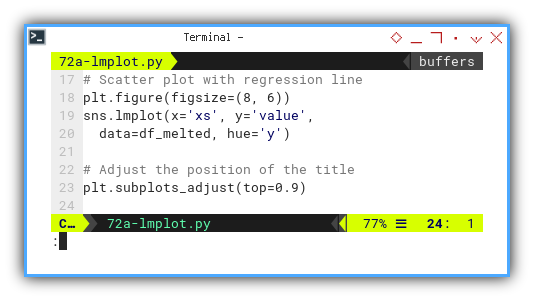
The result of the plot can be visualized as below:
You can obtain the interactive JupyterLab in this following link:
Facet Grid
Grid of Plot
Instead of using subplots, we can arrange our plot in a grid. I give you two different examples. One with shared y-axis, and the other having different y-axis for each.
First we need to get the matrix values.
Then convert the values to pandas dataframe.
For use with this facetgrid,
we need to melt the dataframe to long format.
pairCSV = np.genfromtxt("series.csv",
  skip_header=1, delimiter=",", dtype=float)

cols_all = ['xs', 'ys1', 'ys2', 'ys3']
cols_sel = ['ys1', 'ys2', 'ys3']

df = pd.DataFrame(pairCSV, columns=cols_all)

df_melted = pd.melt(df,
  id_vars='xs', var_name='y', value_name='value')
We need to create a facetgrid with one row and three columns,
with different y-axis for each.
Then we can map regplot to each facet.
g = sns.FacetGrid(df_melted,
  col='y', col_wrap=3, height=4, sharey=False)

g.map_dataframe(sns.regplot,
  x='xs', y='value', color='b')
We can iterate over selected columns and
map regplot to each column in the facetgrid.
In the iteration,
we should filter dataframe subset for each ys category.
Also for each ys category we can use different color,
based on sns.color_palette.
for ax, ys_name in zip(g.axes.flat, cols_sel):
  df_subset = df_melted[
    df_melted['y'] == ys_name]

  color = sns.color_palette("husl", 3)[
    cols_sel.index(ys_name)]

  sns.regplot(x='xs', y='value',
    data=df_subset, ax=ax,
    color=color)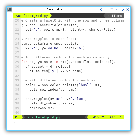
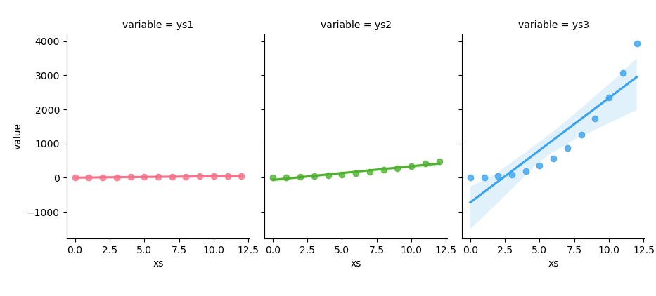
The result of the plot can be visualized as below. They all shared the same y-axis.
You can obtain the interactive JupyterLab in this following link:
If you want you can have different y-axis for each grid.
With panda dataframe,
we can read data from CSV directly.
Do not firget to strip leading spaces from column names.
Now we define selected columns for ys series.
df = pd.read_csv("series.csv") \
  .rename(columns=lambda x: x.strip())

cols_sel = ['ys1', 'ys2', 'ys3']
As usual we should melt the DataFrame to long format for facetgrid.
So we can create a facetgrid with seaborn
df_melted = df.melt(
  id_vars='xs', value_vars=cols_sel)

g = sns.FacetGrid(df_melted,
  col='variable', col_wrap=3,
  sharex=False, sharey=True)
Like previous example, we can iterate over selected columns and
map regplot to each column in the facetgrid.
for ax, col in zip(g.axes.flatten(), cols_sel):
  df_subset = df.melt(
    id_vars='xs', value_vars=col)

  color = sns.color_palette("husl", 3)[
    cols_sel.index(col)]

  sns.regplot(x='xs', y='value',
    data=df_subset, ax=ax, color=color)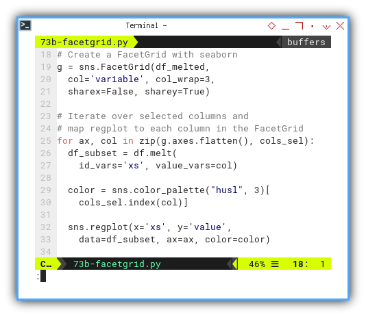
The result of the plot can be visualized as below:
You can obtain the interactive JupyterLab in this following link:
Visualizing Statistics Properties
We have four plots with almost identical settings
- Boxplot
- Violinplot
- Swarmplot
- Striplot
Preparing Dataframe
These plot required the the same data preparation.
As usual, you might either read the dataframe from panda directly,
or using numpy’s np.genfromtxt.
First we need to get the matrix values. Then convert the values to pandas dataframe. For use with this these four kinds of plot, we need to melt the dataframe to long format.
pairCSV = np.genfromtxt("series.csv",
  skip_header=1, delimiter=",", dtype=float)

cols_all = ['xs', 'ys1', 'ys2', 'ys3']
df = pd.DataFrame(pairCSV, columns=cols_all)

df_melted = pd.melt(df,
  id_vars='xs', var_name='y', value_name='value')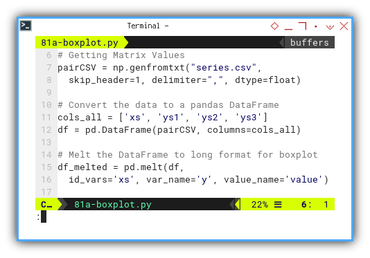
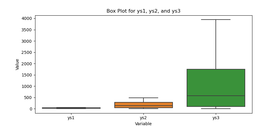
Box Plot
The box plot is the most common visualization.
Creating boxplot is as simple as below:
plt.figure(figsize=(8, 6))
sns.boxplot(x='y', y='value', data=df_melted)
The result of the plot can be visualized as below:
You can obtain the interactive JupyterLab in this following link:
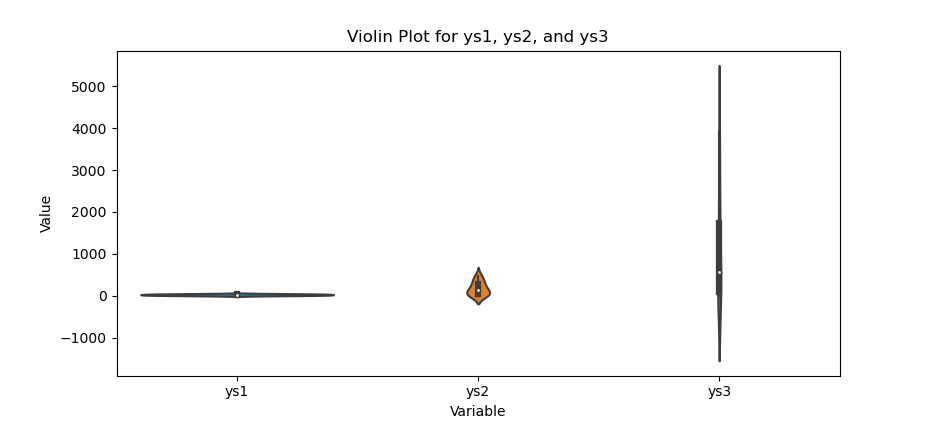
Violin Plot
This violin plot is the most common visualization. This is basically the sum of normal distribution.
Creating violinplot is also simple.
plt.figure(figsize=(8, 6))
sns.violinplot(x='y', y='value', data=df_melted)
The result of the plot can be visualized as below:
You can obtain the interactive JupyterLab in this following link:
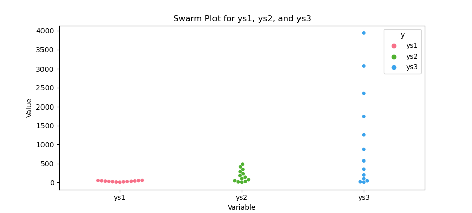
Swarm Plot
There is also other visualization as well.
We can define colors for swarmplot,
by adjust the number of colors as needed,
so we can create swarmplot with different colors
colors = sns.color_palette("husl", 3)

plt.figure(figsize=(8, 6))
sns.swarmplot(x='y', y='value',
  hue='y', data=df_melted, palette=colors)
The result of the plot can be visualized as below:
You can obtain the interactive JupyterLab in this following link:
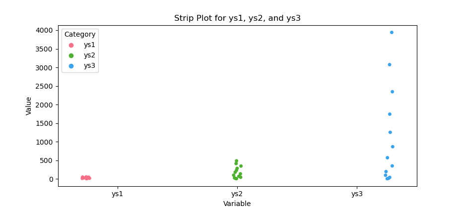
Strip Plot
This looks like swarm plot, but with some kind of offset for each dots, so we can see how the data overlapped with the other.
Just like swarmplot,
We can define colors by adjust the number of colors as needed,
so we can create the striplot with different colors
colors = sns.color_palette("husl", 3)

plt.figure(figsize=(8, 6))
sns.stripplot(x='y', y='value', data=df_melted,
  hue='y', palette=colors, dodge=True)
The result of the plot can be visualized as below:
You can obtain the interactive JupyterLab in this following link:
Visualizing Distribution
Compared to matplotlib, visualizing distribution is much more easier with seaborn.
KDE Plot
Kernel Density Estimation
This is the sum of normal distribution for each points for a data series.
As usual we can prepare the data. Then seaborn decoration such as the style. And also define a color palette for the KDE plot, with adjustable number of colors as you needed.
df = pd.read_csv("series.csv") \
  .rename(columns=lambda x: x.strip())

sns.set_style("whitegrid")
palette = sns.color_palette("husl", 3)

plt.figure(figsize=(8, 6))
And create a KDE plot for each ys category.
for i, col in enumerate(['ys1', 'ys2', 'ys3']):
  sns.kdeplot(data=df[col],
    color=palette[i], label=col)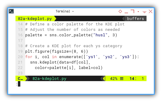
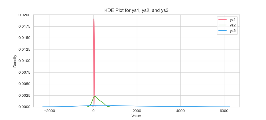
The result of the plot can be visualized as below:
You can obtain the interactive JupyterLab in this following link:
If you wish, you can customize the style, with other parameters.
df = pd.read_csv("series.csv")
df_melted = pd.melt(df, id_vars='xs',
  var_name='Category', value_name='Value')

sns.set_style("darkgrid")

plt.figure(figsize=(8, 6))
Then we can create KDE plot for all categories with oneliner settings.
sns.kdeplot(data=df_melted,
  x='Value', hue='Category', palette='deep',
  alpha=0.7, multiple='stack', linewidth=2)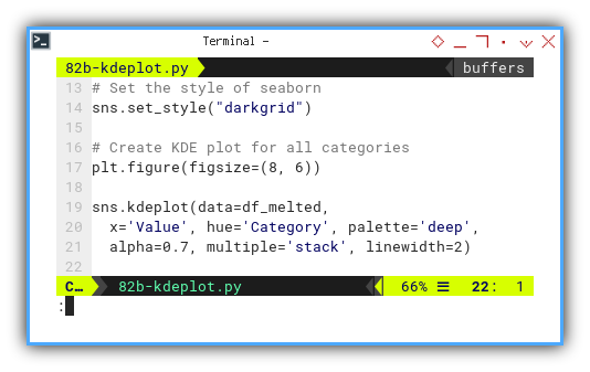
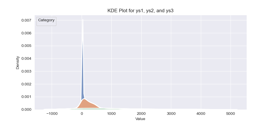
The result of the plot can be visualized as below:
You can obtain the interactive JupyterLab in this following link:
Rug Plot
Sometimes all you need is just the ticks. You can do this with rugs plot.
As usual we need to melt the dataframe to long format for rugplot.
df = pd.read_csv("series.csv")

df_melted = pd.melt(df, id_vars='xs',
  var_name='Category', value_name='Value')
For decoration purpose we need to define a color palette for the rug plots. With using one less color for ‘xs’
palette = sns.color_palette(
  "husl", len(df.columns) - 1)

plt.figure(figsize=(8, 6))
Then we can create rug plot for each category, with ‘xs’ column excluded.
for i, col in enumerate(df.columns[1:]):
  df_subset = df_melted[df_melted['Category'] == col]
  sns.rugplot(data=df_subset, x='Value',
    color=palette[i], label=col, alpha=0.7)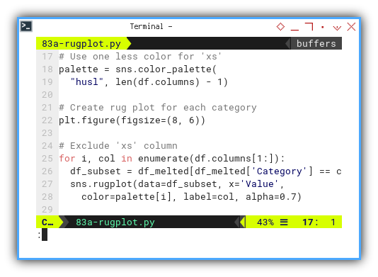
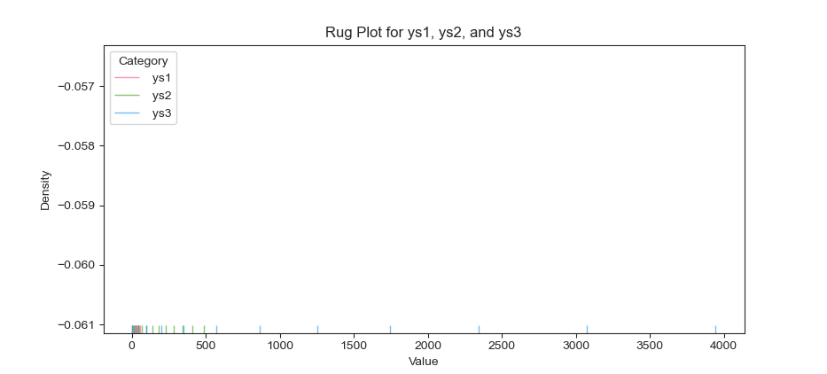
The result of the plot can be visualized as below. This looks like an empty chart as first. But you can see the ticks at the below of the figure.
You can obtain the interactive JupyterLab in this following link:
Histogram Plot
Histogram is a very basic plot and available in matplotlib. So what is so special with this histogram?
With seaborn we can have additional KDE plot with histogram plot.
As usual we need to prepare data.
Then select columns such as ys1, ys2, and `ys3.
Then create a figure and axis objects.
df = pd.read_csv("series.csv") \
  .rename(columns=lambda x: x.strip())

cols_selected = ['ys1', 'ys2', 'ys3']

plt.figure(figsize=(8, 6))
This way we can plot displot for selected columns.
sns.histplot(data=df[cols_selected],
  kde=True, element='step',
  multiple='layer', palette='husl')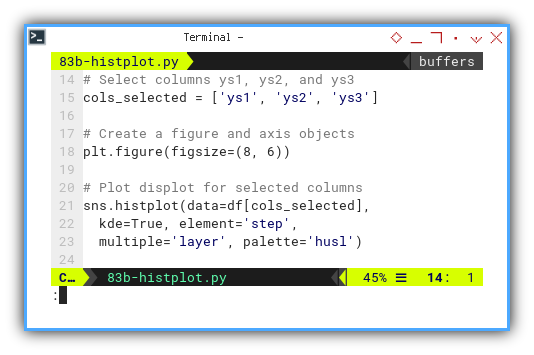
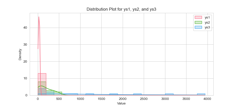
The result of the plot can be visualized as below:
You can obtain the interactive JupyterLab in this following link:
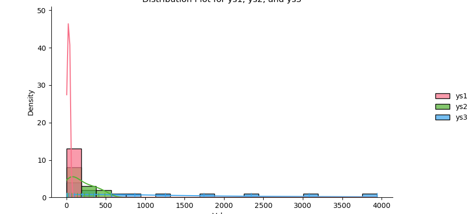
Distribution Plot
This is similar to above plot, but instead of having KDE Plot feature in histogram. Here we have histogram feature in KDE plot.
As above, we need to select columns,
such as ys1, ys2, and ys3.
df = pd.read_csv("series.csv") \
  .rename(columns=lambda x: x.strip())

cols_selected = ['ys1', 'ys2', 'ys3']
df_selected = df[cols_selected]
Let’s decorate the figure as usual.
Defining a color palette for the displot.
palette = sns.color_palette(
  "husl", len(cols_selected))

plt.figure(figsize=(8, 6))
Now we can create displot for selected columns.
sns.displot(data=df_selected,
  kind='hist', rug=True, kde=True,
  palette=palette, alpha=0.7, multiple='layer')
The result of the plot can be visualized as below:
You can obtain the interactive JupyterLab in this following link:
Further Visualization
We can combine different in information in one figure. For example these two plots below have marginal side on top and right.
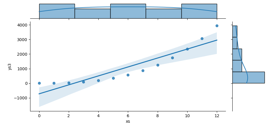
Joint Plot
The first approach is using plot, and putting the marginal settings inside the plots.
For eaxmple, we can use seaborn’s jointplot
to create a scatter plot,
with KDE at the marginal.
df = pd.read_csv("series.csv") \
  .rename(columns=lambda x: x.strip())

sns.jointplot(data=df, x='xs', y='ys3',
  kind='reg', marginal_kws={'fill': True})
The result of the plot can be visualized as below:
You can obtain the interactive JupyterLab in this following link:
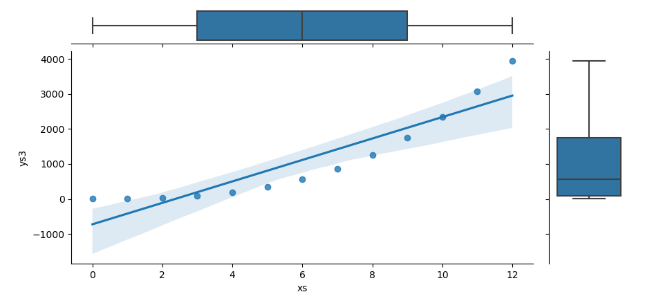
Joint Grid
Or the second approach by using grid, so we can customize the marginal manually.
First we need to create a JointGrid object. Then plot the scatter plot in the center, and also set the histograms plot on the marginal axes.
df = pd.read_csv("series.csv") \
  .rename(columns=lambda x: x.strip())

g = sns.JointGrid(data=df, x='xs', y='ys3')
g.plot_joint(sns.regplot)
g.plot_marginals(sns.boxplot)
The result of the plot can be visualized as below:
You can obtain the interactive JupyterLab in this following link:
What Comes Next 🤔?
We can visualize statistical properties, in practical way.
I would really like to explore PSPPire. PSPP is the open source version of SPSS.
Consider continuing your exploration with [ Trend - Properties - PSPPire ].