Preface
Goal: A practical overview of trends, from modeling data in Excel to scripting it in Python.
I can read the data.
I know what it means.
Once, I had this eureka moment.
I want you to experience it too.
Data is nowadays language, a new form of communication.
The way we perceive data shaping how we think.
In this way, insight becomes natural outcome.
Beyond the Books: A Hands-On Revival
For those left behind.
A statistics handbook that I read make me realize.
They are relics from a pre-code era.
No cheatsheets, no worksheets,
And not a single line of usable code.
That’s when somehow, my conscience stirred with a calling, loud and clear: “To bridge the gap for those left behind.” My inner activist side found my objective.
When Curiosity Meets Data
A Second Chance
Learning should never expire. I’ve always wanted to learn statistics, but I never quite knew where to begin. The breakthrough came when I was challenged to fit a curve to a data series. That one task opened the door to regression, correlation, and a whole new perspective.
Back in college, I never skipped a single statistics class. But even then, what we learned barely scratched the surface, just the basics. Meanwhile, I heard that other universities were diving into things like ANOVA.
Sure my office task doesn’t demand intermediate statistics. But the fact that I know nothing about it, makes me an unprepared employee, who can’t solve things with further tools. Or worse, I feel so uneducated. Now, two decades later, I find myself learning everything from scratch. No formal class. No course. Just curiosity.
I started seriously exploring statistics around 2017. A book helped me lay the foundation, and since then, I’ve seen tons of content, concepts in videos, fancy online calculators, and summaries in articles.
Data, Math, and the Code Behind It
Built for belonging.
But here’s the problem: very few of them come with real, practical Excel examples for everyday use. And without doing the calculations manually, how can I be sure my results are even correct? I want to see how the math works, not just get the answer.
Even the online tools fall short. If they don’t explain the math equation behind the scenes, how am I supposed to learn from them? Books help, sure. But even if I understand the theory, how do I turn that into a script? How do I actually use this knowledge? How do I automate my job with scripting?
Most handbooks reveal their age. Not by their theories, but by their absence of practical tools, like cheatsheets, interactive worksheets, or coding examples that reflect today’s data-driven workflows.
That’s why I’ve decided to take a new approach on learning statistics. One that’s hands-on, grounded, and script-friendly:
- Understand the math behind the method
- Reproduce it manually using Excel
- Implement it programmatically using Python
- Go further with automation, nice visualization, and combine with other technologies
My goal is to speed up the learning process, for anyone wishing to learn. This is not for my personal achievement, nor targeting academics.
This article series is not built for brilliance,
but for belonging.
Reality Bites
I passed the exam, but I failed in the real world.
I’ve been away from the university for more than two decades. And I heard they have a good program nowadays. But how about most people?
Matching skill with market demands is, not just about career planning.
Trust me. When all you got is rice, cheap vegetables and a pile of debts, this is going to affect your body shape soon.
Now those days are gone. Nothing can stop Tom Cruise from running. Nothing can stop me from writing and sharing.
Approachable Statistics
Down to Earth
I want to bring statistics down from the ivory tower, and into the kitchen table, where real people make real decisions.
Let’s make statistics less of a scary math monster, and more of a friendly tool. Something we can use even before our morning coffee kicks in.
Habit Change
How do we start solving math problem?
Back in my college days, it was simple: Grab a sheet of paper, scribble down the equation, and work it through by hand. Line by line. Thought by thought. Derive this. Simplify that. Pure muscle memory.
But times have changed. Paper is rare. Pens are even rarer. These days, I don’t even carry one in my bag. No more old-school notes on napkins. So naturally, the way I “write things down” has evolved.
What tools do we used these days?
How do we approach it now? We’ve had spreadsheets for more than two decades (since about 25 years ago), and they’ve become second nature. When intuition kicks in, I reach straight for Excel It’s quick, visual, and everywhere. Need to show someone your data model? Screenshot it. Paste the result into WhatsApp. Or better yet, just attach the whole spreadsheet file.
How do you communicate the equation itself?
Sure, Excel can display equations nicely. But if I want to share the math behind the scenes, especially in a clean, readable format, I’ll use LaTeX. LaTeX gives me both beauty and precision: equations that are easy to read by humans, and still machine-readable.
What is the final form?
It depends, on the audience, the purpose, and the medium. For something like a polynomial fit, I usually want a visual chart. One that compares the raw data to the fitted curve. So anyone can instantly see what’s going on.
This chart could be made in Excel, sure. But for more control and automation, I use Python’s matplotlib. That way, I can export an image, ready to drop into any chat app or social feed. You could use R, or any language that speaks data. The tool doesn’t matter. The insight does.
How do We Start?
Hands-on walkthrough!
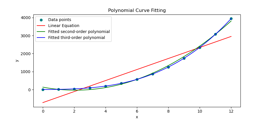
We kick things off with something familiar: polynomial curve fitting.
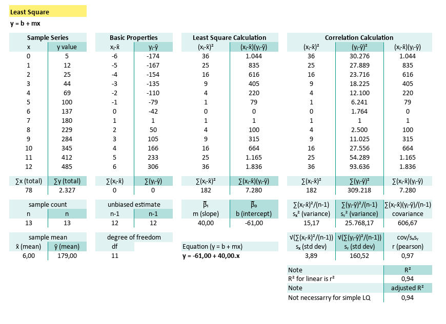
From there, we’ll level up. Venturing into least squares, regression, and correlation. And it all starts with a good old-fashioned cheatsheet.
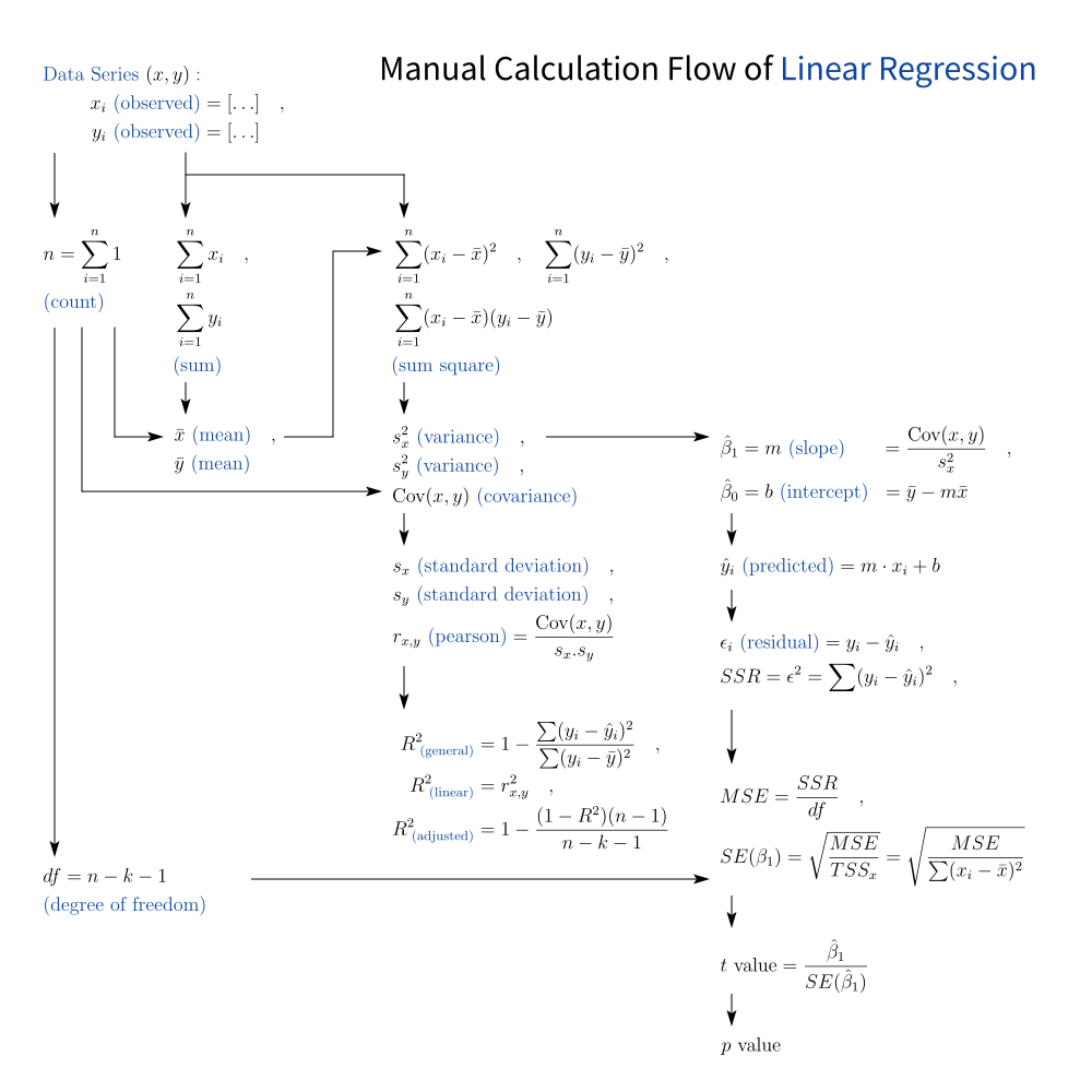
Here’s a breakdown of the equation flow for basic linear regression:
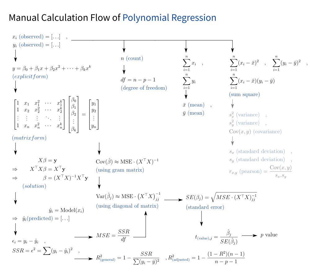
But we’re not stopping at linear. we also tackle polynomial regression too. This is where we lay the real groundwork.
To make this journey easier, I’ve put together a beginner-friendly worksheet. Aa step-by-step guide to solving linear regression by hand, with full statistical context.
Once we’ve done the math manually (because we should understand it before automating it), we’ll switch gears and use built-in spreadsheet formulas, in Excel or LibreOffice Calc.
Then comes Python.
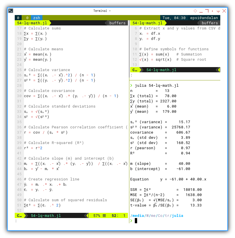
We’ll walk through manual calculations in code,
followed by Python’s built-in helpers.
numpy, scipy, and other statistics libraries.
Then we’ll move on to visualizing results with matplotlib.
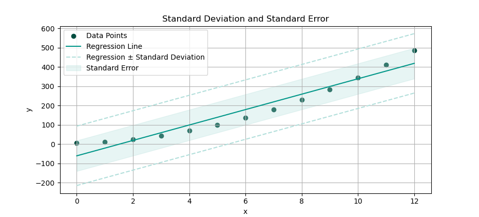
For example: here is a confidence interval shaded around a regression line.
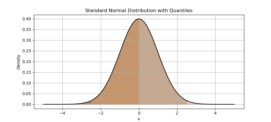
We’ll also cover distribution analysis, plotting density curves to understand how our data behaves. We need to learn the basic of plotting the distribution curve.
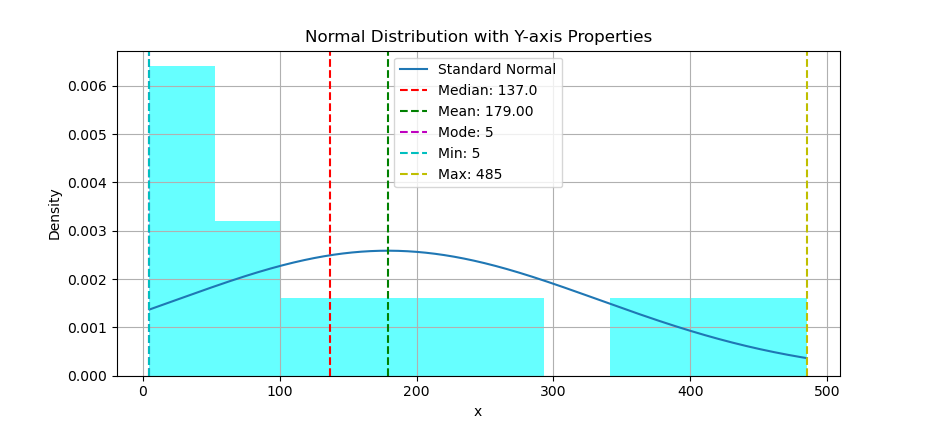
Eventually, we’ll be able to overlay statistical markers on histograms, like this:
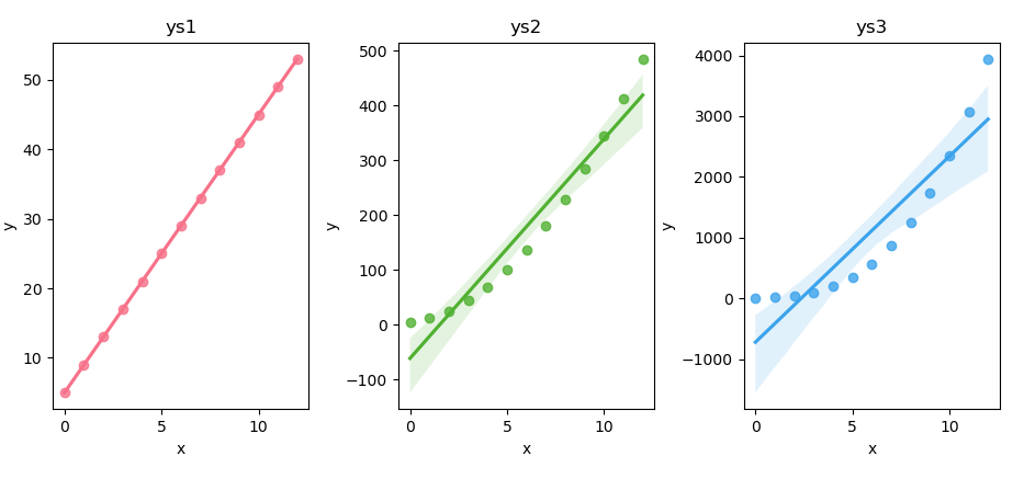
Want a little more elegance?you’ve laid real groundwork We’ll enhance our plots using Seaborn, And yes, there’s a JupyterLab version of every script on GitHub.
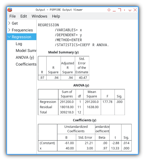
We’ll even verify our manual work using PSPPire, the open-source cousin of SPSS.
Eventually, we’ll see how this entire workflow can be replicated in other languages:
such as R, Julia, and maybe later I will continue with Typescript, and Golang.
That’s all. For further information, please contact your nearest statistician.
How do We Continue?
Build our own diagnostic kit.
With a solid grasp of polynomial regression, stepping into multivariate regression becomes much easier. Like swapping our socket wrench for a full torque-calibrated toolkit From here, we can smoothly move on to ANOVA, ANAREG, MANOVA, and beyond.
The underlying math principles stay familiar,. The workflows in spreadsheets is similar, We can build our own tabular data, just more columns to tune. Python stays approachable, still the same workbench. And PSPP? Built for everyday end-users like us, great for routine jobs.
Now, let’s apply this to a real, highly scientific case: comparing the average cuteness scores of cats, dogs, and rabbits. Since we have more than two contenders in the adorable Olympics, we bring out ANOVA, the referee that checks if any group is truly cuter than the rest. If the p-value is small enough to raise eyebrows, it means at least one furry faction stands out in cuteness.
And once we’ve nailed this case, we’re ready to judge any cute contest that comes our way. From kittens to bunnies to, who knows, maybe even our favorite coffee mug
Once we understand the principles, we become a builder, not just a user. When we know how the system works under the hood, we’re no longer tied to:
- One brand of tools (e.g., Excel, Python, R, PSPP)
- One repair manual (e.g., ANOVA vs regression)
- One model of car (tidy vs. messy datasets)
When we understand the logic of the engine.
We don’t just follow the manual.
We tweak. We upgrade. We invent.
Table of Content
Polynomial Article Series
I divide this polynomial articles series into subseries:
-
Trend: Prediction
-
Trend: Regression
-
Trend: Enhanced
-
Trend: Language
Understanding Data
Do you speak data?
The way we understand data isn’t just about numbers. It’s how we speak to the world, how we connect ideas. It’s more than interpretation. It’s a new language, a shared space where insight emerges naturally, like words forming a story. And once we start seeing it, there’s no going back.
It’s not about mastery, it’s about becoming fluent.
Data Jokes
Philosopical thought could be hard. So, let’s lower our frequency. Relax, and here is a joke for data nerds.
A model strikes up a conversation with a mathematician and proudly says:
“Hey, I’m a model, you know!”
The mathematician replies, deadpan:
“Oh? What kind? Polynomial, Chebyshev, Legendre, or Hermite?”
She meant runway. He meant regression. Neither apologized.
What Comes Next 🤔?
The journey begins with the built-in LINEST formula in spreadsheets,
and the Polynomial library method in Python’s numpy.
So if you’re ready, let’s dive deeper: [ Trend - Built-in Method ].