Preface
Goal: Getting to know the basic of visualizing distribution curve.
Since we also need to visualize the interpretation of statistics properties against the distribution plot curve, then we need to get the basic of making distribution plot curve.
Distribution
Crafting a plot is interesting
Probability Density Function (PDF)
We can start with normal distribution. We can calculate the corresponding y-values for a standard normal distribution with equation as below:
Normal
First we need to generate data points for x-axis:
import numpy as np
import matplotlib.pyplot as plt

x = np.linspace(-5, 5, 1000)
We can implement the equation for the probability density function (PDF) of a standard normal distribution as follows:
y = 1 / np.sqrt(2 * np.pi) * np.exp(-0.5 * x**2)
plt.plot(x, y, color='blue')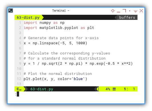
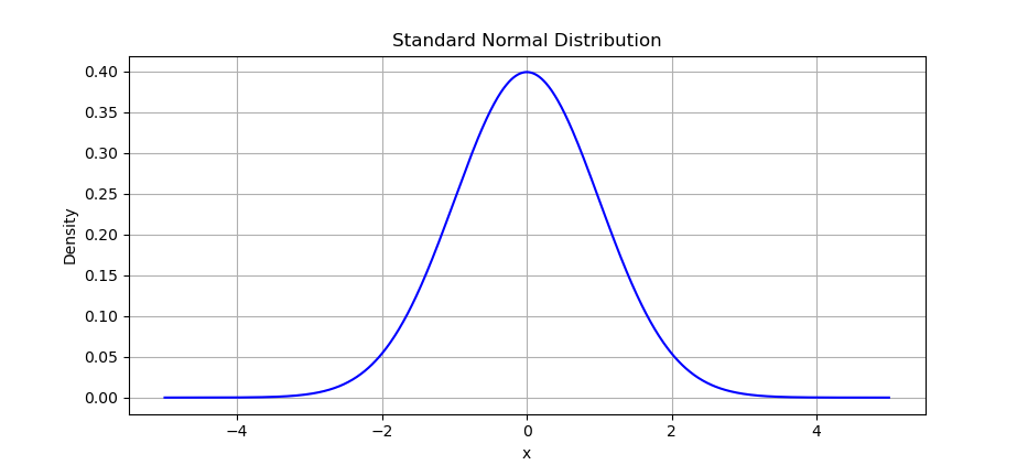
The result of the plot can be visualized as below:
Instead of manually calculating,
we can utilize scipy.stats library,
from scipy.stats import norm
y = norm.pdf(x)
You can obtain the interactive JupyterLab in this following link:
Quantiles
With normal distribution, we can go further with visualizing quantiles.
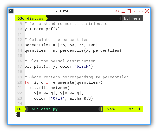
y = norm.pdf(x)

percentiles = [25, 50, 75, 100]
quantiles = np.percentile(x, percentiles)

plt.plot(x, y, color='black')
Now we can shade regions corresponding to percentiles as follows:
for i, q in enumerate(quantiles):
  plt.fill_between(
    x[x <= q], y[x <= q],
    color=f'C{i}', alpha=0.3)
The terms quartiles and quantiles, are related but not exactly the same. Quartiles divide a dataset into four equal parts. Quantiles, on the other hand, divide a dataset into any number of equal parts.
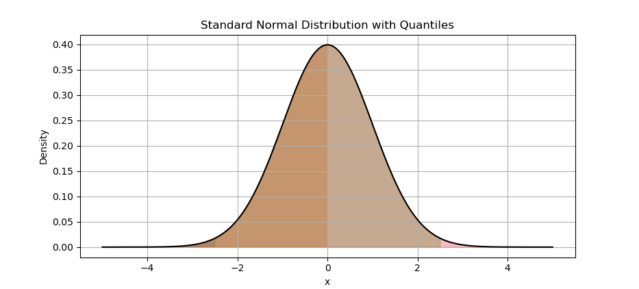
The result of the plot can be visualized as below:
You can obtain the interactive JupyterLab in this following link:
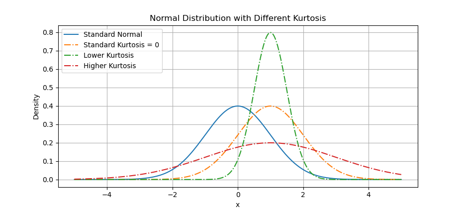
Kurtosis
We can utilize skewnorm.pdf to visualize kurtosis.
Below arrangement are visualization examples of distributions with different levels of kurtosis. To differ with the normal distribution, I move the curve to the right.
from scipy.stats import skewnorm, norm, kurtosis

x = np.linspace(-5, 5, 1000)
y_standard = norm.pdf(x)

y_kurtosis_1 = skewnorm.pdf(x, a=0, loc=1, scale=1)
y_kurtosis_2 = skewnorm.pdf(x, a=0, loc=1, scale=0.5)
y_kurtosis_3 = skewnorm.pdf(x, a=0, loc=1, scale=2)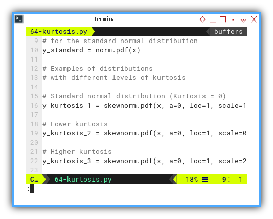
Now we can plot distributions with different levels of kurtosis, on the same plot with the normal distribution.
plt.plot(x, y_standard, label='Standard Normal')

plt.plot(x, y_kurtosis_1, ls='-.',
  label='Standard Kurtosis = 0')
plt.plot(x, y_kurtosis_2, ls='-.',
  label='Lower Kurtosis')
plt.plot(x, y_kurtosis_3, ls='-.',
  label='Higher Kurtosis')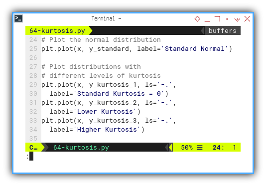
The result of the plot can be visualized as below:
You can obtain the interactive JupyterLab in this following link:
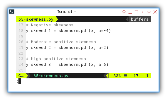
Skewness
We can utilize skewnorm.pdf again to visualize skewness.
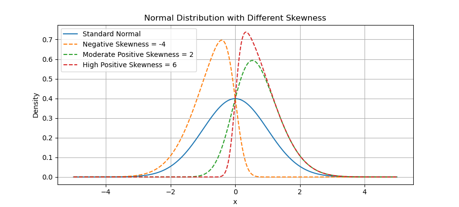
The same method of kurtosis above applied for skewness. Below arrangement are visualization examples of distributions with different skewness parameters.
y_skewed_1 = skewnorm.pdf(x, a=-4)
y_skewed_2 = skewnorm.pdf(x, a=2)
y_skewed_3 = skewnorm.pdf(x, a=6)
After calculating, we can display the result.
plt.plot(x, y_standard, label='Standard Normal')

plt.plot(x, y_skewed_1, ls='--',
         label='Negative Skewness = -4')
plt.plot(x, y_skewed_2, ls='--',
         label='Moderate Positive Skewness = 2')
plt.plot(x, y_skewed_3, ls='--',
         label='High Positive Skewness = 6')
The result of the plot can be visualized as below:
You can obtain the interactive JupyterLab in this following link:
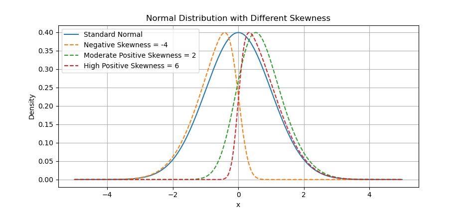
Scaled Skewness
The actual of skewness has different height. For simplicity we can scale so that, the height looks visually the same.
We can scale the skewed distributions to have the same maximum height as the standard normal distribution. This way we can compare better.
max_height_standard = np.max(y_standard)

y_skewed_1_scaled = y_skewed_1 \
  / np.max(y_skewed_1) * max_height_standard
y_skewed_2_scaled = y_skewed_2 \
  / np.max(y_skewed_2) * max_height_standard
y_skewed_3_scaled = y_skewed_3 \
  / np.max(y_skewed_3) * max_height_standard
The result of the plot can be visualized as below:
You can obtain the interactive JupyterLab in this following link:
What’s the Next Chapter 🤔?
There are also common properties for statistics not related with trend. In trend context let’s call them additional properties. This properties is important for other statistics analysis.
Consider progressing further by exploring the next topic: [ Trend - Properties - Additional ].