Preface
Goal: Explore Julia statistic plot visualization. Providing the data using linear model.
Welcome to our Trend meets Julia trilogy.
Julia is like the youngest sibling in the programming family. Fast, smart, and still figuring out where the spoons are. While I haven’t yet studied all of its grammar rules, or fully learned how to conjugate its macros, we can already do what truly matters: plot pretty charts and poke at distributions.
Starting early with Julia means, we are future proofing our workflow , nd catching the train before it becomes the bullet train It’s okay if we don’t understand everything yet. Plots speak first. Syntax catches up later.
We may not be fluent yet, but we’re statistically enthusiastic.
Preparation
All we need is Julia installed on our system.
Preferably somewhere we can find it later without using locate.
Library
The script here begins from the absolute basics. As with any language trying to be both fast and friendly, libraries need to be added gradually, like toppings on statistical pizza.
Use Julia's terminal to install them.
Yes, it talks back.
add Polynomials
add Plots
add CSV
add Printf
add DataFrames
add GLM
add Distributions
add StatsPlots
add ColorSchemes
add ColorTypes
add Gadfly
add IJulia
import Cairo, Fontconfig
These libraries are our statistical toolbox. GLM for models, Plots for the art, Distributions for the theory, and ColorSchemes. Let’s face it, default colors are rarely emotionally fulfilling.
Data Series Samples
As is tradition, we begin with minimal cases. Two datasets to keep things simple. No fifty-column CSV monsters today.
The first is a multi-series file. Great for practicing melt operations, and pretending we’re experts in data tidying:
The second one is a clean, focused dataset for statistical modeling like least squares. Small enough to open in a text editor.
These sample files let us skip, the “where is my data” drama , nd focus on learning the plotting tools. Also, note the filename: “samples” not “population”. Statistically speaking, that’s not a typo, it is a worldview.
Polynomials Fit
Let’s start from simple, just reading data, and interpret.
Vector
We begin with simple arrays.
No DataFrame drama. Just pure, honest xs and ys as a source data.
Then use Polynomials.fit to get the coefficient of curve fitting
This require Polynomials library.
# Given data
x_values = [
  0, 1, 2, 3, 4, 5, 6, 7, 8, 9, 10, 11, 12]
y_values = [
  5, 9, 13, 17, 21, 25, 29,
  33, 37, 41, 45, 49, 53]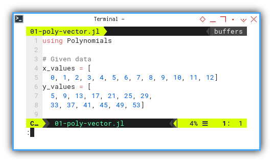
We suspect a linear relationship. And yes, sometimes data is kind enough not to lie to our faces.
Our target regression model:
Let’s let Julia do the math with Polynomials.fit:
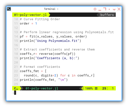
using Polynomials

order = 1
pf = fit(x_values, y_values, order)
println("Using Polynomials.fit")

coeffs_r= reverse(coeffs(pf))
println("Coefficients (a, b):")

coeffs_fmt = [
  round(c, digits=2) for c in coeffs_r]
println(coeffs_fmt, "\n")
We need to set the curve fitting order,
such as one for straight line.
Then perform linear regression using Polynomials.fit.
With the result, we can extract coefficients,
and reverse them to fit the equation above.
And finally printing in rounding decimal format.
We can see the result as follows.
❯ julia 01-poly-vector.jl
Using Polynomials.fit
Coefficients (a, b):
[4.0, 5.0]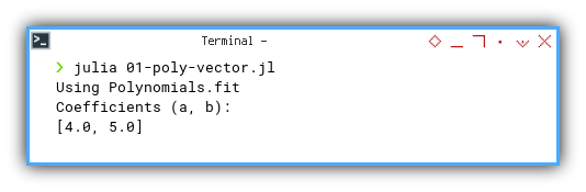
📓 Jupyter version here:
This is the starting point for understanding, how our data trends behave over time or iterations. It helps reveal whether we’re dealing with a polite straight line, or something a bit more rebellious.
Dataframe
Ready to scale up? Let’s switch to using DataFrames for better structure and flexibility.
Instead of array, we can read from CSV, and put the result into dataframe. First we read data from CSV, and sanitize the column names by stripping faces.
using CSV, DataFrames

df = CSV.read("series.csv", DataFrame)
rename!(df, Symbol.(strip.(string.(names(df)))))
Check the contents like any cautious statistician would:
println(last(df,5))
println()
println(names(df))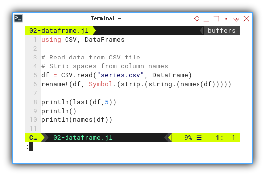
We can see the result as follows.
❯ julia 02-dataframe.jl
5×4 DataFrame
 Row │ xs     ys1    ys2    ys3
     │ Int64  Int64  Int64  Int64
─────┼────────────────────────────
   1 │     8     37    229   1253
   2 │     9     41    284   1742
   3 │    10     45    345   2345
   4 │    11     49    412   3074
   5 │    12     53    485   3941

["xs", "ys1", "ys2", "ys3"]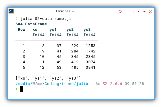
📓 Jupyter version here:
Stack
Long Format
For some kind of visualization, we need to melt the DataFrame to long format.
df_long = stack(df, Not(:xs))

show(df_long, allrows=false)
println("\n")

show(names(df_long))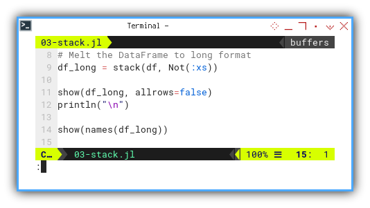
We can see the result as follows.
❯ julia 03-stack.jl
39×3 DataFrame
 Row │ xs     variable  value
     │ Int64  String    Int64
─────┼────────────────────────
   1 │     0  ys1           5
   2 │     1  ys1           9
   3 │     2  ys1          13
   4 │     3  ys1          17
  ⋮  │   ⋮       ⋮        ⋮
  36 │     9  ys3        1742
  37 │    10  ys3        2345
  38 │    11  ys3        3074
  39 │    12  ys3        3941
               31 rows omitted

["xs", "variable", "value"]% 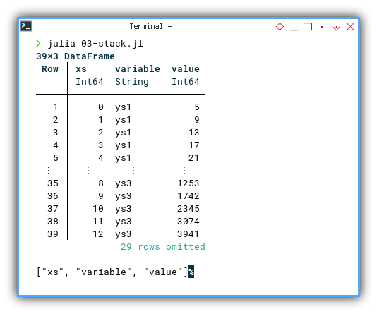
We can see that this dataframe has
three series: [ys1, ys2, ys3].
You can obtain the interactive JupyterLab in this following link:
Stacked (or melted) data makes it easier, to feed multiple series into a single plot. Our charts become neater, and our code becomes less repetitive.
Curve Fitting
Now, the real fun begins. Let’s fit curves of varying orders for our three series.
This is how we can define each series. First, we read data from CSV file, and also strip spaces from column names. Then extract columns from DataFrame.
using CSV, DataFrames, Polynomials, Printf

df = CSV.read("series.csv", DataFrame)
rename!(df, Symbol.(strip.(string.(names(df)))))

x_values = df.xs
y_values1 = df.ys1
y_values2 = df.ys2
y_values3 = df.ys3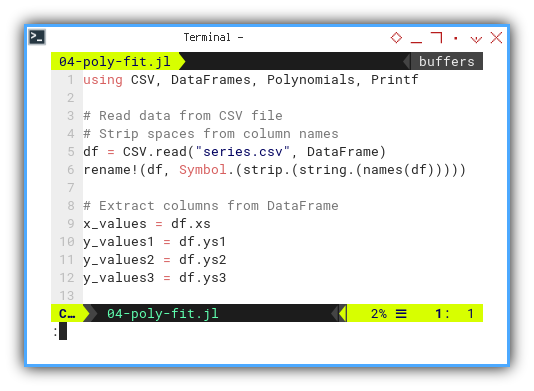
We match each series with a polynomial of suitable ambition. This is how we can calculate polynomial coefficient for each series.
- linear regression (order 1) for
ys₁ - quadratic curve fitting (order 2) for
ys₂ - cubic curve fitting (order 3) for
ys₃
pf_1 = fit(x_values, y_values1, 1)

coeffs_r1 = reverse(coeffs(pf_1))
coeffs_fmt_1 = [
  round(c, digits=2) for c in coeffs_r1]

println("Coefficients (a, b) for ys1:")
println(coeffs_fmt_1, "\n")
… and similarly for pf_2 and pf_3.
pf_2 = fit(x_values, y_values2, 2)
...

pf_3 = fit(x_values, y_values3, 3)
...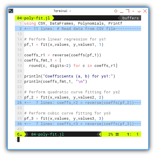
We can see the result as follows.
❯ julia 04-poly-fit.jl
Coefficients (a, b) for ys1:
[4.0, 5.0]

Coefficients (a, b, c) for ys2:
[3.0, 4.0, 5.0]

Coefficients (a, b, c, d) for ys3:
[2.0, 3.0, 4.0, 5.0]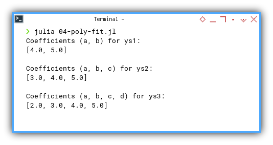
📓 Jupyter version here:
By fitting different polynomial orders, we can assess the complexity of each trend. Are we dealing with a gentle slope or a chaotic rollercoaster?
Merge All Series in One Function
Time to refactor. Let’s write a reusable function and pass symbols like pros.
With this symbol name, we can extract x and y values. Then perform polynomial fitting, for three kinds of polynomial order.
With this equation, we need to reverse coefficients to match output. We also need to round the coefficients, and using string interpolation to print the result
function calc_coeff(df::DataFrame,
    x_col::Symbol, y_col::Symbol, order::Int)

  xs = df[!, x_col]
  ys = df[!, y_col]

  order_text = Dict(1 => "Linear",
    2 => "Quadratic", 3 => "Cubic")
  coeff_text = Dict(1 => "(a, b)",
    2 => "(a, b, c)", 3 => "(a, b, c, d)")

  pf = fit(xs, ys, order)
  cfs_r = reverse(coeffs(pf))
  cfs_fmt = [round(c, digits=2) for c in cfs_r]

  println("Curve type for $y_col: ",
    order_text[order])
  println("Coefficients ",
    "$(coeff_text[order]):\n\t$cfs_fmt\n")
end
Let’s call the function for each ys series with respective order.
df = CSV.read("series.csv", DataFrame)
rename!(df, Symbol.(strip.(string.(names(df)), ' ')))

println("Using Polynomials.fit\n")
calc_coeff(df, :xs, :ys1, 1)
calc_coeff(df, :xs, :ys2, 2)
calc_coeff(df, :xs, :ys3, 3)
We can see the result as follows.
❯ julia 05-poly-merge.jl
Using Polynomials.fit

Curve type for ys1: Linear
Coefficients (a, b):
        [4.0, 5.0]

Curve type for ys2: Quadratic
Coefficients (a, b, c):
        [3.0, 4.0, 5.0]

Curve type for ys3: Cubic
Coefficients (a, b, c, d):
        [2.0, 3.0, 4.0, 5.0]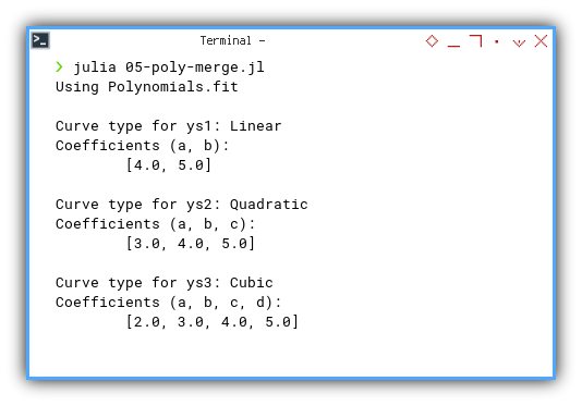
📓 Jupyter version here:
We avoid copy-paste regression, by turning repeated logic into one elegant function. Reusability is the hallmark of statistical sanity.
Plot
Where regressions meet Renaissance.
Wouldn’t it be satisfying, if we could see the regression we just calculated? I mean, what’s the point of fitting models, if we don’t let them strut their stuff on a plot?
Straight Line
Let’s start with the most basic of polynomial creatures: the straight line. No drama, no surprises, just honest-to-goodness linearity.
To begin, we bring in our trusty tools. Think of these as the stat nerd’s brush and palette: We can install using julia REPL.
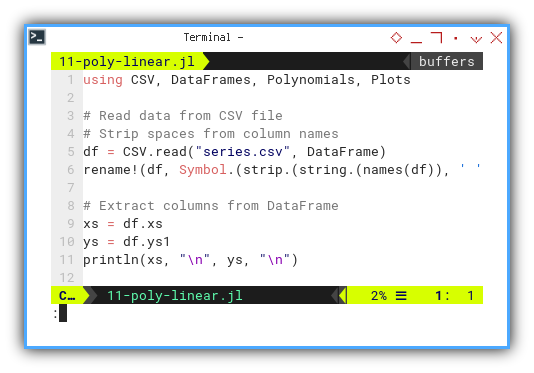
using CSV, DataFrames, Polynomials, PlotsAs usual, we load the data from CSV and sanitize those column names. Then extract columns from DataFrame, like we’re preparing them for polite statistical society:
df = CSV.read("series.csv", DataFrame)
rename!(df, Symbol.(strip.(string.(names(df)), ' ')))

xs = df.xs
ys = df.ys1
println(xs, "\n", ys, "\n")
🖼️ Visual checkpoint
 Seeing all fits
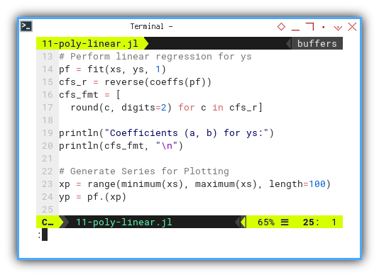
Now we fit a linear model by performing linear regression for ys. And get a new pair series (xp, yp) for the plot. We also pretty-print the coefficients because we’re civilised like that:
pf = fit(xs, ys, 1)
cfs_r = reverse(coeffs(pf))
cfs_fmt = [
  round(c, digits=2) for c in cfs_r]

println("Coefficients (a, b) for ys:")
println(cfs_fmt, "\n")

xp = range(minimum(xs), maximum(xs), length=100)
yp = pf.(xp)
📉 Mid-plot drama
And now, the fun part—drawing it.
As you can see the grammar here is interesting.
First we draw the first plot using scatter,
then we can add the above plot using other plot parts.
All additional parts use exclamation !.
scatter(xs, ys,
  label="Data Points")
plot!(xp, yp, color=:red,
  label="Linear Equation")
xlabel!("X values")
ylabel!("Y values")
title!("Straight line fitting")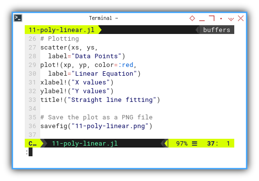
💾 Save our masterpiece
Then finally save the plot output, as a PNG file.
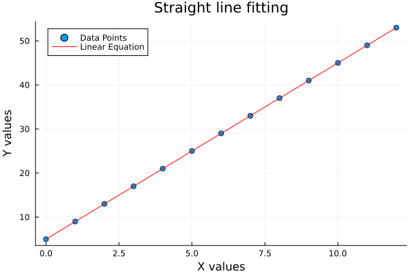
savefig("11-poly-linear.png")We can see the result as follows.
❯ julia 11-poly-linear.jl
[0, 1, 2, 3, 4, 5, 6, 7, 8, 9, 10, 11, 12]
[5, 9, 13, 17, 21, 25, 29, 33, 37, 41, 45, 49, 53]

Coefficients (a, b) for ys:
[4.0, 5.0]
📸 Gallery update
The plot result can be shown as follows:
🧪 Interactive playground:
You can obtain the interactive JupyterLab in this following link:
Linear fitting is our first statistical hello to data trends. It tells us if the relationship walks in a straight line or takes a detour.
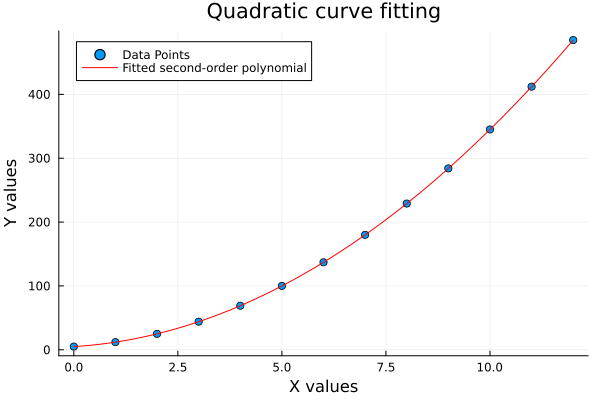
Quadratic Curve
Lines are great. But sometimes data likes to show off and curve a bit. Let’s adapt code above for second order. Extract columns from DataFrame, then perform quadratic regression for ys.
xs = df.xs
ys = df.ys2
println(xs, "\n", ys, "\n")

pf = fit(xs, ys, 2)
cfs_r = reverse(coeffs(pf))
cfs_fmt = [
  round(c, digits=2) for c in cfs_r]

println("Coefficients (a, b, c) for ys:")
println(cfs_fmt, "\n")
📸 Quadratic got curves
The plot result can be shown as follows:
📚 Interactive version:
You can obtain the interactive JupyterLab in this following link:
Quadratics help us catch nonlinear patterns, that a straight line would totally miss. We’re not just drawing curves. We’re modeling real-world bounce and dip.
Cubic Curve
When quadratic still doesn’t cut it, bring in the big polynomial guns: cubic regression.
xs = df.xs
ys = df.ys3
println(xs, "\n", ys, "\n")

pf = fit(xs, ys, 3)
cfs_r = reverse(coeffs(pf))
cfs_fmt = [
  round(c, digits=2) for c in cfs_r]

println("Coefficients (a, b, c, d) for ys:")
println(cfs_fmt, "\n")
🎢 Now that’s a curve
The plot result can be shown as follows:

🧪 Interactive notebook:
You can obtain the interactive JupyterLab in this following link:
Cubic fits are flexible. Maybe too flexible. ike a statistics student overfitting their final project. Use with care.
Merging Plot
Why juggle multiple columns when one will do? Let’s use a single series and fit it using all three orders. Because comparing fits is our version of competitive curling.
Instead of using three series, we can analyze only one series, but using three different orders.
First, we create function skeletons:
using CSV, DataFrames, Polynomials, Plots, Printf

function calc_coeff(df::DataFrame,
    x_col::Symbol, y_col::Symbol, order::Int)
  ...
end

function calc_coeffs(df::DataFrame)
  ...
end

function calc_plot_all(df::DataFrame,
    x_col::Symbol, y_col::Symbol)
  ...
end
We are still using symbol name as parameter argument. Form this we extract x and y values. Then perform polynomial fitting as usual. Remember that we have three kinds of polynomial order.
Fit and print coefficients:
With this equation, we need to reverse coefficients to match output. We also need to round the coefficients, and using string interpolation to print the result
function calc_coeff(df::DataFrame,
    x_col::Symbol, y_col::Symbol, order::Int)

  xs = df[!, x_col]
  ys = df[!, y_col]

  order_text = Dict(1 => "Linear",
    2 => "Quadratic", 3 => "Cubic")
  coeff_text = Dict(1 => "(a, b)",
    2 => "(a, b, c)", 3 => "(a, b, c, d)")

  pf = fit(xs, ys, order)
  cfs_r = reverse(coeffs(pf))
  cfs_fmt = [round(c, digits=2) for c in cfs_r]

  println("Curve type for $y_col: ",
    order_text[order])
  println("Coefficients ",
    "$(coeff_text[order]):\n\t$cfs_fmt\n")
end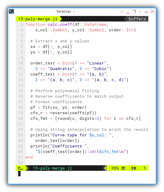
Aggregate results:
Beside plotting, we need to display the coefficient result. Here we call the function for only ys3 column with respective order.
function calc_coeffs(df::DataFrame)
  println("Using Polynomials.fit\n")

  calc_coeff(df, :xs, :ys3, 1)
  calc_coeff(df, :xs, :ys3, 2)
  calc_coeff(df, :xs, :ys3, 3)
end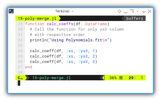
Plot them all:
In this function, we calc and plot.
- Calc all three series and
- Plot all three curve fittings.
function calc_plot_all(df::DataFrame,
    x_col::Symbol, y_col::Symbol)

  # Extract x and y values
  xs = df[!, x_col]
  ys = df[!, y_col]

  # Draw Plot
  xp = range(minimum(xs), maximum(xs), length=100)
  yp1 = fit(xs, ys, 1).(xp)
  yp2 = fit(xs, ys, 2).(xp)
  yp3 = fit(xs, ys, 3).(xp)

  # Plotting
  scatter(xs, ys,
    label="Data Points")
  plot!(xp, yp1, color=:red,
    label="Linear Equation")
  plot!(xp, yp2, color=:green,
    label="Fitted second-order polynomial")
  plot!(xp, yp3, color=:blue,
    label="Fitted third-order polynomial")

  # Decoration
  xlabel!("X values")
  ylabel!("Y values")
  title!("Polynomial Curve Fitting")

  # Save the plot as a PNG file
  savefig("15-poly-merge.png")
end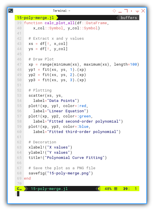
Pull it together:
Let’s gather it all together. Plot all three series.
df = CSV.read("series.csv", DataFrame)
rename!(df, Symbol.(strip.(string.(names(df)))))

calc_coeffs(df)
calc_plot_all(df, :xs, :ys3)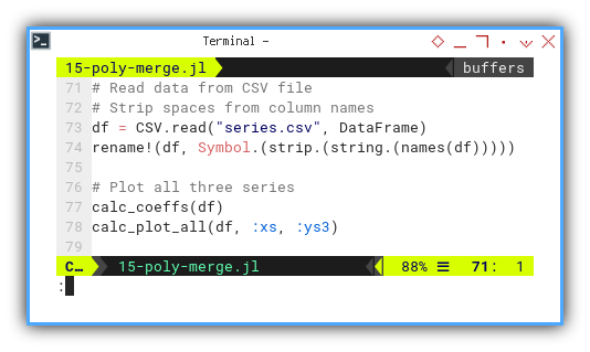
We can see the result as follows.
❯ julia 15-poly-merge.jl
Using Polynomials.fit

Curve type for ys1: Linear
Coefficients (a, b):
        [4.0, 5.0]

Curve type for ys2: Quadratic
Coefficients (a, b, c):
        [3.0, 4.0, 5.0]

Curve type for ys3: Cubic
Coefficients (a, b, c, d):
        [2.0, 3.0, 4.0, 5.0]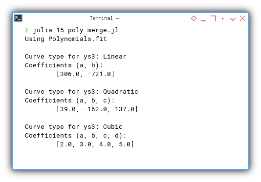
📸 The whole gallery
The plot result can be shown as follows:

📚 Interactive version:
You can obtain the interactive JupyterLab in this following link:
Seeing all fits on one canvas, helps us judge whether our data just wants: a line, a parabola, or full polynomial dramatics.
Struct
Building Class
Julia has unique way to define class. You can observe the example below.
Structs in Julia are how we create custom data types with methods. Think of it like classes, but on vacation. No self, no this, just vibes and clear structure.
It may strange at first. And I don’t know the real reason for not having common building block for the class.
All I can imagine is working with jupyter notebook.
It is easier to write modular code this way,
without the limit of building block issue.
Let’s see the skeleton first.
using CSV, DataFrames, Polynomials, Plots, Printf

mutable struct CurveFitter
  ...
end

function calc_coeff(cf::CurveFitter, order::Int)

  ...
end

function calc_coeffs(cf::CurveFitter)
  ...
end

function calc_plot_all(cf::CurveFitter)
  ...
end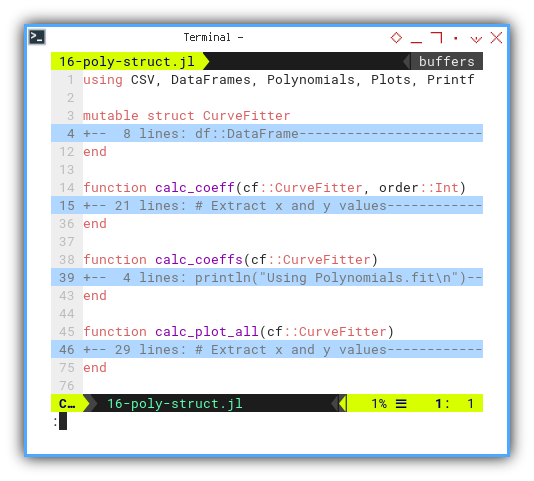
Create our CurveFitter type
Now, let’s see this mutable struct.
mutable struct CurveFitter
  df::DataFrame
  x_col::Symbol
  y_col::Symbol

  function CurveFitter(df::DataFrame,
      x_col::Symbol, y_col::Symbol)
    return new(df, x_col, y_col)
  end
end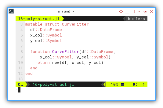
Add methods
Now we can define each methods of the class.
function calc_coeff(cf::CurveFitter, order::Int)
  xs = cf.df[!, cf.x_col]
  ys = cf.df[!, cf.y_col]

  order_text = Dict(1 => "Linear",
    2 => "Quadratic", 3 => "Cubic")
  coeff_text = Dict(1 => "(a, b)",
    2 => "(a, b, c)", 3 => "(a, b, c, d)")

  pf = fit(xs, ys, order)
  cfs_r = reverse(coeffs(pf))
  cfs_fmt = [round(c, digits=2) for c in cfs_r]

  println("Curve type for $(cf.y_col): ",
    order_text[order])
  println("Coefficients ",
    coeff_text[order], ":\n\t", cfs_fmt, "\n")
end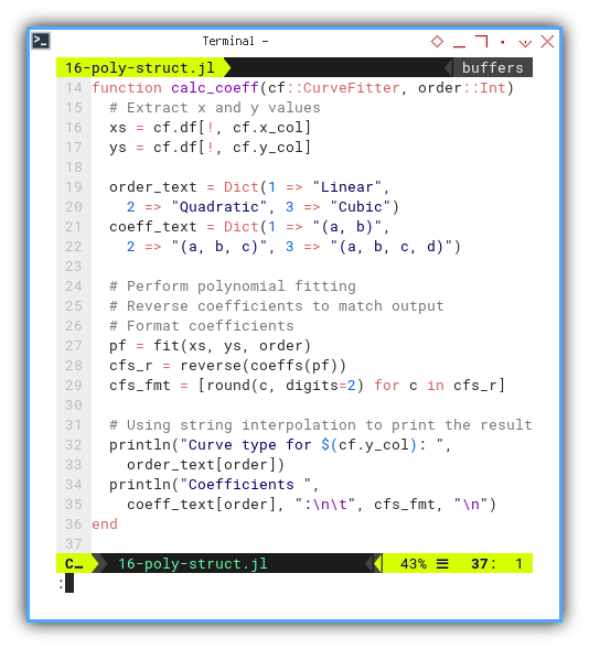
There is no self
Each method use cf::CurveFitter as first parameter.
function calc_coeffs(cf::CurveFitter)
  println("Using Polynomials.fit\n")
  for order in 1:3
    calc_coeff(cf, order)
  end
end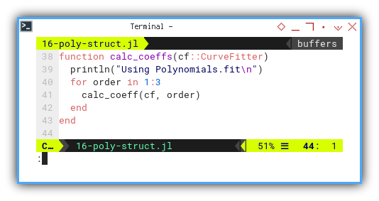
This method is very similar with previous function.
function calc_plot_all(cf::CurveFitter, y_col::Symbol)
  xs = cf.df[!, cf.x_col]
  ys = cf.df[!, cf.y_col]

  xp = range(minimum(xs), maximum(xs), length=100)
  yp1 = fit(xs, ys, 1).(xp)
  yp2 = fit(xs, ys, 2).(xp)
  yp3 = fit(xs, ys, 3).(xp)

  scatter(xs, ys,
    label="Data Points")
  plot!(xp, yp1, color=:red,
    label="Linear Equation")
  plot!(xp, yp2, color=:green,
    label="Fitted second-order polynomial")
  plot!(xp, yp3, color=:blue,
    label="Fitted third-order polynomial")

  xlabel!("X values")
  ylabel!("Y values")
  title!("Polynomial Curve Fitting")

  savefig("16-poly-struct.png")
end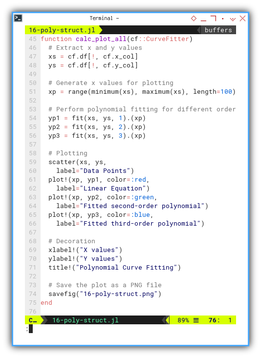
Again, let’s gather all stuff together. After reading data from CSV file. We need to instantiate the class, and call any necessary method.
This can be done by defining a CurveFitter object. then calculate coefficients and plot all three series.
df = CSV.read("series.csv", DataFrame)
rename!(df, Symbol.(strip.(string.(names(df)))))

cf = CurveFitter(df, :xs, :ys3)
calc_coeffs(cf)
calc_plot_all(cf)
We can see the result as follows.
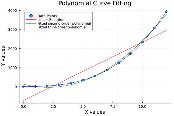
❯ julia 16-poly-struct.jl
Using Polynomials.fit

Curve type for ys1: Linear
Coefficients (a, b):
        [4.0, 5.0]

Curve type for ys2: Quadratic
Coefficients (a, b, c):
        [3.0, 4.0, 5.0]

Curve type for ys3: Cubic
Coefficients (a, b, c, d):
        [2.0, 3.0, 4.0, 5.0]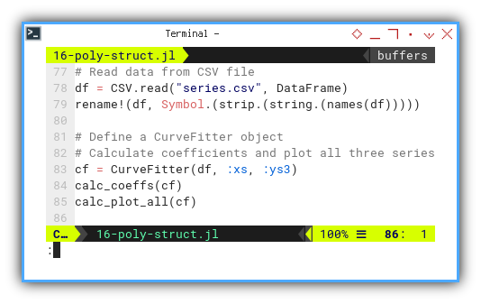
The plot result can be shown as follows:
You can obtain the interactive JupyterLab in this following link:
Modularizing our work like this makes reuse and experimentation a breeze. It’s not just tidy. It’s practical.
What’s the Next Chapter 🤔?
We’re back on our noble quest through the kingdom of Julia,
armed with semicolons and sharp wits.
This time, we’re building classes
(a.k.a. types, because classes are so last season),
exploring statistical properties,
and flexing our UTF-8 muscles,
to write equations that look like,
they walked straight out of a LaTeX fashion show.
Why bother? Because writing μ and σ²,
instead of mean and variance doesn’t just make us look smarter,
it reduces cognitive switching between notation and code.
It’s like giving our brain better variable names, but in Greek.
Also, this approach bridges the gap , etween our code and the math in the textbooks. Fewer translation errors, fewer headaches. It’s like bringing a fluent interpreter, to a multilingual statistics conference.
As always, we balance rigor with readability. And sneak in a pun when least expected.
Consider continuing your Julia-verse adventures with
👉 [ Trend - Language - Julia - Part Two ].