Preface
Goal: Solving trend with built-in method available in excel and python, without reinventing the wheel.
Before we dive into the stone-age ritual of manual curve fitting, armed with nothing but grid cells and existential dread, let’s appreciate the magic of built-in tools.
Think of them as the microwave ovens of data analysis: press a button, get results. No firewood. No tears. Why make life harder when your spreadsheet can do algebra for you?
Here’s the cast of characters:
-
Excel/Calc: The
LINEST(statistically smarter than your boss). -
Python: The
Polynomiallibrary (because polyfit is so last decade).
This saves time: no more manual sums, squares, or swearing at your screen, and also reduces errors.
“Work smarter, not harder, unless you enjoy unnecessary suffering.”
Worksheet Source
Playsheet Artefact
A single workbook to rule them all (or at least trend-fit them all).

Feel free to poke around or break it lovingly:
1: Linest
Need a trendline? LINEST is the statistical butler of Excel.
It serves you linear, quadratic, and cubic fits on a silver platter.
-
Linear:
y = a + bx(the classic “straight line through chaos”). -
Quadratic:
y = a + bx + cx²(for when life gets curvy). -
Cubic:
y = a + bx + cx² + dx³(because sometimes data has drama).
The easiest way to get curve fitting coefficient,
in spreadsheet in Excel or Calc is by using LINEST formula.
LINEST handles regression calculations for us,
including slope, intercept, and more.
Order Matters
Unlike in Some Meetings
The equation complexity scales with the polynomial degree. Here’s the cheat sheet:
Linear Linest
The Straightforward One
Start simple, consider this linear equation:
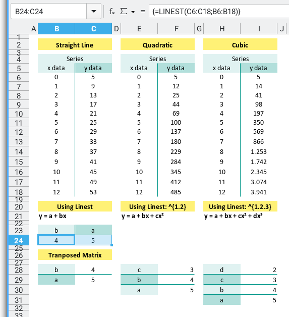
The LINEST formula follows the format.
Be aware that the first argument is y column first,
then x column.
=LINEST(y_observed, x_observed)
=LINEST(C6:C18;B6:B18)
Just don’t get the order reversed, or you’ll end up modeling chaos.
To save space (and your sanity), use TRANSPOSE:
=TRANSPOSE(LINEST(y_observed, x_observed))
=TRANSPOSE(LINEST(C6:C18;B6:B18))
With this result, we get the linear equation as
This gives you the coefficients directly. No matrix math required.
Quadratic Linest
When Life Isn’t Linear
The curve deepens, consider this quadratic equation:
The formula is as below:
=LINEST(y_observed, x_observed^{1.2})
=LINEST(F6:F18;E6:E18^{1.2})
And the transposed version is:
=TRANSPOSE(LINEST(y_observed, x_observed^{1.2}))
=TRANSPOSE(LINEST(F6:F18;E6:E18^{1.2}))
With this result, we get the quadratic equation as
Quadratic models help when your data has inflection points.
Pro tip: Use Ctrl+Shift+Enter because this is an array formula. Excel wants you to really mean it.
Cubic Linest
For Extra Spice
With the same method we can get cubic equation:
The formula is as below:
=LINEST(y_observed, x_observed^{1.2.3})
=LINEST(I6:I18;H6:H18^{1.2.3})
And the transposed version is:
=TRANSPOSE(LINEST(y_observed, x_observed^{1.2.3}))
=TRANSPOSE(LINEST(I6:I18;H6:H18^{1.2.3}))
With this result, we get the quadratic equation as
Again, Ctrl+Shift+Enter, since the formula contain array such as {1.2.3},
Excel insists. Like a parent checking your homework.
Array Operation
So what is this x_observed^{1.2.3} after all?
This is arrays of variables: [xs₁, xs₂, or xs₃].
Yo can try yourself in Excel/Calc with something like:
{=H6:H18^{1.2.3}}Don’t forget to ctrl+shift+enter.
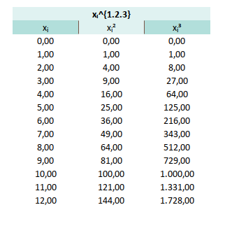
We will need this to built gram matrix later to solve [ys₁, ys₂, or ys₃].
We can also compare to PSPP variable later.
Comparing Linest
Let’s Judge Them All.
Same series. Three different models. Let’s compare, shall we?
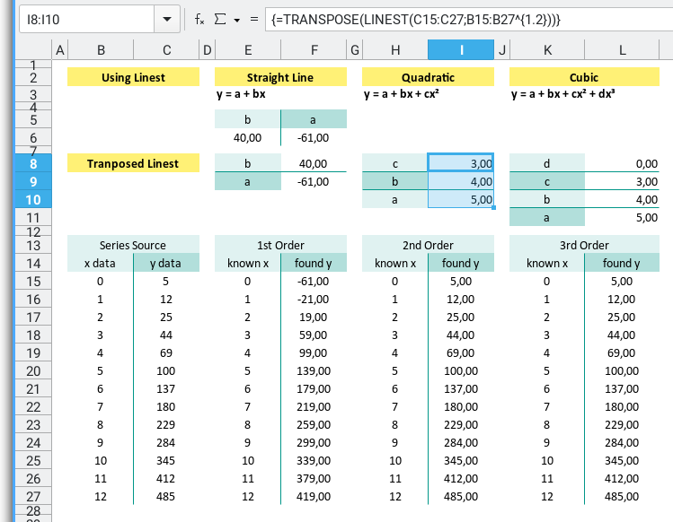
Fit all three models to the same data and ask ourself:
- Does it look right? (Eyeball test) Which one fits the best?
- Does it feel right? (Stats test. But we’ll get to that later.)
- Do I really need that third-degree polynomial or am I just overfitting my ego? Is the extra complexity worth it?
“If your cubic curve has more twists than your thesis, simplify.”
2: Polyfit
Want curve-fitting in Python without summoning the ghost of Gauss?
Say hello to polyfit, NumPy’s built-in function,
that takes your scattered data,
and slaps a line (or curve) through it like it means business.
The library that we need is just numpy and matplotlib.
Two imports. Infinite possibilities. And zero manual calculations.
import numpy as np
import matplotlib.pyplot as plt
The easiest way to get curve fitting coefficient,
in python script is by using polyfit method in numpy,
or the new Polynomial library in numpy.
Instead of wrestling with matrix math,
polyfit or Polynomial library,
gives us instant coefficients,
like a vending machine for regression models.
Linear Polyfit
You can obtain the source code in below link:
We can start with given data series and order.
x_values = np.array([
  0, 1, 2, 3, 4, 5, 6, 7, 8, 9, 10, 11, 12])
y_values = np.array([
  5, 9, 13, 17, 21, 25, 29, 33, 37, 41, 45, 49, 53])
Then getting the polynomial coefficient using polyfit method:
# Curve Fitting Order
order = 1

# Perform linear regression using polyfit
mC = np.polyfit(x_values, y_values, deg=order)
print('Using polyfit')
print(f'Coefficients (a, b):\n\t{np.flip(mC)}\n')
With the result as below coefficient:
Using polyfit
Coefficients (a, b):
        [5. 4.]
With this result, we get the linear equation as
Perfect for trendlines, forecasting, or pretending we’re a data wizard at meetings.
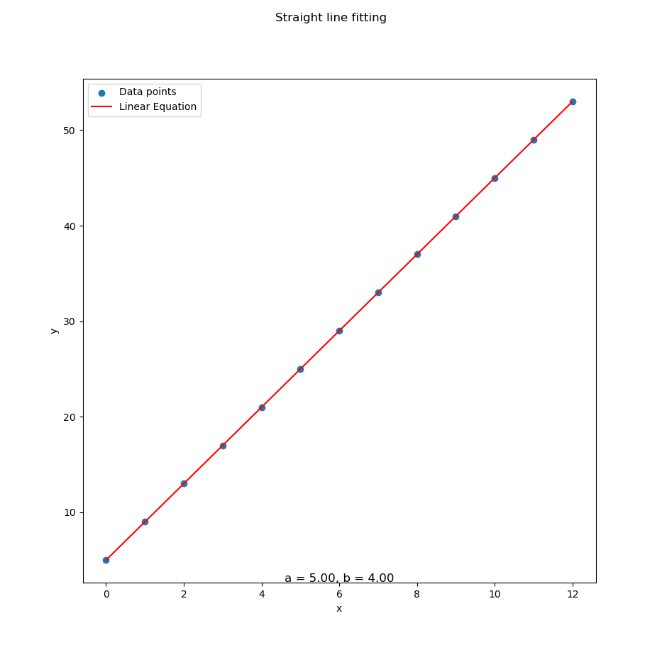
Matplotlib
Seeing is Believing
We can plot the result with matplotlib.
First calculate the x_plot and y_plot:
# Draw Plot
[a, b] = np.flip(mC)
x_plot = np.linspace(min(x_values), max(x_values), 100)
y_plot = a + b * x_plot
Then draw two chart in the same plt object.
Add the scatterplot and the fitted line:
plt.scatter(x_values, y_values, label='Data points')
plt.plot(x_plot, y_plot, color='red',
  label='Linear Equation')
Add some accesories: labels, legends, and title:
plt.legend()
plt.xlabel('x')
plt.ylabel('y')
plt.suptitle(
  'Straight line fitting')
And finally show the plot.
subfmt = "a = %.2f, b = %.2f"
plt.title(subfmt % (a, b), y=-0.01)

plt.show()
Now we can enjoy the simple result as below:
You can obtain the interactive JupyterLab in following link:
Visual feedback helps catch errors fast, or show off to your boss with colorful graphs.
Quadratic Polyfit
Now With Curves™
You can obtain the source code in below link:
Here’s a dataset that’s clearly living its best parabolic life:
x_values = np.array([
  0, 1, 2, 3, 4, 5, 6, 7, 8, 9, 10, 11, 12])
y_values = np.array([
  5, 12, 25, 44, 69, 100, 137,
  180, 229, 284, 345, 412, 485])
Just set order = 2, and let polyfit do its polynomial sorcery
with the result as below:
Using polyfit
Coefficients (a, b, c):
        [5. 4. 3.]
That result gives us quadratic equation as
And the plot? With data series above, a perfect fit for our data:
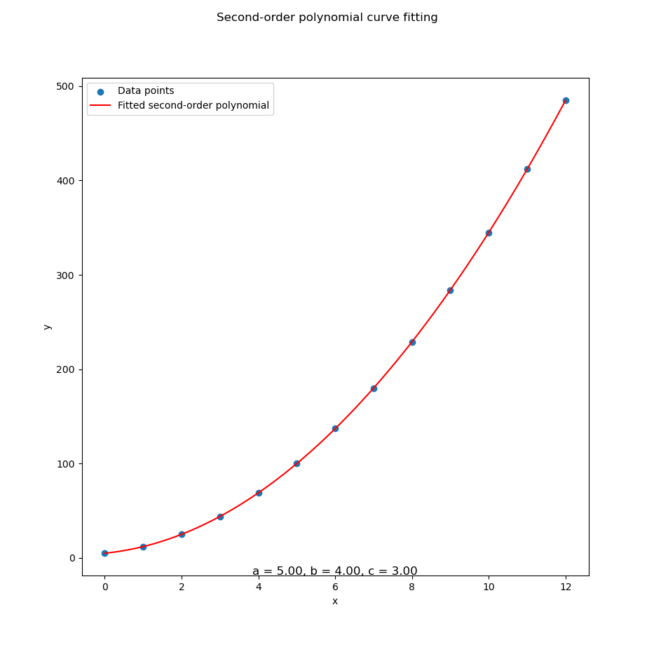
You can obtain the interactive JupyterLab version in following link:
Quadratic models are great when our data bends.
Cubic Polyfit
We can start with given data series and order.
x_values = np.array([
  0, 1, 2, 3, 4, 5, 6, 7, 8, 9, 10, 11, 12])
y_values = np.array([
  5, 14, 41, 98, 197, 350, 569, 866,
  1253, 1742, 2345, 3074, 3941])
You can obtain the source code in below link:
Set order = 3, and we’re in business.
Using similar script we can get the coefficient of cubic equation,
with the result as below:
Using polyfit
Coefficients (a, b, c):
        [5. 4. 3.]
With this result, we get the cubic equation as
Let’s see the visual confirmation:
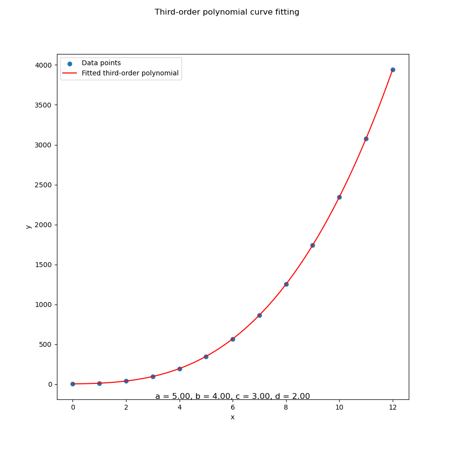
You can obtain the interactive JupyterLab in following link:
Cubic fits handle complex curves, ideal for growth trends, fancy predictions, or data that’s just a little extra.
3: Playing with data
Once you’ve tamed the basics of polyfit,
it’s time to have some fun.
We’re now mixing and matching polynomial orders (1st, 2nd, 3rd)
with different custom data series, aka ys1, ys2, and ys3.
Think of it as speed dating for polynomials: which model will be your perfect match?
You can try this at home (or the office, we won’t judge):
Custom Series
Choose your own adventure: Linear, Parabolic, or “Whoa, that escalated quickly.”
We’ve defined three data series with increasing levels of drama:
-
ys₁: Calm, consistent, linear. (your accountant would love it). -
ys₂: A gentle parabola. (slightly dramatic but manageable). -
ys₃: A full-blown polynomial soap opera.
No need for ys₄, and ys₅.
def main() -> int:
  order = 2

  xs = [ 0, 1, 2, 3, 4, 5, 6, 7, 8, 9, 10, 11, 12]
  ys1 = [ 5, 9, 13, 17, 21, 25, 29,
    33, 37, 41, 45, 49, 53]
  ys2 = [ 5, 12, 25, 44, 69, 100, 137,
    180, 229, 284, 345, 412, 485]
  ys3 = [ 5, 14, 41, 98, 197, 350, 569,
    866, 1253, 1742, 2345, 3074, 3941]

  example = CurveFitting(xs, ys3)
  example.process()

  return 0

if __name__ == "__main__":
  raise SystemExit(main())
Real-world data rarely follows a perfect line. Testing different series and polynomial degrees helps us choose the model that best fits the story our data is telling.
Class Skeleton
Where object-oriented design meets polynomial destiny.
All of this curve-fitting goodness is wrapped neatly in a CurveFitting class.
Oour one-stop shop for modeling, plotting, and feeling like a software architect.
Skeleton methods include:
calc_coeff(): Finds our precious coefficients.calc_plot_*(): Generates points for plotting (based on the polynomial order).draw_plot(): Unleashes matplotlib to draw your masterpiece.process(): Glues it all together so you don’t have to.
This utilized custom CurveFitting class with skeleton as below:
class CurveFitting:
  def __init__(self, order: int,
  def calc_coeff(self) -> None:
  def calc_plot_1st(self) -> None:
  def calc_plot_2nd(self) -> None:
  def calc_plot_3rd(self) -> None:
  def draw_plot(self) -> None:
  def process(self) -> None:

def main() -> int: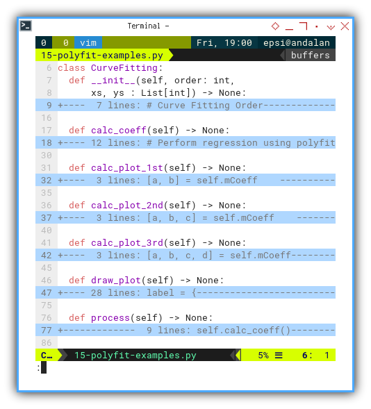
The link to the source code is given above.
Encapsulation keeps things clean and reusable. Plus, we’ll impress our coworkers with phrases like “modular polynomial architecture”.
Example Curve Fitting
Statistically speaking, this is where the magic happens.
For example let’s try the third series ys₃, with polyfit of second order polynomial:
  ys3 = [ 5, 14, 41, 98, 197, 350, 569,
    866, 1253, 1742, 2345, 3074, 3941]
Which gives us the result as below coefficient:
Using polyfit
Coefficients (a, b, c):
        [ 137. -162.   39.]
We get the quadratic equation . A bold, expressive curve that fits our data like a glove made of quadratic velvet.
Let’s get the visual confirmation from ys₃ data series.
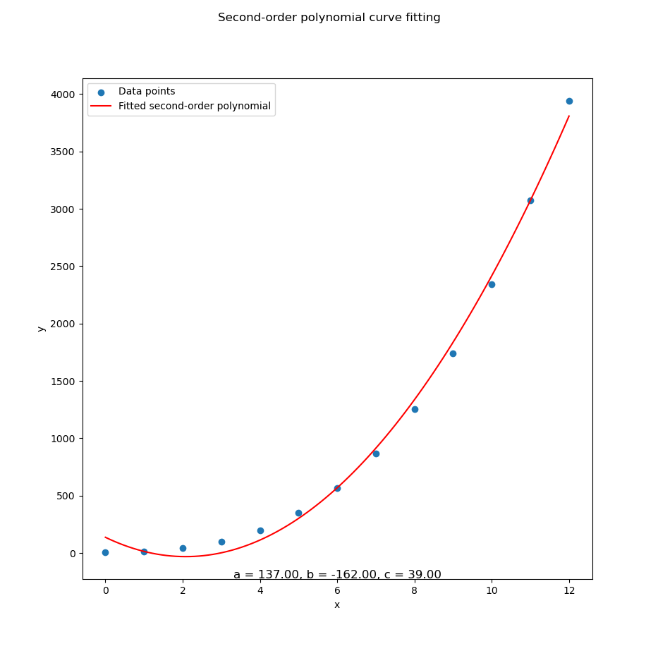
This isn’t just number-crunching. It’s pattern-finding. Whether we’re modeling sales trends, rocket trajectories, or rice prices at south Jakarta, curve fitting reveals the underlying shape of our data.
4: Comparing Plot
Why choose one curve when you can have them all?
Sometimes, choosing just one model feels like picking a favorite child. Impossible and politically dangerous. So why not plot everything and let the visuals speak louder than our analysis?
Here’s how we throw all our polynomial fits, into one glorious plot for easy comparation.
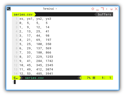
Data Series
tale of three ys: The Linear, the Parabolic, and the Polynomial That Went Too Far.
We’re working with three pre-cooked series.
You may choose ys₁, ys₂, or ys₃:
xs, ys1, ys2, ys3
0,  5,   5,   5
1,  9,   12,  14
2,  13,  25,  41
3,  17,  44,  98
4,  21,  69,  197
5,  25,  100, 350
6,  29,  137, 569
7,  33,  180, 866
8,  37,  229, 1253
9,  41,  284, 1742
10, 45,  345, 2345
11, 49,  412, 3074
12, 53, 485, 3941Comparing all three helps us see which model best matches reality. Or at least fakes it convincingly.
Code Logic
Polyfit Party
We manage the main method.
We start with the main(),
store array in numpy.
We read the CSV, transpose it (because numpy likes it that way),
and run our custom CurveFitting class using one of the series.
Say, ys₃ for maximum curve drama.
def main() -> int:
  # Getting Matrix Values
  mCSV = np.genfromtxt("series.csv",
    skip_header=1, delimiter=",", dtype=float)
  mCSVt   = np.transpose(mCSV)

  example = CurveFitting(mCSVt[0], mCSVt[3])
  example.process()

  return 0
Let’s say that we pick ys₃,
then we choose mCSVt[3] as curve fitting parameter.
Class Skeleton
Let’s peek into the skeleton of our CurveFitting class.
Think of it as the statistical wardrobe,
where all our polynomial fits hang out,
neatly labeled and ready to go.
class CurveFitting:
  def __init__(self, xs, ys : List[int]) -> None:
  def calc_coeff(self, order) -> np.ndarray:
  def calc_plot_all(self) -> None:
  def draw_plot(self) -> None:
  def process(self) -> None:

def main() -> int:
The link to the source code is given above.
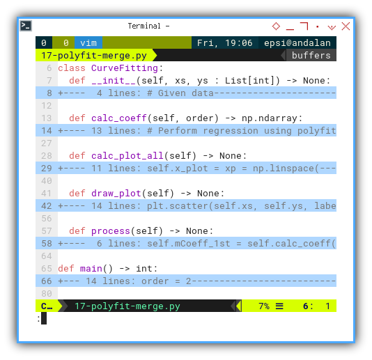
A clear class structure means our code won’t descend into chaos when degrees of polynomials start multiplying like rabbits.
Class
Setting Up the Stats Lab
Our class kicks off with some basic data preparation. Turning our poor, innocent lists into mighty numpy arrays.
class CurveFitting:
  def __init__(self, xs, ys : List[int]) -> None:

    # Given data
    self.xs = np.array(xs)
    self.ys = np.array(ys)
Converting to numpy arrays enables fast numerical operations. Iterating with plain lists is so last century.
Calculate Coefficient
The Shape of Things to Come
Time to fit our equations!
We use np.polyfit to find the best-fitting coefficients
for 1st, 2nd, and 3rd-degree polynomials.
Or, as statisticians call them: the polite, the dramatic,
and the “are you sure this isn’t overfitting?”
Why it matters:
  def calc_coeff(self, order) -> np.ndarray:
    # Perform regression using polyfit,
    mC = np.polyfit(self.xs, self.ys, deg=order)

    # Display
    coeff_text = {
      1: '(a, b)', 2: '(a, b, c)', 3: '(a, b, c, d)'}
    order_text = {
      1: 'Linear',  2: 'Quadratic ', 3: 'Cubic'}

    print(f'Using polyfit : {order_text[order]}')
    print(f'Coefficients  : {coeff_text[order]}:'
      + f'\n\t{np.flip(mC)}\n')

    # Get coefficient matrix
    return np.flip(mC)
Fitting curves lets us model trends, make predictions, and impress friends at data parties.
Get all the coefficient:
  def process(self) -> None:
    self.mCoeff_1st = self.calc_coeff(1)
    self.mCoeff_2nd = self.calc_coeff(2)
    self.mCoeff_3rd = self.calc_coeff(3)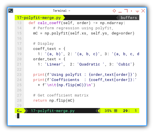
With the coefficient result as:
❯ python 17-polyfit-merge.py
Using polyfit : Linear
Coefficients  : (a, b):
	[-721.  306.]

Using polyfit : Quadratic
Coefficients  : (a, b, c):
	[ 137. -162.   39.]

Using polyfit : Cubic
Coefficients  : (a, b, c, d):
	[5. 4. 3. 2.]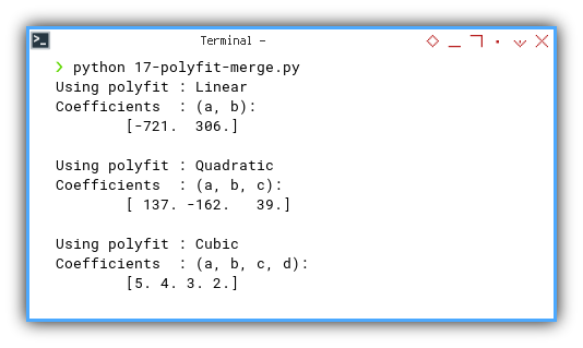
Now we have all the equations:
A linear model walks into a bar. The bartender says, “We don’t serve your kind." The model replies, “That’s OK, I’m just passing through."
Calculate All the Plot Values
Drawing Data Like a Pro
Armed with coefficients,
we can now compute our predicted values.
This is the part where theory meets pixels.
With that coefficient above,
we can calculate all the x_plot and y_plot values.
  def calc_plot_all(self) -> None:
    self.x_plot = xp = np.linspace(
      min(self.xs), max(self.xs), 100)

    [a1, b1] = self.mCoeff_1st
    self.y1_plot = a1 + b1 * xp

    [a2, b2, c2] = self.mCoeff_2nd
    self.y2_plot = a2 + b2 * xp + c2 * xp**2

    [a3, b3, c3, d3] = self.mCoeff_3rd
    self.y3_plot = a3 + b3 * xp + c3 * xp**2 + d3 * xp**3
Or better, without flipping the mC,
just use the polyval.
Also, for the lazy but efficient (i.e. every good data scientist),
np.polyval saves us from having to write out the full equation manually.
Less typing, more plotting.
  def calc_plot_all(self) -> None:
    self.x_plot = xp = np.linspace(
      min(self.xs), max(self.xs), 100)

    self.y1_plot = np.polyval(self.calc_coeff(1), xp)
    self.y2_plot = np.polyval(self.calc_coeff(2), xp)
    self.y3_plot = np.polyval(self.calc_coeff(3), xp)
Plotting without computing is like trying to draw a sine wave from memory. You’ll end up with something that looks more like spaghetti than science.
Draw Plot
From Math to Masterpiece
Raw numbers are great, but visualizing the fit helps us (and our audience) see the story behind the data.
Now we bring it all together in one glorious matplotlib plot.
Scatter the real data, paint the fitted curves, and voilà: statistical art.
Let’s plot all the different y_plot series in one plt object.
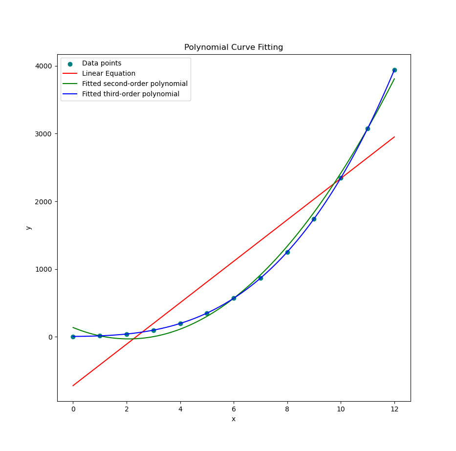
  def draw_plot(self) -> None:
    plt.scatter(self.xs, self.ys, label='Data points', color='teal')
    plt.plot(self.x_plot, self.y1_plot, color='red',
      label='Linear Equation')
    plt.plot(self.x_plot, self.y2_plot, color='green',
      label='Fitted second-order polynomial')
    plt.plot(self.x_plot, self.y3_plot, color='blue',
      label='Fitted third-order polynomial')

    plt.legend()
    plt.xlabel('x')
    plt.ylabel('y')
    plt.title('Polynomial Curve Fitting')

    plt.show()
Use different colors. Even statisticians deserve a little joy.
A good plot is worth a thousand equations. Chance are, our professor won’t read your regression output, if our plot already tells the story.
Execute Process
Final Act of Curve Theatre
The process() method is our conductor.
Orchestrating coefficient calculation, plot preparation,
and the final rendering of all curves.
It’s like conducting Beethoven or Gamelan,
but with more numpy.
  def process(self) -> None:
    self.mCoeff_1st = self.calc_coeff(1)
    self.mCoeff_2nd = self.calc_coeff(2)
    self.mCoeff_3rd = self.calc_coeff(3)

    self.calc_plot_all()
    self.draw_plot()
Behold the curve-fitting magic in action:
And for the hands-on types, you can run it all in JupyterLab.
Keeping our workflow in one place makes the logic clear, reproducible, and less likely to cause future-us, a mental breakdown.
Polynomial Library
Curve Fitting, Now with Extra Fancy
Tired of the same old polyfit?
Spice it up with Polynomial.fit,
the modern twist that brings style (and stability)
to our regression.
And why not throw in Seaborn styling, while we’re at it? Even equations deserve to be pretty.
    def calc_plot_all(self) -> None:
        self.x_plot = xp = np.linspace(
            min(self.xs), max(self.xs), 100)

        # Calculate coefficients directly
        self.y1_plot = Polynomial.fit(self.xs, self.ys, deg=1)(xp)
        self.y2_plot = Polynomial.fit(self.xs, self.ys, deg=2)(xp)
        self.y3_plot = Polynomial.fit(self.xs, self.ys, deg=3)(xp)
Plot result? Identical. But cooler. Statistically approved.
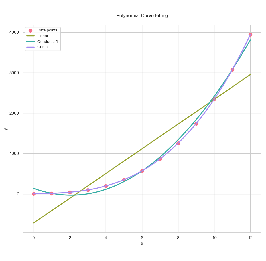
Get the polished Jupyter notebook here. And may your R²s always be close to 1.
Using newer libraries helps write more concise, readable code. And makes our GitHub repo look like it’s from this decade.
What’s the Next Exciting Step 🤔?
Fitting a curve is like getting a tailored suit. It looks great, but it doesn’t tell you how the tailor did it. If we want to build real understanding (and maybe even brag at math parties), we need to look under the hood.
Okay, so we’ve been talking about curves, models, math, and code. And if you’re wondering whether this is turning into a full-blown math lecture… You’re not wrong. But hang in there. It’s about to get even nerdier, and that’s a good thing!
Now that we’ve explored built-in formulas and fitting methods
(thank you, numpy.polyfit and friends), it’s time to up the ante.
So what’s next? We’ll be diving into solving equations. Not just any equations, but the kind that show up when you actually try to construct those curves yourself:
-
A system of linear equations (our classic y = mx + b gang),
-
Then things escalate to quadratic and cubic systems (yes, bring our imaginary friends, roots, that is).
Ready for the next leap?
Continue your journey with: [ Trend - Polynomial Interpolation ].
Let’s go from following the curve to building it from scratch. And who knows, we might start enjoying solving systems of equations.