Preface
Goal: Explore R Programming language visualization with ggplot2. Providing the data using linear model.
We are back in R land, where plots are beautiful,
models are linear, and the coffee is implied.
This time, our journey ventures beyond just fitting lines,
we begin assigning roles to our data.
Who belongs where?
hat kind of behavior do they exhibit?
Is this point just an outlier or a misunderstood rebel?
Our mission now is to build classes and extract statistical properties. Think of this as the Hogwarts Sorting Hat but written in tidyverse.
Plotting trends is lovely, but statistical modeling adds meaning. It’s what turns our colorful dots into interpretable patterns, allowing us to classify, explain, and even predict. In short, it’s where data starts earning its keep.
So let us put our lab coats back on,
keep ggplot2 within reach,
and continue charting the story where our points not only fit in.
They find their purpose.
Let’s continue our previous R journey,
with building class and statistical properties.
Trend: Building Class
Real life experience requrie us to manage our code. This tidying process often be done by creating a class. This tedious process usually started by making the function first, then move them to a class.
We cannot afford a spaghetti bowl of copy-pasted code chunks We need to get civilized. That means tidying up with functions, and eventually, wrapping everything into a class.
But of course, like all noble things in statistics, it starts with a tiny bit of suffering.
Refactor to Function
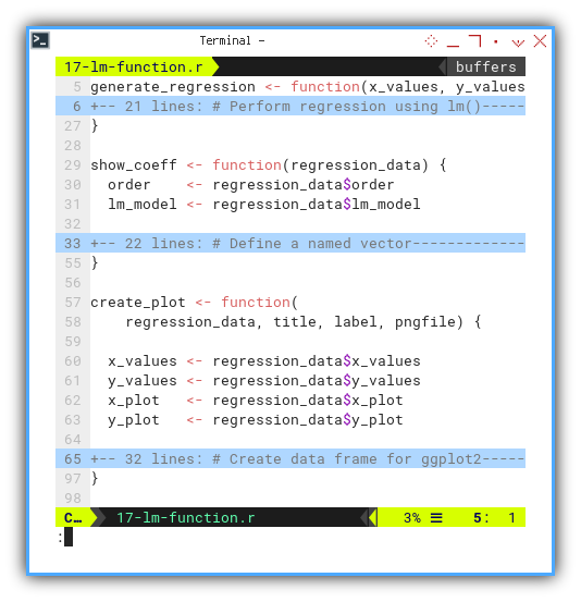
Let’s make move the plain code above to a function. The problem with function is we need a bunch variables, for input and output between function.
Let’s load our toolkit first:
library(readr)
library(ggplot2)
Then put the code to function one at a time,
for example this generate_regression function,
that performing regression using lm(),
generate values for the regression line,
and finally return a list containing all relevant objects.
generate_regression <- function(x_values, y_values, order) {
  ...

  return(list(
    order = order,
    x_values = x_values,
    y_values = y_values,
    lm_model = lm_model,
    x_plot = x_plot,
    y_plot = y_plot
  ))
}
Then we can use the regression data, to show the coefficient.
show_coeff <- function(regression_data) {
  order    <- regression_data$order
  lm_model <- regression_data$lm_model

  ...
}
And finally, wrap the plot in a create_plot function, to do the artistic bit.
create_plot <- function(
    regression_data, title, label, pngfile) {

  x_values <- regression_data$x_values
  y_values <- regression_data$y_values
  x_plot   <- regression_data$x_plot
  y_plot   <- regression_data$y_plot

  ...
}
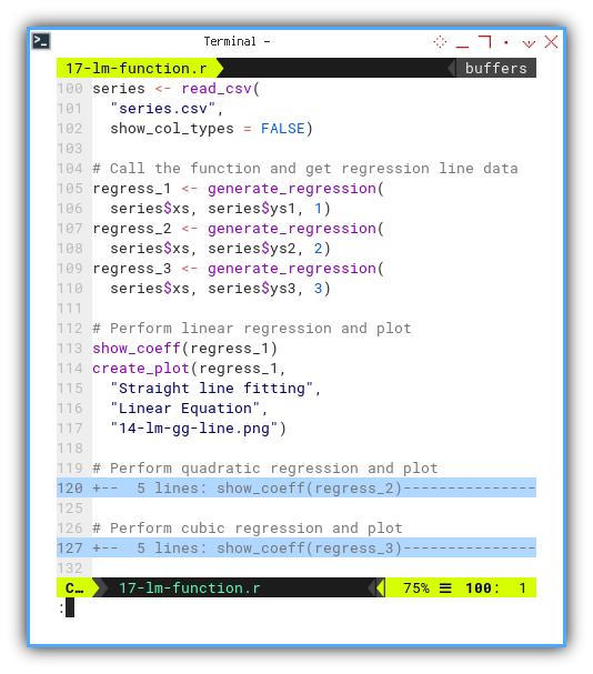
Once we have our function army, we just call them in order, in main script, the outer block of the code. Like conducting a linear symphony:
regress_1 <- generate_regression(
  series$xs, series$ys1, 1)
regress_2 <- generate_regression(
  series$xs, series$ys2, 2)
regress_3 <- generate_regression(
  series$xs, series$ys3, 3)

show_coeff(regress_1)
create_plot(regress_1,
  "Straight line fitting",
  "Linear Equation",
  "14-lm-gg-line.png")

...
Want to tinker interactively? Here’s the JupyterLab notebook:
Functions reduce code duplication, prevent us from losing our sanity, and make our scripts more readable. Even by our future selves.
Merging The Plot
Instead of generating separate plots for each regression order, let’s go full ensemble cast. Same input, multiple fits, one shared stage.
Here’s the new function skeleton:
generate_regressions <- function(x_values, y_values) {
  ...
}

show_coeff <- function(order, lm_model) {
  ...
}

create_plot <- function(regression_data) {
  ...
}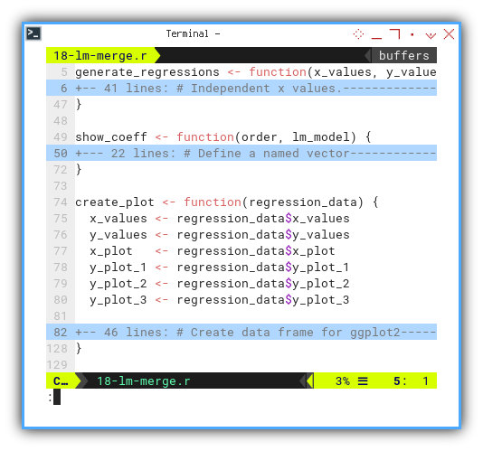
Now we can call the function in main script. Get the regression data. And perform linear regression and plot.
regress <- generate_regressions(
    series$xs, series$ys3)

show_coeff(1, regress$lm_model_1)
show_coeff(2, regress$lm_model_2)
show_coeff(3, regress$lm_model_3)
plot <- create_plot(regress)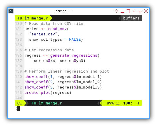
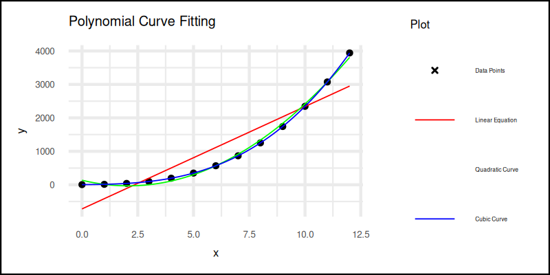
This time, we fit linear, quadratic, and cubic curves and show them all in a single elegant plot.
The plot result can be shown as follows. You can see that in the legend, it lost one color. The green one for quadratic curve legend does not shown well. You can solve this by removing the guides.
Interactive notebook available here:
The problem with function is we need a bunch variables, for input and output between function.
Using R6 Class
Instead of function me can wrap them all into a class.
R has a few kind of class implementation,
one of them is R6
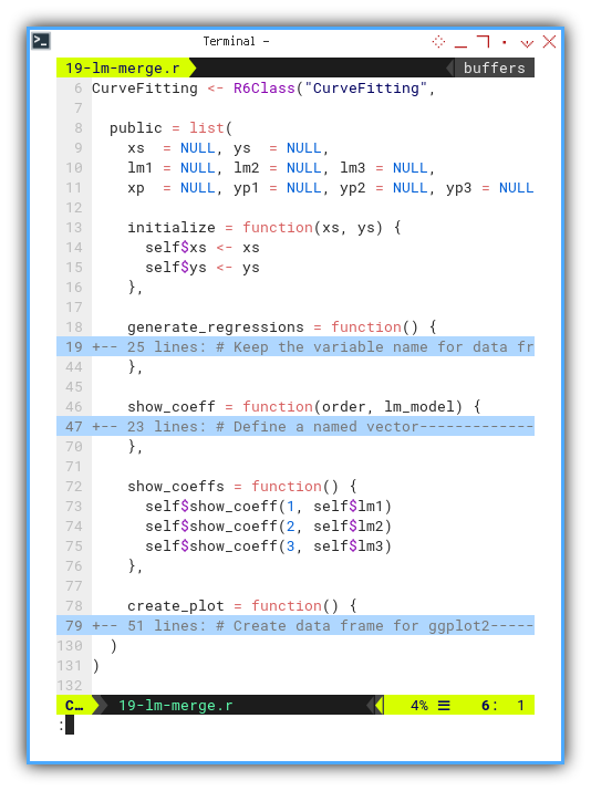
Here’s a trimmed R6 class skeleton for curve fitting:
CurveFitting <- R6Class("CurveFitting",

  public = list(
    xs  = NULL, ys  = NULL,
    lm1 = NULL, lm2 = NULL, lm3 = NULL,
    xp  = NULL, yp1 = NULL, yp2 = NULL, yp3 = NULL,

    initialize = function(xs, ys) {
      self$xs <- xs
      self$ys <- ys
    },

    generate_regressions = function() {
      ...
    },

    show_coeff = function(order, lm_model) {
      ...
    },

    show_coeffs = function() {
      self$show_coeff(1, self$lm1)
      self$show_coeff(2, self$lm2)
      self$show_coeff(3, self$lm3)
    },

    create_plot = function() {
      ...
    }
  )
)
Now our main script is clean, and elegant, become maintainable:
We can instantiate the CurveFitting class in main script.
Then perform linear regression, display, finally and create the plot.
curve_fitting <- CurveFitting$new(series$xs, series$ys3)
curve_fitting$generate_regressions()
curve_fitting$show_coeffs()
curve_fitting$create_plot()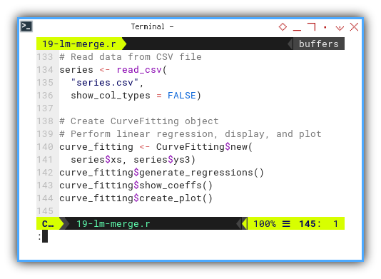
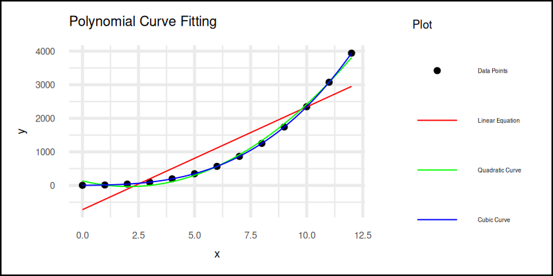
The plot result can be shown as follows:
You can obtain the interactive JupyterLab in this following link:
Classes let us organize code like grown-ups. They encapsulate both data and behavior, letting us focus on logic instead of plumbing.
Built in Plot (alternative)
If ggplot2 feels like overkill for quick-and-dirty plots
we can use R's base plotting system.
Less pretty, but still gets the job done.
    create_plot = function() {
      # Open PNG graphics device
      png("19-lm-merge-alt.png",
        width = 800, height = 400)

      # Plot data points
      plot(self$xs, self$ys,
        col = "black", pch = 20,
        xlab = "x", ylab = "y",
        main = "Polynomial Curve Fitting")

      # Plot regression lines
      lines(self$xp, self$yp1, col = "red", lwd = 2)
      lines(self$xp, self$yp2, col = "green", lwd = 2)
      lines(self$xp, self$yp3, col = "blue", lwd = 2)

      # Add legend
      legend("topright",
         legend = c("Data Points", "Linear Equation",
                    "Quadratic Curve", "Cubic Curve"),
         col = c("black", "red", "green", "blue"),
         pch = c(20, NA, NA, NA), lwd = c(NA, 2, 2, 2))
    }
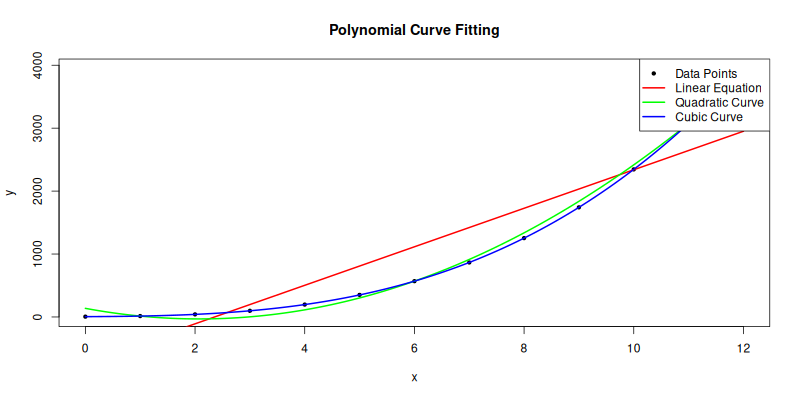
The plot result can be shown as follows:
You can obtain the interactive JupyterLab in this following link:
Note that, not everything should be well structured.
Sometimes, fast and messy wins the race.
For simple thing, we’d better use shortcut as possible,
as will be shown in the next R article.
Statistic Properties
A Gentle Madness in Methodology
In this section, we explore how R handles statistical properties.
Let’s begin with least squares.
It is our trusty wrench for fitting lines through chaos.
Manual Calculation
We begin by rolling up our sleeves, and manually calculating the statistical properties. This is where we pretend we are living in the 1950s, and calculators are still furniture.
You can check the code in this classic beauty:
...
# Calculate deviations
x_deviation <- x_observed - x_mean
y_deviation <- y_observed - y_mean

# Calculate squared deviations
x_sq_deviation <- sum(x_deviation^2)
y_sq_deviation <- sum(y_deviation^2)
...
And here’s the interactive JupyterLab version,
because typing is cardio:
Manual calculation forces us to look math in the eye. It teaches us what each number really means, before the built-in functions whisk them away.
Using Built-in Method
Of course, R comes with built-in functions.
Not everyone wants to do math like a statistician in a log cabin.
...
# Calculate slope (m) and intercept (b)
m_slope <- lm(y_observed ~
  x_observed)$coefficients[2]
b_intercept <- lm(y_observed ~
  x_observed)$coefficients[1]
...
Not everything in R has a built-in method shortcut.
And honestly, I must admit I haven’t explored,
every corner of the statistical attic.
However, here is the full summary from the script, where every Greek letter finds a home:
❯ Rscript 52-lq-built-in.r
n          =   13
∑x (total) =   78.00
∑y (total) = 2327.00
x̄ (mean)   =    6.00
ȳ (mean)   =  179.00

∑(xᵢ-x̄)    =      0.00
∑(yᵢ-ȳ)    =      0.00
∑(xᵢ-x̄)²   =    182.00
∑(yᵢ-ȳ)²   = 309218.00
∑(xᵢ-x̄)(yᵢ-ȳ)  =   7280.00
m (slope)      =     40.00
b (intercept)  =    -61.00

Equation     y = -61.00 + 40.00.x

sₓ² (variance) =     15.17
sy² (variance) =  25768.17
covariance     =    606.67
sₓ (std dev)   =      3.89
sy (std dev)   =    160.52
r (pearson)    =      0.97
R²             =      0.94

SSR = ∑ϵ²           =  18018.00
MSE = ∑ϵ²/(n-2)     =   1638.00
SE(β₁)  = √(MSE/sₓ) =      3.00
t-value = β̅₁/SE(β₁) =     13.33
Fun fact: a t-value above 13 is basically,
statistics yelling “this slope really matters.”
Interactive version? Of course:
The result is the same with the python counterpart.
Knowing both manual and automated approaches, allows us to debug, audit, and impress colleagues at parties. Annoy people in WhatsApp groups at 2AM with unsolicited regression facts.
Visualization
However, I guess the lm above is,
enough to calculate regression line.
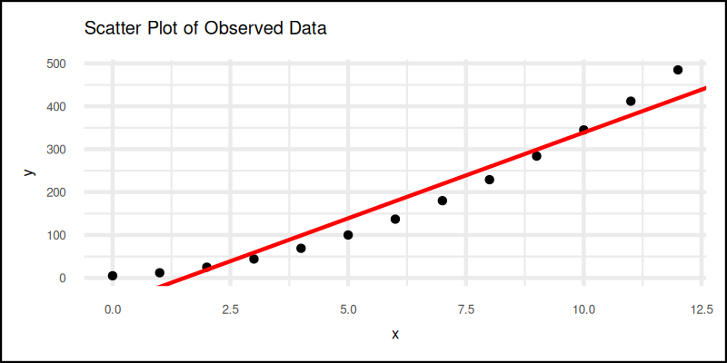
And then we can combine scatter plot and regression line.
We can start with usual scatter plot, always the opening act:
Then add this regression line part the to plot grammar.
regression_line <- geom_abline(
  intercept = b_intercept, slope = m_slope,
  color = "red")

plot <- scatter_plot + regression_line
The plot result can be shown as follows:
Interactive version here—click it before your coffee cools:
Visualizing helps us catch errors, spot patterns, and pretend we are data artists.
Additional Properties
Beyond the slope and intercept, there’s more personality to explore in our data. Kurtosis and skewness tell us about tails and symmetry. Like a weather report for distributions.
To do this, we need the e1071 package,
which sounds like a robot but computes like a dream.
x_kurtosis <- kurtosis(x_observed)
y_kurtosis <- kurtosis(y_observed)

x_skewness <- skewness(x_observed)
y_skewness <- skewness(y_observed)

cat(sprintf('x kurtosis     = %9.2f\n', x_kurtosis))
cat(sprintf('y kurtosis     = %9.2f\n', y_kurtosis))
cat(sprintf('x skewness     = %9.2f\n', x_skewness))
cat(sprintf('y skewness     = %9.2f\n\n', y_skewness))
Here’s the statistical gossip. The result is not really the same with the python counterpart.
❯ Rscript 61-additional.r
x (max, min, range) = (   0.00,   12.00,   12.00 )
y (max, min, range) = (   5.00,  485.00,  480.00 )

x median       =      6.00
y median       =    137.00
x mode         =      0.00
y mode         =      5.00

x kurtosis     =     -1.48
y kurtosis     =     -1.22
x skewness     =      0.00
y skewness     =      0.54

x SE kurtosis  =      1.19
y SE kurtosis  =      1.19
x SE skewness  =      0.62
y SE skewness  =      0.62
Skewness and kurtosis help us understand whether our data is chill (normal) or wild (leptokurtic party). Interactive version available here, for those who love experiments with a safety net:
Let’s be honest, different tools may give slightly different answers As you can see, the kurtosis and the skewness is different, compared with PSPP. Just be aware of it.
I still don’t know the reason of this differences.
What’s the Next Chapter 🤔?
If our journey with ggplot2 so far has felt like,
tuning a well-behaved engine.
One that occasionally leaks warnings
but still gets us beautiful regression lines,
then buckle up. We are just getting started.
We have already explored the manual guts, and the built-in magic of least squares, even threw in some skewness and kurtosis for those of us, who enjoy asymmetric data distributions over symmetrical conversations.
Now would be a great time to continue our exploration with the next chapter: [ Trend - Language - R - Part Three ].
👉 Remember: mastering both the manual and the automated methods, not only helps us debug or audit properly. It also allows us to casually, drop regression trivia in WhatsApp groups at 2AM. We may not attend many parties, but we can dominate a chat thread, with statistically significant insights.
See you in the next part, where the lines get smoother and the plots get sassier.
–
Let’s continue our previous ggplot2 journey.
Consider continuing your exploration with [ Trend - Language - R - Part Three ].