Preface
Goal: Visualizing interpretation of statistic properties, using python matplotlib.
Congratulations,
we’ve survived standard deviations,
t-values, and p-values.
Welcome to the fun part: making the numbers dance.
In this part, we’ll use our trusty Python helper, to interpret statistical properties through visualizations. Think of this as the moment where our regression equation, stops being abstract and starts looking like something our eyes can high-five.
No matter how elegant our model is, if you can’t visualize it, our audience will nod politely, and then go back to watching cat videos.
By learning how to draw these statistics, we also learn to read them better. A good chart tells a story, and if you’ve been following along, this one is about trends, relationships, and how suspiciously straight that regression line looks.
Got ideas to improve these visualizations? Spotted something off? Great! Stats is a team sport, just with less running and more coffee. Drop your thoughts, feedback, or rants, I welcome all contributions that make these interpretations more useful or correct.
Visualizing Interpretation
This is visualization, where statistics gets tired of being misunderstood, and starts drawing diagrams.
We will use matplotlib to turn our statistical properties into visual interpretations. But not every statistic needs a spotlight on stage, some are shy little numbers that prefer to stay in a summary table. Of course not everything can be visualized, some properties are just a number, without any need to be visualized at all. That’s fine. We’ll focus on the extroverts.
Interpretation isn’t just about numbers. It’s about seeing the story they tell. A good visualization helps communicate correlation, trends, and residuals to humans who don’t dream in formulas. You might recognize some of these plots from earlier articles. Now it’s time to go behind the scenes.
If you spot anything fishy in my visuals, calculations, or interpretations, be a kind statistician and let me know. I promise not to take it personally. (Unless you use Comic Sans.)
Skeleton
We’ll lean on our trusty Properties.py helper again:
And the CSV file with our data samples, instead of hardcoded data.
Here’s the basic skeleton for any visualization using our helper:
import matplotlib.pyplot as plt

# Local Library
from Properties import get_properties, display

properties = get_properties("50-samples.csv")
display(properties)
locals().update(properties)

def plot() -> int:
  ...

  return 0

if __name__ == "__main__":
  raise SystemExit(plot())
This pattern gives us a reusable starting point. If the script ends gracefully with exit code 0, your plot hasn’t caught fire. That’s a win in data visualization.
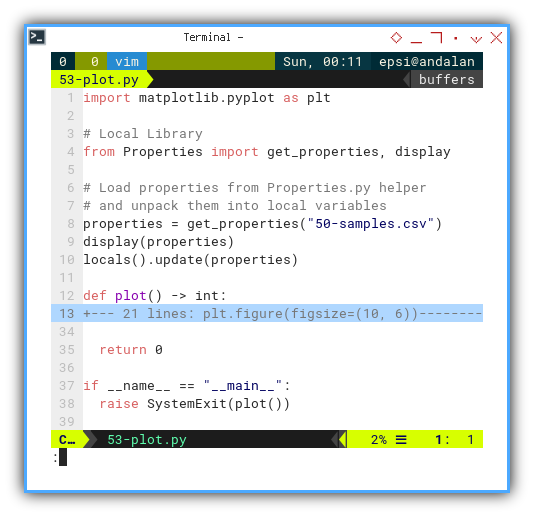
We will use this pattern again and again, like a template for artistic (and statistically valid) expression.
Basic Data Series
Let’s ease into visualization with the basics, no fancy toppings yet.
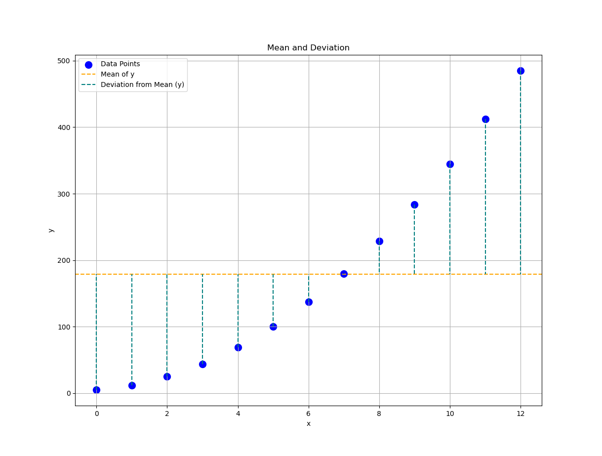
We start with a scatter plot,
the default love language of data points:
def plot() -> int:
  plt.figure(figsize=(10, 6))

  # Plot the data series
  plt.scatter(x_observed, y_observed, color='blue',
    s=100, label='Data Points')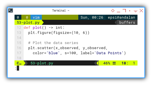
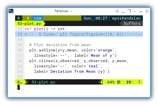
Now, let’s add a touch of drama: the horizontal line showing the mean (ȳ), and the dashed lines showing how far each point deviates from it. This visualizes (yᵢ − ȳ), one of the unsung heroes of variance, for each independent oberserved x.
  # Plot deviation from mean
  plt.axhline(y=y_mean, color='orange',
    linestyle='--',  label='Mean of y')
  plt.vlines(x_observed, y_observed, y_mean,
    linestyle='--', color='teal',
    label='Deviation from Mean (y)')
Saying “standard deviation” doesn’t make people see it. But this shows it, each vertical line whispering, “_I’m how far this point strayed from the group.”
Now it’s time to make it pretty (or at least readable) with axes labels, a grid, and a legend. Even data deserves good UX.
def plot() -> int:
  ...

  # Chart Decoration
  plt.title('Mean and Deviation')
  plt.xlabel('x')
  plt.ylabel('y')
  plt.legend()
  plt.grid(True)

  plt.show()

  return 0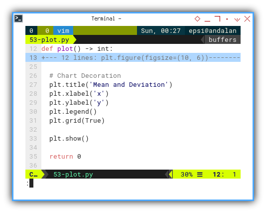
Let’s plot this data points and mean (average), along with it’s (yᵢ-ȳ) interpretation. And voilà, we’ve visualized our first interpretation: raw data and deviation from the mean. You now have a graph that says, “I know my stats and my matplotlib.”
Plotting is pretty simple, right? Plotting doesn’t have to be scary, it’s just math in makeup.
Interactive JupyterLab
Prefer to tweak, explore, and tinker live?
You can interact with the Jupyter Notebook version:
Standard Deviation
The Shaky Truth Beneath the Mean
Let’s take our visualization game one step further, into the realm of standard deviation. No regression line yet, just pure deviation joy.
This tells the story of how data points wobble around the mean, without anyone trying to predict anything.
Aesthetic
I’ve added a custom color palette based on Google’s Material Design. Not only is it pretty, but it helps keep visual cues consistent. (And yes, statisticians care about design too. We’re not animals.)
blueScale = {
  0: '#E3F2FD', 1: '#BBDEFB', 2: '#90CAF9',
  3: '#64B5F6', 4: '#42A5F5', 5: '#2196F3',
  6: '#1E88E5', 7: '#1976D2', 8: '#1565C0',
  9: '#0D47A1'
}
Let’s paint the previous plot with this new palette, a nicer color output:
  # Plot the data series
  plt.scatter(x_observed, y_observed,
    color=blueScale[9], s=100, zorder=5,
    label='Data Points')

  # Plot deviation from mean
  plt.axhline(y=y_mean, color=blueScale[7],
    linestyle='--',  label='Mean of y')
  plt.vlines(x_observed, y_observed, y_mean,
    linestyle='--', color=blueScale[5],
    label='Deviation from Mean (y)')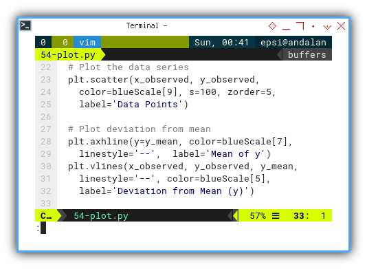
Next, we’ll add a shaded region that shows the standard deviation zone.
  # Plot shaded region for standard deviation
  plt.fill_between(x_observed,
    y_mean - y_std_dev, y_mean + y_std_dev,
    color=blueScale[1], alpha=0.3, zorder=1,
    label='Standard Deviation')

  # Plot covariance
  plt.text(x_mean, max(y_observed),
    f'Covariance: {xy_covariance:.2f}',
    fontsize=12, color=blueScale[9])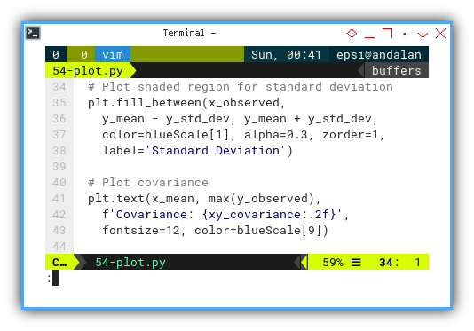
Now we can plot the interpretation of standard deviation relative to mean.
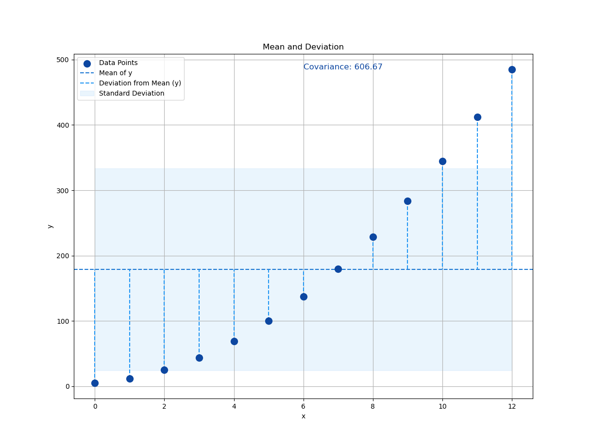
Not bad, huh? A little color, a little shade, and suddenly our chart goes from “meh” to “statistically insightful.”
Interactive JupyterLab
You can experiment interactively using the JupyterLab Notebook here:
Mean and Standard Deviation
So you want a simpler way to visualize the mean and standard deviation? One that looks like a student project but gets the job done? I got you.
We start with a scatterplot (again, our favorite), and then plot the mean on both axes. Like a big statistical “X marks the spot.”
  plt.scatter(x_observed, y_observed,
    color='blue', label='Data Points')

  plt.axvline(x=x_mean, color='green',
    linestyle='--', label='Mean of x')
  plt.axhline(y=y_mean, color='orange',
    linestyle='--', label='Mean of y')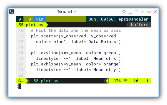
And now for the star of the show: the standard deviation error bars. These are like tiny, symmetric whiskers on the mean, useful for showing spread, but not trying too hard.
  plt.errorbar(x_mean, y_mean,
    xerr=x_std_dev, yerr=y_std_dev,
    fmt='o', color='purple',
    label='Standard Deviation')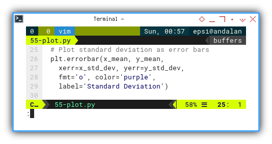
While this chart may not win design awards, it gives us a clean, orthogonal view of how spread-out our data is from the center. Both horizontally and vertically. It’s humble, but honest.
And here’s what that naïve-yet-informative plot looks like:
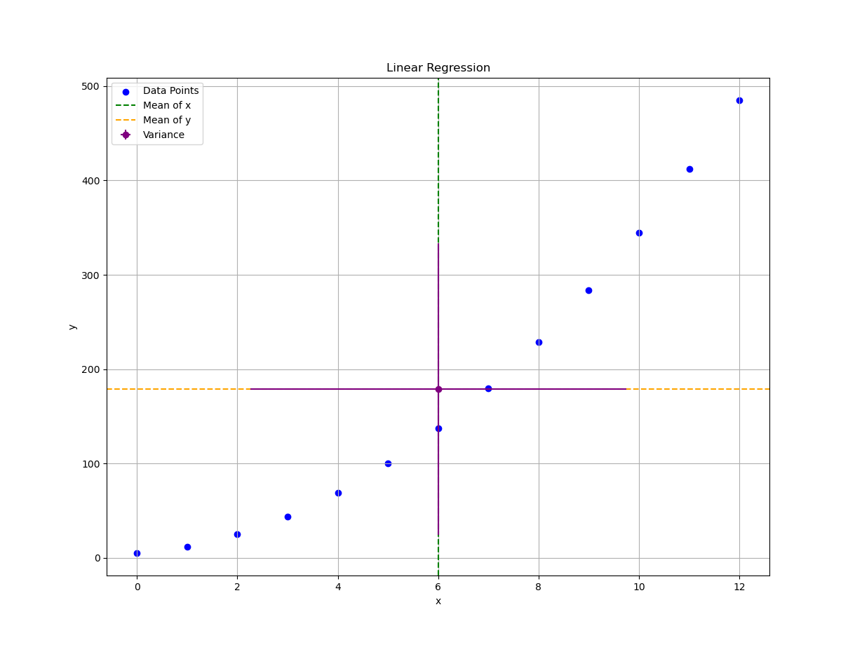
It’s not winning beauty contests, but it’s doing its job. Like a dedicated old spreadsheet with no conditional formatting.
Interactive JupyterLab
Feel free to poke around in the notebook here:
Linear Regression
A Line, a Fit, and a Whole Lot of Assumptions
Let’s roll out the big guns: linear regression. The statistical equivalent of drawing a best-guess straight line, through a cloud of uncertainty.
We’re going to plot our linear regression, based on the least squares method. It’s the classic: minimize the sum of squared regrets, I mean, residuals..
  # Plot the data and regression line
  plt.scatter(x_observed, y_observed,
    color=tealScale[9], label='Data Points')
  plt.plot(x_observed, y_fit,
    color=tealScale[5], label='Regression Line')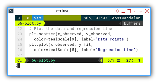
We’re using Google’s teal color scale. Even math deserves good design choices:
tealScale = {
  0: '#E0F2F1', 1: '#B2DFDB', 2: '#80CBC4',
  3: '#4DB6AC', 4: '#26A69A', 5: '#009688',
  6: '#00897B', 7: '#00796B', 8: '#00695C',
  9: '#004D40'
}
Here’s the output:
- Observed y, and
- Predicted ŷ = fit(x) as line.
No interpretation this time. The plot speaks for itself.
Very simple. No Comment.
Interactive JupyterLab
Check it out here:
This is the foundation of predictive analytics. The line isn’t just a line. It’s a model, a summary, and a hopeful whisper that patterns exist.
Residual
The Distance Between Ambition and Reality
Let’s now face the cold, hard truth: residuals. The vertical gap between what our model predicted, and what the data actually did.
How about error (ϵ)? Of course we can draw using vlines.
  # Plot the data and regression line
  plt.scatter(x_observed, y_observed,
    color=blueScale[9], label='Data Points')
  plt.plot(x_observed, y_fit,
    color=blueScale[5], label='Regression Line')

  # Plot residual errors
  plt.vlines(x_observed, y_observed, y_fit,
  linestyle='--', color=blueScale[3],
  label='Residual')
Each dashed line = one regret. Or in more technical terms: ϵᵢ = yᵢ − ŷᵢ.
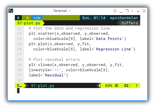
The interpretation of residual or error (ϵ), is simple as shown in below plot:
Simple, but enough to to interpret the (yᵢ-ŷ) difference.
Interactive JupyterLab
Get interactive with our residuals:
Residuals reveal the quality of our model. They tell you if our line is just pretty, or actually useful.
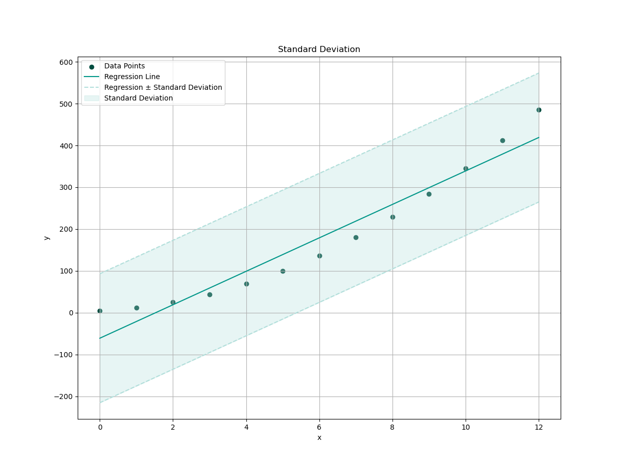
Standard Deviation
How about interpretation of standard deviation relative to predicted values, of regression line?
First, we need to draw our data series, and the regression line.
  # Plot the data and regression line
  plt.scatter(x_observed, y_observed,
    color=tealScale[9], label='Data Points')
  plt.plot(x_observed, y_fit,
    color=tealScale[5], label='Regression Line')
Then plot standard deviation, on both above and below the curve fitting trend.
  plt.plot(x_observed, y_fit + y_std_dev,
    c=tealScale[1], linestyle='--')
  plt.plot(x_observed, y_fit - y_std_dev,
    c=tealScale[1], linestyle='--',
    label='Regression ± Standard Deviation')
Then we fill a shaded region, between upper and lower bounds:
  plt.fill_between(x_observed,
  y_fit - y_std_dev, y_fit + y_std_dev,
  color=tealScale[1], alpha=0.3,
  label='Standard Deviation')
With settings above, we can plot the interpretation of standard deviation relative to curve fitting trend.
This shaded area tells us how much variation exists around our trend. More wiggle = more chaos. Less wiggle = more confidence. No wiggle? We’re either dealing with perfect data, or we’ve broken causality.
This should be pretty cool.
Interactive JupyterLab
Dig in interactively:
Standard deviation helps us understand the spread of your predictions. It answers: “How typical is a typical point?”, or in plain English, “Is this line even believable?”
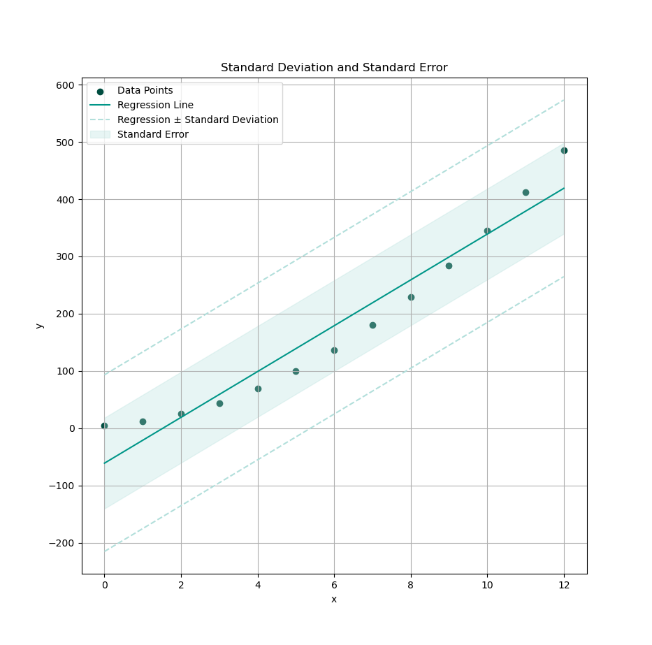
Standard Error with Level of Confidence
Turning Probabilities into Boundaries
Standard deviation was fun, but now it’s time to bring in confidence. (Statistically speaking — not emotionally.)
Instead of measuring spread like standard deviation, we now estimate the standard error and use it to draw a confidence interval.
This confidence of interval can be predicted using OLS. For example, let’s use 95% confidence level, with the result of approximately 1.96.
def get_CI() -> float:
  # Create regression line
  y_fit = m_slope * x_observed + b_intercept
  y_err = y_observed - y_fit

  # Calculate variance of residuals (MSE)
  var_residuals = np.sum(y_err ** 2) / (n - 2)

  SE = np.sqrt(var_residuals)

  # Calculate the confidence interval
  # for the predictions using 95% confidence
  return 1.96 * SE
Now shade in your statistical surety zone. Use this calculation to fill the standard region.
  # Fill between upper and lower bounds
  CI = get_CI()
  plt.fill_between(x_observed,
  y_fit - CI, y_fit + CI,
  color=tealScale[1], alpha=0.3,
  label='Standard Error')
And voilà, a band of confidence wrapped around our prediction line. It’s like saying, “I may be wrong, but here’s how wrong I might be, with math.”
Ultimately, the choice of our plot depends on the specific interpretation and communication goals of our analysis. You should contact your nearest statistician to get most valid visual interpretation.
Interactive JupyterLab
Tinker with confidence:
Confidence intervals quantify uncertainty. While standard deviation describes the scatter of our data, standard error tells us how confident we are in our model’s predictions.
Think of it this way:
- Standard deviation is what our data does.
- Standard error is what our model thinks it’s doing.
When in doubt, shade it out.
Other Tools: Seaborn
When You Want Stats and Style in One Line
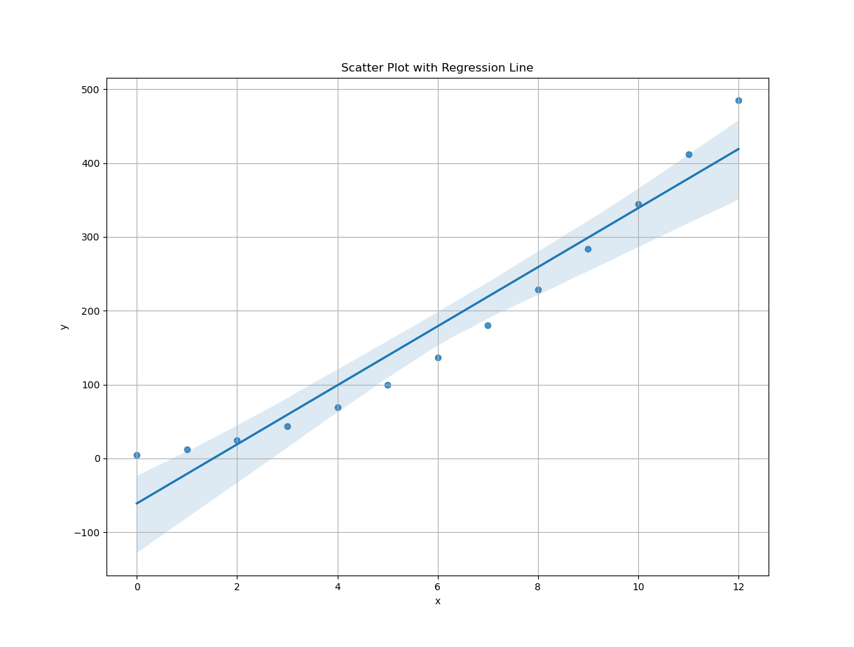
Sure, matplotlib is powerful, like using a wrench to tighten bolts by hand. But what if you want your plots, to look sleek, smart, and socially acceptable, without a hundred lines of config?
Enter seaborn: Matplotlib’s artsy cousin,
who took a data science minor and discovered color theory.
Just add sns to our imports,
and we’re ready to plot like a pro with commitment issues.
import numpy as np
import matplotlib.pyplot as plt
import seaborn as sns

# Getting Matrix Values
pairCSV = np.genfromtxt("50-samples.csv",
  skip_header=1, delimiter=",", dtype=float)

# Extract x and y values from CSV data
x_observed = pairCSV[:, 0]
y_observed = pairCSV[:, 1]
Ready for magic? Here’s the one-liner of the century:
# Scatter plot with regression line
plt.figure(figsize=(8, 6))
sns.regplot(x=x_observed, y=y_observed)
plt.title('Scatter Plot with Regression Line')
plt.xlabel('x')
plt.ylabel('y')
plt.grid(True)
plt.show()
Boom.
You get a fully styled regression plot, with confidence bands and proper labels, all before your coffee even cools.
Now, let’s be honest:
At the time of writing,
I have no idea how Seaborn calculates its regression curve.
Probably via statsmodels under the hood.
Possibly powered by pandas, caffeine, and statistical sorcery.
I refuse to dig further.
All I know is this plot is cool. And have pretty color pallete too.
- It works,
- It looks good, and
- It doesn’t complain.
Interactive JupyterLab
Play with this stylish shortcut here:
Tools like Seaborn remove friction from visualization. When we just want to show a trend, and move on with our analysis (or life), this kind of one-liner plotting is pure gold.
Don’t worry, we’re still statisticians. It’s only cheating if you don’t know how Seaborn did the math, and still publish it in a journal.
At Last
This wraps up our visualization journey, for regression and trend analysis. Of course, the statistical landscape is wide, there are plenty of parameters and visualizations, I may not have covered (or even known about at the time of writing).
If you have other preferred tools, interpretations, or aesthetic preferences (e.g. “can we use hot pink?"), Or just a strong opinion on shaded confidence intervals, feel free to share. I’d love to hear it.
Feedback is welcome. Especially if it comes with coffee.
What’s the Next Exciting Step 🤔?
We’ve charted the straight and narrow path of linear regression. Clean, elegant, and satisfying, like a line of best fit through a row of perfectly behaved ducks.
But life (and data) isn’t always that obedient. Sometimes, the trend curves. That’s where polynomial regression steps in. It lets us bend our model—gracefully—to, better capture complex relationships.
As usual, we will start from first principles, move into spreadsheet formulas (yes, Excel/Calc still deserves a seat at the statistics table), then dive into Python implementations and juicy visualizations.
Ready to curve things up? Head over to [ Trend - Polynomial Regression - Theory ].