Preface
Goal: Exploring additional statistic properties not related to trend.
While trends often hog the spotlight in data analysis (they’re the drama queens of statistics), some lesser, known side characters, like variance, standard deviation, and friends, play quietly in the background and actually hold the story together.
In the context of trends, we’ll call these additional properties. They may not tell you where the data is going, but they do whisper whether it’s marching in a straight line, or chaotically dancing like it’s data prom night.
And here’s why it matters: Before we strap our statistical properties onto a machine-learning rocket, and launch it into our app, we should first test them with a solid mathematical model. Because if our code outputs nonsense, the issue might not be your coding, it could be that our math is drunk.
we can model these properties in a spreadsheet. Yes, Excel isn’t just for budget planning or tracking, who borrowed your flash drive in 2012. But before that, let’s make sure we understand the math that powers the formulas. Trust me: understanding the math is like reading the manual, before assembling IKEA furniture. Sure, it’s optional. But do you really want three leftover screws?
Stay tuned, this isn’t just academic. These properties will sneak their way, into nearly every corner of statistical analysis, from A/B testing to anomaly detection. Ignore them at our peril (or worse, our boss’s angry emails).
Equation
The trend might be the star of the show, but these supporting characters often steal the scene. Now that we’ve left the trend spotlight, it’s time to meet the less glamorous, but just as critical, statistical properties. Think of them as the data janitors, quiet, consistent, and the reason the whole system doesn’t fall apart.
Let’s start laying down the symbolic groundwork. Yes, it’s math time. But the kind of math that makes you look really smart in meetings. We begin with equation symbol, as our base of calculation.
Min, Max, Range
The Bounds of Data Dignity
Obvious, yes. But still foundational. Like socks. They don’t get attention unless missing.
Set-theoretically speaking,
the max function can be express in set notation:
Pretty explanatory
Range gives us the first glance at data spread. A huge range might signal outliers, or just a sensor gone rogue.
Median
The Middle Manager of Our Data
No favoritism here, median doesn’t care about how wild the numbers are, just who’s in the middle. The median can be described as below:
Median resists drama. It stays cool even if our data includes a billionaire or a zero-dollar bank account.
Mode
Popularity Contest Winner
The most frequently appearing value. The celebrity of the dataset.
We need two steps to find the modus. First we have to find frequencies, then find the maximum frequencies, and finally get the value of that frequencies.
To find the frequencies of each unique value in a dataset, where I() is the indicator function, which equals 1 if the condition is true and 0 otherwise.
Step 1: Count how many times each value shows up.
Step 2: Find the biggest fanbase
Then we find the maximum frequency.
Or in the set notation as:
Final step: identify the actual winner(s).
Mathematically, we would find the mode value using this equation:
Or if you’re a fan of compact “math-as-a-one-liner” expressions:
If our dataset were a party, the mode is the person everyone’s talking to. Important for understanding dominant categories.
SEM (Standard Error of the Mean)
The Nervousness of the Mean
Think of the Standard Error of the Mean (SEM) as our data’s social anxiety. It tells us how much the mean might fluctuate with different samples.
The equation for SEM is:
Smaller SEM means more confidence in our average. Larger SEM? Time to re-evaluate our sampling or our life choices.
Kurtosis and Skewness
The Drama Analysts
These two detect asymmetry and “peakedness.” Skewness checks if our data is leaning left or right. Kurtosis checks if it’s just chill or obsessively spiky.
The Standard Error equation for both Kurtosis and Skewness can be tricky, and can be differ from one reference to another.
These moments (third and fourth) help assess normality. If skewness or kurtosis are off the charts, so is our assumption of normal distribution.
Standard Error of Kurtosis and Skewness
Measuring Your Measurement’s Wobble
Here’s where things get spicy. There’s more than one way to calculate these.
Simplified approximations:
The simplified approximation of Standard Error can be expressed as below:
Fancy-pants formulas:
While the complex Standard Error equation can be described as follows:
From StackOverflow ???
From stackoverflow I found out that, on different software the equation of Standard Error of gaussian kurtosis, can be expressed as follows.
Thanks to Howard Seltman, whose R script taught my spreadsheet to do calculus after midnight: I’m simply copying and pasting the code from here:
Note that above equation only applied for data that follow gaussian distribution.
Standard errors help us understand, whether our skewness or kurtosis values are meaningful, or just statistical noise dressed in fancy math.
Spreadsheet Sorcery
Statistics at Your Fingertips
A brief tale of numbers, built-in functions, and spreadsheet wizardry.
I have already prepare the built in formula for these statistics properties.
Worksheet Source
The Magical Artefact
🧙 “Behold, the Spreadsheet of Secrets!”
The Excel file has been forged and uploaded. Tinker, test, or tear it apart. We’re holding a fully functional statistical toolbox:
Min, Max, Range
The Big Three
We begin with the three musketeers of statistical bounds: minimum, maximum, and range. They help define the battlefield. Telling us how far our data stretches. Range might not be sophisticated, but it’s honest and loud.
The formula is also obvious.
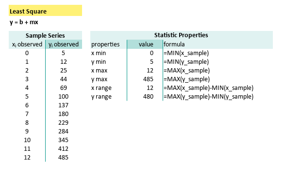
These simple formulas can be summarized as follows:
| properties | formula |
|---|---|
| x min | =MIN(x_sample) |
| y min | =MIN(y_sample) |
| x max | =MAX(x_sample) |
| y max | =MAX(y_sample) |
| x range | =MAX(x_sample)-MIN(x_sample) |
| y range | =MAX(y_sample)-MIN(y_sample) |
If our range is zero, either oour data is broken, or we’ve got a perfect flatline. Call a doctor or a mathematician
Median and Mode
The Democratic Center and the Popular Vote
When mean feels too mainstream.
Median resists outliers like a grumpy old professor ignoring student trends. Mode, on the other hand, is all about popularity, if it exists.
But here’s the catch:
For datasets with all unique values,
mode politely declines to show up,
giving us a #VALUE! instead.
Think of it as statistics saying “I don’t do groupies.”
We can use built-in median() formula.
But we should be careful while i uderstanding the mode() formula.
For example for a completely unique data series,
the result should be no mode, because all data frequency is 1.
Then our beloved spreadsheet is right to give error as #VALUE1.
To fix this, use a helper column (e.g., x_freq),
then channel our inner Excel sage.
The solution is make a new helper column to calculate frequency.
Let’s name the range as x_freq and y_freq,
and we can use our excel/calc expertise to craft this formula:
=INDEX(y_sample, MATCH(MAX(y_freq), y_freq, 0))Voilà!. Manual mode detection, spreadsheet-style.
The summary can be described as follows:
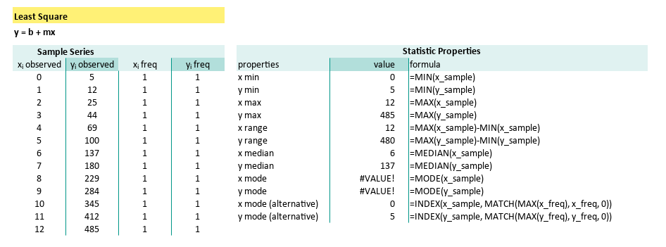
| properties | formula |
|---|---|
| x median | =MEDIAN(x_sample) |
| y median | =MEDIAN(y_sample) |
| x mode | =MODE(x_sample) |
| y mode | =MODE(y_sample) |
| x mode (alternative) | =INDEX(x_sample, MATCH(MAX(x_freq), x_freq, 0)) |
| y mode (alternative) | =INDEX(y_sample, MATCH(MAX(y_freq), y_freq, 0)) |
| x SE Mean | =STDEV.S(x_sample) / SQRT(COUNT(x_sample)) |
| y SE Mean | =STDEV.S(y_sample) / SQRT(COUNT(y_sample)) |
Kurtosis and Skewness
The Drama Queens of Distribution
When our data has a mood.
Skewness shows asymmetry, how lopsided your data is. Kurtosis checks whether our data is heavy-tailed (peaky) or chill (flat). It’s like asking: is our dataset more like, a volcano, a pancake, or somewhere in between?
Excel gives us KURT() and SKEW() to play with.
But for the error bars (standard error),
we will have to roll up our sleeves.
Unfortunately no built-in formula for standard error.
With equation above, we can craft our SE formula as follows:
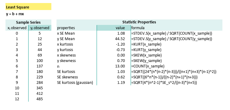
| properties | formula |
|---|---|
| x kurtosis | =KURT(x_sample) |
| y kurtosis | =KURT(y_sample) |
| x skewness | =SKEW(x_sample) |
| y skewness | =SKEW(y_sample) |
| n | =COUNT(x_sample) |
| SE kurtosis | =SQRT((24*(n*(n-2)*(n-3)))/((n+1)*(n+3)*(n-1)^2)) |
| SE skewness | =SQRT((6n(n-1))/((n-2)(n+1)(n+3))) |
| SE kurtosis (gaussian) | =SQRT(4*(n^2-1)*SE_s^2/((n-3)*(n+5)) |
When Excel doesn’t have the function we need, we become the function. It’s like statistical DIY, but with more square roots and fewer splinters.
It is fun to play with these two properties, if you understand the concept. We will also give you the visualization in this article.
A Word About Outliers
We love them, we fear them.
Outliers are the eccentrics of the dataset, possibly geniuses, possibly errors. We will give them their own stage in another article, because like all rebels, they deserve their spotlight.
Python Tools
Oonce we’ve got the average, the real fun begins.
Welcome to the second half of our statistical makeover session, this time with Python as our glamorous assistant. We’re diving into those less-talked-about but absolutely vital properties: median, mode, range, skewness, and kurtosis. Think of them as the supporting actors who steal the show, if the mean ever calls in sick.
Python Source
You don’t have to reinvent the bell curve, just clone the script:
Data Source
No hardcoding here. We like our data fresh and CSV-flavored:
Min, Max, Range
Like in any good soap opera, it’s all about the highs and lows, and the emotional distance in between.
import numpy as np

# Getting Matrix Values
pairCSV = np.genfromtxt("50-samples.csv",
  skip_header=1, delimiter=",", dtype=int)

# Extract x and y values from CSV data
x_observed = pairCSV[:, 0]
y_observed = pairCSV[:, 1]

# Number of data points
n = len(x_observed)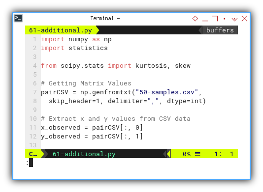
We can calculate
# Calculate maximum, minimum, and range
x_max = np.max(x_observed)
x_min = np.min(x_observed)
x_range = x_max - x_min

y_max = np.max(y_observed)
y_min = np.min(y_observed)
y_range = y_max - y_min

# Output of maximum, minimum, and range
print('x (max, min, range) = '
 + f'({x_min:7.2f}, {x_max:7.2f}, {x_range:7.2f} )')
print('y (max, min, range) = '
 + f'({y_min:7.2f}, {y_max:7.2f}, {y_range:7.2f} )')
print()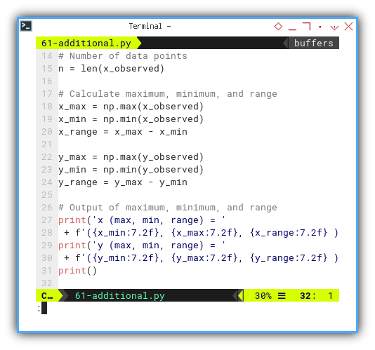
Min, max, and range help us understand the battlefield.
How wide is the spread
Are we talking table tennis or intergalactic warfare?
Median and Mode
If the mean is a people-pleaser, the median is the unbothered introvert, and the mode is… the popular kid who may or may not exist.
We can find mode using statistics library.
import statistics

x_mode = statistics.mode(x_observed)
y_mode = statistics.mode(y_observed)
But Python isn’t always diplomatic.
If there’s no repeating value, statistics.mode() might throw a tantrum (i.e., raise an error).
So here’s a DIY method to calculate median:
We can implement above equation to find median:
def calc_median(data: np.array) -> float:
  # Sort the data
  sorted_data = np.sort(data)

  # Calculate the median
  n = len(sorted_data)
  if n % 2 == 1:
    # If odd number of data points
    median = sorted_data[n // 2]
  else:
    # If even number of data points
    median = (sorted_data[n // 2 - 1] \
           +  sorted_data[n // 2]) / 2

  return median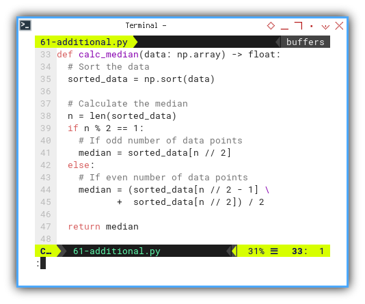
And display.
# Calculate additional propeties
x_median = calc_median(x_observed)
y_median = calc_median(y_observed)

x_mode = statistics.mode(x_observed)
y_mode = statistics.mode(y_observed)

# Output of additional propeties
print(f'x median       = {x_median:9.2f}')
print(f'y median       = {y_median:9.2f}')
print(f'x mode         = {x_mode:9.2f}')
print(f'y mode         = {y_mode:9.2f}')
print()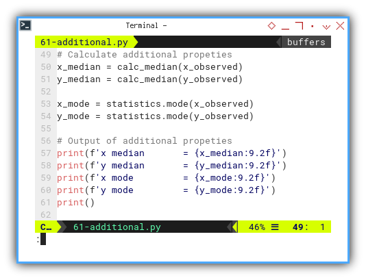
Pro tip for rebels: we can also utilize.
y_mode = np.argmax(np.bincount(y_observed))This bypasses statistics.mode()’s sensitivities.
You’re welcome.
Median is robust against outliers. Mode? Great for categorical or oddly-behaved data. Know our tools before we wield them.
Kurtosis and Skewness
Because data can be weird, lopsided, and prone to drama.
Enter scipy.stat to calculate kurtosis and skewness.
from scipy.stats import kurtosis, skew

# Calculate kurtosis and skewness
x_kurtosis = kurtosis(x_observed, bias=False)
y_kurtosis = kurtosis(y_observed, bias=False)

x_skewness = skew(x_observed, bias=False)
y_skewness = skew(y_observed, bias=False)

print(f'x kurtosis     = {x_kurtosis:9.2f}')
print(f'y kurtosis     = {y_kurtosis:9.2f}')
print(f'x skewness     = {x_skewness:9.2f}')
print(f'y skewness     = {y_skewness:9.2f}')
print()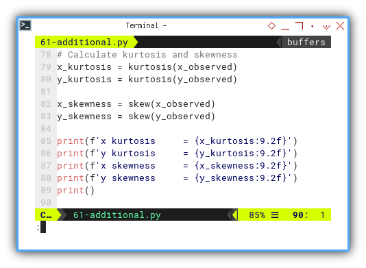
Skewness tells us if our data leans left, right, or politically neutral. Kurtosis tells us whether the tails are drama queens or chill.
Standard Error of Kurtosis and Skewness
We should craft our own method to get the standard errors.
def calc_se_kurtosis(n):
  return np.sqrt( \
    (24 * n * (n - 2) * (n - 3)) \
    / ((n + 1) * (n + 3) * (n - 1) ** 2))

def calc_se_skewness(n):
  return np.sqrt( \
    (6 * n * (n - 1)) \
    / ((n - 2) * (n + 1) * (n + 3)))

def calc_se_kurtosis_gaussian(n):
  return np.sqrt( \
    (4 * n**2 * calc_se_skewness(n)**2) \
    / ((n - 3) * (n + 5)))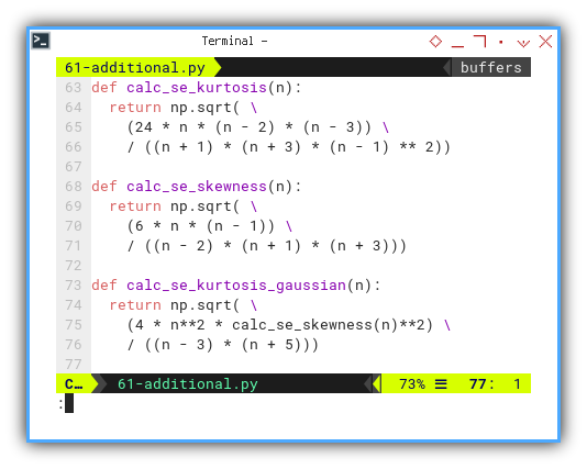
Now deploy those formulas like a well-trained stats ninja:
# number of data points
x_n = len(x_observed)
y_n = len(y_observed)

# Calculate SE kurtosis and SE skewness
x_se_kurtosis = calc_se_kurtosis_gaussian(x_n)
y_se_kurtosis = calc_se_kurtosis_gaussian(y_n)
x_se_skewness = calc_se_skewness(x_n)
y_se_skewness = calc_se_skewness(y_n)

print(f'x SE kurtosis  = {x_se_kurtosis:9.2f}')
print(f'y SE kurtosis  = {y_se_kurtosis:9.2f}')
print(f'x SE skewness  = {x_se_skewness:9.2f}')
print(f'y SE skewness  = {y_se_skewness:9.2f}')
print()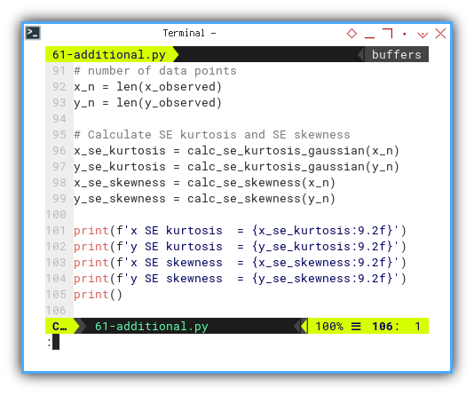
Without standard errors, we’re just guessing in a lab coat. These formulas help us tell signal from noise, and wisdom from nonsense.
Output Result
Just like we practiced, here’s what it looks like when the numbers come home from school:
x (max, min, range) = (   0.00,   12.00,   12.00 )
y (max, min, range) = (   5.00,  485.00,  480.00 )

x median       =      6.00
y median       =    137.00
x mode         =      0.00
y mode         =      5.00

x kurtosis     =     -1.20
y kurtosis     =     -0.73
x skewness     =      0.00
y skewness     =      0.70

x SE kurtosis  =      1.19
y SE kurtosis  =      1.19
x SE skewness  =      0.62
y SE skewness  =      0.62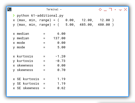
📈 Translation:
- Our x data is symmetrical and well-behaved—basically a textbook student.
- y is a little skewed and platykurtic (a fancy way of saying it’s allergic to drama).
- But nothing’s too wild. Standard errors confirm: we’re in safe territory.
Interactive JupyterLab
Want to poke and prod these stats like a true data scientist? Try it live:
Properties Visualization
Visualizing Descriptive Stats Like a Statistician With a Paintbrush
Welcome to the part where statistics come alive. Not just as numbers in a table, but as glorious visualizations. Think of this as the “Instagram filter” phase of our dataset. We’re going to draw lines, plot curves, and throw some color around like a statistician in art school.
Let’s turn those abstract stat properties into actual plots. Python and matplotlib are our brushes. Our dataset is the canvas. Picasso would approve.
Min, Max, Range, Median and Mode
We’ll begin by scattering the important descriptive stats. But horizontally, like a minimalist’s bookshelf.
# Add horizontal lines for properties
plt.axhline(y_median, c='r', ls='--',
  label=f'Median: {y_median}')
plt.axhline(y_mean,   c='g', ls='--',
  label=f'Mean: {y_mean:.2f}')
plt.axhline(y_mode,   c='m', ls='--',
  label=f'Mode: {y_mode}')
plt.axhline(y_min,    c='c', ls='--',
  label=f'Min: {y_min}')
plt.axhline(y_max,    c='y', ls='--',
  label=f'Max: {y_max}')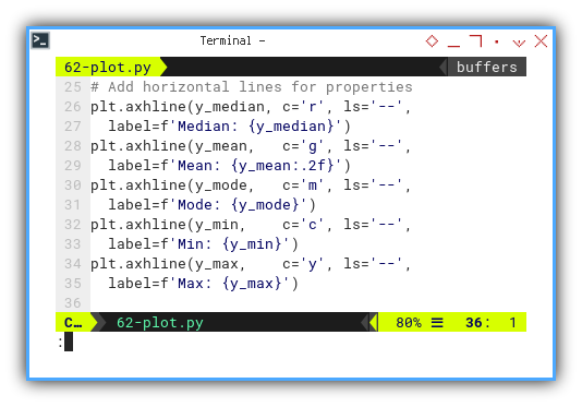
The result of the plot can be visualized as below:
Try it yourself:
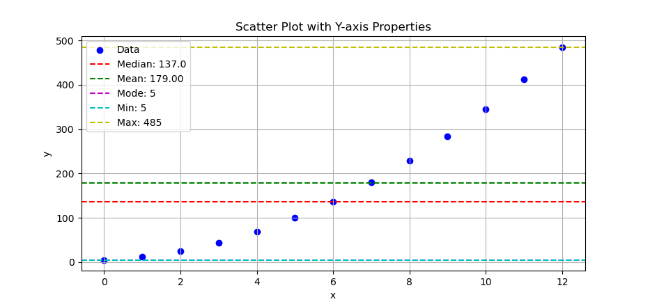
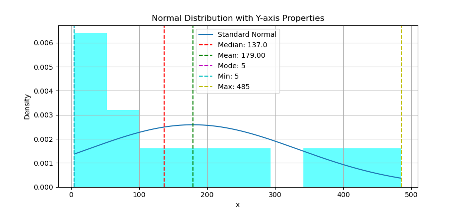
These lines help us see where our data hangs out. Is the mean close to the median? Is the mode just photobombing? Horizontal stats lines = instant data vibes.
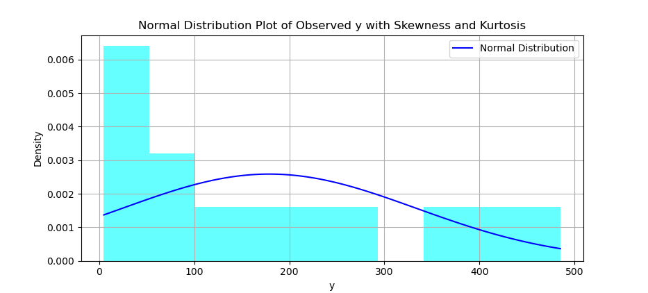
Histogram and Distribution Curve
Time to check how our data is distributed. A histogram shows the crowd, while the curve shows how it’s supposed to behave, in an ideal world. Spoiler: it rarely does.
You can create a histogram, and overlay a normal distribution curve on top of it.
# Calculate skewness and kurtosis of y
y_skewness = np.mean(
  ((y_observed - y_mean) / y_std) ** 3)
y_kurtosis = np.mean(
  ((y_observed - y_mean) / y_std) ** 4)

# Create histogram
plt.hist(y_observed, bins=10,
  density=True, alpha=0.6, color='cyan')

# Create range for x values
x_range = np.linspace(
  min(y_observed), max(y_observed), 100)

y_dist = norm.pdf(x_range, y_mean, y_std)

# Plot normal distribution curve
plt.plot(x_range, y_dist, color='blue',
  label='Normal Distribution')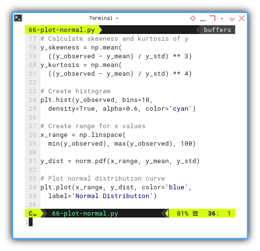
The result of the plot can be visualized as below:
You can obtain the interactive JupyterLab in this following link:
Histograms show real data. The curve? That’s the stat professor’s dream. The comparison tells us how rebellious our data is.
Revisited: Min, Max, Range, Median and Mode
Same plot party, but now we flip everything 90 degrees. Using scatter plot we can put the statistic properties, but this time in vertical line.
# Add vertical lines for properties
plt.axvline(y_median, c='r', ls='--',
  label=f'Median: {y_median}')
plt.axvline(y_mean,   c='g', ls='--',
  label=f'Mean: {y_mean:.2f}')
plt.axvline(y_mode,   c='m', ls='--',
  label=f'Mode: {y_mode}')
plt.axvline(y_min,    c='c', ls='--',
  label=f'Min: {y_min}')
plt.axvline(y_max,    c='y', ls='--',
  label=f'Max: {y_max}')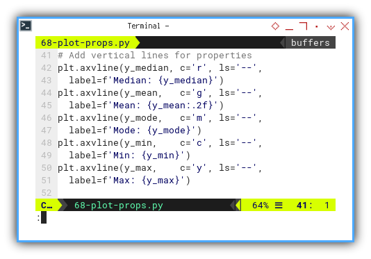
The result of the plot can be visualized as below:
You can obtain the interactive JupyterLab in this following link:
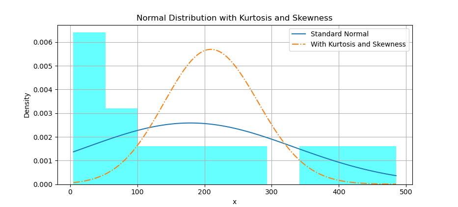
Kurtosis and Skewness
Want to really see what tailedness and tiltedness look like? This is the grand performance. Yes, it’s experimental. Yes, it’s beautiful. No, I still don’t fully understand the shape parameter.
With histogram, we can also overlay a distribution curve, with applied kurtosis and skewness.
First we need to calculate the corresponding y-values for the standard normal distribution. Then we need to adjust the shape parameter manually to achieve the desired kurtosis We may need to experiment with different values to get closer to the desired kurtosis. Then calculate the corresponding y-values for skewnorm distribution with given skewness and adjusted shape parameter. Finally plot both normal distribution curve, and skewnorm distribution.
y_standard = norm.pdf(x_range, y_mean, y_std)

shape_param = 2

y_ks = skewnorm.pdf(x_range, a=y_skewness,
  loc=y_mean, scale=y_std / shape_param)

plt.plot(x_range, y_standard,
  label='Standard Normal')

plt.plot(x_range, y_ks, ls='-.',
  label='With Kurtosis and Skewness')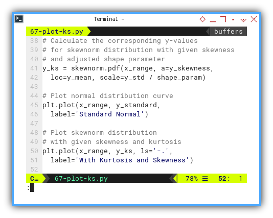
The result of the plot can be visualized as below:
You can obtain the interactive JupyterLab in this following link:
Actually, I’m not sure if I get the visual right. I still don’t know how this shape parameter works. I may have plotted something artistic instead of accurate. If your plot starts to resemble abstract art, please consult your local statistician. Especially one who’s into distribution curves.
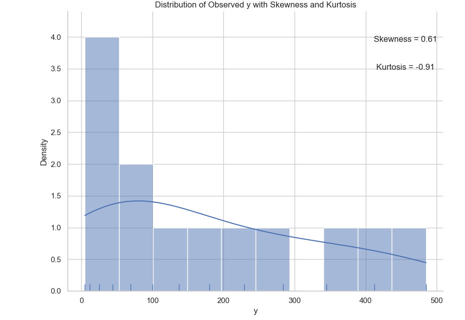
Density with Seaborne
Pretty Matters
Let’s end with dessert. Seaborn gives us plots so pretty they could be wall art. It combines histogram, KDE, and rug plot into a beautiful statistical parfait. Seaborne can make a really pretty chart.
# Plot distribution of y with annotations
sns.set(style="whitegrid")
sns.displot(y_observed,
  bins=10, kde=True, rug=True)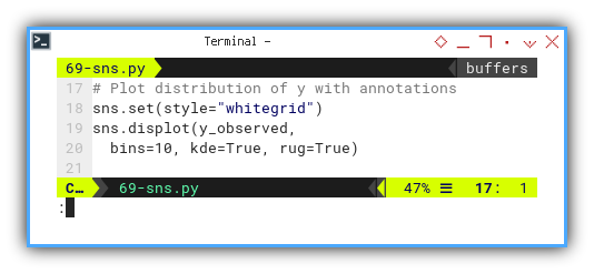
The result of the plot can be visualized as below:
You can obtain the interactive JupyterLab in this following link:
Clean, informative, beautiful. All in one plot. Like the pie chart’s cooler cousin who went to design school.
What’s the Next Chapter 🤔?
A brief intermission before the next scatterplot.
So far, matplotlib has been like that trusty old wrench. Reliable, precise, and a bit clunky when it comes to aesthetics. It gets the job done, but sometimes, you want more… pizzazz.
Enter Seaborn, the statistics nerd’s favorite artist. Think of it as matplotlib after a makeover, easier to use, and with a deep love for statistical plots.
We’re about to crank up the visuals again, this time with Seaborn’s pre-built plots designed for statistics. It’s like switching from hand-tooling our car to, using a diagnostic scanner with a touchscreen. Same insights, way more fun.
Great visualization tools reduce friction. Less time tweaking, more time interpreting. Or sipping our coffee while the plot impresses the team.
So buckle up, because the next chapter will unlock even prettier, more intuitive ways to visualize our dataset’s story. And don’t forget, seaborn library is specifically made for statistics.
When we’re feeling ready to evolve, from matplotlib sketches to Seaborn artistry, head on over to: 🔗 [ Trend - Visualization - Seaborn ].