Preface
Goal: Explore R Programming language visualization with ggplot2. Providing the data using linear model.
R You Ready?
Welcome to the R-side of our trend trilogy.
If this were a movie, this would be where
we zoom in on a shy but powerful character.
The kind who looks awkward in crowds
but aces calculus in their sleep.
Let’s be honest.
or many of us who came from a coding,
first background, R feels… different.
Less like a programming language,
more like a statistics whisperer,
with strong opinions on plotting aesthetics.
At first, I tiptoed around it. Then I made a few plots.
And suddenly, I was in love.
R may be quirky,
but like that brilliant friend who labels their spice jars alphabetically,
it rewards patience. And let’s talk power:
-
ike python’s seaborn, R has ggplot2, a charting ninja with a PhD in grammar.
-
Like python’s polyfit, R has lm(), a humble function that delivers linear models with confidence intervals and style.
-
Like python, R is beginner-friendly. Until it isn’t. Then it’s mysterious. But then you learn one more trick, and it all clicks again.
Instead of asking every question in the R forums
(and being hit with “Have you read the docs?”),
I took the engineer’s path: build a bunch of working examples first.
Now, I can answer questions and feel smug while doing it.
Preparation
Gearing Up
Before we dive in, let’s do the statistical equivalent of, sharpening our chisels and lining up our rulers.
Of course you need R installed in your system.
No need for RStudio, but there is a few things to consider.
📦 Library Check
We’ll start simple. No tidyverse buffet yet. We’re going à la carte for understanding’s sake. Install only what we need.
The script provided here start from the very basic,
and you need to get additional library from time to time.
You can install the package from R terminal.
install.packages("readr")
install.packages("ggplot2")
install.packages("ggthemes")
Yes, tidyverse is like installing a whole kitchen set.
But for now, we’re just learning how to fry an egg,
not host a cooking show.
I’d simply choose one library at a time,
to get more understanding.
Jupyter Lab
Jupyter + R = ❤️
Prefer to work in a Jupyter Lab environment like a civilized data nerd?
Great! we’ll want to activate the R kernel:
IRkernel::installspec()Totally optional, but nice when we like mixing Markdown with R code,
and pretending we’re writing a thesis.
Data Series Samples
One Table to Rule Them All
Why do we care about having a tiny dataset with only a few values? Because small data = fewer distractions. We want to focus on the plotting and analysis, not debugging typos in row 2748.
We will use two example datasets:
- 📈 Series Data for Plotting Practice
This one’s got multiple series—great for trying out melt, layering lines, and watching trends grow exponentially, like our panic before a stats exam.
xs, ys1, ys2, ys3
0,  5,   5,   5
1,  9,   12,  14
2,  13,  25,  41
3,  17,  44,  98
4,  21,  69,  197
5,  25,  100, 350
6,  29,  137, 569
7,  33,  180, 866
8,  37,  229, 1253
9,  41,  284, 1742
10, 45,  345, 2345
11, 49,  412, 3074
12, 53,  485, 3941
[R: ggplot2: Statistical Properties: CSV Source][017-vim-series]
Useful when we want to get fancy and explore the art of beautiful chaos.
- 📏 Sample Data for Regression
This one is plain and perfect for linear regression, least squares, and other noble pursuits.
x,y
0,5
1,12
2,25
3,44
4,69
5,100
6,137
7,180
8,229
9,284
10,345
11,412
12,485
Yes, we call it samples instead of population, because we’re honest statisticians, and don’t want to go to academic jail.
Trend: LM Model
Linear Model
Let us summon the power of lm() and enter the arcane art of modeling.
Today, we predict the future using the most noble of tools:
the line (and its polynomial siblings).
Vector
In the mystical land of R, arrays are known as vectors.
Think of them as the “data sushi rolls” that hold everything together.
# Given data
x_values <- c(
  0, 1, 2, 3, 4, 5, 6, 7, 8, 9, 10, 11, 12)
y_values <- c(
  5, 14, 41, 98, 197, 350, 569, 866,
  1253, 1742, 2345, 3074, 3941)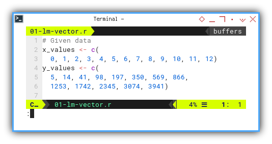
This is the classic “x and y walked into a scatterplot” setup.
We aim to fit our values using a linear regression model. Mathematically, it looks like tthis.
But why stop at a line when we can escalate this to curves with extra flair?
Let us unleash the lm() function with a polynomial twist.
First we need to define the order of the curve fitting.
Then perform cubic regression using lm().
With the lm_model object we can get the coefficient.
But for printing, we need to reverse order to match output.
At last, we can print the coefficients with cat.
order <- 3

lm_model <- lm(y_values ~
  poly(x_values, order, raw = TRUE))

coefficients <- coef(lm_model)
coefficients <- coefficients[
  length(coefficients):1]

cat("Coefficients (a, b, c, d):\n\t",
  coefficients, "\n")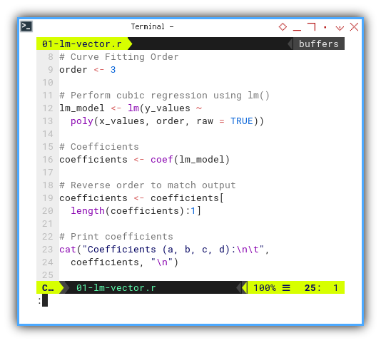
This should output something along the lines of:
❯ Rscript 01-lm-vector.r
Coefficients (a, b, c, d):
         2 3 4 5
It is so predictable, right? with the confidence of a stats professor grading on a curve.
Need something more interactive? Check the JupyterLab version:
Starting with hardcoded vectors helps us test the waters. We build intuition without file I/O headaches.
Reading from CSV
Let’s switch gears from hardcoding vector to file reading.
Because eventually, all our precious data ends up in CSVs,
the duct tape of data science.
We can utilize built-in read.csv method
to read data from CSV file.
We need to extract x values and y values from the data frame.
data <- read.csv("series.csv")

x_values <- data$xs
y_values <- data$ys3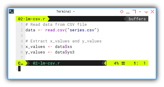
Same data, different delivery method. It’s like ordering the same meal, dine-in versus takeaway.
Interactive version here:
Real-world datasets rarely arrive as perfectly typed vectors.
CSVs are the bridge between the wild data world and our cozy R environment.
Using Readr
Now for the fancier way, with readr library.
We upgrade from public transport to a private data limousine.
It’s faster, more flexible, and supports better metadata handling.
First we need to load the required readr library.
Then read data from CSV file and put into a dataframe.
Then create a variable shortcut,
by extracting x values and y values.
library(readr)

data <- read_csv(
  "series.csv",
  show_col_types = FALSE)

column_spec <- spec(data)

x_values <- data$xs
y_values <- data$ys3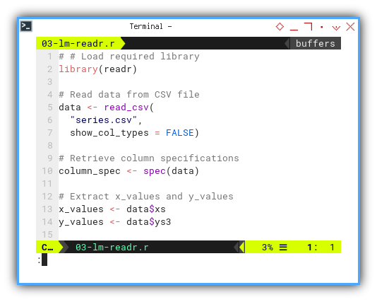
We can retrieve the column specifications,
and print if we need to inspect.
The spec() function helps us peek,
into how R interprets each column,
no surprises allowed.
JupyterLab version available here:
In large or complex projects,
readr improves data loading reliability and error messages.
More stats, less drama.
Different Order of LM
Why settle for one flavor of linear modeling, when we can sample the whole polynomial buffet? We can repeat above code for different order, or make it simpler.
Let’s write a reusable function so we don’t feel like a broken record.
This function,
perform linear regression using lm().
Also define a named vector to map order numbers to curve types.
Get the coefficients and also reverse order to match equation above.
And we can finally print the coefficients result.
calc_coeff <- function(x_values, y_values, order) {
  lm_model <- lm(y_values ~
    poly(x_values, order, raw = TRUE))

  coeff_text <- c(
    "(a, b)" = 1, "(a, b, c)" = 2, "(a, b, c, d)" = 3)
  order_text <- c(
    "Linear" = 1, "Quadratic" = 2, "Cubic" = 3)

  cat(paste("Using lm_model :",
    names(order_text)[order], "\n"))

  coefficients <- coef(lm_model)
  coefficients <- coefficients[
    length(coefficients):1]

  cat("Coefficients ",
    names(coeff_text)[order], ":\n\t",
    coefficients, "\n")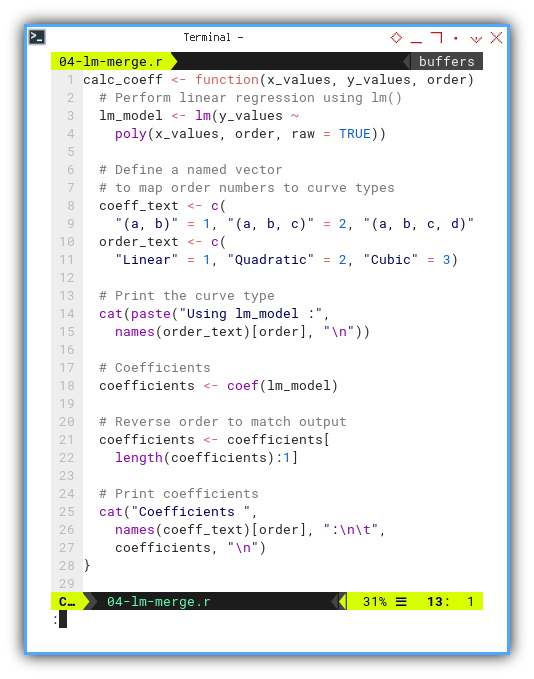
This way we can calculate coefficient, for different order and for different series. Now let’s throw in some real data and try multiple models.
library(readr)
data <- read_csv(
  "series.csv",
  show_col_types = FALSE)

calc_coeff(data$xs, data$ys1, 1)
calc_coeff(data$xs, data$ys2, 2)
calc_coeff(data$xs, data$ys3, 3)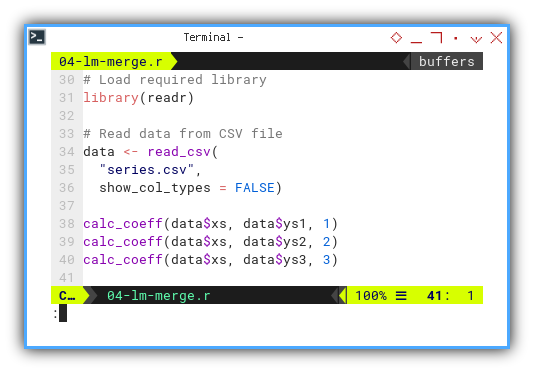
Expected output:
❯ Rscript 04-lm-merge.r
Using lm_model : Linear
Coefficients  (a, b) :
         4 5
Using lm_model : Quadratic
Coefficients  (a, b, c) :
         3 4 5
Using lm_model : Cubic
Coefficients  (a, b, c, d) :
2 3 4 5 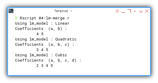
JupyterLab edition available here:
We can test different models and complexity levels with ease. This is critical when the true relationship is, hiding behind layers of curve-fitting suspense.
That wraps up the core machinery of linear modeling in R.
We started with simple vectors, took a CSV detour,
leveled up with readr, and built a flexible regression toolkit.
And remember, in statistics, it’s all about fitting in. Even if that means adding a few extra powers of x just to impress the plot.
Trend: Built-in Plot
When in doubt, plot it out.
Sometimes we do not need shiny visuals or fancy libraries.
Base R's plotting functions may look like they were designed in the late ’90s,
because they were.
But they get the job done with minimal fuss.
It is like the trusty wrench in a toolbox: not flashy, but reliable.
It is rather limited, but enough to get started with plotting.
Default Output
By default, R quietly saves the result to a file called Rplot.pdf.
It is polite like that,
but we might prefer PNG for easier embedding or sharing.
Let us switch gears:
# Open PNG graphics device
png("11-lm-line.png", width = 800, height = 400)
Choosing our output format early saves the embarrassment of, emailing a 4MB PDF when all we needed was a lightweight image for our blog post.
Linear Equation
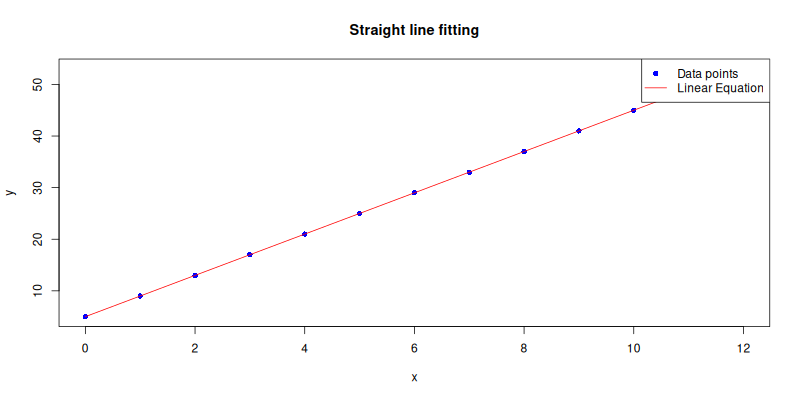
Let us start with the basics: plotting the data points. No drama. No packages. Just pixels and points.
plot(
  x_values, y_values,
  pch = 16, col = "blue",
  xlab = "x", ylab = "y",
  main = "Straight line fitting")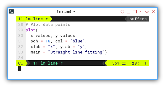
And continue with lines,
from precalculated plot values.
The y values comes from the regression line,
previously performed by lm() into lm_model.
x_plot <- seq(
  min(x_values), max(x_values),
  length.out = 100)
y_plot <- predict(
  lm_model,
  newdata = data.frame(x_values = x_plot))

lines(x_plot, y_plot, col = "red")
Then, communicate the visual result. For those of us who like clarity, or want to impress our thesis advisor, we add a legend:
legend("topright",
  legend = c("Data points", "Linear Equation"),
  col = c("blue", "red"),
  pch = c(16, NA), lty = c(NA, 1))
The plot result can be shown as follows:
You can explore the interactive JupyterLab version here:
A regression without a plot is like a punchline without a joke. Visuals make trends obvious, and suspicious outliers even more so.
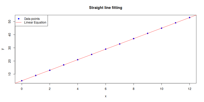
Straight Line
For those who believe in minimalism and shortcuts
(i.e., statisticians during finals week),
we can use abline() to draw the regression line,
directly from the model to the plot.
so we don’t have to generate the y_plot values manually.
abline(lm_model, col = "red")The plot result can be shown as follows:
Interactive Jupyter Notebook:
abline() is like Ctrl+C for plotting regression lines.
Quick. Dirty. Efficient.
Use when elegance is less important than speed.
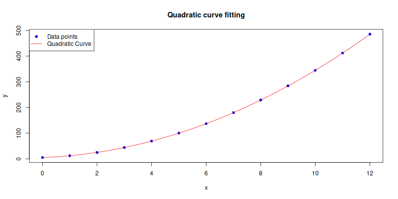
Quadratic Curve
What if the data curves a little? Like life, sometimes it is not linear. All we need to do is increase the polynomial order, and adjust the decorations accordingly.
order <- 2The plot result can be shown as follows:
Interactive Jupyter Notebook:
Quadratic regression captures parabolic trends, essential when things speed up or slow down in a curve, like population growth or our anxiety curve before a deadline.
Cubic Curve
When linear and quadratic just do not cut it, cubic fits come to the rescue. More flexible. More wiggly. More impressive looking in presentations.
order <- 3The plot result can be shown as follows:
You can obtain the interactive JupyterLab in this following link:
Cubic fits can capture subtle turning points in data, though if the model starts oscillating wildly, it may be a cry for help. Statistically speaking, that’s called overfitting. ocially speaking, it’s called trying too hard.
Trend: ggplot2
Plotting with the elegance of a violin plot at a tuxedo gala.
When our data gets more expressive,
and our plots need to level up from “quick sketch” to “conference-ready”,
we turn to the ever-fancy ggplot2.
But be warned: ggplot2 is not just a library, it is a grammar.
A syntax ballet of layers and aesthetics.
This plotting has its own grammar.
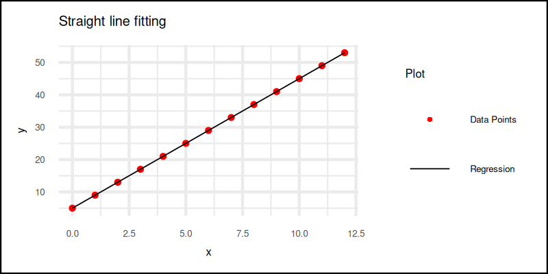
Linear Equation
Let us begin our first dance with a simple straight line.
Before we build the plot, we prepare the stage.
We generate prediction values from our linear model,
and organize both raw data and predicted values,
into proper data.frame structures.
x_plot <- seq(
  min(x_values), max(x_values),
  length.out = 100)
y_plot <- predict(
  lm_model,
  newdata = data.frame(x_values = x_plot))

data <- data.frame(x = x_values, y = y_values)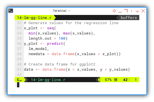
Now the real show begins.
Plot using ggplot2.
We assemble plot components piece by piece,
using the + operator.
As you can see, there is a lot of plus sign here.
This like an object stacked with another object,
all in one ggplot2 figure.
The statistical version of LEGO bricks.
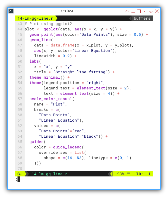
plot <- ggplot(data, aes(x = x, y = y)) +
  geom_point(aes(color="Data Points"), size = 0.5) +
  geom_line(
    data = data.frame(x = x_plot, y = y_plot),
    aes(x, y, color="Linear Equation"),
    linewidth = 0.2) +
  labs(
    x = "x", y = "y",
    title = "Straight line fitting") +
  theme_minimal() +
  theme(legend.position = "right",
        legend.text = element_text(size = 2),
        text = element_text(size = 4)) +
  scale_color_manual(
    name = "Plot",
    breaks = c(
      "Data Points",
      "Linear Equation"),
    values = c(
      "Data Points"="red",
      "Linear Equation"="black")) +
  guides(
    color = guide_legend(
      override.aes = list(
        shape = c(16, NA), linetype = c(0, 1)
    )))
And finally, we save the plot as a PNG,
using pixel-perfect dimensions fit for a blog, report,
or that paper we are totally going to submit before the deadline.
# Save plot as PNG
ggsave("14-lm-gg-line.png",
  plot, width = 800, height = 400, units = "px")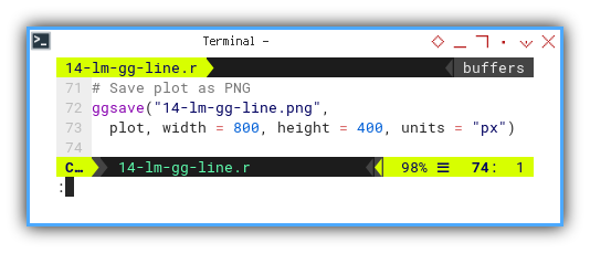
The plot result can be shown as follows:
You can obtain the interactive JupyterLab in this following link:
With ggplot2, our plot becomes both readable and customizable.
It gives us control over every element,
ideal when we want clarity without sacrificing style.
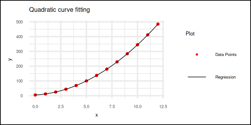
Quadratic Curve
Now, we raise the degree of complexity, literally.
By tweaking the data, increasing the model’s order,
and adjusting the aesthetic elements just a tad,
we can reuse our ggplot2 structure for a curvier scenario.
order <- 2The plot result can be shown as follows:
You can obtain the interactive JupyterLab in this following link:
Real-world data often bends and twists. Quadratic fits help us capture those subtle curves, without spiraling into polynomial madness, yet.
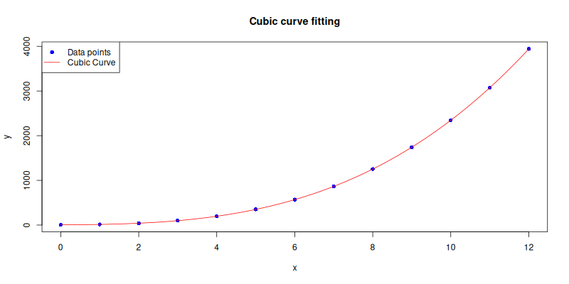
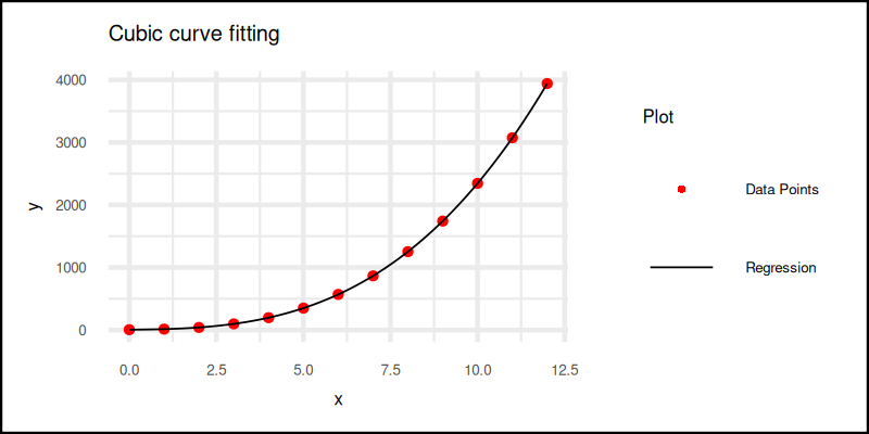
Cubic Curve
And finally, for datasets with extra flair (or drama), we apply a cubic fit. Just as before, we update the order and reuse the same plotting template.
order <- 3The plot result can be shown as follows:
You can obtain the interactive JupyterLab in this following link:
Cubic fits let us catch turning points and inflection. Great for trends that change direction. But let’s not get carried away. Beyond cubic, it often stops being insight and starts being noise.
Easy peasy?
Quite so, once we see ggplot2 for what it really is:
not a plotting tool, but a grammar for visual storytelling.
One where each + means and also,
and each aes() is our secret decoder ring.
What’s the Next Chapter 🤔?
Our ggplot2 adventure has drawn a neat little line,
or curve, to a temporary stop.
But as statisticians, we know the story doesn’t end at a good plot.
Next, we dive into Rs building models,
that think in terms of classes and distributions.
Yes, it’s time for some character development,
where our data points stop being just dots,
and start acting like they belong to something bigger.
Curious about regression’s more sociable cousin? The one that cares about categories and not just numbers? Then grab a fresh cup of coffee and head over to: [ Trend - Language - R - Part Two ].