Preface
Goal: Getting to know the basic of visualizing distribution curve.
Since we also need to visualize the interpretation of statistics properties against the distribution plot curve, we need to get the basic of making distribution plot curve.
Before we get too excited about t-values and p-values,
let’s remember where they live: in the comforting arms of the distribution curve.
If statistics had a family tree, the normal distribution would be the well-dressed grandparent,
who everyone references but nobody fully understands.
To better interpret our regression output,
it’s wise to revisit how distributions work.
Starting from scratch, let’s draw them, shade them, and twist them into funny shapes.
Behind every t-test is a bell curve just waiting to shine.
Distribution
Ah, plotting! The visual symphony of statistics. Let’s roll up our sleeves and start composing. Crafting a plot is interesting.
Probability Density Function (PDF)
Our first guest: the standard normal distribution. Elegant. Symmetrical. Like a bell that never rings.
Its probability density function (PDF) is:
This is the benchmark of “normality” in statistics.
Most tests, including our regression’s p-values,
assume something roughly bell-shaped underneath.
Knowing how it looks helps us spot when things go awry.
Normal
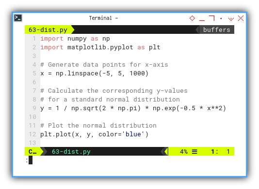
Start by generating a set of values along the x-axis:
import numpy as np
import matplotlib.pyplot as plt

x = np.linspace(-5, 5, 1000)
We can implement the equation for the probability density function (PDF) of a standard normal distribution as follows:
y = 1 / np.sqrt(2 * np.pi) * np.exp(-0.5 * x**2)
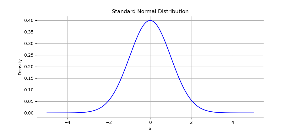
plt.plot(x, y, color='blue')🎨 Voilà: the classic bell curve.
The result of the plot can be visualized as below:
Not in the mood for calculus? Let scipy do the heavy lifting:
Instead of manually calculating,
Let scipy.stats do the heavy lifting:
from scipy.stats import norm
y = norm.pdf(x)
We can play around with it in this Jupyter notebook:
Quantiles
With normal distribution, we can go further with visualizing quantiles. Let’s add some color by slicing the bell into pieces.
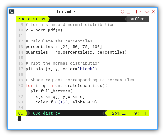
y = norm.pdf(x)

percentiles = [25, 50, 75, 100]
quantiles = np.percentile(x, percentiles)

plt.plot(x, y, color='black')
Now we can shade regions corresponding to percentiles as follows:
for i, q in enumerate(quantiles):
  plt.fill_between(
    x[x <= q], y[x <= q],
    color=f'C{i}', alpha=0.3)
The terms quartiles and quantiles, are related but not exactly the same. Quartiles divide a dataset into four equal parts. Quantiles, on the other hand, divide a dataset into any number of equal parts.
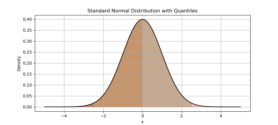
The result of the plot can be visualized as below:
Notebook for tinkering:
Quantiles tell yus where your data falls. Great for understanding outliers, or explaining why our boss’s sales numbers are in the 95th percentile.
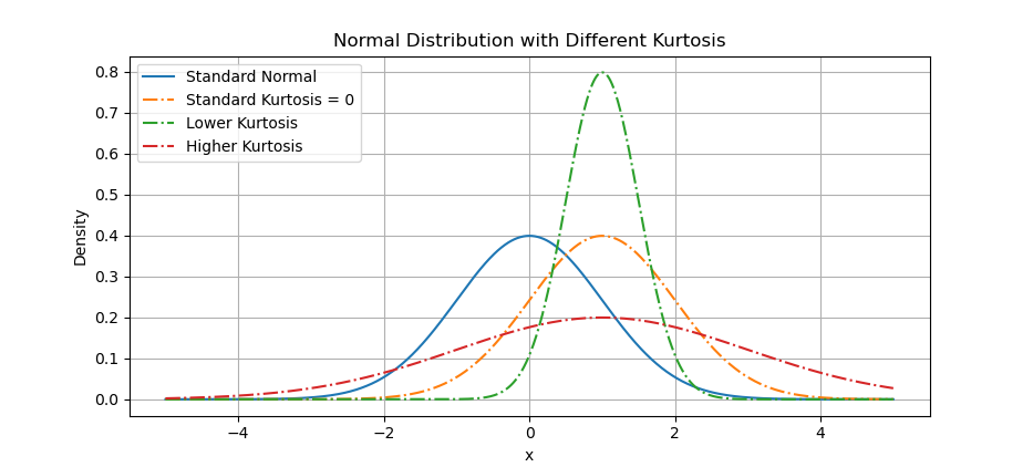
Kurtosis
Let’s meet our first rebel: kurtosis.
It measures whether the tails of a distribution are chunky or skinny.
- Think of it as how dramatic your data likes to be.
We’ll use skewnorm.pdf with different scale values to simulate kurtosis.
Let’s compare them visually. Below arrangement are visualization examples of distributions with different levels of kurtosis. To differ with the normal distribution, I move the curve to the right.
from scipy.stats import skewnorm, norm, kurtosis

x = np.linspace(-5, 5, 1000)
y_standard = norm.pdf(x)

y_kurtosis_1 = skewnorm.pdf(x, a=0, loc=1, scale=1)
y_kurtosis_2 = skewnorm.pdf(x, a=0, loc=1, scale=0.5)
y_kurtosis_3 = skewnorm.pdf(x, a=0, loc=1, scale=2)
Now we can plot distributions with different levels of kurtosis, on the same plot with the normal distribution.
plt.plot(x, y_standard, label='Standard Normal')

plt.plot(x, y_kurtosis_1, ls='-.',
  label='Standard Kurtosis = 0')
plt.plot(x, y_kurtosis_2, ls='-.',
  label='Lower Kurtosis')
plt.plot(x, y_kurtosis_3, ls='-.',
  label='Higher Kurtosis')
The result of the plot can be visualized as below:
Notebook for hands-on play:
High kurtosis means more extreme values. Great for finance. Terrible for blood pressure.
Skewness
Next up: skewness, the art of asymmetry.
If our distribution leans to one side like a suspicious alibi, it’s skewed.
We can utilize skewnorm.pdf again to visualize skewness.
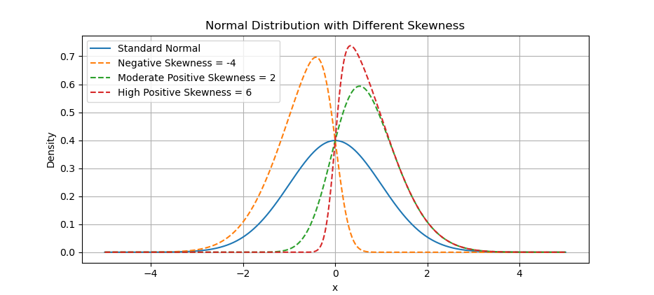
The same method of kurtosis above applied for skewness. Below arrangement are visualization examples of distributions with different skewness parameters.
y_skewed_1 = skewnorm.pdf(x, a=-4)
y_skewed_2 = skewnorm.pdf(x, a=2)
y_skewed_3 = skewnorm.pdf(x, a=6)
Let’s draw their curious curves.
plt.plot(x, y_standard, label='Standard Normal')

plt.plot(x, y_skewed_1, ls='--',
         label='Negative Skewness = -4')
plt.plot(x, y_skewed_2, ls='--',
         label='Moderate Positive Skewness = 2')
plt.plot(x, y_skewed_3, ls='--',
         label='High Positive Skewness = 6')
The result of the plot can be visualized as below:
Notebook for exploration:
Skewness tells us where most data is hiding. Useful when averages lie, like when a few rich folks mess up the “average income”.
Scaled Skewness
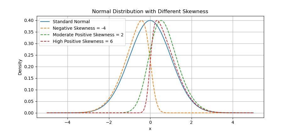
Statistically speaking, it’s not fair to compare plots, when one is shouting and the other’s whispering. The actual of skewness has different height. For simplicity we can scale so that, the height looks visually the same. Let’s level the playing field.
We’ll scale the skewed curves to match the standard normal’s peak height: Set the skewed distributions to have the same maximum height as the standard normal distribution. This way we can compare better.
max_height_standard = np.max(y_standard)

y_skewed_1_scaled = y_skewed_1 \
  / np.max(y_skewed_1) * max_height_standard
y_skewed_2_scaled = y_skewed_2 \
  / np.max(y_skewed_2) * max_height_standard
y_skewed_3_scaled = y_skewed_3 \
  / np.max(y_skewed_3) * max_height_standard
The result of the plot can be visualized as below:
Notebook available here:
When comparing shapes, height shouldn’t distract from symmetry (or the lack thereof). Scaling gives a fair visual comparison.
What’s the Next Chapter 🤔?
There are also common properties for statistics not related with trend. In trend context let’s call them additional properties. This properties is important for other statistics analysis.
Distribution is just the appetizer. Now that we know how the data looks, we’re ready to inspect some behind-the-scenes properties, that aren’t directly about trendlines, but still impact analysis.
Up next: [ Trend - Properties - Additional ] Because even statistics have bonus features.