Preface
Goal: Goes further from linear regression to polynomial regression. The practical implementation, shows how to implement the theory in python code.
We’ve already built the theoretical scaffolding, and wrestled Excel into obedience. But real-world data is messy, expectations are high, and Ctrl+C only goes so far as the rows grow. It’s time to move from spreadsheets to scripts, from clicking to coding.
Now don’t get me wrong, spreadsheets are fantastic. They make us look brilliant in meetings, and our office admin can spot a trend, faster than our manager can say “Q4 report.” But let’s face it: they’re not built for scale, automation, or creative chaos.
That’s where Python enters, stage left. 🐍 With Python, we will:
-
Reproduce our polynomial models programmatically
-
Automate the boring stuff (goodbye, repetitive formula updates!)
-
Customize for edge cases (reality rarely follows your tidy cell ranges)
When your data hits 10,000 rows, we’ll want something more robust than Excel and a prayer.
So sharpen our Jupyter notebooks, warm up our terminal, and prepare for lift-off into, the statistically thrilling world of Polynomial Regression in Python.
Let’s bring theory to life, with code.
1: Statisctic Properties
Welcome to the part where we roll up our sleeves, and inspect the machinery inside polynomial regression. Not just admiring the curve, but poking at the math that put it there.
We’ll begin with minimalist tools (hello, numpy)
before bringing in reinforcements from scipy and sklearn.
This is the programmer’s equivalent of,
starting with a torque wrench before switching to a power drill.
We are going to start from minimalist to solve this situation, using numpy manual calculation only, then utilize other library as well. Since most topic is already covered in previous section, we are going to skip the explanation, and goes to ready to use class, for practical application.
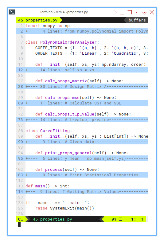
1: From Skeletons to Stats:
Building Blocks
This time we’re engineering a master-detail class setup,
with CurveFitting orchestrating the show,
and PolynomialOrderAnalyzer doing the dirty work,
for linear, quadratic, and cubic fits.
One main class, manage three kind of polynomial order.
import ...

class PolynomialOrderAnalyzer:
    ...

class CurveFitting:
    ...

def main() -> int:
    ...

if __name__ == "__main__":
    raise SystemExit(main())
A reusable, extensible codebase saves future-us, from copy-paste regret. And lets us test multiple fits with a single call.
Yes, it’s verbose. But so is our favorite statistics professor, who often explain things in great depth.
2: CurveFitting
The Conductor
The first is the main CurveFitting class.
This is the main controller.
It stores data, prints general stats,
and loops through each polynomial order.
class CurveFitting:
    def __init__(self, xs, ys : List[int]) -> None:
        ...

    def print_props_general(self) -> None:
        ...

    def process(self) -> None:
        ...
Polynomial fitting is only useful, if we understand how the curve behaves across different complexities. This lets us test and compare all three in one go.
3: PolynomialOrderAnalyzer
The Intern Who Does the Actual Work
Then comes the PolynomialOrderAnalyzer class to analyse each order.
class PolynomialOrderAnalyzer:
    COEFF_TEXTS = {1: '(a, b)', 2: '(a, b, c)', 3: '(a, b, c, d)'}
    ORDER_TEXTS = {1: 'Linear', 2: 'Quadratic', 3: 'Cubic'}

    def __init__(self, xs, ys: np.ndarray, order: int) -> None:
        ...

    def calc_props_matrix(self) -> None:
        ...

    def calc_props_mse(self) -> None:
        ...

    def calc_props_t_p_value(self) -> None:
        ...
This is where we compute the good stuff.
The matrix math, error stats, and the ever-humble p-values.
4 : Required Imports
The Arsenal
We need to include a few import statements.
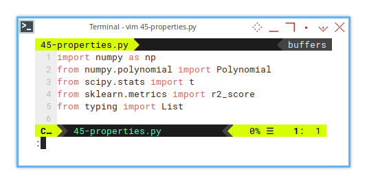
import numpy as np
from numpy.polynomial import Polynomial
from scipy.stats import t
from sklearn.metrics import r2_score
from typing import List
You can see that we are going to use a few different library.
Yes, scipy.stats.t is our friendly t-distribution.
Like any good academic, it’s judgy and loves small p-values.
5: Data Series
From humble rows, mighty fits are born.
For example using these series,
you may choose ys₁, ys₂, or ys₃:
xs, ys1, ys2, ys3
0,  5,   5,   5
1,  9,   12,  14
2,  13,  25,  41
3,  17,  44,  98
4,  21,  69,  197
5,  25,  100, 350
6,  29,  137, 569
7,  33,  180, 866
8,  37,  229, 1253
9,  41,  284, 1742
10, 45,  345, 2345
11, 49,  412, 3074
12, 53,  485, 3941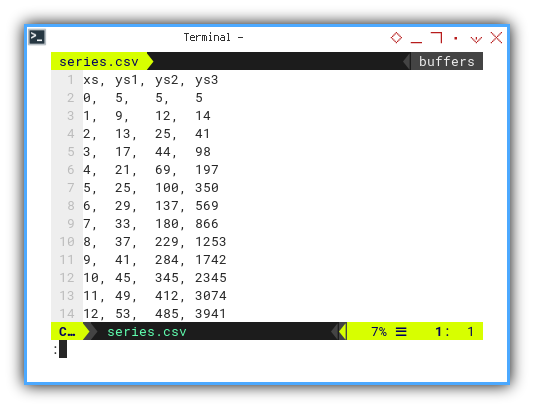
Real-world data often bends and curves. Linear fits get nervous. Higher-order polynomials step in.
6: Entry Point
Where the Show Begins
The entry point is simply as below:
if __name__ == "__main__":
    raise SystemExit(main())
While the main function itself is just CSV loader, featuring column chooser.
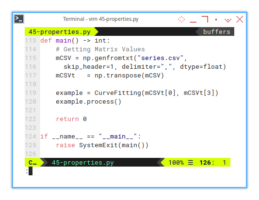
def main() -> int:
    # Getting Matrix Values
    mCSV = np.genfromtxt("series.csv",
      skip_header=1, delimiter=",", dtype=float)
    mCSVt   = np.transpose(mCSV)

    example = CurveFitting(mCSVt[0], mCSVt[3])
    example.process()

    return 0
Yes, we pick a column and unleash math on it.
7: CurveFitting: Initialization
We just need to convert he list to np.array, for further use.
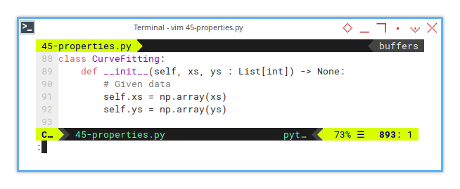
class CurveFitting:
    def __init__(self, xs, ys : List[int]) -> None:
        # Given data
        self.xs = np.array(xs)
        self.ys = np.array(ys)
8: CurveFitting: General Properties
ȳ and ∑(yᵢ - ȳ)²
Then print general properties.
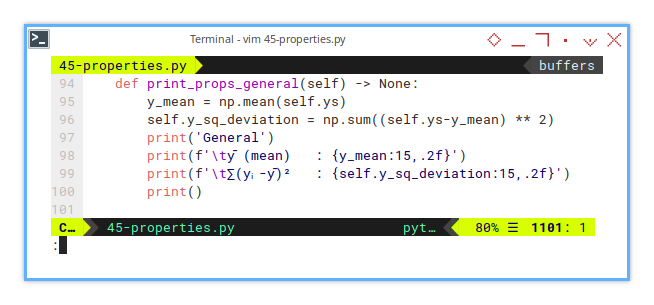
    def print_props_general(self) -> None:
        y_mean = np.mean(self.ys)
        self.y_sq_deviation = np.sum((self.ys-y_mean) ** 2)
        print('General')
        print(f'\tȳ (mean)   : {y_mean:15,.2f}')
        print(f'\t∑(yᵢ-ȳ)²   : {self.y_sq_deviation:15,.2f}')
        print()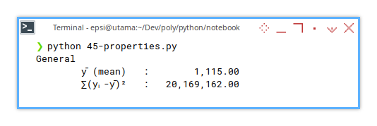
Before fitting a curve, we need to know how wild the data is. This is our baseline. The “no model” chaos.
9: CurveFitting: Process
Loop Through Orders
Here we print all the properties.
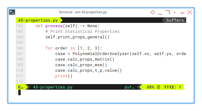
    def process(self) -> None:
        # Print Statistical Properties
        self.print_props_general()

        for order in [1, 2, 3]:
            case = PolynomialOrderAnalyzer(self.xs, self.ys, order)
            case.calc_props_matrix()
            case.calc_props_mse()
            case.calc_props_t_p_value()
            print()
Not all curves are created equal. Some just overfit and lie. This loop checks who’s telling the truth.
10: Polynomial Order Analyzer: Initialization
Here we take care of each polynomial order.
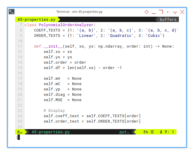
class PolynomialOrderAnalyzer:
    COEFF_TEXTS = {1: '(a, b)', 2: '(a, b, c)', 3: '(a, b, c, d)'}
    ORDER_TEXTS = {1: 'Linear', 2: 'Quadratic', 3: 'Cubic'}

    def __init__(self, xs, ys: np.ndarray, order: int) -> None:
        self.xs = xs
        self.ys = ys
        self.order = order
        self.df = len(self.xs) - order -1

        self.mA   = None
        self.mC   = None
        self.yp   = None
        self.diag = None
        self.MSE  = None

        # Display
        self.coeff_text = self.COEFF_TEXTS[order]
        self.order_text = self.ORDER_TEXTS[order]
11: Properties Calculation: Matrix
Design and Coefficients
The actual matrix calculation is short.
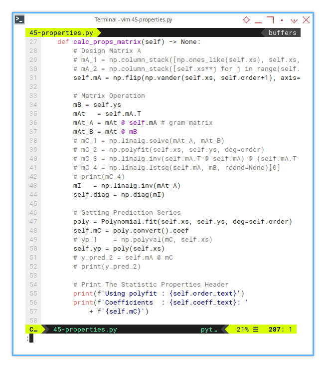
    def calc_props_matrix(self) -> None:
        # Perform regression using polynomial.
        poly = Polynomial.fit(self.xs, self.ys, deg=self.order)
        self.mC = poly.convert().coef
        self.yp = poly(self.xs)

        # Matrix Operation
        self.mA = np.flip(np.vander(self.xs, self.order+1), axis=1)
        mAt   = self.mA.T
        mAt_A = mAt @ self.mA # gram matrix
        mI   = np.linalg.inv(mAt_A)
        self.diag = np.diag(mI)

        print(f'Using polyfit : {self.order_text}')
        print(f'Coefficients  : {self.coeff_text}: '
            + f'{self.mC}')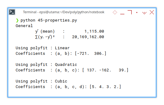
But for broader overview, we have different kind of calculations. I commented the alterantive calculation.
Design Matrix A
        # Design Matrix A
        # mA_1 = np.column_stack([np.ones_like(self.xs), self.xs, self.xs**2])
        # mA_2 = np.column_stack([self.xs**j for j in range(self.order+1)])  # Design matrix
        self.mA = np.flip(np.vander(self.xs, self.order+1), axis=1)
Matrix Operation
        mB = self.ys
        mAt   = self.mA.T
        mAt_A = mAt @ self.mA # gram matrix
        mAt_B = mAt @ mB
        # mC_1 = np.linalg.solve(mAt_A, mAt_B)
        # mC_2 = np.polyfit(self.xs, self.ys, deg=order)
        # mC_3 = np.linalg.inv(self.mA.T @ self.mA) @ (self.mA.T @ mB)
        # mC_4 = np.linalg.lstsq(self.mA, mB, rcond=None)[0]
        # print(mC_4)
        mI   = np.linalg.inv(mAt_A)
        self.diag = np.diag(mI)
Getting Prediction Series
        poly = Polynomial.fit(self.xs, self.ys, deg=self.order)
        self.mC = poly.convert().coef
        # yp_1    = np.polyval(mC, self.xs)
        self.yp = poly(self.xs)
        # y_pred_2 = self.mA @ mC
        # print(y_pred_2)
Print The Statistic Properties Header
        print(f'Using polyfit : {self.order_text}')
        print(f'Coefficients  : {self.coeff_text}: '
            + f'{self.mC}')
we don’t get meaningful t-tests,
unless we’ve built the model matrix right.
This is our math foundation.
12: Properties Calculation: MSE and R²
Mean Square Error
Are We Even Close?
This is how we calculate MSE manually.
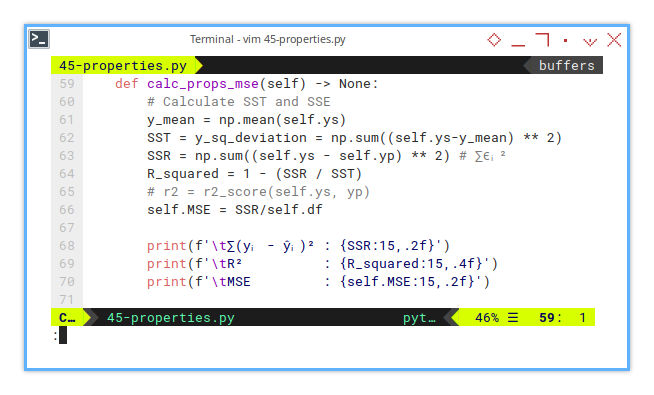
    def calc_props_mse(self) -> None:
        # Calculate SST and SSE
        y_mean = np.mean(self.ys)
        SST = y_sq_deviation = np.sum((self.ys-y_mean) ** 2)
        SSR = np.sum((self.ys - self.yp) ** 2) # ∑ϵᵢ²
        R_squared = 1 - (SSR / SST)
        # r2 = r2_score(self.ys, yp)
        self.MSE = SSR/self.df

        print(f'\t∑(yᵢ - ŷᵢ)² : {SSR:15,.2f}')
        print(f'\tR²          : {R_squared:15,.4f}')
        print(f'\tMSE         : {self.MSE:15,.2f}')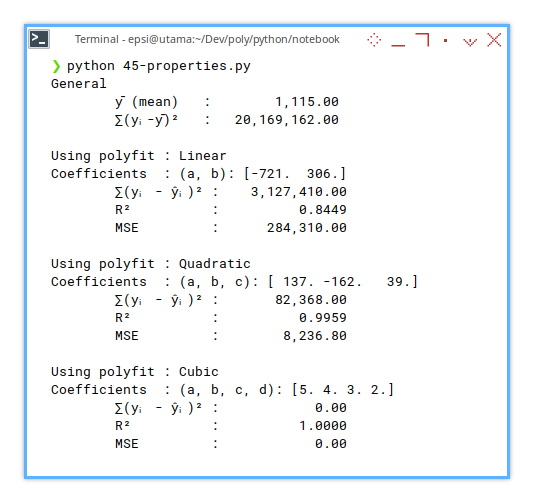
R² is our curve’s bragging score. MSE is its humility check. Together, they balance hubris and usefulness.
r2_score()?
Note that we can calculate R² using r2_score() function from sklearn.metrics.
But why can’t we calculate MSE using mean_squared_error() function from sklearn.metrics.
This is because of difference of degree freedom.
This is due of the focus of the sklearn.metrics is not for the statistical properties,
but designed for general use (e.g., evaluating predictions without knowing model internals).
The DoF in sklearn.metrics use n as divisor, while we are using (n - k -1).
Degrees of freedom matter, and sklearn doesn’t care about our academic rigor.
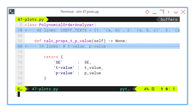
13: Properties Calculation: t-value, p-value
The Statistical Lie Detector
The calculation using t distribution is simple.
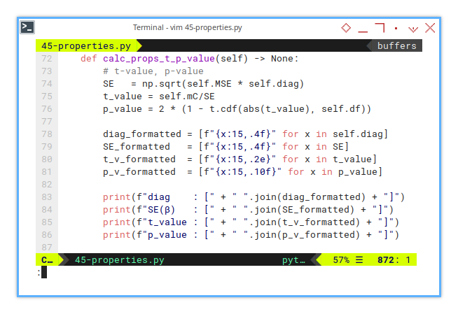
    def calc_props_t_p_value(self) -> None:
        # t-value, p-value
        SE   = np.sqrt(self.MSE * self.diag)
        t_value = self.mC/SE
        p_value = 2 * (1 - t.cdf(abs(t_value), self.df))
But we need to convert the array inpit, so that this would have nice looks in output.
        diag_formatted = [f"{x:15,.4f}" for x in self.diag]
        SE_formatted   = [f"{x:15,.4f}" for x in SE]
        t_v_formatted  = [f"{x:15,.2e}" for x in t_value]
        p_v_formatted  = [f"{x:15,.10f}" for x in p_value]
Now we can finally print the result.
        print(f"diag    : [" + " ".join(diag_formatted) + "]")
        print(f"SE(β)   : [" + " ".join(SE_formatted) + "]")
        print(f"t_value : [" + " ".join(t_v_formatted) + "]")
        print(f"p_value : [" + " ".join(p_v_formatted) + "]")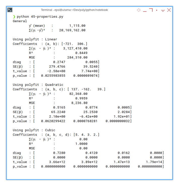
This is where we ask, “Are these coefficients statistically significant, or just enthusiastic guesswork?”
2: Simple Plot
After printing the stats (yes, all those glorious coefficients and R2R2 values), it’s time to do what every stats professor secretly lives for: draw a nice plot. But this time, we will give our chart a little more personality, and a lot more polynomial.
This time with emphasis of selected properties.
Skeleton
Anatomy of a Trend-Plotter
This plotting class is lean, and clean. We have only three new functions here:
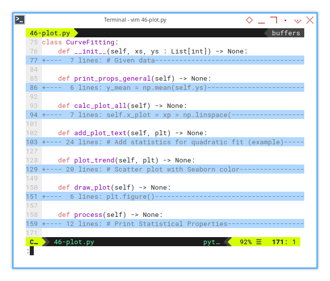
class CurveFitting:
    def __init__(self, xs, ys : List[int]) -> None:
        ...

    def print_props_general(self) -> None:
        ...

    def calc_plot_all(self) -> None:
        ...

    def add_plot_text(self, plt) -> None:
        ...

    def plot_trend(self, plt) -> None:
        ...

    def draw_plot(self) -> None:
        ...

    def process(self) -> None:
        ...
Separating concerns in code is like labeling our axes. It saves our sanity later. Each method here has a clear purpose, just like each coefficient in a quadratic equation (even the one that always seems to vanish).
Prediction Calculation
A Gentle Squeeze from Chaos into Curve
From given points, it got us three beautiful, smooth curves: linear, quadratic, and cubic. No drama. The calculation is as simple as this one below:
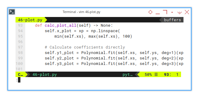
    def calc_plot_all(self) -> None:
        self.x_plot = xp = np.linspace(
            min(self.xs), max(self.xs), 100)

        # Calculate coefficients directly
        self.y1_plot = Polynomial.fit(self.xs, self.ys, deg=1)(xp)
        self.y2_plot = Polynomial.fit(self.xs, self.ys, deg=2)(xp)
        self.y3_plot = Polynomial.fit(self.xs, self.ys, deg=3)(xp)
A plot without prediction is like regression without a cause. These lines help us see how the model fits. Not just mathematically, but viscerally (cue dramatic music).
Plot Trend
The Curve Awakens
Time to let matplotlib strut its stuff.
Scatter + curves = the stats professor’s version of abstract art.
The plot is also the same as in previous section,
but I put it in separate function.
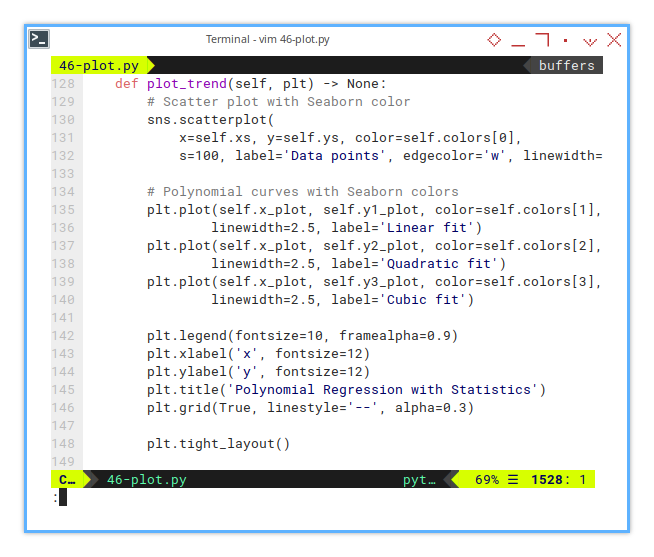
    def plot_trend(self, plt) -> None:
        # Scatter plot with Seaborn color
        sns.scatterplot(
            x=self.xs, y=self.ys, color=self.colors[0],
            s=100, label='Data points', edgecolor='w', linewidth=0.5)

        # Polynomial curves with Seaborn colors
        plt.plot(self.x_plot, self.y1_plot, color=self.colors[1],
                linewidth=2.5, label='Linear fit')
        plt.plot(self.x_plot, self.y2_plot, color=self.colors[2],
                linewidth=2.5, label='Quadratic fit')
        plt.plot(self.x_plot, self.y3_plot, color=self.colors[3],
                linewidth=2.5, label='Cubic fit')

        plt.legend(fontsize=10, framealpha=0.9)
        plt.xlabel('x', fontsize=12)
        plt.ylabel('y', fontsize=12)
        plt.title('Polynomial Regression with Statistics')
        plt.grid(True, linestyle='--', alpha=0.3)

        plt.tight_layout()
Visualizing each polynomial degree side by side, lets us compare their fit personalities. Linear is minimal, quadratic is flexible, and cubic is a drama queen. Pick our champion.
Main Plot Function
Bringing It All Together (With Style)
Now we can merge that trend plot into the main plot function.
this way we can add additional plot later easily.
This is where it all merges:
scatterplot, curves, and stats-packed annotation box.
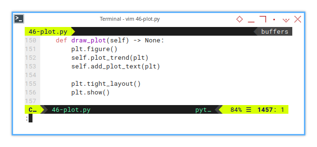
    def draw_plot(self) -> None:
        plt.figure()
        self.plot_trend(plt)
        self.add_plot_text(plt)

        plt.tight_layout()
        plt.show()
Notes that I add this weird line here. Yes, this line below may seem mysterious, but it’s the secret sauce:
self.add_plot_text(plt)Numbers are powerful, but annotations turn our chart into a conversation. Especially when our audience is tired and caffeinated.
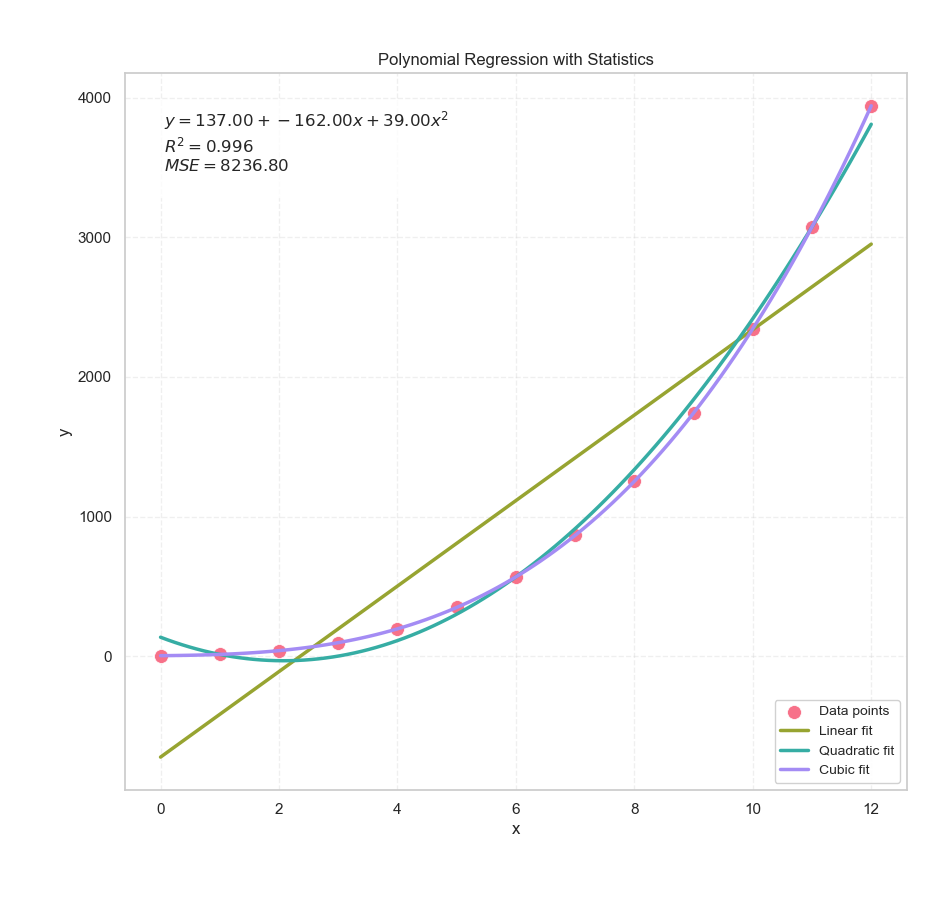
Selected Properties
Stats in a Box
Sometimes, we want the plot to speak, specifically, to whisper something like:
_Hey, quadratic fit here._
_I’ve got an R²=0.928,_
_and a mean squared error of only 2.1._
_Just saying._
This line add a box for any text. For example, if we want to emphasis, the result of the second order polynomial, We can display the statistical properties easily.
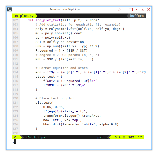
    def add_plot_text(self, plt) -> None:
        # Add statistics for quadratic fit (example)
        poly = Polynomial.fit(self.xs, self.ys, deg=2)
        mC = poly.convert().coef
        yp = poly(self.xs)
        SST = self.y_sq_deviation
        SSR = np.sum((self.ys - yp) ** 2)
        R_squared = 1 - (SSR / SST)
        MSE = SSR / (len(self.xs) - 3)  # deg=2 → 3 params (a, b, c)

        # Format equation and stats
        eqn = f"$y = {mC[0]:.2f} + {mC[1]:.2f}x + {mC[2]:.2f}x^2$"
        stats_text = (
            f"$R^2 = {R_squared:.3f}$\n"
            f"$MSE = {MSE:.2f}$\n"
        )

        # Place text on plot
        plt.text(
            0.05, 0.95,
            f"{eqn}\n{stats_text}",
            transform=plt.gca().transAxes,
            ha='left', va='top',
            bbox=dict(facecolor='white', alpha=0.8)
        )
This turns our graph into a mini-report. When people ask, “So, how good is your model?”, we can just point at the chart smugly.
Execute The Process
The Grand Finale
Put it all together. This is the conductor cueing the orchestra. Then add the plot to the main process.
    def process(self) -> None:
        # Print Statistical Properties
        self.print_props_general()

        for order in [1, 2, 3]:
            case = PolynomialOrderAnalyzer(self.xs, self.ys, order)
            case.calc_props_matrix()
            case.calc_props_mse()
            case.calc_props_t_p_value()
            print()

        self.calc_plot_all()
        self.draw_plot()
If this method were a person, it would be your overachieving classmate, who not only finishes the assignment, but also builds a working demo with animated transitions.
The Result
Not Just a Chart, But a Conversation
Yes, it’s still a humble old scatter plot chart. But now it speaks. It tells us how well the curve fits, which model performs better, and whether our hypothesis has any statistical backbone.
Feedback
Got a different way to interpret the fit? Found a flaw in the logic? Or just want to argue that cubic fits are overkill 90% of the time? Let’s chat—data nerd to data nerd.
I welcome any other useful interpretation, or any feedback. If you think my visualization, or interpretation is wrong, please let me know.
3: Visualizing the Invisible
Coefficients
When our regression results are feeling a little too abstract, like a shy statistician at a party, it’s time to give them a visual voice. Let’s plot the statistical properties of our polynomial coefficients, because staring at numbers in a table is so last century.
I actually do not have any idea for the visualization of the statistical properties. But I think we can recap the coefficient result in a simple chart. so people can just read our result easily.
We’re talking standard errors, t-values, and p-values. Yes, those awkward guests at every stats gathering, let’s shine a spotlight on them.
Saving the Statistical Goods
Before we can show off our coefficients’ credentials, we need to save them. Think of this step as grabbing their résumé before printing it on a billboard.
class PolynomialOrderAnalyzer:
    ...

    def calc_props_t_p_value(self) -> None:
        ...

        return {
            'SE'      :  SE,
            't-value' :  t_value,
            'p-value' :  p_value
        }
These values tell us how trustworthy each coefficient is. They’re like GPA scores for your polynomial terms.
- Big t-values? Great!
- Tiny p-values? Even better!
And no, no need to add abs(t_value). Negative coefficients deserve love too. The direction in positive and negative is matter.
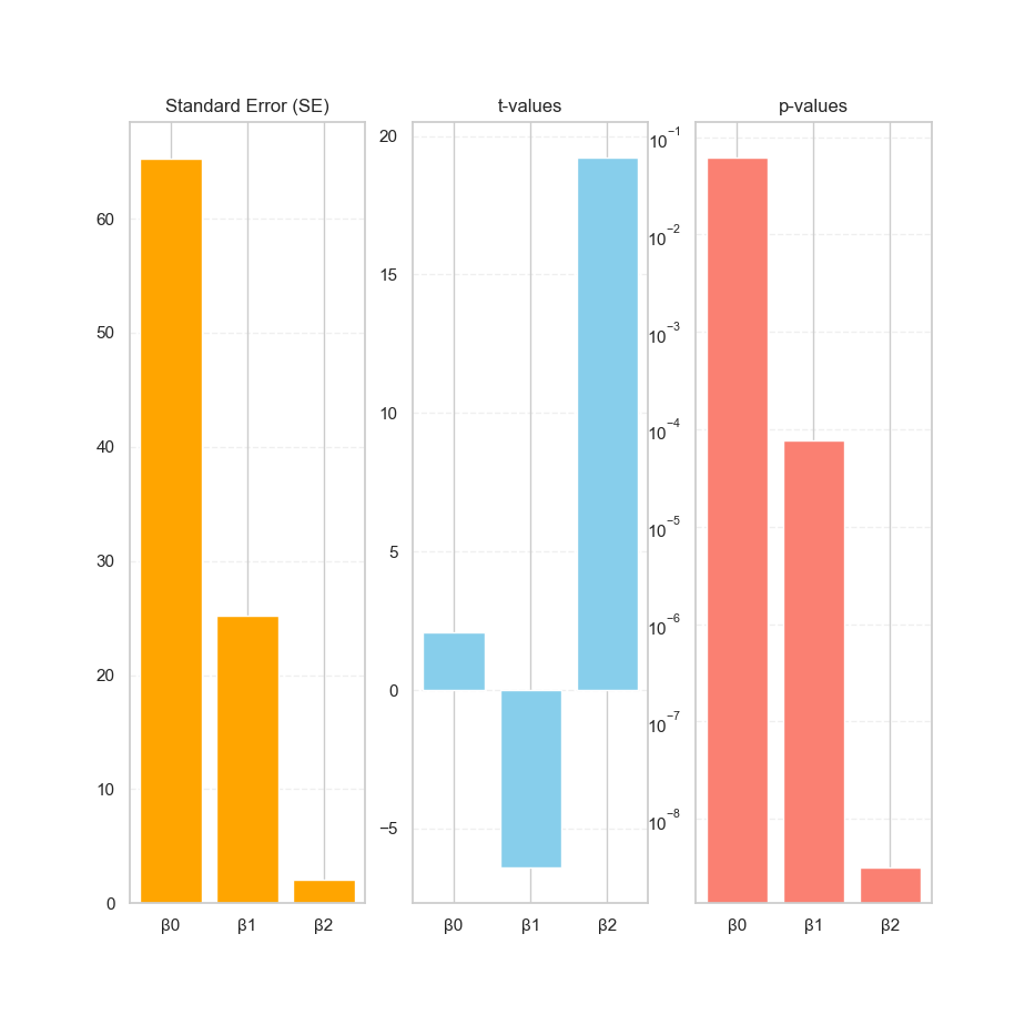
Statistic Plot
Bar Charts to the Rescue
Numbers can mumble, but plots shout. Let’s pick one polynomial order (say, degree 2), and visualize how each coefficient performs.
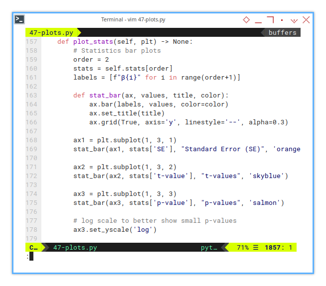
    def plot_stats(self, plt) -> None:
        # Statistics bar plots
        order = 2
        stats = self.stats[order]
        labels = [f"β{i}" for i in range(order+1)]

        def stat_bar(ax, values, title, color):
            ax.bar(labels, values, color=color)
            ax.set_title(title)
            ax.grid(True, axis='y', linestyle='--', alpha=0.3)

        ax1 = plt.subplot(1, 3, 1)
        stat_bar(ax1, stats['SE'], "Standard Error (SE)", 'orange')

        ax2 = plt.subplot(1, 3, 2)
        stat_bar(ax2, stats['t-value'], "t-values", 'skyblue')

        ax3 = plt.subplot(1, 3, 3)
        stat_bar(ax3, stats['p-value'], "p-values", 'salmon')

        # log scale to better show small p-values
        ax3.set_yscale('log')
These plots reveal which coefficients are reliable, and which are just freeloaders pretending to help the model. The p-values in particular help us judge, whether a coefficient is significantly different from zero, or just statistically loitering.
Main Plot Function
Drawing the Big Picture
Let’s blend everything together in the draw_plot() method,
both the trend and the stats.
Context is everything:
without the trend line, those stats are just numbers in a vacuum.
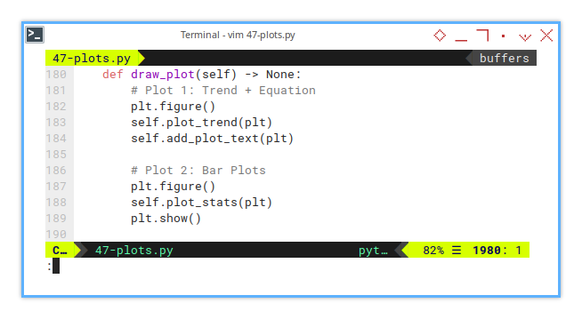
    def draw_plot(self) -> None:
        # Plot 1: Trend + Equation
        plt.figure()
        self.plot_trend(plt)
        self.add_plot_text(plt)

        # Plot 2: Bar Plots
        plt.figure()
        self.plot_stats(plt)
        plt.show()
By combining the regression plot and its statistical underpinnings, we create a full narrative: “Here’s the curve, and here’s why we should believe it.”
No, the chart doesn’t talk (yet),
but it does whisper important truths:
“This coefficient is legit,” or “This term might be nonsense.”
And if our β₂ has a p-value that could legally be rounded to zero,
that’s our cue to shout “Statistically significant!”,
like a proud parent at graduation.
I’m still curious how to visualize further, for better visual metaphors in future posts. But this time I still have no idea. For now, these bar plots help turn statistical smoke into readable signal.
What’s the Next Exciting Step 🤔?
Now that we’ve tamed the coefficients, what’s next on this statistical safari?
Well, we’ve plotted the trend.
We’ve grilled the coefficients for their p-values.
We’ve even thrown their t-values onto a public chart for all to see.
Now it’s time to turn our eyes toward another shady character in statistics:
📈 The Distribution Curve.
If our statistical properties are the “what,” the distribution plot is the “why.” It helps us see the shape of the data that justifies those values. It’s like finally meeting the parents after dating the regression line for a while.
Understanding the distribution helps us validate assumptions. Are the residuals normal? Are we modeling randomness or just noise with a fancy hat?
But before we go full Gauss, we’ll need to brush up on the basics of drawing distribution plots. So we can later connect them with the statistical interpretations we’ve just made.
Curious how this unfolds? Continue your exploration in 👉 [ Trend - Visualizing Distribution ]. Because even regression models deserve to know where they come from.