Preface
Goal: Curve fitting examples for daily basis, using vandermonde matrix.
Let’s be honest: on a typical Tuesday, nobody wakes up excited to derive polynomial equations by hand. Fortunately, we don’t have to. I’ve got ready-made spreadsheets and Python scripts, so we can focus on the fun part, like fitting curves to wildly unpredictable real-world data (or impressing friends with our Excel wizardry).
To make things digestible, I’ve cooked up a spreadsheet with three themed tabs:
- Linear Equation (first order polynomial)
- Quadratic Equation (second order polynomial)
- Cubic Equation (third order polynomial)

Each sheet follows a familiar recipe, as seen in the last article:
-
From the known coefficient, find the points (x, y).
-
Building the matrix visually, based on equation of the system.
-
From the points (x, y), find the coefficient. Inverse the matrix, solving the equation.
Understanding how equations morph from abstract coefficients to real-world points, and back again, is the statistical equivalent of learning how the sausage is made. You don’t have to do it daily, but knowing how gives you control, when the auto-tools misbehave.
Practical
For daily basis, all you need is just the last sheet (matrix inverse) of selected case (order). The real data for daily basis is dispersed, unlike given data in this example sheet.
The worksheet is pretty explanatory. Assuming that you have read previous article, The first and the second sheet is, already well explained in previous article, so we are going to skip these sheets. I do not think that I should explain each worksheet in detail.
The python script also has been explained in previous article, the purpose of this exampale is just giving a ready to use script. So I won’t go into detail either.
Other Method
Of course, the Vandermonde matrix isn’t the only player in town. Later, we’ll look at the Least Squares Method. A powerful technique when our data points refuse to play nice (which they always do).
Multiple tools mean more flexibility. When one method makes your data look like a confused doodle, another might give you a Mona Lisa.
Worksheet Source
Playsheet Artefact
Here’s the Excel file. Tinker, explore, and maybe even break it. The best way to understand something is to make it crash gloriously.
1: Linear Equation
First Order Polynomial Method
Curve Fitting
Since real data matrix is definitely not a square matrix,
and matrix inverse can only work with square nxn matrix.
We need to alter the equation with transpose.
Our real-world data shows up in a less-than-cooperative format (read: a tall, skinny matrix), things get interesting. Since we can’t invert a non-square matrix, we apply a little matrix magic: the transpose trick.
Here’s how that looks in spreadsheet reality:
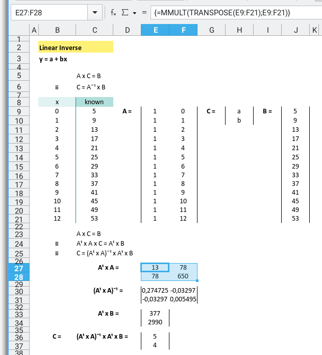
To recap the formula:
First, calculate Aᵀ × A:
=MMULT(TRANSPOSE(E9:F21);E9:F21)Then take the inverse:
=MINVERSE(E27:F28)Multiply Aᵀ × B:
=MMULT(TRANSPOSE(E9:F21);J9:J21)And finally, the crown jewel: calculate the coefficient vector CC
=MMULT(E30:F31;E33:E34)Tidy it all up, and your spreadsheet transforms from chaos to clarity:
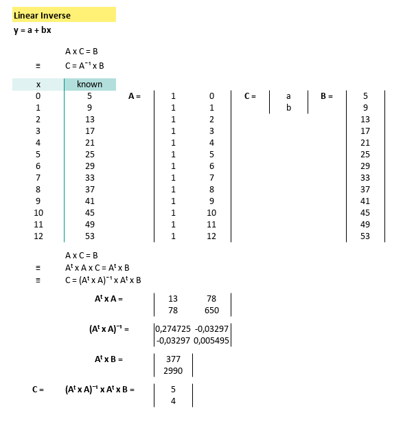
With our shiny new coefficients:
And known x for this equatio,
this gives us
Now plug in values of x(from 0 to 12), and we can calculate the predicted yy values using. We can calculatey` by using spreadsheet formula.
=$C$43+$C$44*B47The prediction value can be shown as spreadsheet below:
Python Scripts
Instead of hardcoded data, we can setup the source data in CSV.
If Excel isn’t your thing, or if you just enjoy wrangling matrices in code, here’s a Python script to do the same thing.
The CSV looks like this file below:
x,y
0,5
1,9
2,13
3,17
4,21
5,25
6,29
7,33
8,37
9,41
10,45
11,49
12,53
The python source can be obtained from below link
It’s almost identical to the one from our earlier article, except that it is tuned for linear equations. So I don’t think that I should explain into the detail.
# Initial Matrix Value
order = 1

# Getting Matrix Values
mCSV = np.genfromtxt("31-linear-equation.csv",
  skip_header=1, delimiter=",", dtype=float)

...
The result, courtesy of Matplotlib, is a beautiful straight line that says, “Yep, the trend is real.”
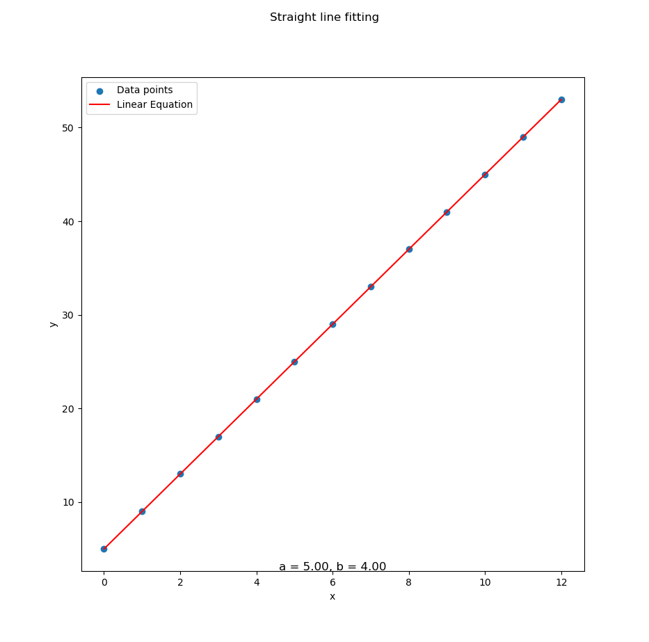
Reproducing spreadsheet results in code, makes our analysis reproducible, scalable, and automatable
Interactive JupyterLab
Want to poke around interactively?
Here’s a JupyterLab notebook so you can tweak,
rerun, and experiment to your heart’s content:
It’s like Excel, but with less clicking and more satisfaction.
2: Quadratic Equation
Second Order Polynomial Method
When straight lines just won’t cut it.
Curve Fitting
Using the same matrix-based steps as before (transpose, multiply, invert, survive), we can visualize the quadratic system equation, straight in the spreadsheet:
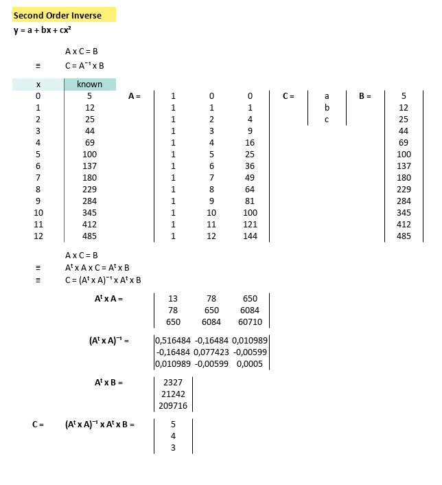
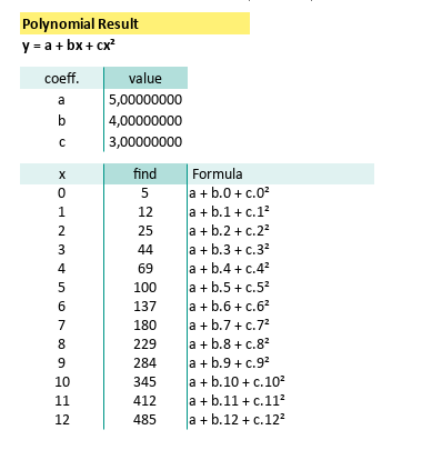
Our spreadsheet spits out the coefficients:
With known x for this equation,
we can calculate y by using spreadsheet formula.
Which means our prediction model is now flexing some curvature. Here’s the spreadsheet result in all its second-degree glory:
Not all relationships in data are linear. A quadratic fit lets you model acceleration, parabolic trends, or just the kind of weird behavior Excel charts love to dramatize.
Python Scripts
As before, we can ditch the manual entry (aka hardcoded data), and bring in our data via CSV like a civilized data analyst.
Here’s what it looks like:
x,y
0,5
1,12
2,25
3,44
4,69
5,100
6,137
7,180
8,229
9,284
10,345
11,412
12,485
The python source can be obtained from below link
The Python version, once again, sticks close to our earlier structure, just tuned up for second-order fitting. So again, I don’t think that I should explain into the detail.
# Initial Matrix Value
order = 2
# Getting Matrix Values
mCSV = np.genfromtxt("32-data-second-order.csv",
skip_header=1, delimiter=",", dtype=float)
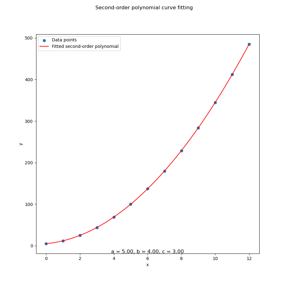
...With that in place, Python does its matrix dance and gives us this satisfying curve:
With data series in CSV above in place, Python does its matrix dance and gives us this satisfying curve fitting as below:
Interactive JupyterLab
For those who prefer mixing code and results in real time (a.k.a. data sorcery), grab the interactive notebook:
Bend it, break it, rerun it. Jupyter makes experimenting with trends feel like play, not work.
3: Cubic Equation
Third Order Polynomial Method
When our trendline has mood swings.
Curve Fitting
As with the previous cases, we follow our usual matrix three-step: transpose, multiply, and invert. Now with more dimensions and potential for confusion!
Here’s how that plays out visually in a spreadsheet:
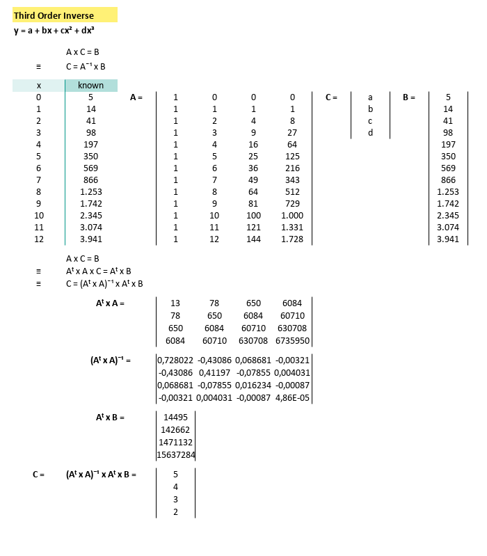
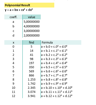
We wrangle the matrix, and out pop these coefficients:
With known x for this equation,
we can calculate y by using spreadsheet formula.
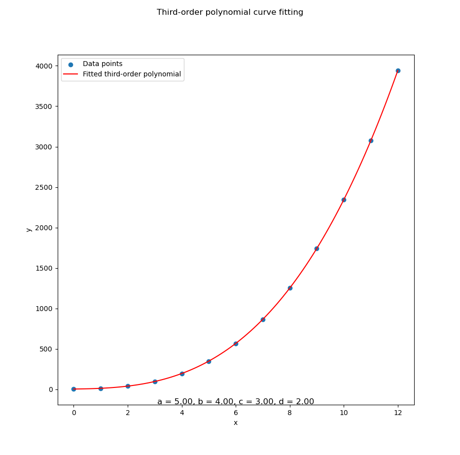
Apply it down our sheet, and we get a plot that would make even a rollercoaster designer proud:
Cubic fits are ideal when our data does the statistical equivalent of jazz, unexpected turns, dramatic rises, and inflection points galore.
Python Scripts
As always, ditching hardcoded values and feeding your script with a CSV, is the way to go, let our computer do the heavy lifting, while we sip coffee and pretend it’s magic.
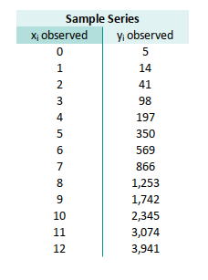
Here’s what the data looks like:
x,y
0,5
1,14
2,41
3,98
4,197
5,350
6,569
7,866
8,1253
9,1742
10,2345
11,3074
12,3941
And the Python source (familiar, yet now powered for cubic glory):
It is very similar with source code in previous article, except that it is for quadratic equation. So again, I don’t think that I should explain into the detail.
# Initial Matrix Value
order = 3

# Getting Matrix Values
mCSV = np.genfromtxt("33-data-third-order.csv",
  skip_header=1, delimiter=",", dtype=float)

...
Python digs through the data and returns a beautiful curve:
Whether we’re modeling stock prices, scientific measurements, or the emotional arc of your last project, cubic curves are the sweet spot for capturing complexity, without going full math meltdown.
Interactive JupyterLab
For the tinkerers and the curious, here’s our playground:
Fire it up, tweak a coefficient, rerun the cell, and instantly see how the curve morphs. Like magic, but statistically sound.
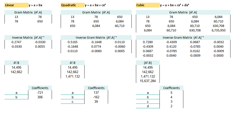
4: Optimizing Spreadsheet
How I Learned to Stop Worrying and Love the Gram Matrix
Let’s be honest. Real-world data isn’t just a neat set of five numbers, you can eyeball in one coffee break. Once you’ve got rows upon rows of data, it is simply doesn’t make any sense, to write the whole long column of matrix transpose of A. Manually writing out matrix A (and its beautiful but exhausting transpose) becomes… Well, statistically unsustainable.
We can simplifiy this by writing the formula of (Aᵗ.A) at once. In fact we do not even need to write A matrix in physical cell at all.
Worksheet Source
A spreadsheet so efficient it should be peer-reviewed
Don’t reinvent the pivot table. Download the Excel file, play with it, and bask in the automation:
Formula Step by Step
Let’s break it down. Here’s the pipeline of spreadsheet matrix algebra:
As a concept we can describe the process as:
- Transpose of A: (Aᵗ)
=TRANSPOSE(A)- Gram Matrix (Aᵗ·A)
=MMULT(TRANSPOSE(A), A)Inverse of Gram Matrix: (Aᵗ.A)ˉ¹
=MINVERSE(Aᵗ.A)Moment Vector (Aᵗ.B):
=MMULT(TRANSPOSE(A), B)C = Coefficient Vector = (Aᵗ.A)ˉ¹(Aᵗ.B)
This is the actual fit: the line/curve we’re modeling.
=MMULT((Aᵗ.A)ˉ¹, (Aᵗ.B))This workflow automates the fitting process, scales with our data, and most importantly, saves us from dragging formulas down 300 rows, like a spreadsheet peasant.
Generic Matrix
Now, what is matrix A anyway?
We can generalized the matrix in equation to:
Matrix A is like a trend-fitting chameleon. It changes shape based on your polynomial order:
Apply to Spreadsheet
Suppose we have this data series containing pair observed values,
in range B37:C49:
- x: B37:B49
- y: C37:C49
Let’s build the model without ever writing out matrix A.
Temporary Matrix
We can utilize CHOOSE formula as as replacement of matrix A.
No visual clutter, no risk of accidental edits.
=CHOOSE({1,2}, 1, B37:B49)Transpose it with:
=TRANSPOSE(CHOOSE({1,2}, 1, B37:B49))Matrix B is just our y-values:
And for the matrix B, we use range C37:C49, the same with y series.
Now we can write gram matrix (Aᵗ.A) in range B12:C13 using this formula:
=MMULT(TRANSPOSE(CHOOSE({1,2}, 1, B37:B49)),
       CHOOSE({1,2}, 1, B37:B49))
Now we can continue writing inverse of gram matrix (Aᵗ.A)ˉ¹,
in range B18:C19 using this formula:
=MINVERSE(B12:C13)Let’s continue to RHS (right hand side) of the equation,
containing the moment vector (Aᵗ.B),
in range B24:B25 using this formula:
=MMULT(TRANSPOSE(CHOOSE({1,2}, 1, B37:B49)), C37:C49)Finally, calculate the C matrix containing coefficient (Aᵗ.A)ˉ¹.(Aᵗ.B) using this formula:
=MMULT(B18:C19, B24:B25)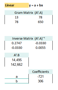
We are done with trend without even writing A matrix in any cells. This setup gives us clean, dynamic, and scalable modeling, without cluttering our sheet with every power of every x. It’s like wearing noise-cancelling headphones in a crowded matrix.
Gram Matrix: Quadratic
ime to upgrade to second-order polynomial. We can continue writing gram matrix (Aᵗ.A) for quadratic polynomial: Here’s your cheat sheet:
A
=CHOOSE({1,2,3},
 1, B37:B49, B37:B49^2)

B: Range: C37:C49

Aᵗ
=TRANSPOSE(A)
=TRANSPOSE(CHOOSE({1,2,3},
           1, B37:B49, B37:B49^2))

(Aᵗ.A)
Range: E12:G14
=MMULT(TRANSPOSE(A), A)
=MMULT(TRANSPOSE(CHOOSE({1,2,3},
           1, B37:B49, B37:B49^2)),
       CHOOSE({1,2,3},
       1, B37:B49, B37:B49^2))

(Aᵗ.A)ˉ¹
Range: E18:G20
=MINVERSE(E12:G14)

(Aᵗ.B)
Range: E24:E26
=MMULT(TRANSPOSE(A), B)
=MMULT(TRANSPOSE(CHOOSE({1,2,3},
           1, B37:B49, B37:B49^2)),
       C37:C49)

C: Coefficients (Aᵗ.A)ˉ¹.(Aᵗ.B)
=MMULT(E18:G20, E24:E26)
Gram Matrix: Quadratic
Feeling brave? Welcome to cubic. Also continue writing gram matrix (Aᵗ.A):
A
=CHOOSE({1,2,3,4},
 1, B37:B49, B37:B49^2, B37:B49^3)

B: Range: C37:C49

Aᵗ
=TRANSPOSE(A)
=TRANSPOSE(CHOOSE({1,2,3,4},
           1, B37:B49, B37:B49^2, B37:B49^3))

(Aᵗ.A)
Range: I12:L15
=MMULT(TRANSPOSE(A), A)
=MMULT(TRANSPOSE(CHOOSE({1,2,3,4},
           1, B37:B49, B37:B49^2, B37:B49^3)),
       CHOOSE({1,2,3,4},
       1, B37:B49, B37:B49^2, B37:B49^3))

(Aᵗ.A)ˉ¹
Range: I18:L21
=MINVERSE(I12:L15)

(Aᵗ.B)
Range: I24:I27
=MMULT(TRANSPOSE(A), B)
=MMULT(TRANSPOSE(CHOOSE({1,2,3,4},
           1, B37:B49, B37:B49^2, B37:B49^3)),
       C37:C49)

C: Coefficients (Aᵗ.A)ˉ¹.(Aᵗ.B)
=MMULT(I18:L21, I24:I27)
The spreadsheet with all coefficients looks something like this:
Predicted Series
Now that you’ve got all your coefficients, use them to generate predicted values for: linear, quadratic, and cubic models, side by side.
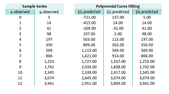
It’s like a polynomial bake-off. Same kitchen (data), different recipes (models), and now you can taste, test the results.
Note that we can enhance the prediction formula further with this form:
=SUMPRODUCT(TRANSPOSE(coeff_3),B37^{3,2,1,0})We are going to use this form later, while using spreadsheet with named range in polynomial regression.
Completed Worksheet
You can imagine how your life can be easier now. You can even compare different result at once, since all written side by side in the same worksheet.
The final form of our spreadsheet, the statistical equivalent of achieving Excel enlightenment:
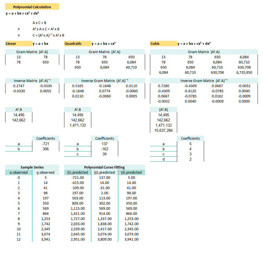
With this setup, we’re now free to model, compare, and update without breaking a sweat, or a formula. Just change the data, and the rest updates like clockwork.
We are going to use this matrix calculation later, while doing polynomial regressions.
What’s the Next Chapter 🤔?
We’ve played with trendlines, climbed the polynomial curve up to degree three, and survived matrix math with dignity mostly intact. But guess what? There’s an even sharper tool in the shed: Least Squares.
This technique isn’t just a way to draw the best squiggly line through our data points. It’s a foundational approach that underpins most of modern regression analysis. And like all good thrillers, it starts simple: linear least squares.
Least squares isn’t just a method. It’s the method. Mastering it means we’re not just throwing curves at our data. We’re actually understanding the forces behind the fit. Plus, it opens doors to correlation analysis, inference, and all sorts of future fun.
Ready to shift from trendlines to simple regression? Check out the next adventure: [ Trend - Least Square ].
(Bring your data. And maybe a cup of coffee.)