Preface
Goal: Implement polynomial equation in python. From data modelling in spreadsheet to programming language. Solving third order polynomial equation.
Spreadsheets are great.
They’ve helped humanity track budgets, analyze experiments, and so on.
But when it comes to scaling our analysis,
Python steps in like a caffeinated intern with NumPy.
In this article, we take the cubic polynomial work, we carefully built in a spreadsheet and translate it into a Python script. You’ll see how the matrix math maps one-to-one between Excel and code. And you’ll start to appreciate Python not just as a language, but as a force multiplier.
Why Python? Because it’s readable, powerful, and probably already installed on your laptop. Plus, it lets us handle large datasets, run simulations, and plot things with colors, which is really all a statistician wants.
Along the way, we’ll confirm spreadsheet values, visualize fitted curves, and maybe even have a brief existential crisis about overfitting. Fun times.
1: Matrix in Python
Where Code Meets Coefficients
Consider represent above equation into python code. We are going to turning algebra into automation, Doing matrix math by hand is a cry for help.
Source Code
If you’d rather see this in action, and possibly make fewer typos, here are the full scripts:
They contain the full setup and matrix solution process.
Setup Matrix A
We begin by channeling the power of numpy,
the Swiss Army knife of numerical Python.
First, define the polynomial order and your x-values:
import numpy as np

order = 3
mx  = np.array([
        0, 1, 2, 3,
        4, 5, 6, 7,
        8, 9, 10, 11, 12])
Now generate the design matrix using list comprehension, because you’re not just a coder. You’re an artist with loops:
mA = np.array([
       [(x ** i) for i in range(order+1)]
         for x in mx])

print(mA)
With numpy, the matrix result is nicer,
compared with regular array.
Which gives us:
$ python 01-poly.py
[[   1    0    0    0]
 [   1    1    1    1]
 [   1    2    4    8]
 [   1    3    9   27]
 [   1    4   16   64]
 [   1    5   25  125]
 [   1    6   36  216]
 [   1    7   49  343]
 [   1    8   64  512]
 [   1    9   81  729]
 [   1   10  100 1000]
 [   1   11  121 1331]
 [   1   12  144 1728]]
You can see the result here:
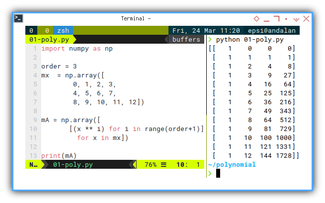
This is the foundation of the model. Each row is a data point. Each column is a power of x. Together, they form our design matrix. The DNA of our polynomial regression.
Alternatives: Column Stack
If you want the clean version without loops, to build design matrix using list comprehension, here’s a cheat code:
mA = np.column_stack([np.ones_like(mx), mx, mx**2, mx**3])But hardcoding powers is like naming your kids “Child1”, “Child2”, “Child3”… not scalable. So we go dynamic:
mA = np.column_stack([mx**j for j in range(order+1)])Numpy’s Vander
The Fancy Option
Feeling lazy?
numpy.vander lets you generate a Vandermonde matrix with one line:
mV = np.vander(mx, 4)But note: vander assumes the classic polynomial form arrangement:
While our version reads left-to-right:
No worries, just np.flip the matrix horizontally:
We can replace our list comprehension with vander.
mV = np.flip(np.vander(mx, 4), axis=1)Same math, different notation. Always check whether your library prefers “mathematical elegance” or “computational chaos.”
Matrix Operation
Solving for Coefficients
Matrix operation in python is incredibly simple. Let’s say we have this setup. A know XY value pairs.
Let’s define our known values x and y:
import numpy as np

order = 3
mx  = np.array([
        0, 1, 2, 3,
        4, 5, 6, 7,
        8, 9, 10, 11, 12])
mB  = np.array([
         5,   14,   41,   98,
       197,  350,  569,  866,
      1253, 1742, 2345, 3074, 3941])

mA = np.array([
       [(x ** i) for i in range(order+1)]
         for x in mx])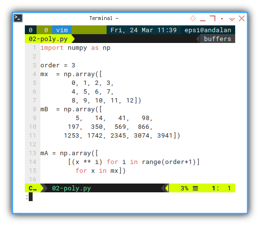
We can prepare to compute the previous matrix equation. Now apply the matrix formula:
mAt   = np.transpose(mA)
mAt_A = np.matmul(mAt, mA)
mAt_B = np.matmul(mAt, mB)
Finally, solve for C, get the result:
Method 1: The long way:
mAt_A_i = np.linalg.inv(mAt_A)
mC      = np.matmul(mAt_A_i, mAt_B)
print("Coefficients (a, b, c, d):", mC)
Method 2: The smarter way:
mC      = np.linalg.solve(mAt_A, mAt_B)
print("Coefficients (a, b, c, d):", mC)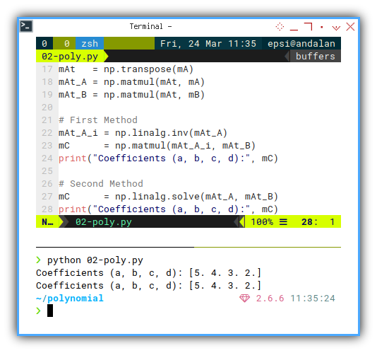
This is the core of polynomial regression. It turns your data into a formula. That formula predicts.
Predicting is good. Predicting while looking smart in Python? Even better.
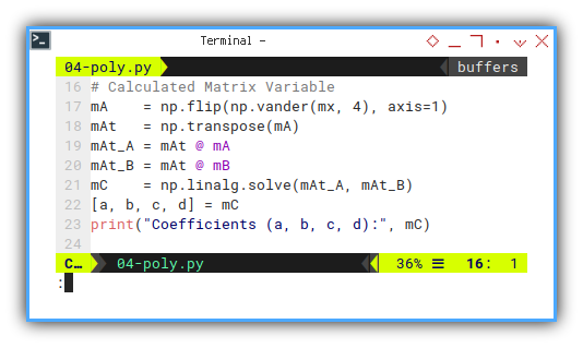
@ (at) Operator
Want a cleaner syntax? Use the @ (at) operator.
It’s like MMULT, but cooler.
# Calculated Matrix Variable
mA = np.flip(np.vander(mx, 4), axis=1)
mAt = np.transpose(mA)
mAt_A = mAt @ mA
mAt_B = mAt @ mB
# First Method
mAt_A_i = np.linalg.inv(mAt_A)
mC = mAt_A_i @ mAt_B
print("Coefficients (a, b, c, d):", mC)
# Second Method
mC = np.linalg.solve(mAt_A, mAt_B)
print("Coefficients (a, b, c, d):", mC)
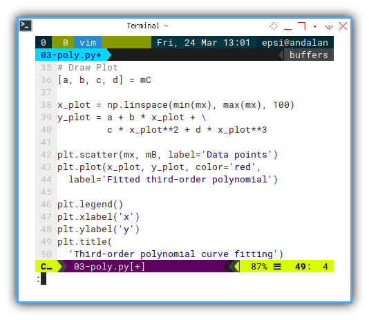
# Draw Plot
[a, b, c, d] = mCThis Python matrix operation mirrors what we did in Excel earlier. But now it’s scalable, automatable, and doesn’t require you to wrestle with Ctrl+Shift+Enter.
Whether you’re modeling data trends or building a machine learning model, this is your algebraic skeleton key.
2: Alternative Coefficient Solution
Along with Prediction Solution
Sometimes it feels like Python libraries are multiplying faster than a grad student’s coffee intake during finals. Just when you master one method, a newer, shinier one pops up, Complete with better docs and an example in TensorFlow.
But fear not, here’s a guided tour through the jungle of coefficient-solving methods.
We’ll take the same design matrix mA and vector mB,
and find our coefficient vector mC (then predict yp),
using various tools in the Python ecosystem.
Why so many options? Because one size fits all only works for socks. And even then, not really.
Pick Your Solver, Pick Your Style
In Python, there are at least six ways to solve any problem. And seven ways to feel bad about not knowing all of them.
However, this is what I know so far to solve the coefficient.
From the known design matrix mA, how do we find the coefficient mC,
and what is the final yp prediction result?
1. Using linalg library
Solving gram matrix.
First up, the direct linear algebra approach. Think of this as the textbook method. You know, the one they put on the midterm.
mAt_A = mA.T @ mA # gram matrix
mAt_B = mA.T @ mB
mC = np.linalg.solve(mAt_A, mAt_B)
yp = mA @ mC
Using inverse of gram matrix. When you’re feeling bold and rebellious.
This is the foundation of OLS regression. Also a good way to make your linear algebra professor proud, or at least not sigh loudly.
mC = np.linalg.inv(mA.T @ mA) @ (mA.T @ mB)
yp = a + b * mx + c * mx**2 + d * mx**3
Using least square.
Note that np.linalg.lstsq works for any polynomial degree
(linear, quadratic, cubic, etc.)
Bbecause it works even if your matrix is being dramatic:
mC = np.linalg.lstsq(mA, mB, rcond=None)[0]2. Using the deprecated polyfit
Despite being labeled “deprecated” more times than Fortran, this still works like a charm.
mC = np.polyfit(mx, my, deg=order)
yp = np.polyval(mC, self.xs)
It’s quick and easy. But like using a fax machine in 2025, it’s time to move on if you’re building serious models.
3. Using numpy Polynomial library
Polynomial.fit is polyfit's well-behaved younger sibling.
It’s object-oriented and much more polite.
We can use this instead of polyfit.
from numpy.polynomial import Polynomial
poly = Polynomial.fit(mx, my, deg=order)
mC = poly.convert().coef
yp = poly(mx)
Want to feel fancy?
Swap in Polynomial for Chebyshev, Legendre,
or Hermite for different basis functions
Great for impressing your math friends,
or confusing your coworkers.
4. Using stats `linregress’
This one-trick Pony is strictly for linear regression (degree = 1), focuses on hypothesis testing, not regression. It’s less flexible but great for t-tests and p-values.
from scipy import stats
m, b, _, _, _ = stats.linregress(mx, my)
Use this when your professor asks you to “test a hypothesis”, and you pretend to know what that means.
5. Using statsmodels `OLS’ (ordinary least square)
If you’re looking to get serious with confidence intervals,
t-values, and beautiful .summary() outputs, this is the one.
Linear regression only, because scipy.stats focuses on
hypothesis testing, not regression.
import statsmodels.api as sm

x = sm.add_constant(mx)
model = sm.OLS(y_values, x).fit()
a, b, c = model.params
This method is for people who enjoy linear regression reports, with more footnotes than a PhD thesis.
6. Using sklearn PolynomialFeatures library
Let’s go simple machine learning mode.
Here’s how to use PolynomialFeatures with LinearRegression.
This is for a more complex case.
Let’s rewrite in complete code.
import numpy as np
from sklearn.preprocessing import PolynomialFeatures
from sklearn.linear_model import LinearRegression
from sklearn.metrics import mean_squared_error

order = 3
mx  = np.array([
        0, 1, 2, 3,
        4, 5, 6, 7,
        8, 9, 10, 11, 12])
my  = np.array([
         5,   14,   41,   98,
       197,  350,  569,  866,
      1253, 1742, 2345, 3074, 3941])

mx = mx.reshape(-1, 1)
Then transform and fit:
# design matrix mA
poly   = PolynomialFeatures(degree=order)
mA = poly.fit_transform(mx)

model  = LinearRegression().fit(mA, my)
y_pred = model.predict(mA)

# Default: does NOT adjust for Degree of Freedom
mse_sklearn = mean_squared_error(my, y_pred)
print(f"Scikit-learn MSE (unadjusted): {mse_sklearn:.3f}")
Ideal when we’re building models with cross-validation, pipelines, and trying to sound impressive during coffee breaks.
Cool right!
A Random Note: FOMO is Real
So many libraries, so little certainty.
Fear of missing out yet? Sometimes, python is amazingly making us so incompetence, worst than social media.
And then, have you ever have this feeling,
when you should decide whether using np.linalg.solve, or using np.polyfit,
or sacrifice a goat to the stats gods and hope Polynomial.fit gives the right curve?
Python’s data ecosystem can feel like statistical imposter syndrome on steroids.
One moment we’re solving a system with np.linalg.solve,
and the next we’re 12 tabs deep into Chebyshev polynomials for time series forecasting.
But the good news? They all get you to the same coefficients (eventually). Use what fits your problem, your data, and your current level of caffeination.
3: Matplotlib
Visual confirmation
If you can’t plot it, did it even happen?
After crunching all those numbers
and doing your best impersonation of Gauss with a keyboard,
It’s time to actually see if your curve makes sense.
Enter: matplotlib, the data scientist’s favorite excuse to avoid writing reports.
Source Code
Need the full code? We’ve got you:
Basic Plot
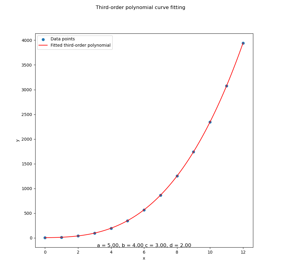
Let’s revisit our polynomial-fitted coefficients, toss them into a pretty plot, and bask in the satisfaction of seeing math and reality shake hands.
Here’s how to bring the curve to life:
x_plot = np.linspace(min(mx), max(mx), 100)
y_plot = a + b * x_plot + \
         c * x_plot**2 + d * x_plot**3

plt.scatter(mx, mB, label='Data points')
plt.plot(x_plot, y_plot, color='red',
  label='Fitted third-order polynomial')

plt.legend()
plt.xlabel('x')
plt.ylabel('y')
plt.title(
  'Third-order polynomial curve fitting')

plt.show()
Visualization helps verify that our model isn’t just spitting out plausible numbers. It’s actually following the data trend. It also helps when our boss asks. So… what does this mean?
With the result as.
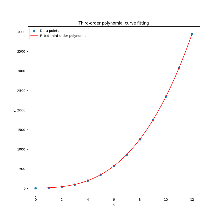
Congratulations!
We’ve plotted something fancier than a straight line.
The ghost of Legendre nods approvingly.
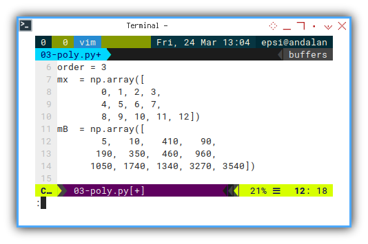
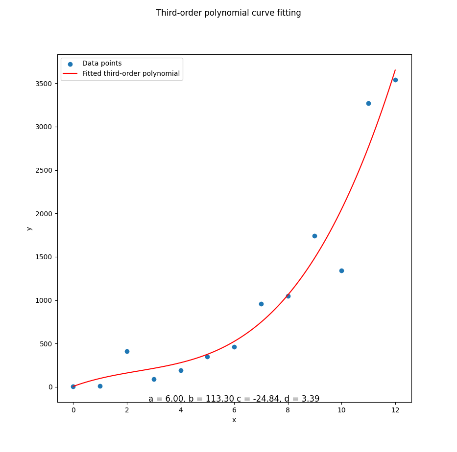
Test Other Data
Chaos Mode
Let’s mix things up.
Change the mB values and see how the polynomial tries to keep up.
Sometimes you learn more when the math starts sweating.
mB  = np.array([
         5,   10,  410,   90,
       190,  350,  460,  960,
      1050, 1740, 1340, 3270, 3540])
This tests the robustness of our model. Does it gracefully adjust to new patterns? Or does it panic like a student on exam day?
The matrix equation should remain the same.
Add a title to show the actual fitted coefficients:
# Draw Plot
[a, b, c, d] = mC

...

plt.suptitle(
  'Third-order polynomial curve fitting')

subfmt = "a = %.2f, b = %.2f c = %.2f, d = %.2f"
plt.title(subfmt % (a, b, c, d), y=-0.01)

plt.show()
That’s right. We’re labeling the curve with the actual math behind it. Because we’re fancy like that.
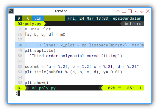
And the final result. Now we can see, how the line fit the dots.
If our plot starts to look like modern art, double-check the data. Or say it’s non-linear heteroscedasticity and walk away confidently.
You can do it yourself.
Here we can see whether our elegant third-degree curve is, actually capturing the chaos, or awkwardly missing the mark like a first-year undergrad estimating Pi with a ruler.
4: Enhance Script
Polynomial Polish: Scripting Like a Pro
Ah yes, Enhancing our script. Let’s add some polish (the scripting kind, not the Eastern European kind), to make your polynomial workflow smoother than a cubic curve at an inflection point.
You can make your life easier with these few tricks.
Source Code
Want the full script? Grab it here:
Setup Numpy
Tired of Numpy arrays printing like an accountant in panic mode? Clean up the formatting globally with one line. It won’t do your taxes, but it will make debugging less of an optical illusion.
Instead of formatting data all the time,
we can set the numpy output globally.
# Setup numpy
np.set_printoptions(
  precision=2,
  formatter={
    'int':   '{:30,d}'.format,
    'float': '{:10,.8f}'.format
  },
  linewidth=np.inf,
  suppress=True)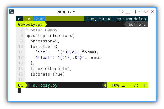
Readable output helps avoid mistaking 1e3 for a rounding error or a rogue exponential.
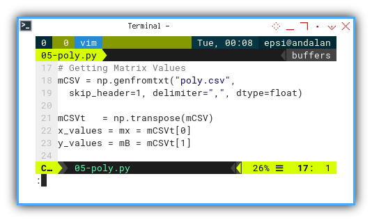
Data Source with CSV
Hardcoding arrays is for amateurs and tutorial screenshots. Real data scientists live dangerously, with CSVs.
Instead of array, you can have your data source from anywhere, from database, spreadsheet, or simple CSV.
# Getting Matrix Values
mCSV = np.genfromtxt("poly.csv",
  skip_header=1, delimiter=",", dtype=float)

mCSVt   = np.transpose(mCSV)
mx = mCSVt[0]
mB = mCSVt[1]
Real-world data often comes in files, not copy-pasteable arrays from Stack Overflow. Welcome to adulthood.
You can get the example CSV here.
Here’s how the CSV looks:
x,y
0,5
1,14
2,41
3,98
4,197
5,350
6,569
7,866
8,1253
9,1742
10,2345
11,3074
12,3941
Yes, this file is more polite than some coworkers, it even has headers.
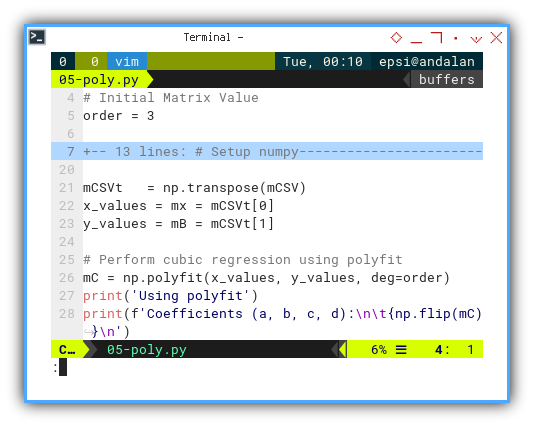
Polyfit
Rather than reenact matrix algebra by hand every time,
let polyfit do the number crunching.
It’s fast, flexible, and doesn’t require caffeine.
# Initial Matrix Value
order = 3

mCSVt   = np.transpose(mCSV)
x_values = mx = mCSVt[0]
y_values = mB = mCSVt[1]

# Perform cubic regression using polyfit
mC = np.polyfit(x_values, y_values, deg=order)
print('Using polyfit')
print(f'Coefficients (a, b, c, d):\n\t{np.flip(mC)}\n')
You can try different polynomial degrees like a buffet. No matrix multiplication hangovers required.
Statistically speaking, that’s a beautiful curve if we’ve ever seen one.
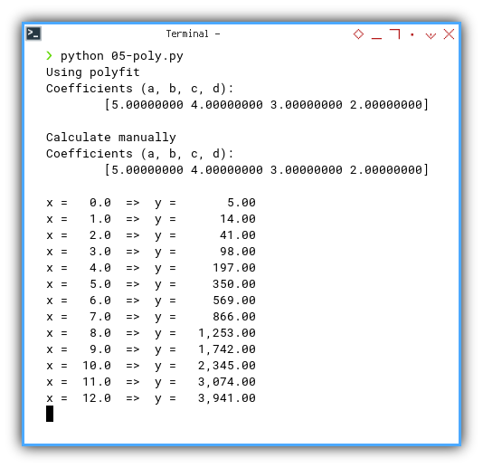
$ python 05-poly.py
Using polyfit
Coefficients (a, b, c, d):
	[5.00000000 4.00000000 3.00000000 2.00000000]
Output Result
For debugging purpose you can show each prediction value line by line.
for x in mx:
  y = a + b*x + c*x**2 + d*x**3
  print(f'x = {x:5}  =>  y = {y:10,.2f} ')
$ python 05-poly.py
x = 0.0 => y = 5.00
x = 1.0 => y = 14.00
x = 2.0 => y = 41.00
x = 3.0 => y = 98.00
x = 4.0 => y = 197.00
x = 5.0 => y = 350.00
x = 6.0 => y = 569.00
x = 7.0 => y = 866.00
x = 8.0 => y = 1,253.00
x = 9.0 => y = 1,742.00
x = 10.0 => y = 2,345.00
x = 11.0 => y = 3,074.00
x = 12.0 => y = 3,941.00 Does our model actually work, or is it just faking it? Print predicted values alongside input. Great for testing and smug satisfaction.
Verifying model output one row at a time is the data scientist’s version of reading poetry aloud. Cathartic.
Editable Output
Want to edit your plot in Illustrator or Inkscape without recreating it?
Export as .svg, not .png.
This not enhanced script, but rather a trick.
Instead of exporting .png from matplotlib,
you can export to .svg.
Sometimes you need to alter the result for further processing,
such as report, or removing annoying lines quickly.
You can have the SVG source from here
SVG is vector-based, editable, and doesn’t pixelate when our manager asks for it “slightly bigger.”
Choosing Order
In my experience, higher order tend to have further precision. If you have issue with precision, you might consider lower order.
# Initial Matrix Value
order = 2
Higher order = more precision, until it becomes overfitting’s evil twin. Sometimes, less is more. And sometimes more is… still too much.
Interactive JupyterLab
Want sliders, instant feedback, and markdown magic?
Open the Jupyter Notebook.
The notebook version is here:
Jupyter is where ideas come to life. Or crash in real time. Either way, it’s interactive.
5: Variants Beyond polynomial
Polynomials are like vanilla ice cream:
reliable, smooth, and always a crowd-pleaser.
But sometimes, your dataset deserves rocky road.
Enter numpy's other regression flavors:
Chebyshev, Legendre, and Hermite.
All fancy, all orthogonal, and all with names
that sound like 19th-century mathematicians
who probably owned monocles.
Numpy offers four built-in regression bases:
PolynomialChebyshevLegendreHermite
The same series points (xₛ, yₛ) will produce different coefficients for each kind of variants. But the prediction result is the same, you can check that in matplotlib.
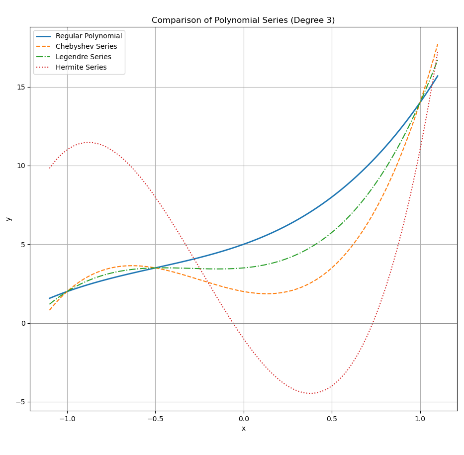
On the other hand, the same coefficient would produce different prediction, for each variants.
What’s Our Next Endeavor 🤔?
That was fun, wasn’t it?
Math that compiles and runs? Truly, we live in the future.
We’ve built polynomial models in spreadsheets, coded them in Python, and we’ve survived both. But now it’s time to bring this knowledge down to Earth, with real, practical examples.
Not just equations, but tools we can plug into daily analysis. Linear, quadratic, cubic… in Excel and Python, with scripts we’ll actually use. Because a good theory is only as valuable, as its copy-pasteable implementation.
What do you think?
Continue here: [ Trend - Polynomial Examples ].