Preface
Goal: Connect the dots perfectly with interpolation.
So far, we’ve seen curve fitting, the art of finding a line that kind of fits the data. But what if you’re a perfectionist? What if “close enough” makes your inner statistician twitch?
Enter interpolation: instead of approximating the data, we draw a curve that passes exactly through all given points. No curve gets left behind.
Interpolation is our go-to when we cannot afford to guess. Like reconstructing sensor readings, pricing points in finance, or trying to explain to our boss why our data model doesn’t miss a single dot.
Polynomial Interpolation
Interpolation ≠ Curve Fitting
Curve fitting is not the only target that you want to achieve. We might just want to connect the dots perfectly. This is called interpolation.
Unlike curve fitting, interpolation require the curve to pass through all the given data points. We can use polynomial method to connect a few data points. This method use minimal required point to calculate the equation for example:
- Two points for linear equation.
- Three points for quadratic equation.
- Four points for cubic equation.
If you’re just connecting two points, you don’t even need a polynomial. Just calculate the slope. It’s the statistical equivalent of, using a butter knife instead of a chainsaw.
Piecewise
Please note that when conducting interpolation in practical applications, curve fitting isn’t the sole method available. There are also the option to utilize multiple straight lines, connecting points from one to another, without necessitating of curve fitting at all.
Interpolation insists on perfection, while curve fitting allows for a little statistical flexibility (i.e., it’s okay to be “a bit off” sometimes, just like real life). You can also use a piecewise approach. connect the dots with straight lines. It’s low effort, but still respectable. Like wearing sweatpants to a Zoom meeting.
Worksheet Source
Playsheet Artefact
Although this sounds fancy. It’s really just a handy spreadsheet.
Need options? We’ve got options. Jump between sheets like a data ninja, and choose the one that works best for your problem:

And yes, you can download the whole file, tweak it, break it, or build your own polynomial empire:
This isn’t just theory. You’ll get your hands dirty (in Excel). The workbook is packed with sheets for various interpolation techniques, including matrix-based polynomial solving.
1: Straight Line from Two Points
Calculating Slope
If you only need to connect two data points, skip the high-drama polynomial gymnastics. Just use the humble, glorious straight line. It’s fast, and accurate. You should use simple method instead of the complex one. Stay away from polynomial method, and just use this slope equation.
When you’ve only got two points to worry about, don’t bring a bazooka to a dart game.
Visualization
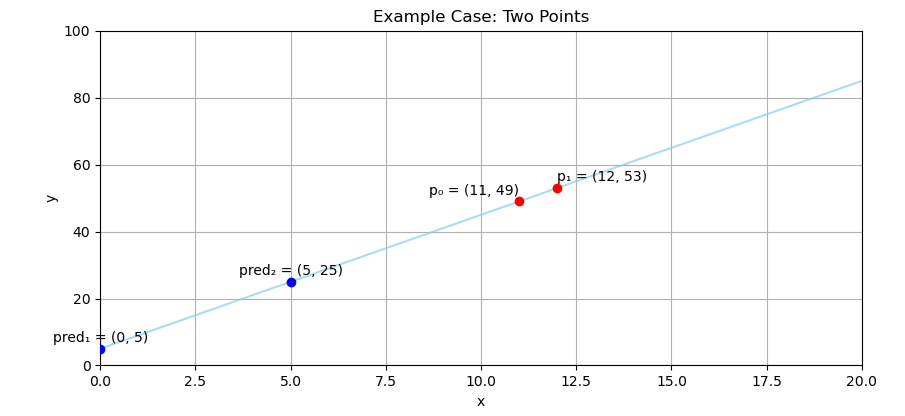
The Classic “Two-Dot Problem”
We’ve got two points, and our goal is to predict what lies between them. (Think of it as statistically dignified guesswork.)
The Math Behind It
Fear Not
The equation of linear trend for straight line is, as friendly as math gets:
Where:
-
mis the slope (how steep the line is), -
ais the intercept (where the line crosses the y-axis).
To calculate the slope we take the difference for both y and x, then divide.
For two points, the slope become y2-y1, and x2-x1.
Then we plug that slope into the formula to find the a variable.
Slope-based interpolation is the Swiss army knife of modeling. It’s lightweight, perfect for quick predictions, and easily done in your head (or Excel).
Other Equation Forms
Different Ways to Say the Same Thing
Textbooks and papers like to change outfits.
The variable names above is named as:
m: slope, anda: intercept.
The notation can be different from book to book. But they have the same meaning. Such this below example:
The standard notation for statistics is sound intimidating, with the cryptic form as below, for curve fitting with many samples data.
They are all serve simple straight lines.
Getting Coefficient
In Practice
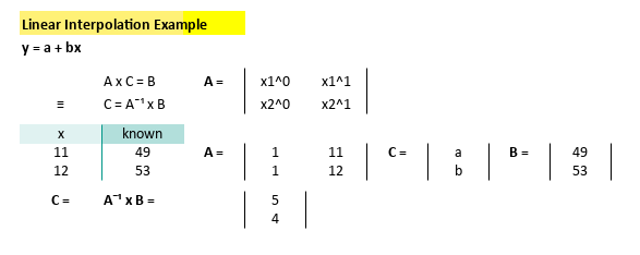
Supposed you have two pairs of point
p1= (11, 49), andp2= (12, 53)
Throw them into a spreadsheet (or calculate manually if you’re feeling bold):
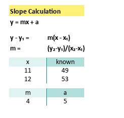
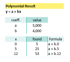
We’ll find the coefficient as
m= 5, anda= 4
Our line is now:
Simple. Elegant. Statistically satisfying.
Predicting Values
Now that you have your equation, try interpolating values for example [x=0, x=5, x=12]
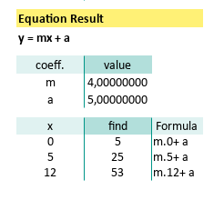
This will get this pairs of point:
- (
x= 0,y= 5), - (
x= 5,y= 25), - (
x= 12,y= 53),
And so on.
And just like that, we’re doing predictive modeling. With two points and some good old-fashioned algebra.
Polynomial Interpolation: Linear
Minimum Two Points
When you only have two points to connect, you could use slope-intercept form. Sure. But if you’re feeling a bit extra, you can go full matrix mode.
Matrix Equation
Getting unknown Coefficient value
Let’s say you want to connect these two noble data points:
Instead of calculating slope and intercept the classic way, let’s dress it up in a matrix suit. A system of linear equations can be represented as a matrix equation.
This matrix can be represented as variable below:
Solving the Coefficients
We are going to solve the formula above using this equation
Matrix form generalizes nicely.
Add more points, and it still works.
It’s basically the scalable, professional version of solving for y.
In Excel/Calc, we can calculate the inverse of matrix A.
Let’s turn this into a matrix using MINVERSE formula.
When in doubt, pivot to linear algebra:
And solve this matrix equation and get below coefficient result:
In case you’re wondering, here’s the gritty detail:
With coefficient above we can write the linear equation as below:
A beautiful, linear masterpiece, brought to you by matrices.
The Matrix Has You
Worksheet
Getting unknown Y-Value
Jerry Maguire said: Show Me the Spreadsheet!
Here’s how we’d set it up in Excel. Write down the equation as below, to get the coefficient:
Use the formula:
=MMULT(MINVERSE(E9:F10);J9:J10)Now we can easily get the predicted value using interpolation above,
by applying it to new x values and start predicting like a regression wizard:
Whether you’re coding, calculating by hand, or using spreadsheets, _this method scales beautifully into quadratic, cubic, and higher-order interpolation. _
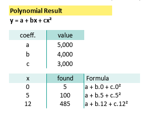
Polynomial Interpolation: Quadratic
Minimum Three Points
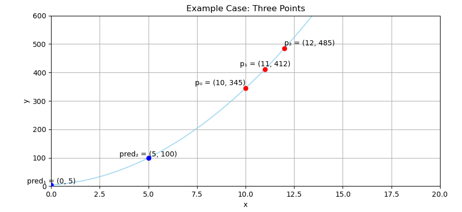
So you’ve conquered the straight line. Bravo! But what if life isn’t linear? (Spoiler: It usually isn’t.) That’s where quadratic interpolation comes in: the elegant art of connecting three points with a single curve, that says, “Yes, I pass through all of you.”
With the same method as linear equation, we can do the the quadratic equation.
Visualization
Here’s the scenario: three points, one mission. To predict the rest.
Matrix Equation
Getting unknown Coefficient value
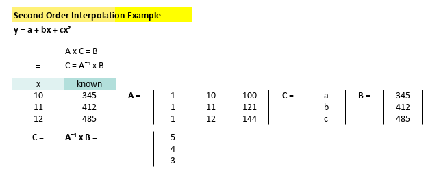
We’re given three precious data points:
Let’s turn this into a matrix. Because, as any statistician will tell you, when in doubt, pivot to linear algebra: A system of quadratic equations can also be represented as a matrix equation
Quadratic interpolation gives you curvature. It’s great for modeling real-world trends like growth, decay, or the mood swings of your coffee consumption.
Solving the Coefficients
We are going to solve the formula above using this equation
We can use spreadsheet using MINVERSE formula.
Break out Excel and plug in that matrix.
Here’s the inverse matrix:
Solve this matrix equation by multiply it by the output vector, to reveal below coefficient result:
Which means we now have our equation:
Worksheet
Getting unknown Y-Value
Here’s how it looks in the spreadsheet realm:
Just plug in this magical incantation:
=MMULT(MINVERSE(E9:G11);K9:K11)And voilà, predictions pour in like coffee on a Monday. We can easily get the predicted value using interpolation above.
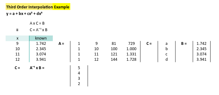
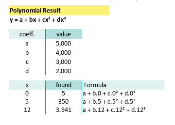
Polynomial Interpolation: Cubic
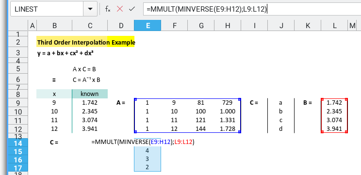
Minimum Four Points
Congratulations! You’ve made it past linear and quadratic interpolation. Now it’s time for cubic.
Visualization
You’ve got four points. You want a curve. Not just any curve, but one that hugs all your data like a well-fit model should.
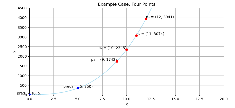
Real-world data often bends. Think population growth, depreciation curves, or coffee consumption over deadlines. Cubic interpolation gives you that sweet third-degree bend.
Matrix Equation
Getting unknown Coefficient value
Let’s connect four points with a cubic equation. That’s just enough info to model a curve with a twist. Here’s our cast of data:
Let’s express this using matrix form. A system of cubic equations can be represented as a matrix equation
Notice how that third column escalates things quickly. Welcome to the power of cubes.
Solving the Coefficients
Time to solve it like a boss. This matrix also can be represented as variable. Again, we are going to solve the formula above using this equation
Yep, you can still use Excel like a total matrix whisperer with MINVERSE.
to solve this matrix equation and get coefficient result.
Here’s below what we get:
And this coefficient above gives us our mighty cubic equation:
More coefficients mean more flexibility. But beware, like a third espresso, cubic power is potent. Great for smooth curves. Terrible for noisy overfits.
Worksheet
Getting unknown Y-Value
With spreadsheet, we can write down the equation, as below to get the coefficient:
Your Excel/Calc formula incantation:
=MMULT(MINVERSE(E9:H12);L9:L12)From here, calculating predictions is a breeze. Or at least a gentle curve. Now we can easily get the predicted value using interpolation above.
Just because we can fit a higher-order polynomial doesn’t mean we should. Use cubic with care. It’s powerful, but a bad fit will bend the truth, faster than a misquoted correlation.
So what’s next? quartic? quintic? Maybe we should stop before we enter overfitting territory.
What’s Our Next Endeavor 🤔?
Real-world scenario
Where do we go after fitting a curve through perfection? Answer: Real life, where data is messy and points don’t always hold hands.
So far, we’ve been living in a mathematical utopia. Where points align, curves obey, and interpolations are smooth as your favorite regression line. But now… things get real. 😅
Welcome to the next step: Polynomial curve fitting. Instead of demanding a perfect fit through every point (because life is rarely that cooperative), we fit a curve that approximates the trend, through noisy, scattered, and very human data.
In real-world scenarios, whether it’s predicting sales, climate trends, or how many gorengan (or doughnuts) our team consumes before 10 AM perfect fits are rare. Curve fitting lets us model the general pattern, without sweating the small stuff (or the outliers).
Algebra with a Twist
The structure is the same as before, matrix equations, inverse operations, and just the right sprinkle of Excel wizardry. But instead of connecting exactly through every point, we use more points than the polynomial’s degree and solve for a best-fit curve.
And yes, we still use the same polyfit (or build it manually using matrix magic),
only now we let it do what statisticians love best: minimize errors like a boss.
Ready to move from interpolation to fitting? Then brace ourself, polish our matrix skills, and head over to: [ Trend - Polynomial Algebra ].
It’s like interpolation, but with lower expectations and better coffee.