Preface
Goal: Realtime data plot using Pandas.
The main idea is to put additional data series, to keep timestamp as the float, so we can interpolate the x axis in float, and cast to time later as plotting source.
As usual we separate data and chart.
4: Plotting Time Series: Data
How about smoothing the line? The issue with smoothing is, the interpolation method does not accept time series. So we have to keep the data in float instead, and cast into time series before we plot.
Python Source Code
It is just a one script. And it is yours now.
So you won’t get lost while retyping all over again.
Required Package
Interpolate from scipy
We are going to smooth our plot lines, one method here is to interpolate using scipy library.
import matplotlib
import matplotlib.pyplot as plt
import matplotlib.dates as md

import pandas as pd
import numpy  as np
import random

from datetime import datetime
from time     import sleep
from scipy    import interpolate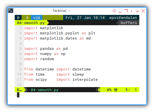
It is getting longer.
Skeleton
We have a bunch of methods. Because I like to refactor things into smaller parts.
class rndPlotter:
  def __init__(self):
  def chart_setup(self):
  def number_setup(self):
  def update_num(self):
  def print_new_pair(self, new_pair):
  def update_data(self):
  def get_df_smooth(self):
  def generateSeries(self):
  def plotSeries(self):
  def __call__(self):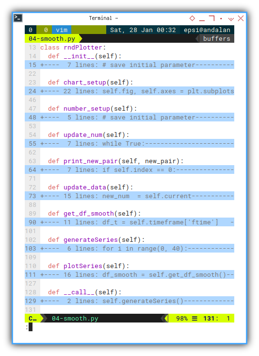
Constructor
We include ftime series in the dataframe.
This series hold float type for time series.
class rndPlotter:
  def __init__(self):
    # save initial parameter
    self.index = 0
    self.timeframe = pd.DataFrame({
      "time": [], "ftime": [], "temp": [] })

    self.chart_setup()
    self.number_setup()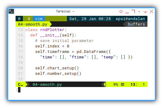
Generating Data
It is still verbatim copy from method from previous article.
  def generateSeries(self):
    for i in range(0, 40):
      self.update_num()
      self.update_data()
      sleep(0.25)

    self.timeframe.info()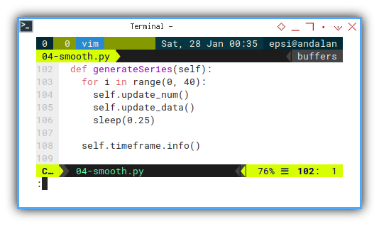
Update Data Frame
We also need to update the ftime method.
Casting from time to float type.
  def update_data(self):
    new_num  = self.current
    new_time = datetime.now()
    new_time_as_float = datetime.timestamp(new_time)

    new_pair = pd.DataFrame({
      "time" : new_time,
      "ftime": new_time_as_float,
      "temp" : new_num
    }, index=[self.index])

    self.print_new_pair(new_pair)

    self.index += 1
    self.timeframe = pd.concat(
      [self.timeframe, new_pair])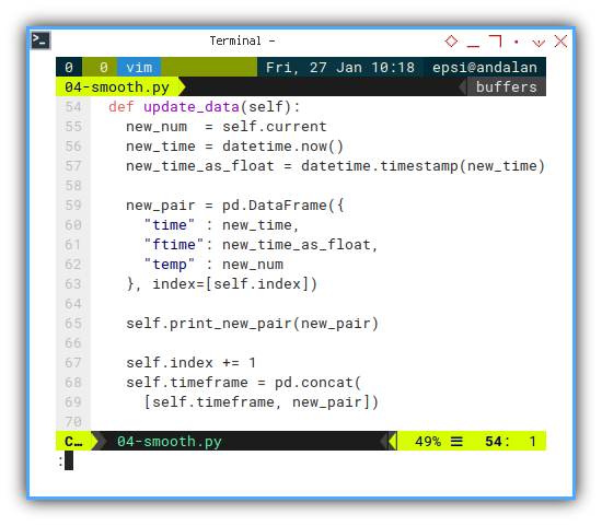
Print Progress
Since we have a lot of data. We should make it simple, by showing them, as one liners.
print(new_str, end="\r", flush=True)The complete method shown below:
  def print_new_pair(self, new_pair):
    if self.index == 0:
      new_str = new_pair.to_string(
        index=False)
    else:
      new_str = new_pair.to_string(
        index=False, header=False)
    print(new_str, end="\r", flush=True)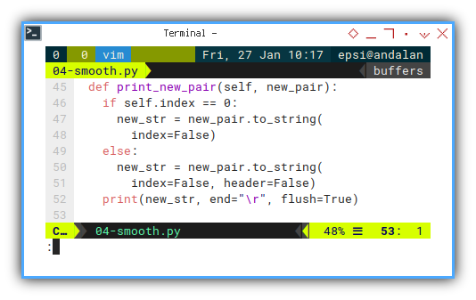
Interpolation
Simple Data Example
You can find splrep tutorial anywhere else.
Suppose you have simple data series with xdata and ydata.
You can just interpolate with this code
      n = len(self.ydata)
      tck = interpolate.splrep(
        self.xdata, self.ydata, s=0)

      xfit = np.arange(0, n-1, np.pi/50)
      yfit = interpolate.splev(xfit, tck, der=0)
And set the plot later with:
      self.line.set_xdata(xfit)
      self.line.set_ydata(yfit)
We can interpolate simple number such as float type,
and get the xfit and yfit.
But we cannot interpolate timestamp type.
That is why we have ftime series in the first place.
Interpolating Time Series
Here is the trick, instead of plot the float directly, we cast the float to timestamp. List translation can be obtained by using list comprehension.
  def get_df_smooth(self):
    df_t = self.timeframe['ftime']
    tck = interpolate.splrep(
        df_t, self.timeframe['temp'], s=0)

    xfit = np.arange(df_t[0], df_t.values[-1], 0.1)
    yfit = interpolate.splev(xfit, tck, der=0)
    tfit = [datetime.fromtimestamp(f) for f in xfit]

    return pd.DataFrame({
      "time": tfit,
      "temp": yfit
    })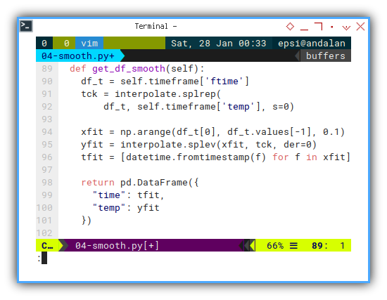
So instead of packaging values as xfit and yfit.
We package the tfit and yfit into dataframe.
Now we are ready to plot.
Main Method
  def __call__(self):
    self.generateSeries()
    self.plotSeries()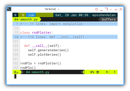
Output in CLI
Now you can run the script, even without the chart, you can still have below output.
rndPlo = rndPlotter()
rndPlo()
So we can have output as below:
❯ python 04-smooth.py time ftime temp
<class 'pandas.core.frame.DataFrame'>09 9.8573885
Int64Index: 40 entries, 0 to 39
Data columns (total 3 columns):
# Column Non-Null Count Dtype
--- ------ -------------- -----
0 time 40 non-null datetime64[ns]
1 ftime 40 non-null float64
2 temp 40 non-null float64
dtypes: datetime64[ns](1), float64(2)
memory usage: 1.2 KB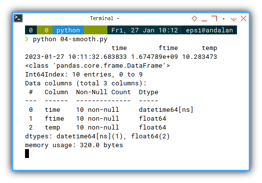
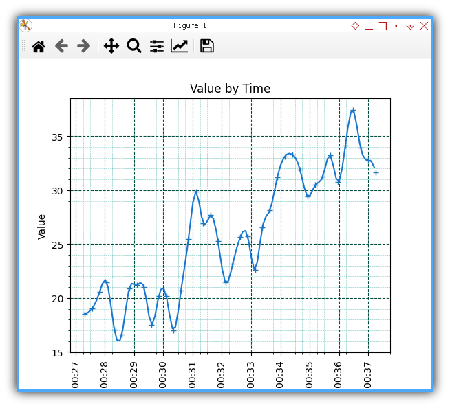
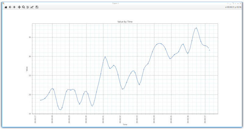
4: Plotting Time Series: Chart
After dataframe, we are ready to draw the chart.
Instead of one lines, we actually have to dataframes.
- The basic
self.timeframe, and - Something comes up by smoothing.
Setting up Chart Decoration
Consider add some title and label, beside formatting.
  def chart_setup(self):
    self.fig, self.axes = plt.subplots()

    xfmt = md.DateFormatter('%H:%M:%S')
    self.axes.xaxis.set_major_formatter(xfmt)

    plt.title('Value by Time')
    plt.xlabel('Time')
    plt.ylabel('Value')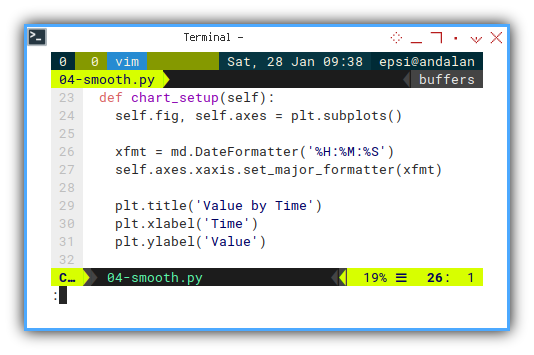
Setting up Grid
Let’s make it pretty with grid.
Both major and minor.
    self.axes.grid(
      which='major',
      color = '#004d40',
      linestyle = '--',
      linewidth = 0.8)

    self.axes.grid(
      which='minor',
      color = '#009688',
      linestyle = ':',
      linewidth = 0.4)

    self.axes.minorticks_on()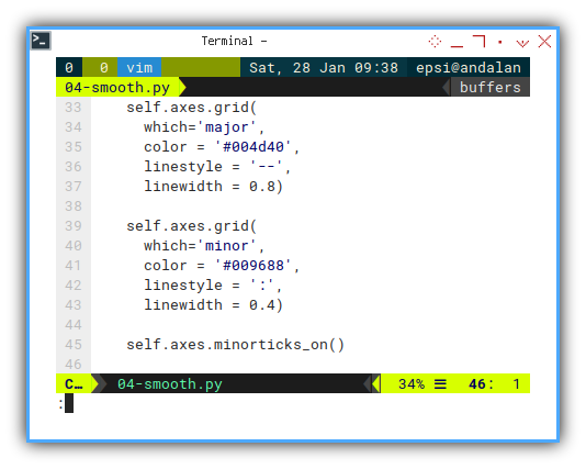
Plotting Series
We have two series, draw both.
- Original data as marker only.
- Smooth data as normal line.
  def plotSeries(self):
    df_smooth = self.get_df_smooth()

    self.axes.plot(
      self.timeframe.time,
      self.timeframe.temp,
      linestyle="None",
      marker='+', markerfacecolor='#00796b')

    self.axes.plot(
      df_smooth.time,
      df_smooth.temp, color='#1976d2')

    for tick in self.axes.get_xticklabels():
      tick.set_rotation(90)

    plt.show()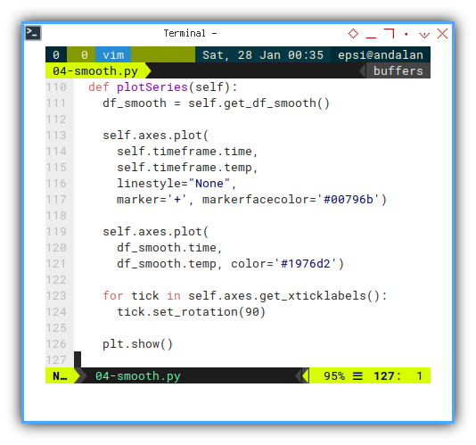
I use material design color to make the looks pretty.
Chart Preview
The result is not bad.
What is Next 🤔?
This chart is static. How about realtime?
We are going to reboot the article with data using mqtt, then plot the receiving data later.
Consider continue reading [ Python - MQTT - Simulator ].