Preface
Goal: Realtime data plot using Pandas.
Separate data and visualization.
3: Simple Dataframe Plot: Data
Tips: Do not mix stuff!
The main idea, is to get your data ready. so you can plot your chart easier.
The more mature, you build your dataframe, the easier to think about the visual representation.
Python Source Code
Baby crawl before you walk, matplotlib is a complex library.
Life is easier with source code. And I give you two.
The source code above is very similar, except one method.
The first is using matplotlib object directly, and the second one is using dataframe object to plot.
Required Package
Pandas
I also read people’s blog.
Sometimes I get lost,
when people do not give the import stuff.
So I present you complete stuff.
import matplotlib
import matplotlib.pyplot as plt
import matplotlib.dates as md

import pandas as pd
import numpy as np
import random

from time import sleep
Skeleton
But complete code is confusing. So We need an overview.
This might looks scary at first. But don’t worry, most of the method is, verbatim from previous class.
class rndPlotter:
  def __init__(self):
  def chart_setup(self):
  def number_setup(self):
  def update_num(self):
  def print_new_pair(self, new_pair):
  def update_data(self):
  def generateSeries(self):
  def plotSeries(self):
  def __call__(self):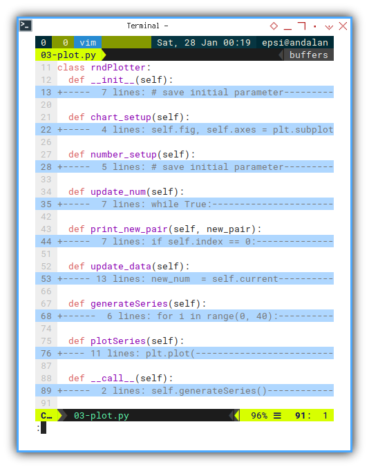
Constructor
We only add this chart_setup() line.
class rndPlotter:
  def __init__(self):
    # save initial parameter
    self.index = 0
    self.timeframe = pd.DataFrame({
      "time": [], "temp": [] })

    self.chart_setup()
    self.number_setup()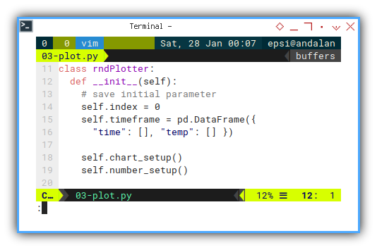
We are going to discuss chart at the end of this article.
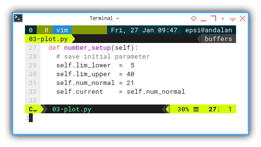
Setting up Number
The same initial setup as previous.
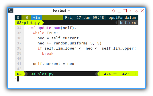
Update Number
The same update number method as previous.
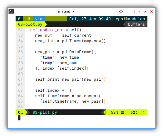
Update Data Frame
The same update dataframe method as previous.
Print Progress
Is it debugging stuff?
Why do we even’t need to print progress in console?
Most of the times, I need to know whether my script is freeze or not. That is all.
So this is not a debugging stuff, but rather a soft requirement. You can freely dispose this method, if you prefer clean console.
  def print_new_pair(self, new_pair):
    if self.index == 0:
      new_str = new_pair.to_string(
        index=False)
    else:
      new_str = new_pair.to_string(
        index=False, header=False)
    print(new_str)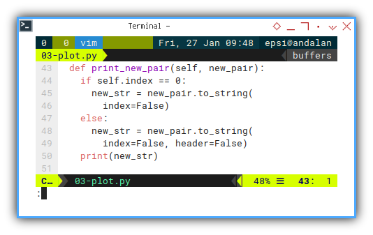
The result will be as below code:
Main
We can refactor the main method into two parts. Generatting the dataframe series, and plotting the data frame series.
  def __call__(self):
    self.generateSeries()
    self.plotSeries()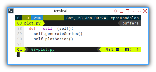
Where the data build in this generateSeries method.
def generateSeries(self):
for i in range(0, 40):
self.update_num()
self.update_data()
sleep(0.25)
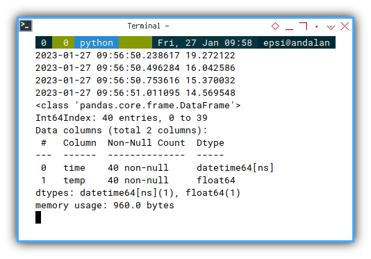
self.timeframe.info()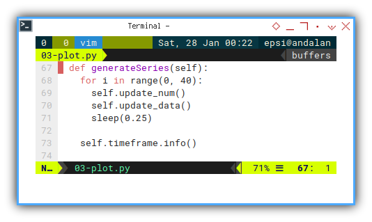
Dataframe structure
I put timeframe.info() to check the structure of the dataframe.
The output could be as below:
<class 'pandas.core.frame.DataFrame'>
Int64Index: 40 entries, 0 to 39
Data columns (total 2 columns):
 #   Column  Non-Null Count  Dtype
---  ------  --------------  -----
 0   time    40 non-null     datetime64[ns]
 1   temp    40 non-null     float64
dtypes: datetime64[ns](1), float64(1)
memory usage: 960.0 bytes
Output in CLI
We can create class instance and run:
rndPlo = rndPlotter()
rndPlo()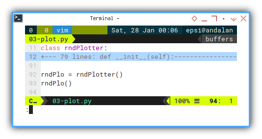
Without the plot stuff, we can examine the data.
This is going to be a long output.
❯ python 03-plot.py time temp
2023-01-28 10:27:33.299987 19.58234
2023-01-28 10:27:33.554449 15.834969
...
2023-01-28 10:27:42.906653 28.701011
2023-01-28 10:27:43.159416 23.97157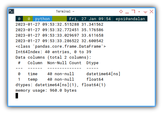
3: Simple Dataframe Plot: Chart
After the data ready, we can care about the chart.
In this simple example, we only need to represent X axis as time series.
Setting up Chart
  def chart_setup(self):
    self.fig, self.axes = plt.subplots()

    xfmt = md.DateFormatter('%H:%M:%S')
    self.axes.xaxis.set_major_formatter(xfmt)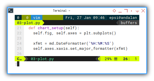
Chart Preview
Now we can plot the data series in matplotlib.
  def plotSeries(self):
    plt.plot(
      self.timeframe.time,
      self.timeframe.temp)

    plt.xticks(rotation=90, ha='right')
    plt.title('Value by Time')

    plt.xlabel('Time')
    plt.ylabel('Value')

    plt.show()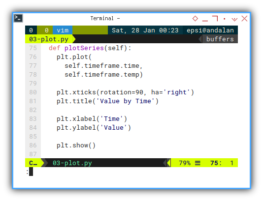
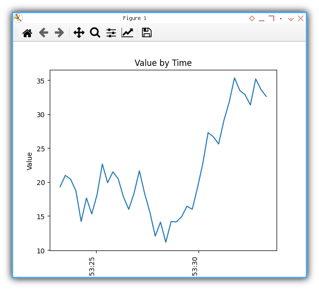
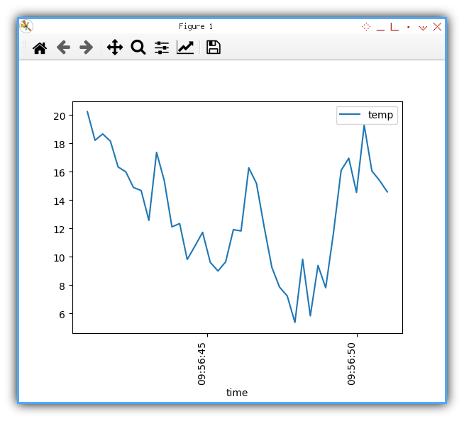
With the result similar as below figure:
Plotting Using Dataframe
Alternatively, you may utilize dataframe method to plot data.
  def plotSeries(self):
    self.timeframe.plot(
      'time', 'temp', ax=self.axes)

    for tick in self.axes.get_xticklabels():
      tick.set_rotation(90)

    plt.show()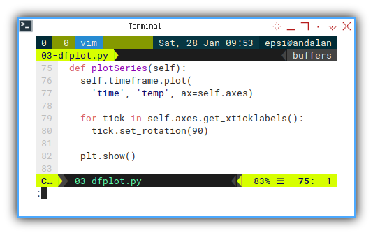
With about the same result as previous chart.
It is up to you to choose whatever suit your case better.
What is Next 🤔?
We are done with simple example. But we need more than just simple example right?
How about smoothing the line? The issue with smoothing is, the interpolation method does not accept time series. So we have to keep the data in float instead, and cast into time series before we plot.
Consider continue reading [ Python - Panda - Time Series ].