Preface
Goal: Prepare data structure for plot a pie chart.
I finally got a chance to use matplotlib in daily office hours. I have done a lot of training, and for each training, I have to make a lot of report, based on google forms.
The graphic from googleform itself is already good. The problem is the result is often unexpected, and need manual editing. I also found new pattern each week, so I have to normalize most of data manually, and recreate each pie chart.
Of course I can utilize LibreOffice Calc or Microsoft Excel. But I think it is my chance to use matplotlib, to create that bunch of report. Using matplotlib is simply reproducible easily, and I can automate stuff later on.
Do not Rush!
This first article won’t talk about matplotlib at all.
Preparation Step:
-
Visualize what you need to achieve. Choose data representation. Piechart or other.
-
Begin with data structure. The source data that you need.
-
Build the model using functional programming. Extract the structure.
-
Test the output in CLI, before making visual.
1: Data Structure
Consider data structure as a starting point. I have been in a tour form town to town. I also count the total number of trainees in each town.
Script
The python script is simple:
# dict { location : (number of trainee, date of training) }

response = {
  'Bandung' : (50, '10 Oct'),
  'Banjar'  : (31, '13 Oct'),
  'Bekasi'  : (28, '15 Oct')
}

locations = list(response.keys())
elements  = list(response.values())

print(locations)
print(elements)
Result
Run the script above. This will show you this below:
['Bandung', 'Banjar', 'Bekasi']
[(50, '10 Oct'), (31, '13 Oct'), (28, '15 Oct')]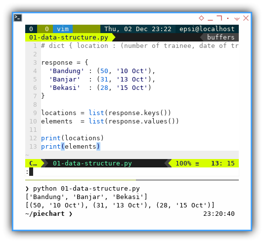
Dictionary Method
The response variable can produce different object,
depend on the methods.
response.keys()response.value()response.items()
locations = list(response.keys())
elements  = list(response.values())

print(locations)
print(elements)
2: Pretty Print
Since in real world we have to deal with a lot of data. It is wise to setup pretty print. So we can read and then examine the result easily, without hurting your good retina.
Script
import pprint

# dict { location : (number of trainee, date of training) }

response = {
  'Bandung' : (50, '10 Oct'),
  'Banjar'  : (31, '13 Oct'),
  'Bekasi'  : (28, '15 Oct'),
  'Bogor'   : (50, '26 Oct'),
  'Cimahi'  : (10, '28 Oct'),
  'Cirebon' : (46, '08 Nov'),
  'Depok'   : (38, '08 Nov'),
  'Sukabumi': (47, '20 Nov')
}

locations = [key for key, value in response.items()]
elements  = [value for key, value in response.items()]

my_print  = pprint.PrettyPrinter(width=60, compact=True)
my_print.pprint(locations)
my_print.pprint(elements)
Result
Run the script above. This will show you this below:
['Bandung', 'Banjar', 'Bekasi', 'Bogor', 'Cimahi',
 'Cirebon', 'Depok', 'Sukabumi']
[(50, '10 Oct'), (31, '13 Oct'), (28, '15 Oct'),
 (50, '26 Oct'), (10, '28 Oct'), (46, '08 Nov'),
 (38, '08 Nov'), (47, '20 Nov')]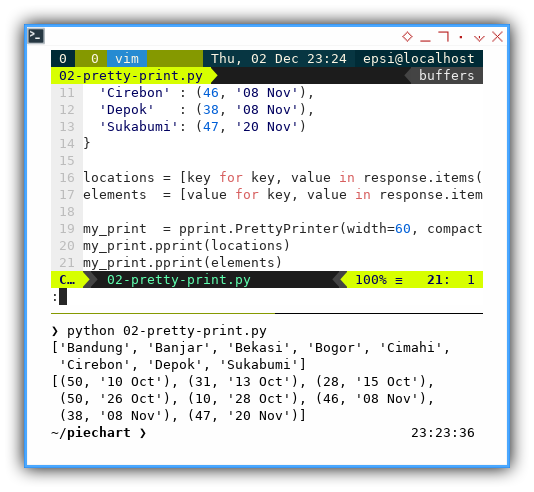
List Comprehension
Instead of dictionary method,
we can reproduce using list comprehension [.. for .. in ..].
locations = [key for key, value in response.items()]
elements  = [value for key, value in response.items()]
And print later using pprint.
my_print  = pprint.PrettyPrinter(width=60, compact=True)
my_print.pprint(locations)
my_print.pprint(elements)
3: List Comprehension
Consider go further with list comprehension.
Data Structure
Imagine that you need to add additional data.
One more columnn to go.
Our response data from our survey will be as below.
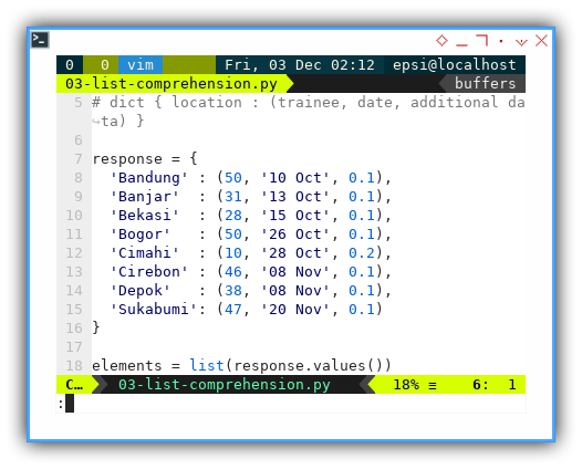
# dict { location : (trainee, date, additional data) }

response = {
  'Bandung' : (50, '10 Oct', 0.1),
  'Banjar'  : (31, '13 Oct', 0.1),
  'Bekasi'  : (28, '15 Oct', 0.1),
  'Bogor'   : (50, '26 Oct', 0.1),
  'Cimahi'  : (10, '28 Oct', 0.2),
  'Cirebon' : (46, '08 Nov', 0.1),
  'Depok'   : (38, '08 Nov', 0.1),
  'Sukabumi': (47, '20 Nov', 0.1)
}
Extracting Data
This is where functional programming comes to rescue.
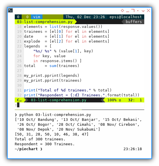
elements = list(response.values())
trainees = [el[0] for el in elements]
date     = [el[1] for el in elements]
explode  = [el[2] for el in elements]
legends  = [
    "%s/ %s" % (value[1], key)
    for key, value
    in response.items() ]
total    = sum(trainees)
Pretty Print
And at last, another pretty print.
import pprint

my_print = pprint.PrettyPrinter(width=60, compact=True)

my_print.pprint(legends)
my_print.pprint(trainees)

print("Total of %d trainees." % total)
print("Respondent = {:d} Trainees.".format(total))
Result
Run the complete script above. This will show you this below:
['10 Oct/ Bandung', '13 Oct/ Banjar', '15 Oct/ Bekasi',
 '26 Oct/ Bogor', '28 Oct/ Cimahi', '08 Nov/ Cirebon',
 '08 Nov/ Depok', '20 Nov/ Sukabumi']
[50, 31, 28, 50, 10, 46, 38, 47]
Total of 300 trainees.
Respondent = 300 Trainees.
Nice Screenshot
As usual I need to put my nicescreenshot here, so I can give data structure example in any social media. Whenever I need, wherever I need.
- I usually start with data structure.
- Build the model using functional programming. Extract the structure.
- Test the output, before making visual.
Two String Formats
You should notice two kind of format. Both produce exactly the same result
print("Total of %d trainees." % total)
print("Respondent = {:d} Trainees.".format(total))
4: Material Colors
The colors
However there is, other aspect that I use mostly in my report. It is the colors.
I use material colors almost so I can have consistent color, from my website, presentation, flyer, and this time also my report.
With material color for my pie chart, I can easily change, for darker tone, or lighter tone.
Script
In order to keep my code clean. I put the name of each color as dictionary. The python script as usual:
import pprint

my_print = pprint.PrettyPrinter(width=60, compact=True)

# dict { color name: rgb code }

material_colors = {
  'red500'   : '#F44336',
  'pink500'  : '#E91E63',
  'purple500': '#9C27B0',
  'indigo500': '#3F51B5',
  'blue500'  : '#2196F3',
  'cyan500'  : '#00BCD4',
  'teal500'  : '#009688',
  'green500' : '#4CAF50',
  'lime500'  : '#CDDC39',
  'orange500': '#FF9800'
}

colors = list(material_colors.values())

my_print.pprint(colors)
Result
Run the script above. This will show you this below:
['#F44336', '#E91E63', '#9C27B0', '#3F51B5', '#2196F3',
 '#00BCD4', '#009688', '#4CAF50', '#CDDC39', '#FF9800']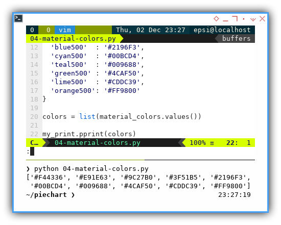
That is all with colors.
What is Next 🤔?
Data structure is fun, but we have to move on.
Consider continue reading [ Matplotlib - Pie Chart - Part Two ].