Preface
Goal: Plot a simple pie chart.
For a good reason, we should start from simple.
1: A Very Simple Pie Chart
Consider start with subplot. Then make the pie chart.
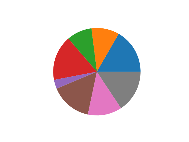
import matplotlib.pyplot as plt

# data structure
trainees = [50, 31, 28, 50, 10, 46, 38, 47]

# plot pie chart
axes = plt.subplot()
axes.pie(trainees)
plt.show()
With the result about similar to below chart.
2: Percentage Label
We are going to add label for each wedges.
Initial Variables
Again start with data structure.
import numpy as np
import matplotlib.pyplot as plt

# data structure
trainees  = [50, 31, 28, 50, 10, 46, 38, 47]
locations = [
  'Bandung', 'Banjar', 'Bekasi', 'Bogor',
  'Cimahi',  'Cirebon', 'Depok', 'Sukabumi']
colors = {
  '#F44336', '#E91E63', '#9C27B0', '#3F51B5',
  '#2196F3', '#00BCD4', '#009688', '#4CAF50',
  '#CDDC39', '#FF9800' }
explode = [0.1, 0.1, 0.1, 0.1,
           0.1, 0.1, 0.1, 0.1]
Matplotlib
Then the chart part with matplotlib.
# plot pie chart
axes = plt.subplot()

wedges, texts, autotexts = axes.pie(
  trainees,
  labels  = locations,
  colors  = colors,
  explode = explode,
  autopct = "%.1f")

[print(obj.get_text()) for obj in texts]

plt.show()
With the result as chart below
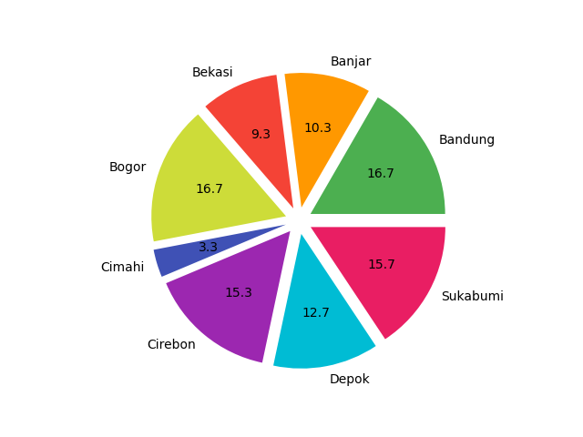
Notice that the chart color now looks nicer than the default one, because the color has been equipped with material color.
More Pie Paramater
Notice the labels, colors and explode in code below:
wedges, texts, autotexts = axes.pie(
  trainees,
  labels  = locations,
  colors  = colors,
  explode = explode,
  ...
The color might differ, everytime you generate the pie chart. I guess it is a feature, when I have more colors than it should be.
Inspect The Object
You should notice that the axes.pie,
has result in left side assignment.
wedges, texts, autotexts = axes.pie(...)You can read the official documentation, for more information. However you can have a peek, to see what is inside the variable.
[print(obj.get_text()) for obj in texts]With the result as below
Bandung
Banjar
Bekasi
Bogor
Cimahi
Cirebon
Depok
Sukabumi
Now you know.
3: Percentage Label with Lambda
How about further processing to create a complex percentage label? Of course we can.
Initial Variables
We con reuse the same data structure,
with additional total variable.
total = sum(trainees)Helper Function
Instead of just setting autopct = "%.1f",
we can go further with total survey participant for each wedges.
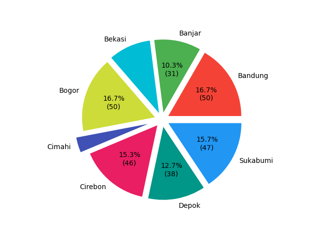
# additional function
def wedge_text(percent, total):
    absolute = int(round(total*percent/100))
    return "{:.1f}%\n({:d})".format(percent, absolute)
Or even further, only show the result, with percentage more than 10%.
# additional function
def wedge_text(percent, total):
    absolute = int(round(total*percent/100))
    if percent > 10:
      return "{:.1f}%\n({:d})".format(percent, absolute)
    else:
      return ""
Matplotlib
Finally the pie chart as usual, with a very clean code.
# plot pie chart
axes = plt.subplot()

wedges, texts, autotexts = axes.pie(
  trainees,
  labels  = locations,
  colors  = colors,
  explode = explode,
  autopct = lambda percent: wedge_text(percent, total))

plt.show()
The displayed chart can be as good as below figure.
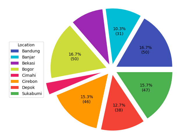
4: A Very Simple Legend
Instead of label, we can use legend.
A Small Change
All you need to do is disable the labels.
# plot pie chart
axes = plt.subplot()

wedges, texts, autotexts = axes.pie(
  trainees,
  labels  = None,
  colors  = colors,
  explode = explode,
  autopct = lambda percent: wedge_text(percent, total))
And add this axes.legend method as line below:
axes.legend(
  wedges, locations,
  loc="lower left",
  bbox_to_anchor=(0, 0, 0, 0))

plt.show()
And let me show you this ugly result below:
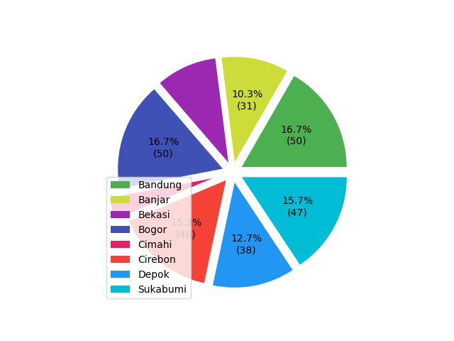
How do I suppose to do to solve, this overlapped chart and legend positioning?
5: Positioning
We need to understand how the matplotlib position these two:
- The chart itself.
- And the label, anchored to the chart position.
The code is here:
Chart Positioning
The chart positioning can be obtained by using this line:
axes.set_position([0.2, 0, 0.8, 1])It is more like trial and error to have the right position.
But basically, I give 0.2 space at the left.
And the rest width is 0.8.
Legend Positioning
The legend positioning is not based on the canvas,’
but based on the chart instead.
Because we are using bbox_to_anchor setting.
axes.legend(
  wedges, locations,
  loc="lower left",
  bbox_to_anchor=(0, 0, 0, 0))

plt.show()
Now we can have the result as displayed below:
What is Next 🤔?
We have all the preparation, we need to conclude this article.
Consider continue reading [ Matplotlib - Pie Chart - Part Three ].