Preface
Goal: Realtime data plot using Pandas.
We have solved the interpolation for time series. It is a good time to apply our knowledge into realtime data with MQTT.
This is a long article, but worth to read. You might consider to take a break, making a cup of coffe, before we start.
8: Smooth Realtime Plotting Using Time Series Dataframe
Main Course
No more baby crawl, let’s jump into real project.
Python Source Code
Use the source, Luke!
This time, source code reading is a must.
Required Package
We have all we need
import asyncio
import asyncio_mqtt  as aiomqtt

import matplotlib
import matplotlib.pyplot as plt
import matplotlib.dates as md

import pandas as pd
import numpy  as np

from datetime import datetime, timedelta
from time     import sleep
from scipy    import interpolate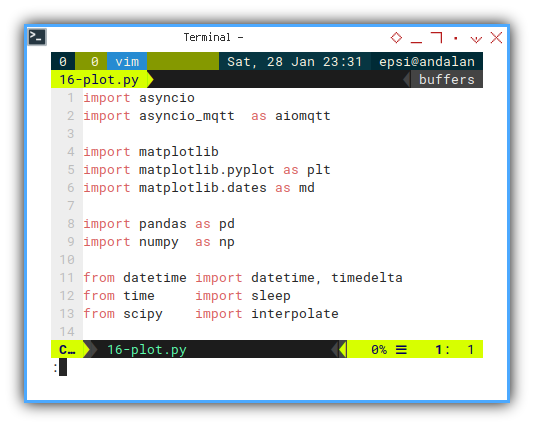
Skeleton
Only a few method, but teach has its own complexity.
class mqSubscriber:
  def __init__(self):
  def chart_setup(self):
  def update_limit(self, new_time, new_num):
  def build_df_smooth(self):
  def remove_old(self, new_time):
  def update_data(self, msg):
  def update_view(self):
  async def main(self):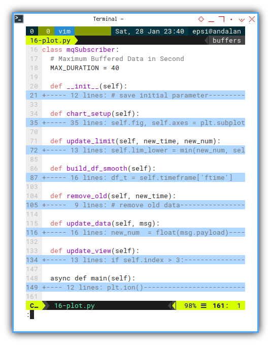
Constructor
class mqSubscriber:
  # Maximum Buffered Data in Second
  MAX_DURATION = 40

  def __init__(self):
    # save initial parameter
    self.index = 0
    self.timeframe = pd.DataFrame({
      "time": [], "ftime": [], "temp": [] })

    self.lim_lower = 10
    self.lim_upper = 40

    self.lim_start = None
    self.lim_end   = None

    self.chart_setup()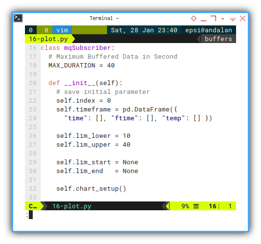
Main Method
Interactive On
The rest is just ordinary asyncio_mqtt routine.
  async def main(self):
    plt.ion()
    plt.show()

    client = aiomqtt.Client(
      hostname="localhost", port=1883)

    async with client:
      async with client.messages() as messages:
        await client.subscribe("topic/signal")
        async for message in messages:
          self.update_data(message)
          self.update_view()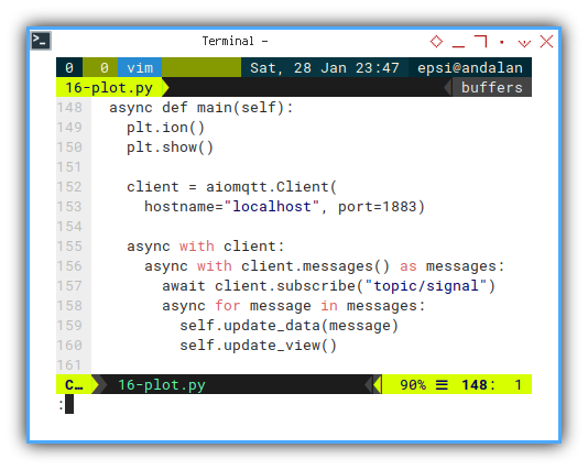
There is two sequence task for each message.
- Updating the data by preparing frame such as interpolation, and then we can go to the next task.
- Updating View: Updating Limit, Remove obsolete data.
The code is wrapped in each own respective method.
  self.update_data(message)
  self.update_view()
Updating Data Frame
Using float type timestamp
We have three data series.
Actually we can dispose the time series,
but I keep it there for my own observation.
  def update_data(self, msg):
    new_num  = float(msg.payload)
    new_time = datetime.now()
    new_time_as_float = datetime.timestamp(new_time)

    new_pair = pd.DataFrame({
      "time" : new_time,
      "ftime": new_time_as_float,
      "temp" : new_num
    }, index=[self.index])

    self.index += 1
    self.timeframe = pd.concat(
      [self.timeframe, new_pair])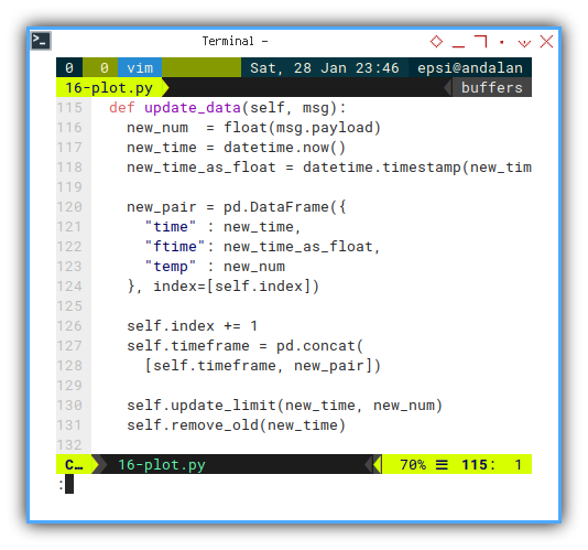
I make an additional enhancement here. We can deal with this later in this article.
  def update_data(self, msg):
    ...

    self.update_limit(new_time, new_num)
    self.remove_old(new_time)
Right now we need to discuss the data, before additinal chart enhancement.
Print Progress
For simplicity for this article, I remove this feature. You can add yourself, for convenience.
Interpolation
Smoothing Lines with Moving Index
We have once solve the time series issue using float type. But there come another issue.
The other issue with interpolation is, getting the index for moving data. We should not assume the index start from zero, because we regularly dispose obsolete data. This means we also deal with moving index.
Getting secondary line for horizontal axes can be done this way. You can check by printing the data series in the script into the console yourself.
    df_t = self.timeframe['ftime']

    idx = self.timeframe.index
    fst = df_t[idx[0]]
    lst = df_t[idx[-1]]

    xfit = np.arange(fst, lst, 0.1)
Now we can apply the code above for our interpolation.
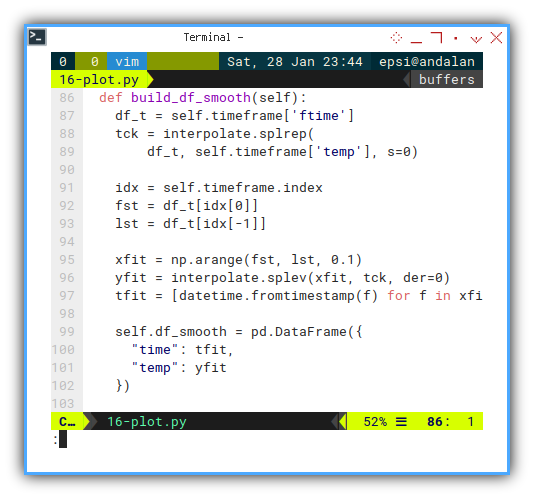
  def build_df_smooth(self):
    df_t = self.timeframe['ftime']
    tck = interpolate.splrep(
        df_t, self.timeframe['temp'], s=0)

    idx = self.timeframe.index
    fst = df_t[idx[0]]
    lst = df_t[idx[-1]]

    xfit = np.arange(fst, lst, 0.1)
    yfit = interpolate.splev(xfit, tck, der=0)
    tfit = [datetime.fromtimestamp(f) for f in xfit]

    self.df_smooth = pd.DataFrame({
      "time": tfit,
      "temp": yfit
    })
I have already give simple interpolation example in previous article. If you still confused about how it works, you can googled for more simple interpolation example for a while, then go back here when you get the clue.
Setting Up Chart
Making pretty matplotlib chart always take long setup code. But it worth the looks.
  def chart_setup(self):
    self.fig, self.axes = plt.subplots()
    self.axes.set_ylim(
      self.lim_lower, self.lim_upper)

    xfmt = md.DateFormatter('%H:%M:%S')
    self.axes.xaxis.set_major_formatter(xfmt)
    plt.subplots_adjust(bottom=0.3)
    plt.xticks(rotation=90, ha='right')

    plt.title('Value by Time')
    plt.xlabel('Time')
    plt.ylabel('Value')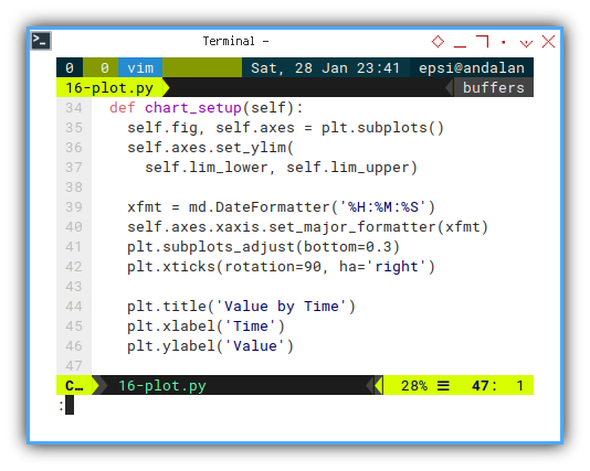
We can go further exploiting any matplotlib feature, such major grid, and minor grid.
    self.axes.grid(
      which='major',
      color = '#004d40',
      linestyle = '--',
      linewidth = 0.8)

    self.axes.grid(
      which='minor',
      color = '#009688',
      linestyle = ':',
      linewidth = 0.4)

    self.axes.minorticks_on()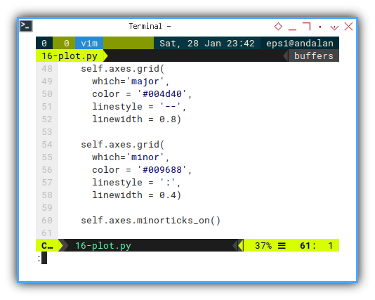
We also need to add event handler to close the script, whenever the chart window closed.
    self.fig.canvas.mpl_connect(
      'close_event', exit)
And finally we should draw both lines:
- Original Data as marker only
- Smooth Data as lines
    self.line, = self.axes.plot(
      [], [], linestyle="None",
      marker='+', markerfacecolor='#00796b')
    self.smooth, = self.axes.plot(
      [], [], color='#1976d2')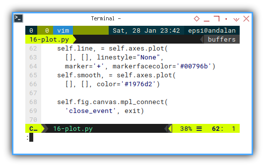
I also use material design, for nice color. The trick with design is, make variation details, but do not abuse. For example, we plot original data with marker, but please keep small. And do not use thick lines, unless you have good reason about it.
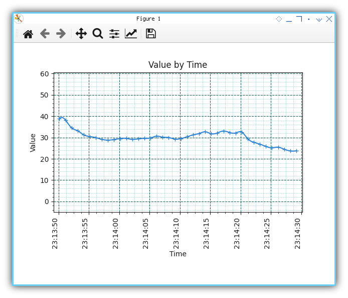
Not really impressive. This is just a minimum one, without legend and stuff.
For this article, I intent to make this as simple as possible. You can read my other article to setup more complex view.
Updating Limit
It works on my computer.
Since we want to do update chart boundary manually, we have to create our own method to setup our limit boundary.
This is what I have got so far, based on trial and error, to find the right time difference. Good enough for prototype, but maybe need to be simplified.
  def update_limit(self, new_time, new_num):
    self.lim_lower = min(new_num, self.lim_lower)
    self.lim_upper = max(new_num, self.lim_upper)

    self.axes.set_ylim(
      self.lim_lower - 15, self.lim_upper + 10)

    self.lim_end = new_time
    if self.index <= 1:
      self.lim_start = new_time
    else:
      self.axes.set_xlim(
        self.lim_start - timedelta(seconds=1),
        self.lim_end   + timedelta(seconds=1))
I must admit I’m new in this area. Since I can’t wait for somebody to code for me, I brave myself to get this done. My code could be wrong, not enough test. Use it with your own risk.
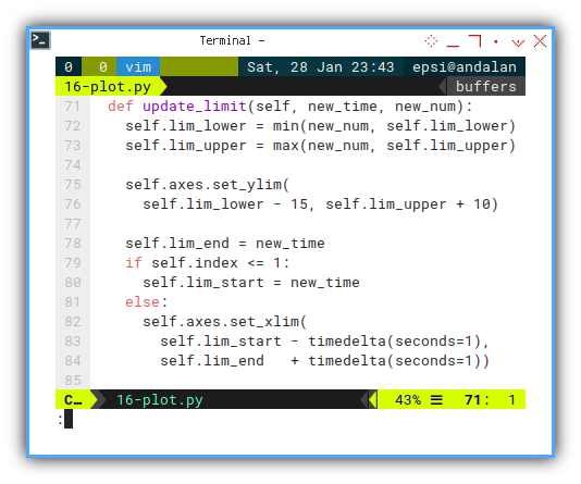
I could be wrong but there might be somewhere, a ready standard do this task.
Meanwhile, you are free to make your own limit algorithm.
Cut Obsolete Data
Moving Time Series
The idea is to make, animation like chart.
  def remove_old(self, new_time):
    # remove old data
    obsolete = new_time \
      - timedelta(seconds=self.MAX_DURATION)

    self.timeframe = self.timeframe\
      [self.timeframe.time >= obsolete]

    if self.index >= self.MAX_DURATION:
      self.lim_start = obsolete + timedelta(seconds=2)
It works on my computer.
This is a last minute enhancement. And I know this is not a good code.
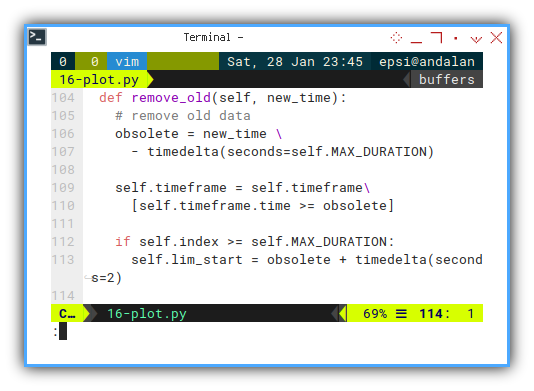
Not much test yet. Use it with your own risk.
Updating Chart
Finally, draw both lines.
We still have to assign each data to matplotlib. I’m not sure which one is primary and which one is secondary. I guess both are important for me.
  def update_view(self):
    if self.index > 3:
      self.build_df_smooth()
      self.line.set_xdata(self.timeframe.time)
      self.line.set_ydata(self.timeframe.temp)
      self.smooth.set_xdata(self.df_smooth.time)
      self.smooth.set_ydata(self.df_smooth.temp)

    # tips: not to steal focus
    plt.draw()
    self.fig.canvas.draw_idle()
    self.fig.canvas.start_event_loop(0.001)

    sleep(0.1)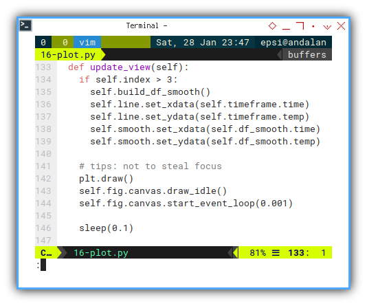
And don’t forget my attribution, as my respect for stackoverflow people. The answer of most basic coding issue.
Execute: Run
Be brave, grow up, and run!
mqSub = mqSubscriber()
asyncio.run(mqSub.main())
Chart Preview
The limit is your imagination
Run, test, run test, stop the publisher, experiment with dual publisher, and so on. You can figure out, the result of code above yourself, or by observing this video below:
Performance
I also have checked the htop. The CPU usage is still low.
I guess we can use this script for use with further project.
What is Next 🤔?
Consider clean up.
The fact that the code above works, does not means the code above is not sucks.
Make things simple. Refactor to internal design, while preserving your working code.
Better code does not means not sucks either. But at least I can do something about it.
Consider continue reading [ Python - MQTT - Clean Up ].