Preface
Goal: Conclude the pie chart view.
Let’s make things complex.
1: Modularizing
Before we begin, we need to separate reusable code, into different script.
colors.pyhelper.pytrainees.py
So we don’t have to retype all the time.
Colors
# dict { color name: rgb code }

material_colors = {
  'red500'   : '#F44336',
  'pink500'  : '#E91E63',
  'purple500': '#9C27B0',
  'indigo500': '#3F51B5',
  'blue500'  : '#2196F3',
  'cyan500'  : '#00BCD4',
  'teal500'  : '#009688',
  'green500' : '#4CAF50',
  'lime500'  : '#CDDC39',
  'orange500': '#FF9800'
}

colors = list(material_colors.values())
Helper
# additional function

def wedge_text(percent, total):
    absolute = int(round(total*percent/100))
    if percent > 10:
      return "{:.1f}%\n({:d})".format(percent, absolute)
    else:
      return ""
Trainees
# dict { location : (trainee, date, additional data) }

response = {
  'Bandung' : (50, '10 Oct', 0.1),
  'Banjar'  : (31, '13 Oct', 0.1),
  'Bekasi'  : (28, '15 Oct', 0.1),
  'Bogor'   : (50, '26 Oct', 0.1),
  'Cimahi'  : (10, '28 Oct', 0.2),
  'Cirebon' : (46, '08 Nov', 0.1),
  'Depok'   : (38, '08 Nov', 0.1),
  'Sukabumi': (47, '20 Nov', 0.1)
}

elements = list(response.values())
trainees = [el[0] for el in elements]
date     = [el[1] for el in elements]
explode  = [el[2] for el in elements]
legends  = [
    "%s/ %s" % (value[1], key)
    for key, value
    in response.items() ]
total    = sum(trainees)
2: Data Test Bed
Combine All
Consider combine all the script above
import numpy as np
import matplotlib.pyplot as plt

from colors import *
from trainees import *
from helper import wedge_text- Beware that we have a longer legend text.
Matplotlib
The chart code, is very similar with the previous one. With little differences.
# plot pie chart
axes = plt.subplot()

wedges, texts, autotexts = axes.pie(
  trainees,
  labels  = None,
  colors  = colors,
  explode = explode,
  autopct = lambda percent: wedge_text(percent, total))

axes.legend(
  wedges, legends,
  title="Date/Location",
  loc="center left",
  bbox_to_anchor=(-0.6, 0.5, 0, 0))

axes.set_position([0.4, 0, 0.6, 1])

plt.show()
Wwe have a longer legend text. So we need to create more space
axes.set_position([0.4, 0, 0.6, 1])Since we use bbox_to_anchor setting.
the setting should also be changed.
bbox_to_anchor=(-0.6, 0.5, 0, 0)Chart Result
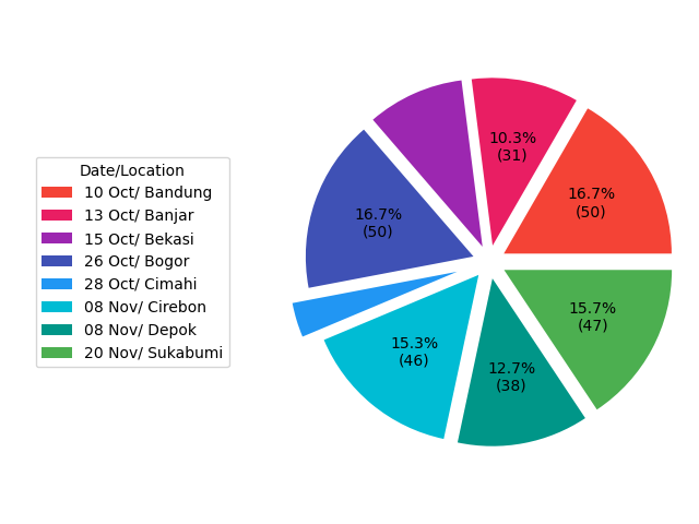
The chart result is drawn as expected. It is shown in figure below:

3: Chart Decoration
We can add more chart decoration such as title, suptitle,
and also a few enhancement.
Title and Suptitle
This line below is self explanatory.
plt.suptitle("Participants in West Java Region",
  horizontalalignment='center',
  weight="bold",
  fontsize=12)
plt.title(   "Respondent = %d Trainees" % total,
  horizontalalignment='center',
  fontsize=9, y=-0.1)

plt.show()
Positioning
Since we add more object, we need more whitespace. So we should set the chart positioning again.
axes.legend(
  wedges, legends,
  title="Date/Location",
  loc="center left",
  bbox_to_anchor=(-0.6, 0.5, 0, 0))

axes.set_position([0.4, 0.1, 0.6, 0.9])
More Parameters
For learning and curiosity purpose, I add more paramater:
wedges, texts, autotexts = axes.pie(
  trainees,
  labels  = None,
  colors  = colors,
  explode = explode,
  startangle=30,
  pctdistance=0.75,
  textprops=dict(color="#212121"),
  autopct = lambda percent: wedge_text(percent, total))
Chart Result
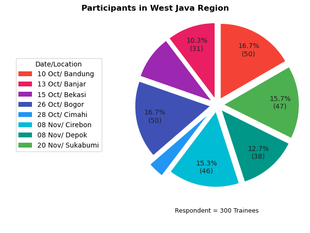
Now we can see the result:

All done properly.
4: Fancy Piechart
We can go further with visual.
Original Article
I found this amazing article, by Kevin Amipara.
We need to achieve the same effect.
Subplots instead of just subplot.
Wait…! Is this a plural form?
Since we need to draw object in figure, we need to change a little bit from:
# plot pie chart
axes = plt.subplot()
Into this form:
# plot pie chart
fig, axes = plt.subplots(figsize=(8, 5))
With this form we can make multiple chart. But in this case. Just drawing a circle.
Drawing Circle
The code is almost verbatim copy carbon, taken from the original article.
#draw circle
centre_circle = plt.Circle((0,0),0.80,fc='white')
fig = plt.gcf()
fig.gca().add_artist(centre_circle)
Instead of explaing the code here. You’d better read the original article.
Adjustment
We need to make a few adjustment as usual, so we can have proper chart.
wedges, texts, autotexts = axes.pie(
  trainees,
  labels  = None,
  colors  = colors,
  explode = explode,
  startangle=30,
  pctdistance=0.5,
  textprops=dict(color="#212121"),
  autopct = lambda percent: wedge_text(percent, total))

axes.legend(
  wedges, legends,
  title="Date/Location",
  loc="center left",
  bbox_to_anchor=(-0.6, 0.5, 0, 0))

axes.set_position([0.4, 0.1, 0.6, 0.8])
Chart Result
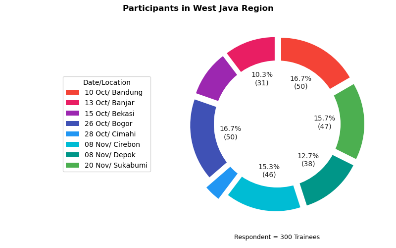
Finally, the fancy chart.:

This works require creativity. And of course, imagination.
What is Next 🤔?
After pretty pie chart, we can continue to cumulative bar chart.
Consider continue reading [ Matplotlib - Bar Chart - Part One ].