Preface
Goal: Plot a Chart, Based on Population.
Supposed that you have your statistic data, you might wonder how to visualize the data. This article is my exercise as a beginner in statistic area. From beginner to other beginner.
I’m going to use python, as the language in this article.
1: Populate Random Data
For this example to works, we require example data.
Our very first step is to populate data.
My choice is a height of students in centimeter.
The range is between 165 to 174.
In Python Numpy terms,
this would be described as np.random.randint(165, 175, size=...).
So be aware of the +1 difference here.
The complete script would be:
import numpy as np

range_min = 165
range_max = 175

np.random.seed(7)
data = np.random.randint(range_min, range_max, size=32)

data_str = ', '.join(str(x) for x in data)
print('[' + data_str + ']')
The result would be a long list of integer number.
[169, 174, 171, 168, 168, 172, 172, 174, 172, 173, 174, 173, 172, 171, 169, 165, 172, 165, 172, 171, 168, 170, 173, 173, 172, 170, 165, 165, 167, 173, 174, 171]Now we can copy the output as data for our next script.
Static Data
Why copy? Why not use random? why use static data?
Because, I need to examine the data. From script to chart. Many times in this experiment I have to count manually.
I can switch to random data later. But now I need static data.
2: Histogram Chart
It is a good time to use the population data into something.
Header
Script we are going to use in this article require this library
import numpy as np
import matplotlib.pyplot as plt
Data
Consider start with data
range_min = 165
range_max = 175

data = np.array([
    169, 174, 171, 168, 168, 172, 172, 174,
    172, 173, 174, 173, 172, 171, 169, 165,
    172, 165, 172, 171, 168, 170, 173, 173,
    172, 170, 165, 165, 167, 173, 174, 171
  ])
Chart
Consider present the data interpreation into matplotlib’s histogram chart.
bins  = np.arange(range_min, range_max+1)

plt.hist(data, bins=bins,
  facecolor="tab:green", edgecolor="k", linewidth=0.7)

plt.show()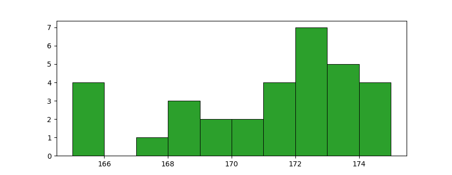
The chart still show nothing I know. That is why we have to use other chart, called dotplot.
3: Histogram Text
Before we moved on, we need to understand, how the python script works behind the scene.
Header and Data
The same as previous example.
Bins
The dotplots chart require numpy’s histogram.
The calculation based on bins as below.
range_x = np.arange(range_min, range_max)
bins    = np.arange(range_min, range_max+1)

freq, edges = np.histogram(data, bins=bins)

print("range_x: " + str(range_x))
print("freq: " + str(freq))
The bins edge require the +1.
Now we have the frequency count as below:
range_x: [165 166 167 168 169 170 171 172 173 174]
freq: [4 0 1 3 2 2 4 7 5 4]
To avoid repetition, we can rewrite the variable, using python slice.
bins    = np.arange(range_min, range_max+1)
range_x = bins[:-1]
Zip
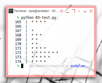
Consider make a tuple from both list, and present the tuple interpretation in text.
pairs = zip(range_x, freq)

for key, value in pairs:
  print(key, ' | ', ' '.join(np.repeat('*', value)))
Just run the script! We will get nice text histogram.
165  |  * * * *
166  |
167  |  *
168  |  * * *
169  |  * *
170  |  * *
171  |  * * * *
172  |  * * * * * * *
173  |  * * * * *
174 | * * * *- .
4: Dotplot
It is a good time to use the population data, into something more meaningful.
I have got this code from stackoverlow.
Header and Data
The same as previous example.
Chart
To create dotplots,
all we need is matplotlib’s scatter chart.
This scatter chart require numpy’s meshgrid.
bins    = np.arange(range_min, range_max+1)
range_x = bins[:-1]

freq, edges = np.histogram(data, bins=bins)

y = np.arange(1, freq.max()+1, 1)
x = range_x
X,Y = np.meshgrid(x,y)

plt.scatter(X,Y, c=Y<=freq, cmap="Greens")

plt.show()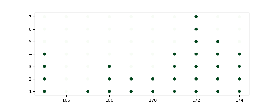
Decoration
Now we can complete the chart with ticks, label, and limits.
We can also hide the spines border.
bins    = np.arange(range_min, range_max+1)
range_x = bins[:-1]

freq, edges = np.histogram(data, bins=bins)

y = np.arange(1, freq.max()+1, 1)
x = range_x
X,Y = np.meshgrid(x,y)

plt.title('Height of Students')
plt.xlabel('Height (cm)')
plt.ylabel('Frequency')
plt.yticks(y)
plt.xticks(x)
plt.ylim(0, freq.max()+1)
plt.xlim(range_min-3, range_max+2)
plt.tick_params(top=False, bottom=True, left=False, right=False, labelleft=False, labelbottom=True)

for pos in ['right', 'top', 'left']:
    plt.gca().spines[pos].set_visible(False)

plt.scatter(X,Y, c=Y<=freq, cmap="Greens")

plt.subplots_adjust(bottom=0.2)
plt.show()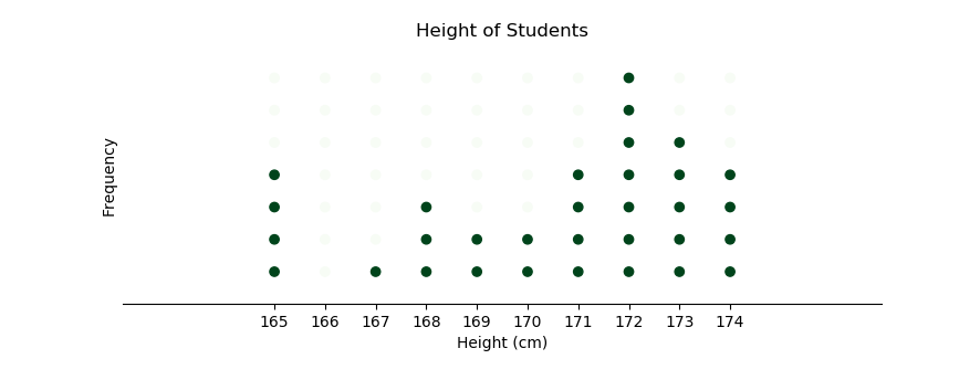
The dotplot is all we need.
5: Stemplots
However, for curiosity reason, we can also make a stem plot chart.
I have got this code from geeksforgeeks.
Counting the Frequency
Stem plot count the frequency based on the unique data. Thus no need for any range with zero count.
Sure we can use previous calculation.
uniq = np.unique(np.sort(data))
freq = freq[freq >0]
But this code below is more straightforward.
uniq, freq = np.unique(data, return_counts=True)Chart
Now we can have a complete chart along with the decorations.
uniq, freq = np.unique(data, return_counts=True)

plt.title('Height of Students')
plt.xlabel('Frequency')
plt.ylabel('Height (cm)')
plt.xticks(np.arange(1, freq.max()+1, 1))
plt.yticks(np.arange(range_min-1, range_max+1, 1))

for pos in ['right', 'top', 'left']:
    plt.gca().spines[pos].set_visible(False)

plt.ylim(range_min-2, range_max+2)
plt.xlim(0, freq.max()+1)
plt.stem(freq, uniq)

plt.subplots_adjust(bottom=0.2)
plt.show()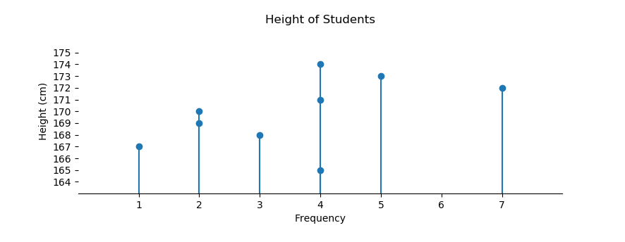
It is done, although I still do not know what stemplot use for.
What is Next 🤔?
Remember our previous equation plot? The difficulties escalate quickly. Let’s animate previous simple plot.
You can continue reading [ Python - Matplotlib Animation ].