Preface
Goal: Plot a Chart based on Math Equation.
I also wish that I had matplotlib, while I was studying Engineering Degree. My final assignment was data acquisition, Realtime data taken from diesel engine, and the representation of P-V diagram, should be shown immediately on desktop screen.
I think matplotlib should be just the right tool for that kind of chart. Now that I meet Data Science, and Functional Programming, I also have a need to plot down chart, in a blog, or sent chart via Telegram or Whatsapp using PNG image
Despite of my regret, I try to make myself a basic script, to show equation in matplotlib.
2D Line
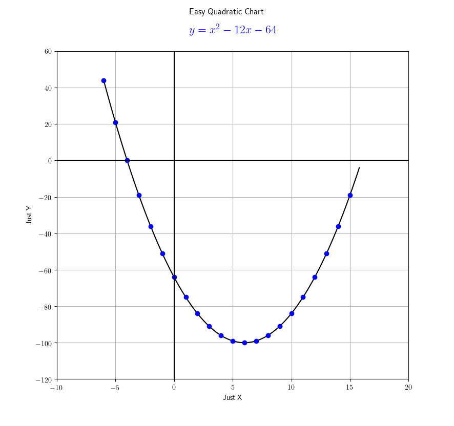
The python script is simple
import numpy as np
import matplotlib
matplotlib.rcParams['text.usetex'] = True
import matplotlib.pyplot as plt

def f(x):
    return x**2 - 12*x - 64

x    = np.arange(-6, 16, 0.2)
xdot = np.arange(-6, 16, 1)

plt.plot(x, f(x), 'k', xdot, f(xdot), 'bo')
plt.axis([-10, 20, -120, 60])

plt.axhline(y=0, color='k')
plt.axvline(x=0, color='k')

plt.grid()
plt.suptitle('Easy Quadratic Chart')
plt.title(r'$y = x^2 - 12x - 64$', fontsize=16, color='b', y=1.04)
plt.xlabel('Just X')
plt.ylabel('Just Y')

plt.show()
Then run the folowing command
$ python yourscript.pyThis will show you this below:

3D Surface
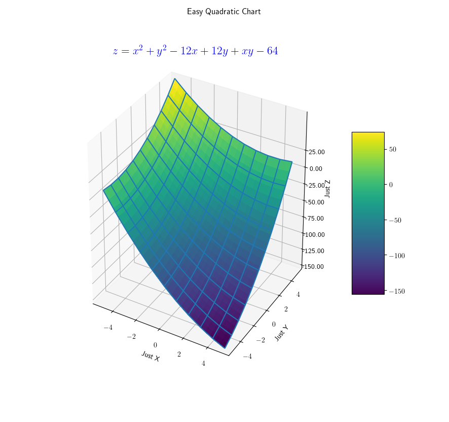
The python script is a little bit longer.
# This import registers the 3D projection, but is otherwise unused.
from mpl_toolkits.mplot3d import Axes3D

import matplotlib
matplotlib.rcParams['text.usetex'] = True

import matplotlib.pyplot as plt
from matplotlib import cm
from matplotlib.ticker import LinearLocator, FormatStrFormatter
import numpy as np

def f(x, y):
  return x**2 + y**2 - 12*x + 12*y + x*y - 64

# plot figure

fig = plt.figure()
ax = fig.gca(projection='3d')

# Make data.
X = np.arange(-5, 5.1, 0.2)
Y = np.arange(-5, 5.1, 0.2)
X, Y = np.meshgrid(X, Y)

Xline = np.arange(-5, 5.1, 1)
Yline = np.arange(-5, 5.1, 1)
Xline, Yline = np.meshgrid(Xline, Yline)

# Compute z to make the surface.
Z = f(X, Y)
Zline = f(Xline, Yline)

# Plot the surface.
surf = ax.plot_surface(X, Y, Z, cmap=cm.viridis,
          linewidth=1, antialiased=False)

wire = ax.plot_wireframe(Xline, Yline, Zline)

# Customize the z axis.
ax.set_zlim(-151, 76)
ax.zaxis.set_major_locator(LinearLocator(10))
ax.zaxis.set_major_formatter(FormatStrFormatter('%.02f'))

# Add a color bar which maps values to colors.
fig.colorbar(surf, shrink=0.5, aspect=5)

# Make a 3D quiver plot
x, y, z = np.zeros((3,3))
u, v, w = np.array([[1,1,0],[1,0,1],[0,1,1]])

ax.quiver(x,y,z,u,v,w,arrow_length_ratio=0.1)

# Some decoration
plt.suptitle('Easy Quadratic Chart')
plt.xlabel('Just X')
plt.ylabel('Just Y')
ax.set_zlabel('Just Z', rotation=90)

# set z ticks
ax.set_zticks(np.arange(-150, 50, 25))

# latex
plt.title(r'$z = x^2 + y^2 - 12x + 12y + xy - 64$',
          fontsize=16, color='b', y=1.06)

# finally
plt.show()
This will show you this below:

That is all.
I keep these two scripts in my blog,
so I can find any of them easily later.
Plotting with matplotlib is fun.
What do you think ?