Preface
Goal: Plot a cumulative bar chart, for a good reason.
Have you ever have a very big sheets? when it somes to reporting, your boss might need a summary.
Just one page, and nothing more!
1: Simple Vertical Bar Chart
Always start from simple.
Variable Initialization
Consider start with subplot. Then make the bar chart, just for puppies.
import matplotlib.pyplot as plt
import numpy as np

from MyColors import material
from MyPopulation import breeds, stages, transpose

puppy  = transpose[0]
width = 0.65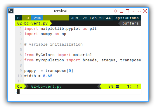
Vertical Plot
Consider start with subplot. Just a few line, and viola, a vertical bar chart.
axes = plt.subplot()

axes.bar(breeds, puppy, width,
  color=material['blue500'], label='Puppy')

plt.show()
Vertical Decoration
Do not forget to add decoration as required. To find the right property attribute to suit your needs, you might involve trial and error process.
axes.set_ylabel('Population')
axes.set_title('Puppies')
axes.set_position([0.1, 0.3, 0.85, 0.6])
axes.set_ylim([-1, 11])

plt.xticks(rotation='vertical')
plt.show()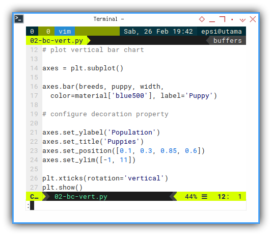
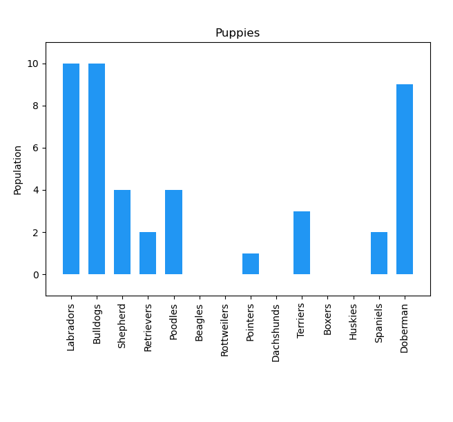
The result might about similar to below chart.
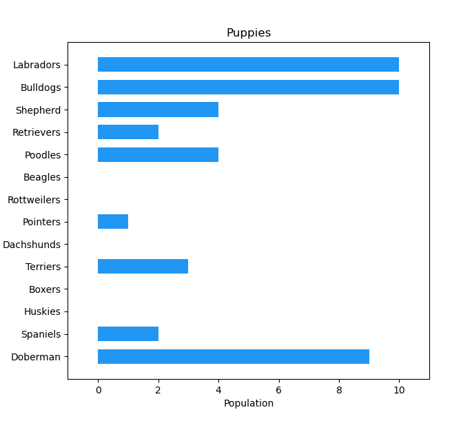
2: Simple Horizontal Bar Chart
We need to expereiment with different kind view.
Variable Initialization
Exactly the same with the simple vertical bar chart above.
Horizontal Plot
Just another subplot.
But this time with barh equipped with y_pos.
axes = plt.subplot()
y_pos = np.arange(len(breeds))

axes.barh(y_pos, puppy, width,
  color=material['blue500'], label='Puppy')

plt.show()
You can refer to official documentation to understand the y_pos.
Horizontal Decoration
It is slighly different with the vertical counterpart.
Especially the invert_yaxis() part.
axes.set_yticks(y_pos, labels=breeds)
axes.invert_yaxis()
axes.set_xlabel('Population')
axes.set_title('Puppies')
axes.set_position([0.15, 0.1, 0.80, 0.8])
axes.set_xlim([-1, 11])

plt.show()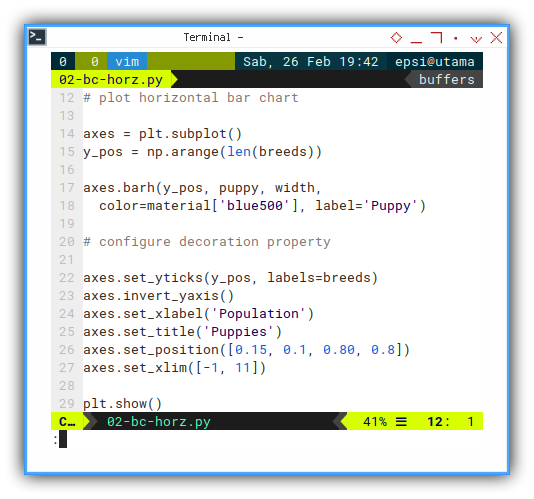
The result might about similar to below chart.
3: Cumulative Vertical Bar Chart
The dogs life cycle can be represented in cumulative value. So that we know the total sum of dog, that already pass a particular life cycle.
Variable Initialization
Consider start with subplot. Then make the bar chart, for all stages.
import matplotlib.pyplot as plt
import numpy as np

# variable initialization

from MyColors import material
from MyPopulation import breeds, stages, transpose

[puppy, junior, adult, mature] = transpose
width = 0.35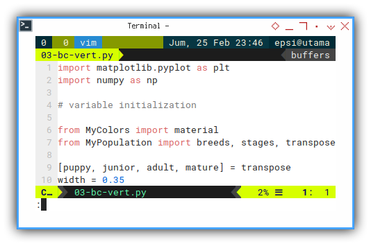
Vertical Plot
This time, we draw multiple barcharts.
Each on upper side of each other,
using the bottom parameter argument.
axes = plt.subplot()

axes.bar(breeds, puppy,  width,
  color=material['blue500'],   label='Puppy')

axes.bar(breeds, junior, width,
  color=material['cyan500'],   label='Junior',
  bottom = puppy)

axes.bar(breeds, adult, width,
  color=material['green500'],  label='Adult',
  bottom = puppy + junior)

axes.bar(breeds, mature, width,
  color=material['teal500'], label='Mature',
  bottom = puppy + junior + adult)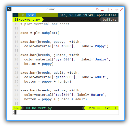
Notice how we add the bottom parameter argument, cumulatively.
This way, each vertical bar, do not overlap with each other.
Vertical Decoration
It is pretty similar with previous decoration.
I also add legend to make the chart more informative.
axes.legend(
  loc="upper left",
  bbox_to_anchor=(1, 1, 0, 0))
axes.margins(x=0.1)

axes.set_ylabel('Population')
axes.set_title('Pet Stages')
axes.set_position([0.1, 0.3, 0.65, 0.6])
axes.set_ylim([-1, 25])

plt.xticks(rotation='vertical')
plt.show()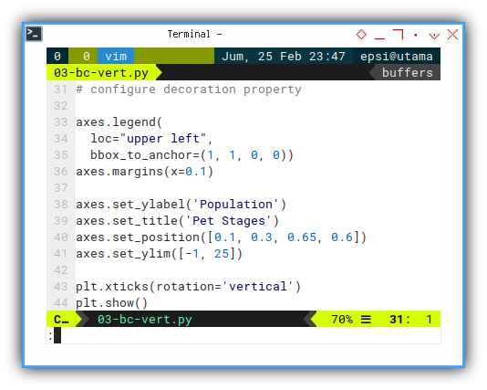
The result might about similar to below chart.
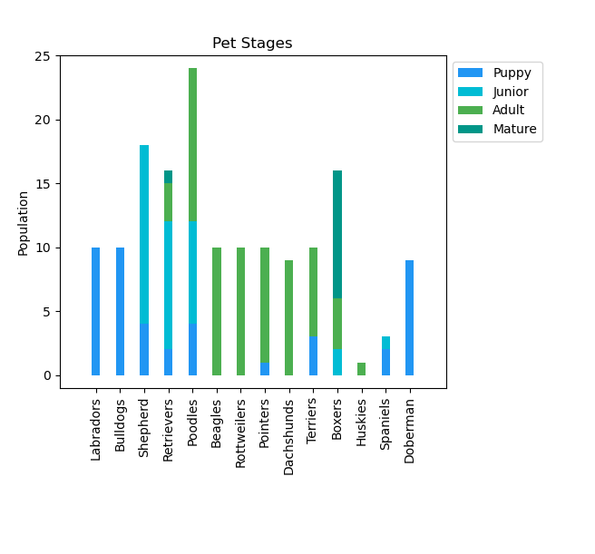
I found that is not easy to read the dog breed name at the bottom. It is a kind of annoying, so I move on creating horizontal chart.
4: Cumulative Horizontal Bar Chart
This horizontal chart is easier to read. And also can hold more breed in portrait page.
Variable Initialization
Exactly the same with the Cumulative vertical bar chart above.
Horizontal Plot
Just multiple barcharts,
using barh equipped with y_pos.
Each bar on right side of each other,
using the left parameter argument.
axes = plt.subplot()
y_pos = np.arange(len(breeds))

axes.barh(y_pos, puppy, width,
  color=material['blue500'],   label='Puppy')

axes.barh(y_pos, junior, width,
  color=material['cyan500'],   label='Junior',
  left = puppy)

axes.barh(y_pos, adult, width,
  color=material['green500'],  label='Adult',
  left = puppy + junior)

axes.barh(y_pos, mature, width,
  color=material['teal500'], label='Mature',
  left = puppy + junior + adult)
Notice how we add the left parameter argument, cumulatively.
This way, each horizontal bar do not overlap with each other.
Horizontal Decoration
It is also pretty similar with previous decoration.
Again, I append legend to make the chart more informative.
axes.legend(
  loc="upper left",
  bbox_to_anchor=(1, 1, 0, 0))
axes.margins(x=0.1)

axes.set_yticks(y_pos, labels=breeds)
axes.invert_yaxis()
axes.set_xlabel('Population')
axes.set_title('Pet Stages')
axes.set_position([0.15, 0.1, 0.60, 0.8])
axes.set_xlim([-1, 25])

plt.show()
The result might about similar to below chart.
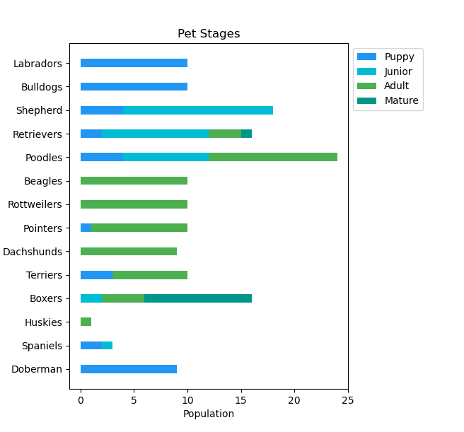
I found that is easier to read the dog breed name at the left axes.
This my report. Only consist one page, and nothing more!
Conclusion
That is all.
I keep these scripts in my blog,
so I can find any of them easily later.
Plotting with matplotlib is fun.
What do you think ?